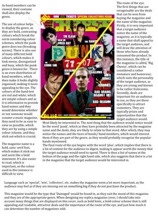
Route of the eye punk
•Download as DOCX, PDF•
0 likes•225 views

The document analyzes the cover of a punk music magazine. It discusses the use of bold, contrasting colors that break norms to represent the punk genre. It also notes the even distribution of band members makes the cover look organized while still maintaining a messy, disorganized style associated with punk. The magazine title uses a bold font that stands out and the deals and names of bands are the first things that catch the eye of the target audience.
Report
Share
Report
Share
Recommended
Existing names & mastheads 
The masthead font of Billboard magazine connotes strength and stability. The consistent spacing and sizing of letters reinforces uniformity. The colors dark grey and white communicate professionalism, quality, and establish the magazine as high-profile. The name "Billboard" implies it covers high-profile artists and is respected in the music industry hierarchy.
The capitalized title "DIY" may reference the acronym "Do It Yourself" and inspire readers to further their music industry knowledge from feature articles. Readers feel encouraged to buy the magazine. The white color implies transparency while the dark grey adds seriousness.
The name "Kerrang" uses onomatopoeia of a guitar strum to
Music magazines
The document summarizes a magazine article about the music magazine Smash Hits. It analyzes the target audience, layout, language, and content of the magazine to conclude it is aimed at teenage girls interested in pop music. Colors, photos of celebrities, informal language, scattered layout, and articles about celebrities' personal lives all suggest the magazine is targeting teenage readers.
Initial ideas
The document outlines initial ideas for developing a music magazine focused on the alternative rock genre. It discusses researching the target audience to inform choices for magazine conventions. Sections cover potential masthead names that reference music, font and text style options for the masthead, cover line ideas featuring well-known alternative rock artists, gift and competition ideas related to concerts and bands, and suitable color schemes for the magazine reflecting the alternative rock genre.
Anotate music magazines
The document discusses the design elements of magazine covers, using the cover of Kerrang! magazine as an example. It explains that the masthead font is the largest and boldest to catch readers' attention. For Kerrang!, the unique cracked font indicates the genre of loud rock music covered. Color schemes and band member positioning are also designed to attract buyers. Cover lines and positioning statements describe the magazine's contents to encourage purchases.
How did you attract/address your audience?
The document summarizes how the author addressed and attracted their target audience for a dance/electronic music magazine. The magazine targets two age groups - 18-21 and 30-40 - who enjoy similar artists. Graphology, typography, color, and consistent branding were used to make the magazine visually appealing. The masthead was designed to stand out on shelves using a simple black font. Photographs on the front cover and inside featured attractive young male DJs in styles appealing to both audiences. The tone of the main article was informal to match the fun nature of the music genre.
Question 5
The document discusses how the author addressed and attracted their target audience for a dance music magazine. The audience is split into two age groups, 18-21 and 30-40, who both enjoy electronic artists. The magazine uses graphic design elements like typography, color, and consistent branding to attract and engage readers. Photos of attractive young male DJs on the cover and inside are intended to draw in both male and female readers. The tone of an article about an adolescent DJ duo is informal to suit the fun nature of dance music genres and language familiar to the audience.
Q1 media
The document summarizes the layout and design choices for the front cover and inside pages of a student-designed music magazine. On the front cover, the designer followed conventions like featuring the main artist and having a bold masthead, but challenged expectations by making it look professionally designed. Inside, they included original artist names and events. The double-page spread followed an interview format and included photos to engage readers. While some design elements like the background image challenged conventions, the overall layout was typical for a music magazine.
Question 1 Presentation
My media product challenges conventions of country music magazines in some ways:
1. It uses a decorative masthead font rather than a plain sans serif font to make it more unique and interesting.
2. The front cover includes additional images and varied coverline effects and styles compared to a single shadow effect.
3. The language on the front cover is more colloquial to engage audiences.
4. It develops on other magazines by including fashion and gossip topics to attract younger female readers, inspired by successful magazines in other genres.
Recommended
Existing names & mastheads
The masthead font of Billboard magazine connotes strength and stability. The consistent spacing and sizing of letters reinforces uniformity. The colors dark grey and white communicate professionalism, quality, and establish the magazine as high-profile. The name "Billboard" implies it covers high-profile artists and is respected in the music industry hierarchy.
The capitalized title "DIY" may reference the acronym "Do It Yourself" and inspire readers to further their music industry knowledge from feature articles. Readers feel encouraged to buy the magazine. The white color implies transparency while the dark grey adds seriousness.
The name "Kerrang" uses onomatopoeia of a guitar strum to
Music magazines
The document summarizes a magazine article about the music magazine Smash Hits. It analyzes the target audience, layout, language, and content of the magazine to conclude it is aimed at teenage girls interested in pop music. Colors, photos of celebrities, informal language, scattered layout, and articles about celebrities' personal lives all suggest the magazine is targeting teenage readers.
Initial ideas
The document outlines initial ideas for developing a music magazine focused on the alternative rock genre. It discusses researching the target audience to inform choices for magazine conventions. Sections cover potential masthead names that reference music, font and text style options for the masthead, cover line ideas featuring well-known alternative rock artists, gift and competition ideas related to concerts and bands, and suitable color schemes for the magazine reflecting the alternative rock genre.
Anotate music magazines
The document discusses the design elements of magazine covers, using the cover of Kerrang! magazine as an example. It explains that the masthead font is the largest and boldest to catch readers' attention. For Kerrang!, the unique cracked font indicates the genre of loud rock music covered. Color schemes and band member positioning are also designed to attract buyers. Cover lines and positioning statements describe the magazine's contents to encourage purchases.
How did you attract/address your audience?
The document summarizes how the author addressed and attracted their target audience for a dance/electronic music magazine. The magazine targets two age groups - 18-21 and 30-40 - who enjoy similar artists. Graphology, typography, color, and consistent branding were used to make the magazine visually appealing. The masthead was designed to stand out on shelves using a simple black font. Photographs on the front cover and inside featured attractive young male DJs in styles appealing to both audiences. The tone of the main article was informal to match the fun nature of the music genre.
Question 5
The document discusses how the author addressed and attracted their target audience for a dance music magazine. The audience is split into two age groups, 18-21 and 30-40, who both enjoy electronic artists. The magazine uses graphic design elements like typography, color, and consistent branding to attract and engage readers. Photos of attractive young male DJs on the cover and inside are intended to draw in both male and female readers. The tone of an article about an adolescent DJ duo is informal to suit the fun nature of dance music genres and language familiar to the audience.
Q1 media
The document summarizes the layout and design choices for the front cover and inside pages of a student-designed music magazine. On the front cover, the designer followed conventions like featuring the main artist and having a bold masthead, but challenged expectations by making it look professionally designed. Inside, they included original artist names and events. The double-page spread followed an interview format and included photos to engage readers. While some design elements like the background image challenged conventions, the overall layout was typical for a music magazine.
Question 1 Presentation
My media product challenges conventions of country music magazines in some ways:
1. It uses a decorative masthead font rather than a plain sans serif font to make it more unique and interesting.
2. The front cover includes additional images and varied coverline effects and styles compared to a single shadow effect.
3. The language on the front cover is more colloquial to engage audiences.
4. It develops on other magazines by including fashion and gossip topics to attract younger female readers, inspired by successful magazines in other genres.
Emily new
The document summarizes the key components and conventions of a music magazine, including the front cover, double page spread, editor's letter, and contents page. It then discusses how the author of the magazine applied these conventions in their own student media coursework project on a music magazine called "URBAN". Specifically, it discusses the design choices made for the front cover focusing on the title, images, and taglines, as well as the use of black and white images on the double page spread based on feedback. It also summarizes the simple one-column design used for the contents page to avoid clutter.
Nme contents
The document summarizes key aspects of a magazine's contents page layout and design. The contents page uses a three-column layout to make sections stand out. Fonts are large and bold for visibility. Article listings down the side are organized under headers to aid navigation. The worn appearance of some text and dark color scheme signal this is an alternative music magazine rather than a mainstream publication. Consistent house style through elements like color and layout help build the magazine's brand identity and draw in regular audiences.
Q1 media
The document summarizes the layout and design choices for the front cover and interior pages of a student-created music magazine. On the front cover, the main image features the faces of the featured artist group. The masthead is bold to attract attention. Throughout the magazine, original artist, band, and event names are used to challenge conventions. Inside pages follow typical magazine layouts like a double-page artist interview spread in columns, but some unconventional design elements are included, such as using an artist's logo as the background image. The contents page lists features on one side and page numbers on the other for easy scanning.
S and w
The student chose to create an R&B magazine because pop music is associated with younger audiences that they do not understand, and they do not personally enjoy rock music. R&B is a popular genre that will appeal to a wide audience. Some potential magazine names discussed are Tunes, Albums, and Hercules. The masthead Tunes was chosen because it relates to music and implies a focus on new songs, appealing to teenagers. The masthead is designed to represent the R&B genre and target audience through being bold, colorful, and symbolizing good music.
Media Evaluation Question 1.
This document summarizes the key aspects of a rock music magazine created by the author for an evaluation. The author researched existing rock magazines like Kerrang!, Classic Rock, Q, and Rock Sound to understand conventions of the genre. The author's magazine, called "Rock Harder", uses typical rock magazine design elements like a black, red, and white color scheme. It also features a large, bold masthead font and organized layout. While conforming to conventions like consistent colors, the author challenged conventions with an orderly presentation to represent genres like rock, blues, and soul. The magazine targets determined readers interested in artist news and music over just images and design.
Media Evaluation Question 1.
The document summarizes the process of creating a magazine called "Rock Harder" that focuses on rock music. Key points:
1) The author researched existing rock magazines like Kerrang!, Classic Rock, and Rock Sound to understand conventions of the genre.
2) The magazine uses common rock magazine design elements like a black, red, and white color scheme and a bold masthead font.
3) While maintaining elements like focused content and complex writing for serious fans, the layout is more organized than typical "chaotic and messy" rock magazine layouts.
4) In conclusion, the magazine successfully used, developed, and challenged conventions of existing rock magazines in its genre.
Media Evaluation Question 1.
This document summarizes the key aspects of a rock music magazine created by the author for an evaluation. The author researched existing rock magazines to understand conventions of the genre. The magazine's design uses colors, fonts, and layouts common to rock magazines, including a black, red, and white color scheme. The masthead font and magazine name "Rock Harder" are intended to clearly signal the genre to readers. While maintaining elements like the color scheme, the author's magazine layout is more organized than typical rock magazines to suit its targeted readership.
EDM Magazine Analysis
The magazine cover uses bright colors and unconventional typography to appeal to a young EDM audience. It features an image of Avicii making serious eye contact. The masthead is prominently centered to promote the lesser-known brand. Puffs and headlines throughout reference EDM songs and artists to create an insular community for readers in the know. The non-traditional layout challenges conventions to position the magazine as cutting-edge.
Plan B Magazine Ad
The advertisement for Plan B's new album uses bold visual elements and minimal text to quickly attract readers. At the top, the band name and "presents" text informs readers that a new release is coming while drawing their eye with bright color against the page. Though the font is initially hard to read, the all-caps, sans-serif typeface shouts to get attention. The main image of the singer establishes familiarity with the artist for fans, though some may object to his depiction smoking given the magazine's general audience. Dark, dull colors and imagery of high rise buildings and a razorblade logo reflect the album's likely rebellious and gritty themes and messages tailored to its target demographic.
Nme Magazine Analysis
The magazine cover features a collage of images from various bands promoting the magazine's articles on the best albums of 2010. The layout is busy but structured, aimed at attracting a young, indie-loving audience. Words are in capital letters and colors are bold to stand out. The cover effectively promotes the bands and albums featured inside using an engaging visual design tailored to its target demographic.
Media evaluation music mag ew
The document evaluates a music magazine coursework project by Emily Watson. It discusses several key conventions of music magazines, including the front cover, double page spread (DPS), editor's letter, and contents page. For the front cover, Watson used different fonts, colors, and images to attract readers and included the magazine title, strapline, and cover lines. For the DPS and contents page, Watson experimented with layouts using columns, images, and text styles. The feedback on her black and white design was positive.
Focus group home magazine
The document summarizes the findings from a focus group of 20 women aged 25-60 from Kent regarding preferences for magazine content and design. Key points:
- 5 members read regional magazines occasionally, while others prefer magazines like Vogue, Elle, and Cosmopolitan.
- They want a regional magazine focused on home and interior design featuring clear writing and elegant visuals.
- Preferences included simple, elegant covers and a contents page like Now magazine.
- House Beautiful was favored as a model for style and content over an existing regional magazine.
evaluation
This document summarizes the key elements and conventions used in the student's music magazine project to resemble a real music magazine. The student positioned the masthead, headlines, sell lines, banner and barcode on the front cover, contents page, and double page spreads similarly to other hip hop magazines. Photos were also positioned similarly to appeal to the target hip hop audience. The layout, colors, and information used were like those in Vibes magazine to fit the hip hop genre.
Attitude complete
This magazine will be presented in an informal manner to relate to its target audience of younger people who would not want to read many pages of writing. It will use bright colors, bold fonts, and large pull quotes to emphasize the bold and outgoing genres of music featured. Photographs will show the audience's perspective to make the magazine feel more real. The layout and design will give readers a feel of freedom in the music world and relate to different genres through bold and funky fonts, with some pages using only images and little text to avoid discouraging the audience.
Contents planning
The document discusses plans for the contents page of a magazine called "Bounce" with a pop theme. It will include 3 columns, with categories like "Features" and "Bands and Artists". The contents page will have the same fonts, colors and house style as the cover to maintain brand consistency. Photographs on the contents page will reflect the bright, colorful theme of pop music.
Target audience analysis
The document discusses target audience analysis for different magazines. It analyzes the front covers of magazines like XXL and Kerrang to understand how they appeal to their target audiences. XXL targets teenage and young adult males and females by featuring popular rappers on its cover. Kerrang targets rock music fans by including a competition to win Metallica shoes. The content pages of magazines like Kerrang provide information about bands and events to give readers a sense of what each section offers. An article about Bruno Mars in Vibe magazine appeals to its pop music audience by providing background on his rise to fame. The layout, images, and writing style used in the article help engage the target readership.
Content page
The document summarizes the key elements and design of a magazine content page. It explains that the title catches readers' attention and helps them navigate the magazine. Pictures and credits keep readers engaged. The footer displays the page number while sections and features inform readers about the magazine's content. Color, font, and graphical elements are used strategically to guide the eye and emphasize important information.
Evaluation question 2 media
The magazine represents social groups as follows:
1. Age is represented through models that are 16-17 years old, implying the target audience is young people interested in R&B and indie music.
2. Gender is represented equally, with both male and female models used on the cover, contents page, and double page spread.
3. Race and ethnicity are somewhat represented, with the cover model not being white British, however other models are white British, conforming to typical music magazine representation.
Working title complete
The document discusses potential titles for a new music magazine. The working title is "Overload," which is meant to convey that the magazine will be packed with images, gossip and information. While "Overload" grabs attention, it does not clearly indicate the music genres covered. The author plans to choose a one-word masthead in line with popular music magazine conventions, and will further develop the title as the magazine concept progresses.
Magazine analysis
The document analyzes the magazine cover and contents page design of various music magazines. It discusses design elements like the masthead, images, color schemes, fonts and layouts used and how they appeal to target audiences. For the magazine covers, it examines how the large central images of bands, use of high contrast colors and direct eye contact from the bands help grab readers' attention. The contents pages feature bold section headings, a band index and promotional ads to easily guide readers to articles of interest and encourage future purchases. Overall the document provides a detailed breakdown of the visual design strategies employed across different music magazine publications.
Magazine analysis
The document analyzes the magazine cover and contents page design of different music magazines. It discusses various design elements and how they are used to attract audiences. For the magazine cover, it examines the use of images, logos, fonts, layout, and color schemes. It notes how these elements are tailored for the target readership and genre of music featured. For the contents page, it discusses the organization of content sections, use of headings, images and advertisements. Across magazines, there is consistency in branding elements but also uniqueness in design to suit the publication's style of music coverage.
More Related Content
What's hot
Emily new
The document summarizes the key components and conventions of a music magazine, including the front cover, double page spread, editor's letter, and contents page. It then discusses how the author of the magazine applied these conventions in their own student media coursework project on a music magazine called "URBAN". Specifically, it discusses the design choices made for the front cover focusing on the title, images, and taglines, as well as the use of black and white images on the double page spread based on feedback. It also summarizes the simple one-column design used for the contents page to avoid clutter.
Nme contents
The document summarizes key aspects of a magazine's contents page layout and design. The contents page uses a three-column layout to make sections stand out. Fonts are large and bold for visibility. Article listings down the side are organized under headers to aid navigation. The worn appearance of some text and dark color scheme signal this is an alternative music magazine rather than a mainstream publication. Consistent house style through elements like color and layout help build the magazine's brand identity and draw in regular audiences.
Q1 media
The document summarizes the layout and design choices for the front cover and interior pages of a student-created music magazine. On the front cover, the main image features the faces of the featured artist group. The masthead is bold to attract attention. Throughout the magazine, original artist, band, and event names are used to challenge conventions. Inside pages follow typical magazine layouts like a double-page artist interview spread in columns, but some unconventional design elements are included, such as using an artist's logo as the background image. The contents page lists features on one side and page numbers on the other for easy scanning.
S and w
The student chose to create an R&B magazine because pop music is associated with younger audiences that they do not understand, and they do not personally enjoy rock music. R&B is a popular genre that will appeal to a wide audience. Some potential magazine names discussed are Tunes, Albums, and Hercules. The masthead Tunes was chosen because it relates to music and implies a focus on new songs, appealing to teenagers. The masthead is designed to represent the R&B genre and target audience through being bold, colorful, and symbolizing good music.
Media Evaluation Question 1.
This document summarizes the key aspects of a rock music magazine created by the author for an evaluation. The author researched existing rock magazines like Kerrang!, Classic Rock, Q, and Rock Sound to understand conventions of the genre. The author's magazine, called "Rock Harder", uses typical rock magazine design elements like a black, red, and white color scheme. It also features a large, bold masthead font and organized layout. While conforming to conventions like consistent colors, the author challenged conventions with an orderly presentation to represent genres like rock, blues, and soul. The magazine targets determined readers interested in artist news and music over just images and design.
Media Evaluation Question 1.
The document summarizes the process of creating a magazine called "Rock Harder" that focuses on rock music. Key points:
1) The author researched existing rock magazines like Kerrang!, Classic Rock, and Rock Sound to understand conventions of the genre.
2) The magazine uses common rock magazine design elements like a black, red, and white color scheme and a bold masthead font.
3) While maintaining elements like focused content and complex writing for serious fans, the layout is more organized than typical "chaotic and messy" rock magazine layouts.
4) In conclusion, the magazine successfully used, developed, and challenged conventions of existing rock magazines in its genre.
Media Evaluation Question 1.
The document summarizes the process of creating a magazine called "Rock Harder" that focuses on rock music. Key points:
1) The author researched existing rock magazines like Kerrang!, Classic Rock, and Rock Sound to understand conventions of the genre.
2) The magazine uses common rock magazine design elements like a black, red, and white color scheme and a bold masthead font.
3) While maintaining elements like focused content and complex writing for serious fans, the layout is more organized than typical "chaotic and messy" rock magazine layouts.
4) In conclusion, the magazine successfully used, developed, and challenged conventions of existing rock magazines in its genre.
Media Evaluation Question 1.
This document summarizes the key aspects of a rock music magazine created by the author for an evaluation. The author researched existing rock magazines to understand conventions of the genre. The magazine's design uses colors, fonts, and layouts common to rock magazines, including a black, red, and white color scheme. The masthead font and magazine name "Rock Harder" are intended to clearly signal the genre to readers. While maintaining elements like the color scheme, the author's magazine layout is more organized than typical rock magazines to suit its targeted readership.
EDM Magazine Analysis
The magazine cover uses bright colors and unconventional typography to appeal to a young EDM audience. It features an image of Avicii making serious eye contact. The masthead is prominently centered to promote the lesser-known brand. Puffs and headlines throughout reference EDM songs and artists to create an insular community for readers in the know. The non-traditional layout challenges conventions to position the magazine as cutting-edge.
Plan B Magazine Ad
The advertisement for Plan B's new album uses bold visual elements and minimal text to quickly attract readers. At the top, the band name and "presents" text informs readers that a new release is coming while drawing their eye with bright color against the page. Though the font is initially hard to read, the all-caps, sans-serif typeface shouts to get attention. The main image of the singer establishes familiarity with the artist for fans, though some may object to his depiction smoking given the magazine's general audience. Dark, dull colors and imagery of high rise buildings and a razorblade logo reflect the album's likely rebellious and gritty themes and messages tailored to its target demographic.
Nme Magazine Analysis
The magazine cover features a collage of images from various bands promoting the magazine's articles on the best albums of 2010. The layout is busy but structured, aimed at attracting a young, indie-loving audience. Words are in capital letters and colors are bold to stand out. The cover effectively promotes the bands and albums featured inside using an engaging visual design tailored to its target demographic.
Media evaluation music mag ew
The document evaluates a music magazine coursework project by Emily Watson. It discusses several key conventions of music magazines, including the front cover, double page spread (DPS), editor's letter, and contents page. For the front cover, Watson used different fonts, colors, and images to attract readers and included the magazine title, strapline, and cover lines. For the DPS and contents page, Watson experimented with layouts using columns, images, and text styles. The feedback on her black and white design was positive.
Focus group home magazine
The document summarizes the findings from a focus group of 20 women aged 25-60 from Kent regarding preferences for magazine content and design. Key points:
- 5 members read regional magazines occasionally, while others prefer magazines like Vogue, Elle, and Cosmopolitan.
- They want a regional magazine focused on home and interior design featuring clear writing and elegant visuals.
- Preferences included simple, elegant covers and a contents page like Now magazine.
- House Beautiful was favored as a model for style and content over an existing regional magazine.
evaluation
This document summarizes the key elements and conventions used in the student's music magazine project to resemble a real music magazine. The student positioned the masthead, headlines, sell lines, banner and barcode on the front cover, contents page, and double page spreads similarly to other hip hop magazines. Photos were also positioned similarly to appeal to the target hip hop audience. The layout, colors, and information used were like those in Vibes magazine to fit the hip hop genre.
Attitude complete
This magazine will be presented in an informal manner to relate to its target audience of younger people who would not want to read many pages of writing. It will use bright colors, bold fonts, and large pull quotes to emphasize the bold and outgoing genres of music featured. Photographs will show the audience's perspective to make the magazine feel more real. The layout and design will give readers a feel of freedom in the music world and relate to different genres through bold and funky fonts, with some pages using only images and little text to avoid discouraging the audience.
Contents planning
The document discusses plans for the contents page of a magazine called "Bounce" with a pop theme. It will include 3 columns, with categories like "Features" and "Bands and Artists". The contents page will have the same fonts, colors and house style as the cover to maintain brand consistency. Photographs on the contents page will reflect the bright, colorful theme of pop music.
Target audience analysis
The document discusses target audience analysis for different magazines. It analyzes the front covers of magazines like XXL and Kerrang to understand how they appeal to their target audiences. XXL targets teenage and young adult males and females by featuring popular rappers on its cover. Kerrang targets rock music fans by including a competition to win Metallica shoes. The content pages of magazines like Kerrang provide information about bands and events to give readers a sense of what each section offers. An article about Bruno Mars in Vibe magazine appeals to its pop music audience by providing background on his rise to fame. The layout, images, and writing style used in the article help engage the target readership.
Content page
The document summarizes the key elements and design of a magazine content page. It explains that the title catches readers' attention and helps them navigate the magazine. Pictures and credits keep readers engaged. The footer displays the page number while sections and features inform readers about the magazine's content. Color, font, and graphical elements are used strategically to guide the eye and emphasize important information.
Evaluation question 2 media
The magazine represents social groups as follows:
1. Age is represented through models that are 16-17 years old, implying the target audience is young people interested in R&B and indie music.
2. Gender is represented equally, with both male and female models used on the cover, contents page, and double page spread.
3. Race and ethnicity are somewhat represented, with the cover model not being white British, however other models are white British, conforming to typical music magazine representation.
Working title complete
The document discusses potential titles for a new music magazine. The working title is "Overload," which is meant to convey that the magazine will be packed with images, gossip and information. While "Overload" grabs attention, it does not clearly indicate the music genres covered. The author plans to choose a one-word masthead in line with popular music magazine conventions, and will further develop the title as the magazine concept progresses.
What's hot (20)
Similar to Route of the eye punk
Magazine analysis
The document analyzes the magazine cover and contents page design of various music magazines. It discusses design elements like the masthead, images, color schemes, fonts and layouts used and how they appeal to target audiences. For the magazine covers, it examines how the large central images of bands, use of high contrast colors and direct eye contact from the bands help grab readers' attention. The contents pages feature bold section headings, a band index and promotional ads to easily guide readers to articles of interest and encourage future purchases. Overall the document provides a detailed breakdown of the visual design strategies employed across different music magazine publications.
Magazine analysis
The document analyzes the magazine cover and contents page design of different music magazines. It discusses various design elements and how they are used to attract audiences. For the magazine cover, it examines the use of images, logos, fonts, layout, and color schemes. It notes how these elements are tailored for the target readership and genre of music featured. For the contents page, it discusses the organization of content sections, use of headings, images and advertisements. Across magazines, there is consistency in branding elements but also uniqueness in design to suit the publication's style of music coverage.
Mediaaaaaa
The magazine cover uses bold colors and imagery of recognizable band members to attract its target young adult audience. Black and yellow dominate the cover to imply danger and rebellion, appealing to this demographic. Large capitalized text and a "shattered" masthead create the impression that this magazine breaks conventions. Pictures of bands the audience follows like Paramore and All Time Low encourage purchase by implying insider access. Posed shots invite the viewer in while selling the magazine's music focus. Additional band member images and promises of exclusive content further incentivize buying the issue.
Neck deep kerrang analysis
The document discusses the design elements of the Kerrang magazine cover. It aims to attract its target audience of rock music fans. Some key design elements discussed include:
- The bold red and white masthead resembles the bold genre of rock music.
- The title uses an exclamation point to convey excitement like rock music.
- A dominant image of band member Ben Barlow is used to attract fans of that band.
- Additional band images and names are featured to draw in more readers interested in other artists.
- Bold fonts, colors, and imagery are used throughout to loudly grab attention as people pass by.
Evaluation – question 5
1) The document discusses how the magazine addressed its target audience through its design elements, including using a black, white, and red color scheme that is common in indie/alternative rock magazines.
2) Price was set at £3, the lowest possible for a monthly magazine, and a subscription was offered to make it more affordable for the target audience including students.
3) Layout and design elements like minimal images and color, neat formatting, and differentiated text styles were used to create a sophisticated look appealing to the target audience.
Evaluation – question 5
The document provides details on how the author addressed their target audience in their indie/alternative rock magazine. They used a black, white, and red colour scheme that is common in the genre. Images were in black and white to match the genre's aesthetic. Clothing worn by models was mature but not branded to appeal to readers. Font, layout, price, and other design elements were chosen to match preferences expressed by the target audience and conventions of similar magazines. Camera work and poses of models in images were selected to align with attitudes associated with indie rock artists and appeal to readers.
Magazine analysis- Media Coursework
The document analyzes the design elements of magazine covers for different music magazines, summarizing how each element appeals to the target audience. For the Mixmag cover: The masthead, color scheme, and images are designed to target young adults interested in dance music and clubbing. The main image of DJ David Guetta presents him as cool and laid back to appeal to readers. For Kerrang magazine: The masthead, black color, and broken glass motif represent genres like punk and appeal to fans of rebellious music. The Black Veil Brides cover focuses on their threatening frontman to intrigue heavy metal fans. Design elements across the magazines aim to connect with readers through shared interests in music and lifestyle.
Evaluation – question 5
The document discusses how the author addressed their target audience of indie/alternative rock fans in their magazine design. They used a black, white, and red color scheme; set the price at £3 to be affordable but financially sustainable; employed a minimalist layout with few images as preferred; featured mature, non-branded clothing worn by models that would appeal to readers; selected a font that looked like it could be on an album cover; chose an original masthead name; included intriguing pull quotes and sell lines; shot black and white images that conveyed the genre's atmosphere; and more. The careful considerations made the magazine appealing to its intended readership.
Drafting textual analysis
The document discusses the design elements that will be used for the magazine "CRASH" including:
- The masthead will be the largest text to signify its importance and help the name gain recognition. It will be in a sans-serif font to look more visual and appeal to the target audience.
- The date, price, and cover lines are designed to attract readers by showing relevant content and being affordable. Images will feature male artists to follow rock conventions and build fan bases.
- Elements like the pull quote, plug, and banner are strategically placed and designed to draw attention and build excitement around exclusive news, competitions, and information.
- Consistent colors, fonts, logo placement, and
All analysis
This document contains an analysis of the front cover of a music magazine. It discusses various design elements of the cover including the prominent image of Mariah Carey in a revealing bikini posing in a confident manner. The colors and fonts used are described as being summery and youthful to match the target demographic. Through the image and design, the magazine aims to portray Carey as a role model and fantasy figure to attract young readers.
All analysis
This document analyzes the front cover of a magazine featuring Mariah Carey. It discusses various design elements of the cover and how they target a young, urban audience interested in hip hop and R&B. Elements like Carey's revealing outfit, sexy facial expression, and the summery colors are meant to draw in this key demographic. The minimal text and bold font also give the magazine a fast-paced feel aligned with the music industry.
Written evaluation
The document provides an in-depth evaluation of a media magazine product. It summarizes how the magazine front cover, contents page, and double page spread use conventions of real magazines, such as including a masthead, strap line, cover lines and images. It also discusses how the magazine represents its target audience of males aged 15-35 through the images and language used. Major music distributors could publish the magazine due to its mainstream music genre. Audience feedback indicated the magazine pages were easy to read but the front cover was most successful at achieving its goals.
Music magazine analysis
The magazine cover analyzes uses bold red lettering and phrases like "world exclusive" to attract readers' attention and make them want to read something others have not. The masthead, date, and price suggest it is an established brand. The main image uses calm colors to reflect the artist's relaxed vibe and give the magazine a laidback feel. Included free posters and mentions of both new and classic artists target both younger and older audiences with different music tastes.
Market research
This document provides a summary of key elements found in various music magazines' media packs and covers. It describes common design features across magazines like Rock Sound, Billboard, Q Magazine, including prominent artist images, plugs and puffs to attract readers, and consistent branding elements. Information on the target audiences and what readers can access in each magazine is also summarized. The document analyzes specific techniques used across magazine covers and spreads to engage and inform readers.
Neck deep kerrang analysis
The document discusses the design elements of Kerrang magazine covers and how they appeal to their target audience. Kerrang uses bold colors, dramatic images of rock artists, and attention-grabbing fonts to attract readers. The covers feature dominant images of popular bands to draw in fans. Subtle messages about individuality and rebellion are encoded in design choices like the use of the color red. Kerrang aims to engage adolescents aged 13-19 from working class backgrounds who aspire to the rock lifestyle. Consistent branding and cover designs keep the audience interested issue to issue.
Analysis of magazine covers
The front cover uses bold colors like black, white, yellow and red to attract attention. These colors also reflect the genre of rocky music typically featured. The large splash image of the band member dominates the cover and draws the eye, showing his importance. Additional graphics and images are laid out neatly down the left side for easy access. The bold text stands out and identifies the key band and article. The overall busy design suggests there is a lot of content to entice readers.
Music magazine front cover analysis
The Kerrang magazine cover uses distinctive design elements to attract rock music fans. The smashed glass font of the masthead is instantly recognizable and represents the wild image of rock music. The cover photo features a band giving direct address with diverse emotional expressions to seem relatable to different fans. As popular figures in rock, the band members cover part of the masthead and are the main attraction of the issue. The large centered headline promotes the featured band in contrasting color to stand out. Minimal cover lines employ images to seem less text-heavy while still promoting content.
Evaluation
The document discusses the planning and research that went into creating a music magazine targeted at 15-28 year olds interested in rock and alternative music. It covers choosing the target audience and genre, researching similar magazines to determine style and content elements, selecting a color palette to represent the genre, and using flat plans to layout the front cover, contents page, and articles. Key elements like the masthead, images, and features are discussed in relation to attracting the target readership.
Liiar analysis own work
The document provides an analysis of the language, ideology, institution, audience and representation used in the front cover, contents page, and double page spread of a magazine called Unchained.
Some key points:
- The language uses capitalization and direct words to draw readers in while reflecting the rock genre. Images feature people in black leather and red lipstick performing to represent the genre.
- The ideology aims to appeal to ages 16-21 and increase awareness and enjoyment of rock music.
- Bauer Media would be a good institution to distribute the magazine since they work with similar rock magazines.
- The target audience is ages 16-21 of both genders, represented through inclusive artists and affordable price.
Signs & Signifiers Textual Analysis of Music Magazines
The document analyzes magazine covers and articles using semiotic analysis to identify symbolic, iconic, and indexical signs. For the magazine covers, it examines the use of color schemes, images of bands, camera shots and angles. It finds the colors, band images and poses are often symbolic signs to appeal to fans and represent the genre. However, some more aggressive or stereotypical elements could be seen as just feeding desirable images. The typography, language and images in articles are also analyzed, finding both formal and informal elements aim to target teenage audiences but could limit others or overplay stereotypes. Overall, the document considers how signs aim to attract readers through preferred meanings but could also be seen as manipulating audiences or relying too heavily
Similar to Route of the eye punk (20)
Signs & Signifiers Textual Analysis of Music Magazines
Signs & Signifiers Textual Analysis of Music Magazines
More from Ellie Fleming
How i edited my images
By editing an image's brightness, contrast, saturation, and cropping white space, a user customized an image to make it appear more bold and aggressive for its audience, then copied and pasted it into a word document for use on a front cover. The user increased brightness and contrast by 20%, lowered saturation to 0%, and cropped the image to remove excess white space.
Stuart hall encoding decoding
Stuart Hall was a prominent cultural theorist and sociologist from Jamaica who worked in the UK. He developed theories of encoding and decoding in media where the producer encodes a message and the audience can interpret it in dominant, negotiated, or oppositional ways depending on their background and experiences. Hall argued that audiences are not passive and can change the intended meaning. He provided the example of a conversation where one person encodes knowledge into speech and the other decodes it based on their understanding of language.
Ethnomethodology
Ethnomethodology (EM) emerged from the work of Harold Garfinkel in the 1960s as an approach interested in how social order is actively constructed by members in everyday life using commonsense knowledge and methods. Unlike functionalists who see social order as imposed from above, EM views it as achieved from below as members produce meanings and order through language and descriptions that make situations seem clear and organized. EM uses experiments like breaching interactions to disrupt taken-for-granted assumptions and demonstrate that order is accomplished, not inevitable. However, EM has been criticized for potentially trivial findings and for ignoring wider social structures that influence meaning construction.
Phenomonology
This document discusses phenomenology and phenomenological sociology. It explains that phenomenology studies things as they appear to our senses rather than as they are in themselves. Phenomenological sociology, developed by Alfred Schutz, applies this idea to the social world. It argues that we impose meaning and order on the world through shared mental categories and typifications that enable social interaction and the construction of a common "life world". However, the meanings of experiences depend on social context and can be unstable without these typifications.
Documents
Documents provide qualitative data for sociologists to study various topics. They include written texts, images, and recorded media. Sociologists use public documents produced by organizations, as well as personal documents like diaries and letters. While documents allow insight into meanings and experiences, they also have limitations due to potential lack of authenticity, reliability, and representativeness. Sociologists may analyze documents using either formal content analysis to produce quantitative data, or thematic analysis for a qualitative examination of underlying meanings.
Labelling theory
Labelling theorists use interactionist concepts like the definition of the situation, the looking glass self, and career to study areas like education, health, and crime. The definition of the situation refers to how people's behavior is shaped by how others label them, regardless of their actual behavior. The looking glass self describes how people develop their self-concept through internalizing how others see them. Career in labelling theory refers to how people progress through different statuses based on their labels, such as becoming a "mental patient" through being labeled by a psychiatrist.
How I linked my products
The document discusses techniques used to link different products together, including a band's music video, CD, and promotional materials. Some examples given are using recurring hazard strips, logos, hairstyles, locations, and text to tie the products visually. This helps inform audiences that the products are related and that things like the song from a music video may be contained on the CD.
Shot listing planning
The document describes 62 different camera shots that could be used in a music video, including wide shots, close-ups, over-the-shoulder shots, and various angles. Each shot is numbered and includes a brief description of what it would focus on and why it would be used at that point in the video. The shots are intended to showcase different band members, capture crowd reactions, and highlight musical elements at different points in the song.
Product comparisons
This document discusses strategies for designing effective promotional album posters and covers. It examines how to apply the "route of the eye" concept to guide the viewer's attention in a quick and impactful way. Key elements discussed include placing the band name and album title prominently, including images of the band and CD for recognition, highlighting new releases or reviews to generate hype, and showing the record label for branding. Color, font, and layout are also addressed to make the design appealing, identifiable within the genre, and similar to successful existing products. Comparing to other examples allows one to determine if their own design achieves these goals of attracting attention, conveying necessary information efficiently, and relating appropriately to the target market.
How I used iMovie
The document describes how the author used iMovie to edit a music video. Key steps included:
1) Importing video clips and arranging them in the project timeline.
2) Adding a song from iTunes to the timeline.
3) Editing individual clips by adjusting settings like contrast, brightness, and saturation.
4) Sharing the finished video by uploading it to YouTube.
Promotional Package Analysis
The document analyzes how the music video for the song "Leave It Alone" by the band NOFX relates to and references the band's album artwork and cover. It provides multiple examples of visual connections between the video and the front and back covers of the album in terms of colors, styles, actions, and imagery. These connections include the pink tint of the video matching the front cover, youthful characters jumping in the video relating to those on the front cover, a man's green clothing and red strap linking to colors on the back cover, and putting out a fire with water guns relating to risky behavior on the back cover.
Props and costume
My research into punk music genre conventions has enabled me to select appropriate props and costumes for an effective punk music video. Key elements include: heavy chains and studded bracelets to appear tough; black leather jackets, ripped jeans, and high-top shoes as typical punk style; logos of punk bands and alcoholic drinks to demonstrate rebellious attitudes; and battered guitars and drums to appear authentic to the working-class roots and fast-paced music of the genre. Maintaining these conventions of appearance and symbolism will help the music video properly represent the punk genre.
History of punk
Punk music emerged in the mid-1970s as a reaction to disco music, shaped by bands like the Ramones. It was started by people unfamiliar with traditional music rules, allowing them to break rules easily. England adopted punk music amid high unemployment, fueling rebellious youth who had free time. This led to punk fashion centered in a shop called SEX, owned by Malcolm McClaren who aimed to reinvent New York fashion for British youth, founding the Sex Pistols. By late 1970s punk was solidified as a genre and style, spawning subgenres that further pushed boundaries.
Brand identity
The document discusses several aspects of the punk genre as represented by the band The Sex Pistols. It notes that concert posters for The Sex Pistols and other punk bands advertised aggressive "moshing" dancing at concerts. Punk bands aimed to play for audiences as aggressive as themselves. Album covers and music videos related to the punk genre used low-key lighting and imagery that was bold, old-fashioned, and depicted aggression and rejection of consequences.
Screenplay
The document provides shots from both an abandoned area during the day and a music venue at night, showing a band playing an aggressive song. In both locations, there are numerous shots of each band member intensely performing their instruments and interacting energetically with the music. At the venue, the crowd also appears fully engaged, singing, moshing, and responding intensely to the performance. Both the band and crowd display passion throughout the song.
History of punk
Punk music emerged in the mid-1970s as a reaction to disco music, shaped by bands like the Ramones. It was started by people inexperienced in traditional music rules, allowing them to break rules easily. England adopted punk to express issues like high unemployment, resonating with rebellious, angry youth who had free time. This led to punk fashion stocked in shops like SEX, owned by Malcolm McClaren who aimed to reinvent New York fashion, eventually founding the iconic Sex Pistols. By the late 1970s, punk was solidified as both a genre and style, spawning subgenres that further pushed boundaries.
Risk assessment
This document outlines the risks and safety precautions for filming a music video in a punk environment. Key risks include fire hazards due to limited exits, noise pollution disturbing neighbors, trip hazards from unmaintained areas, and back injuries from heavy equipment. To mitigate these risks, the film crew will position themselves near exits, use bamboo drumsticks to reduce noise, carefully remove trip hazards wearing gloves, and evenly distribute heavy loads to prevent back injuries. Taking these precautions is necessary to avoid endangering others or committing crimes while capturing the anarchic spirit of punk music.
Presentationpitch
The document proposes pitching the band Damaged to the record label Hellcat Records. Hellcat Records specializes in genres like ska, punk, and hardcore that match Damaged's style. The pitch would highlight the song "Graves," which contains politically and socially driven lyrics about food waste and unnecessary animal slaughter. While the music video cannot include actual animal cruelty footage, it will feature conventional elements like performances to an audience and in an abandoned area to suit the genre and appeal to Hellcat Records' target audience.
Punk thing
The document describes the typical style of punk fashion, including heavy silver necklaces, dark eye makeup, piercings or body modifications, patches or badges representing political views or bands, studded bracelets, torn band t-shirts, leather jackets with silver studs, large belt buckles related to interests, studded or torn gloves, belts with sharp studs or messages, and torn jeans that are baggy or skinny.
More from Ellie Fleming (20)
Route of the eye punk
- 1. As band members can be viewed, their costume shall also display the genre. The use of colour helps to display the genre, as they are bold, contrasting colours which break the norm considering colour schemes, which the punk genre does too (breaking norms). There is also use of many different bold colours, which makes it look messy, disorganized and busy, which the punk genre is known for. There is an even distribution of band members, which does make it looks slightly organised; making it more appealing to the eye. The colours of the band text are red and white; which are simple colours and as it is informative to provide band names and they would determine whether or not someone would cosume a music magazine, they need to be as easy to view as possible, which they are by using a simple colour scheme, and they stick out which is crucial. The magazine name is a bold, sans- serif font, which makes it stick out and seem like a bold statement. It’s also easier to read, which is important, as the colour used in this instance is difficult to view. The route of the eye. The first things that are recognisable are the deals that can be won from buying the magazine and the name of the magazine. Firstly, it is very important that a target audience notice the name of the magazine, as it is typically a name that shall appeal to the target audience, and will draw the attention of those who have already consumed the product. In this instance, the title of the magazine is called, ‘Big Cheese’, which can be considered a rather immature and humorous; which suits the personality of the target audience, as they are young and known to be rather frolicsome. Secondly, deals are important for an audience to see, as they are there specifically to attract customers. They are typically prizes and opportunities that the target audience would Most likely be interested in. The next thing that the audience would notice would be the word ‘punk’, which as they have probably been attracted by the magazine name and the deals, they are likely to relate to that word. After which, they may notice the names and the faces of bands/ band members, which would interest them if they are part of the genre, as they would probably recognise the popular bands mentioned. The final route of the eye begins with the word ‘plus’, which implies that there is a lot of content for the audience to digest, making it appear worth the money that the target audience would need to spend. There is then a list of names at the bottom of the page and the right hand side, which also suggests that there is a lot in the magazine that the target audience would be interested in. Language such as ‘special’, ‘win’, ‘collectors’, etc. makes the magazine seem a lot more important, as the audience may feel as if they are missing out on something big if they do not purchase the product. This magazine would be the type that ‘Damaged’ would be found in, as they suit the mood of this magazine and they are of the appropriate genre. When designing my replica magazine cover, I should take into account many things that are displayed on this cover, such as bold fonts, a bold colour scheme that is still appealing and readable, attractive deals and the importance of the route of the eye, and just how much it can determine the number of magazines sold.