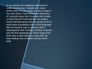
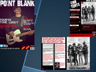
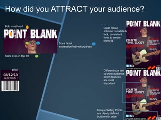
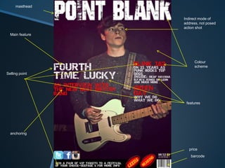
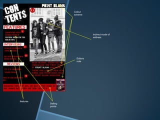
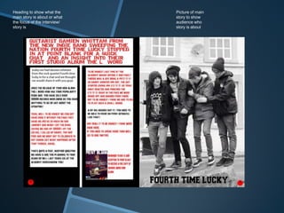
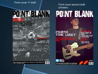
Ronan Beirne
AQ132395
33435
AS Media Studies
OCR G321: Foundation Portfolio
QUESTION 1. Who would be the
audience for your media product?
My magazine is
aimed at
Music taste
b.m.t.h, aski
ng
Alexandria, f
all out boy,
Rhcp.
Influenced by
Twitter,
Facebook,
Instagram,
Kerrang.
Age range
Teens/ young adults,
Rock music
lovers/enthusiasts
Who spend money on/
shop at
Cd’s, magazines, tech, music
al instruments.
H&m, pulp, apple store, black
sheep store.
I feel that my magazine is/ would be
similar to kerrang magazine and share a
similar audience, however my magazine
wouldn’t be as mainstream and share a
closer audience group I also think that
there are not enough rock magazines
out there and mine would be a different
approach aimed at teens, this would be
my selling point
My main audience is the teen demographic
And young adults interested in my sub genre
of rock (punk/heavy rock in particular).this
will be combined with gig reviews and
fashion (drop dead clothing (ETC)..).the
features and stories etc. will all be pioneered
towards my chosen demographic, the reason
I have picked this demographic is because
they are the most likely audience that my
magazine would attract.
In my opinion my magazine represents a
niche social group – people who enjoy
and/or listen to rock music or heavy metal in
my main piece I have shown the behaviour
of a typical cocky rock musician who is also
a close friend of mine damian we made a
mock interview about how he would act if his
band were successful some of the language
that he chose to use is coherent with a
stereotypical rock musician another musician
who fits this stereotype is Oliver Sykes from
bmth who is also seem as cocky with his
band selling over a million records world
wide
Q2. How does your star represent
particular social groups?
Oli Sykes mainstream representation
Direct Eye contact
Positive facial
expression
Looks calm-more
appealing to audience/
looks normal
Trying to appear as a role
model
Tattoo's show a
reverse side of
his personality
Clothing makes him look
youthful
Oli Sykes niche representation
Eye contact with
audience
Not smiling- less
welcoming
Tattoos showing show his
alternative side
Less clothing
Looks more suitable to his
audience
I would sell my publication as a sister
publication to either kerrang magazine, my
magazine will be published weekly along
with kerrang and will show the up and
coming bands that kerrang doesn’t cover.
This will effect the price as an issue of
kerrang costs £2.70 so as it is a subsidiary
the price of kerrang would increase to
£4.00 (a £1.30 increase).
Web page
Create another outlet for fans and readers to interact with the
magazine using convergence and synergy (eg) adding sponsor
logo to website and host sponsored competitions, giveaways
etc… have links to subscription site and have an e-reader so
readers can read online through a subsidised subscription fee so
the hard copy of the magazine would cost £2.50 and the e-copy
would be £1.50 so a £1 deduction,
Also have a link to a merchandise store so people interested in
the magazine can get exclusive clothing
merchandise
Merchandising will give the
readers another way to show that
they enjoy the magazine and also
all revenues and profit made will
be pumped back into the magazine
and also help increase the
competition prizes
The editors will also be given/ sold
tshirts so they can promote the
magazine while they are outy and
about
Mobile
app
Another way for people to
interact with the station
would be through the use of
an application, the app
would be another way for
the reader to read the
magazine online at the
subsidized £1.50 rate and it
would also be a way for the
readers to interact with
each other and discuss
Ideas that may improve the
magazine it would be
available on these
platforms
-iTunes store
-Google play store
-windows phone store
My magazine front cover conveys some of the techniques and
conventions used in published magazines as seen below, I have also
picked out some of the covers that have similar styles/ colour schemes to
my own. (Nme,Kerrang,Q).the reason I picked these magazines is mainly
because they follow the same sub-genre as me and have a contrast of
material . This issue of kerrang was a good choice to use as the layout is
similar to my own, the masthead at the top spreads across the whole
page like my own , also it has a banner spanning the bottom of the page
with a competition. Nme-magazine is the closest design to my own as
they are both in the genre of music and the sub-genre of indie rock, also
this cover follows the same colour scheme and layout as my own. The Q
magazine front cover relates to my own cover as both are music
magazines, in the sub-genre of rock and both star a musician (e.g.) (Dave
Grohl) .
The colour scheme of Q magazine is similar to my own-
(red, black, white).all of these magazines also use techniques to draw the
reader in such as (“revealed!, the secrets behind 2013’s most wanted
album”) (kerrang).
205wds.
My contents page also uses some of the
conventions found in a music magazine
front cover, my contents are listed down the
left hand side the same as Nme & Q
magazine with the magazine name and
contents written in bold to tell the reader
that they are on the right page and also for
ease of access, (Q magazine and kerrang
both use this whereas Nme uses the title
(BAND INDEX).my contents page has a
picture in the right hand side top corner of
the page of the main story to highlight the
sort of (importance of the story)Q magazine
also does this.
My contents page follows the colour
scheme of my front cover
(black, red, white)with the headings for
each section clearly shown in white
banners over the black background with
red writing to stand out kerrang uses the
same kind of method, using their house
style to make the titles stand out.
My dps is unfinished but when finished it will have two columns similar to
Q magazine and have quotes pulled out to make the reader feel intrigued
and want to read on it will also stick to my colour scheme it will include
pictures like the magazines below and will also have a picture of the band
that my interview is based around it will have the page numbers clearly
shown at the bottom of the page while sticking to my set colour scheme I
will also include a snippet about the subscription services that are
available and will advertise the bands album as free with the magazine
subscription
Question 5
How did you attract/address your
audience?
How did you ATTRACT your audience?
Bold masthead
Stars eyes in top 1/3
Stars facial
expression/indirect address
price Different size text
to show audience
which features
are most
important
Unique Selling Points
are clearly defined
button with prize
Clear colour
scheme:red,white,b
lack, consistent
fonts to create
brand id
How did you ADDRESS your audience?
I chose to address the rock audience, using bands that are familiar and characterised
by that style such as Green Day and blink 182’ I used pull quotes and special
features to draw the reader in.
This is also show in the way I have structured the magazine as the fonts I have used
red,black,white show a dark magazine – rock, my pictures also support this, my
main cover photo is of a 16 year old male rock musician.
I have also added pictures of social networks that would perhaps be accessed by my
particular audience such as: twitter, Facebook, instagram.
My magazine is either similar to kerrang or nme due to the music style, genre, the
bands used and the way the cover stars dress/ pose.
masthead
Selling point
Indirect mode of
address, not posed
action shot
Colour
scheme
price
barcode
anchoring
features
Main feature
Colour
scheme
Indirect mode of
address
features
Selling
points
Editors
note
Picture of main
story to show
audience who
story is about
Heading to show what the
main story is about or what
the focus of the interview/
story is
In this assignment I have realised the
effects that certain technologies can
have with your work such as the front
cover of my magazine, it took
thorough amounts of photo shop to
get the desired effect. It also helped
with all of the photos that I have used
as I have used filters to emphasise
the main story and my stars.
In addition to this I have used more
simple technologies such as microsoft
publisher to create mky contents
page as I saw it as an easier option to
create my desired effect
I feel that my photo
shop skills have
progressed throughout
the unit as I have learnt
how to use grey scales
and filtering to achieve a
specific photo image
quality
My first dps design
was completely
flawed the pictures
were placed in wrong
positions and just
looked rather messy
it was missing a clear
introduction, columns
and the colour
scheme was terrible
The colour scheme of a magazine is important as it can help to give the magazine a
individual and unique style, it also helps to reveal what sub genre the style is heading
towards as it is clear to see by my magazine that the style im going for is a rock/indie
kind of style fourth time lucky are a rock band so this colour scheme and layout
relates to their style.
I think that
this dps is
a great
improvem
ent to my
previous
one as it
relates
more to
my
consumer
and my
target
audience
Front cover 1st draft
Front cover second draft
(chosen)
I have used several layers of
Photoshop effect to create a good
light and a kind of aura around my
main cover star the original picture
looked bland so I messed about a bit
to get the desired effect
The indirect address gives
the star a cocky quality
which may be seen as
courageous to the reader

Ronan beirne mock exam question

  • 1.
    Ronan Beirne AQ132395 33435 AS MediaStudies OCR G321: Foundation Portfolio
  • 2.
    QUESTION 1. Whowould be the audience for your media product? My magazine is aimed at Music taste b.m.t.h, aski ng Alexandria, f all out boy, Rhcp. Influenced by Twitter, Facebook, Instagram, Kerrang. Age range Teens/ young adults, Rock music lovers/enthusiasts Who spend money on/ shop at Cd’s, magazines, tech, music al instruments. H&m, pulp, apple store, black sheep store.
  • 3.
    I feel thatmy magazine is/ would be similar to kerrang magazine and share a similar audience, however my magazine wouldn’t be as mainstream and share a closer audience group I also think that there are not enough rock magazines out there and mine would be a different approach aimed at teens, this would be my selling point
  • 4.
    My main audienceis the teen demographic And young adults interested in my sub genre of rock (punk/heavy rock in particular).this will be combined with gig reviews and fashion (drop dead clothing (ETC)..).the features and stories etc. will all be pioneered towards my chosen demographic, the reason I have picked this demographic is because they are the most likely audience that my magazine would attract.
  • 7.
    In my opinionmy magazine represents a niche social group – people who enjoy and/or listen to rock music or heavy metal in my main piece I have shown the behaviour of a typical cocky rock musician who is also a close friend of mine damian we made a mock interview about how he would act if his band were successful some of the language that he chose to use is coherent with a stereotypical rock musician another musician who fits this stereotype is Oliver Sykes from bmth who is also seem as cocky with his band selling over a million records world wide
  • 9.
    Q2. How doesyour star represent particular social groups?
  • 10.
    Oli Sykes mainstreamrepresentation Direct Eye contact Positive facial expression Looks calm-more appealing to audience/ looks normal Trying to appear as a role model Tattoo's show a reverse side of his personality Clothing makes him look youthful
  • 11.
    Oli Sykes nicherepresentation Eye contact with audience Not smiling- less welcoming Tattoos showing show his alternative side Less clothing Looks more suitable to his audience
  • 13.
    I would sellmy publication as a sister publication to either kerrang magazine, my magazine will be published weekly along with kerrang and will show the up and coming bands that kerrang doesn’t cover. This will effect the price as an issue of kerrang costs £2.70 so as it is a subsidiary the price of kerrang would increase to £4.00 (a £1.30 increase).
  • 15.
    Web page Create anotheroutlet for fans and readers to interact with the magazine using convergence and synergy (eg) adding sponsor logo to website and host sponsored competitions, giveaways etc… have links to subscription site and have an e-reader so readers can read online through a subsidised subscription fee so the hard copy of the magazine would cost £2.50 and the e-copy would be £1.50 so a £1 deduction, Also have a link to a merchandise store so people interested in the magazine can get exclusive clothing
  • 16.
    merchandise Merchandising will givethe readers another way to show that they enjoy the magazine and also all revenues and profit made will be pumped back into the magazine and also help increase the competition prizes The editors will also be given/ sold tshirts so they can promote the magazine while they are outy and about
  • 17.
    Mobile app Another way forpeople to interact with the station would be through the use of an application, the app would be another way for the reader to read the magazine online at the subsidized £1.50 rate and it would also be a way for the readers to interact with each other and discuss Ideas that may improve the magazine it would be available on these platforms -iTunes store -Google play store -windows phone store
  • 19.
    My magazine frontcover conveys some of the techniques and conventions used in published magazines as seen below, I have also picked out some of the covers that have similar styles/ colour schemes to my own. (Nme,Kerrang,Q).the reason I picked these magazines is mainly because they follow the same sub-genre as me and have a contrast of material . This issue of kerrang was a good choice to use as the layout is similar to my own, the masthead at the top spreads across the whole page like my own , also it has a banner spanning the bottom of the page with a competition. Nme-magazine is the closest design to my own as they are both in the genre of music and the sub-genre of indie rock, also this cover follows the same colour scheme and layout as my own. The Q magazine front cover relates to my own cover as both are music magazines, in the sub-genre of rock and both star a musician (e.g.) (Dave Grohl) . The colour scheme of Q magazine is similar to my own- (red, black, white).all of these magazines also use techniques to draw the reader in such as (“revealed!, the secrets behind 2013’s most wanted album”) (kerrang). 205wds.
  • 20.
    My contents pagealso uses some of the conventions found in a music magazine front cover, my contents are listed down the left hand side the same as Nme & Q magazine with the magazine name and contents written in bold to tell the reader that they are on the right page and also for ease of access, (Q magazine and kerrang both use this whereas Nme uses the title (BAND INDEX).my contents page has a picture in the right hand side top corner of the page of the main story to highlight the sort of (importance of the story)Q magazine also does this. My contents page follows the colour scheme of my front cover (black, red, white)with the headings for each section clearly shown in white banners over the black background with red writing to stand out kerrang uses the same kind of method, using their house style to make the titles stand out.
  • 21.
    My dps isunfinished but when finished it will have two columns similar to Q magazine and have quotes pulled out to make the reader feel intrigued and want to read on it will also stick to my colour scheme it will include pictures like the magazines below and will also have a picture of the band that my interview is based around it will have the page numbers clearly shown at the bottom of the page while sticking to my set colour scheme I will also include a snippet about the subscription services that are available and will advertise the bands album as free with the magazine subscription
  • 22.
    Question 5 How didyou attract/address your audience?
  • 23.
    How did youATTRACT your audience? Bold masthead Stars eyes in top 1/3 Stars facial expression/indirect address price Different size text to show audience which features are most important Unique Selling Points are clearly defined button with prize Clear colour scheme:red,white,b lack, consistent fonts to create brand id
  • 24.
    How did youADDRESS your audience?
  • 27.
    I chose toaddress the rock audience, using bands that are familiar and characterised by that style such as Green Day and blink 182’ I used pull quotes and special features to draw the reader in. This is also show in the way I have structured the magazine as the fonts I have used red,black,white show a dark magazine – rock, my pictures also support this, my main cover photo is of a 16 year old male rock musician. I have also added pictures of social networks that would perhaps be accessed by my particular audience such as: twitter, Facebook, instagram. My magazine is either similar to kerrang or nme due to the music style, genre, the bands used and the way the cover stars dress/ pose.
  • 28.
    masthead Selling point Indirect modeof address, not posed action shot Colour scheme price barcode anchoring features Main feature
  • 29.
  • 30.
    Picture of main storyto show audience who story is about Heading to show what the main story is about or what the focus of the interview/ story is
  • 32.
    In this assignmentI have realised the effects that certain technologies can have with your work such as the front cover of my magazine, it took thorough amounts of photo shop to get the desired effect. It also helped with all of the photos that I have used as I have used filters to emphasise the main story and my stars. In addition to this I have used more simple technologies such as microsoft publisher to create mky contents page as I saw it as an easier option to create my desired effect
  • 34.
    I feel thatmy photo shop skills have progressed throughout the unit as I have learnt how to use grey scales and filtering to achieve a specific photo image quality
  • 35.
    My first dpsdesign was completely flawed the pictures were placed in wrong positions and just looked rather messy it was missing a clear introduction, columns and the colour scheme was terrible
  • 36.
    The colour schemeof a magazine is important as it can help to give the magazine a individual and unique style, it also helps to reveal what sub genre the style is heading towards as it is clear to see by my magazine that the style im going for is a rock/indie kind of style fourth time lucky are a rock band so this colour scheme and layout relates to their style. I think that this dps is a great improvem ent to my previous one as it relates more to my consumer and my target audience
  • 37.
    Front cover 1stdraft Front cover second draft (chosen)
  • 38.
    I have usedseveral layers of Photoshop effect to create a good light and a kind of aura around my main cover star the original picture looked bland so I messed about a bit to get the desired effect The indirect address gives the star a cocky quality which may be seen as courageous to the reader