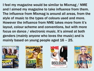
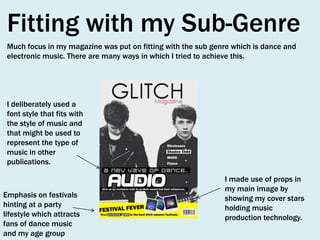
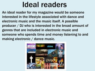
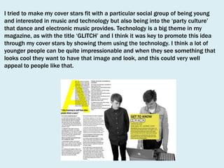
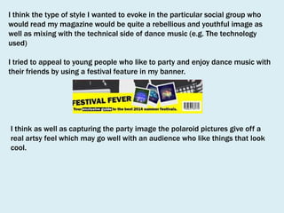
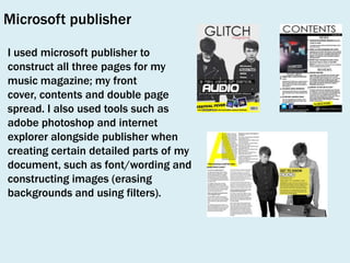
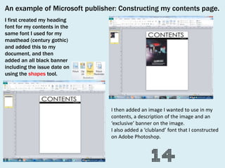
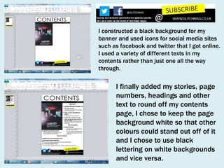
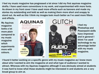
Name: Mathew Petit
Candidate number: 2805
Centre: 33435 Aquinas College
AS MEDIA STUDIES
OCR G321: Foundation Portfolio
Brief from ocr syllabus
QUESTION 1

Who would be the audience
for your media product?
Know what
music they like

Live in city /
suburbs

16 / 25 year
olds

I aimed my
magazine at..

Like to party

Go to festivals
Spend money
on..
I feel my magazine would be similar to Mixmag / NME
and I aimed my magazine to take influence from them.
The influence from Mixmag is around all areas, from the
style of music to the types of colours used and more.
However the influence from NME takes more from it’s
layout, colour scheme and conventions, but with more
focus on dance / electronic music. It’s aimed at both
genders (mainly anyone who loves the music) and is
mainly based on young people aged 16 – 25.
Fitting with my Sub-Genre
Much focus in my magazine was put on fitting with the sub genre which is dance and
electronic music. There are many ways in which I tried to achieve this.

I deliberately used a
font style that fits with
the style of music and
that might be used to
represent the type of
music in other
publications.

Emphasis on festivals
hinting at a party
lifestyle which attracts
fans of dance music
and my age group

I made use of props in
my main image by
showing my cover stars
holding music
production technology.
Primary audience
The primary audience of my magazine relates to those
who it’s targeted at. The age group is based at young
people (16-25) who are interested in dance and
electronic music. My magazine is aimed at both genres
and may attract people who are interested in technology.
I focused on trying to determine the character of my
audience, for example they may spend money on records,
going out to clubs / parties and clothes and they might
watch TV related to the culture of dance music.
The secondary audience for my magazine represents other
groups of people who might be interested in the
magazine.
One example could be parents / family of the young
people who initially may buy the magazine, to see the type
of things that they have been reading about and listening
to.
As dance and electronic music has such a wide spectrum
and relates to people not just in todays generation but
from other decades such as the 70’s/80’s/90’s and
therefore older people may want to buy the magazine
because they also like the music.
As well as this, the magazine may reach out to people in
the business such as club owners. Those kind of people
will be looking for opportunities to advertise their business
or to get artists and fans of the artists interested in them.
Demographic
The demographic for my magazine is basically be those
who are interested in club / party lifestyle. It would point
out new club nights / festivals and where’s the best to
go. It would also be aimed at people interested in dance
music. for example how it’s made and the evolvement of
electronic music. This may aim the magazine at
producers / DJ’s as it would feature equipment that they
would be interested in and what’s the best to use.
Audience idols
There are many different audience idols available on
offer for my magazine. I mainly looked at big DJ’s /
producers that people look to as big at the minute and
have been big in evolving dance music. I took focus from
producers such as Daft Punk, Justice, Benny Benassi,
Calvin Harris and producers big for evolving certain
genres of dance music such as Chic and Nile Rodgers
work on disco or Kraftwerk’s use of synthesizers and
electronics in the 1970’s. I would not feature artists that
don’t fit with my sub genre, such as other genres such as
Jazz or Rock. There would however be pop music in my
magazine as I think so much of what is popular music
today is electronic / dance music and the style is very
popular.
Ideal readers
An ideal reader for my magazine would be someone
interested in the lifestyle associated with dance and
electronic music and the music itself. A possible
producer / DJ who is interested in the broad amount of
genres that are included in electronic music and
someone who spends time and money listening to and
making electronic / dance music.
How does your media
product represent
particular social groups?
For my music magazine it was important to make
my cover stars appeal to my target audience, this
meant relating to features of an ‘ideal reader’ who
would be interested in the music and the lifestyle
surrounding the music. I tried to make my images
look appealing through colours
used, props, expressions, clothing and more.

The following slides should show how my chosen
cover stars fitted my target audience and
particular social groups that would enjoy my
magazine.
White background relates to the ‘purity’ and
‘innocence’ of youth / young people.

Black / leather
is suited to
alternative
culture.
‘Clubland’
font
represents
the style of
music and the
clubbing
lifestyle.
Festival promotion suits party / clubbing
culture suited to my social group.

Dark colours connote
the mystery behind
the music, trying to
invite people to look
into the meanings of
the music.
The use of musical
technology attracts
those readers who
are interested in
making music. Those
interested in the art
/ technology behind
the music and that
particular social
group.
I tried to make my cover stars fit with a particular social group of being young
and interested in music and technology but also being into the ‘party culture’
that dance and electronic music provides. Technology is a big theme in my
magazine, as with the title ‘GLITCH’ and I think it was key to promote this idea
through my cover stars by showing them using the technology. I think a lot of
younger people can be quite impressionable and when they see something that
looks cool they want to have that image and look, and this could very well
appeal to people like that.
I think the type of style I wanted to evoke in the particular social group who
would read my magazine would be quite a rebellious and youthful image as
well as mixing with the technical side of dance music (e.g. The technology
used)
I tried to appeal to young people who like to party and enjoy dance music with
their friends by using a festival feature in my banner.

I think as well as capturing the party image the polaroid pictures give off a
real artsy feel which may go well with an audience who like things that look
cool.
What kind of media
institution may
distribute your product
and why?
To distribute my magazine I would
choose development hell Ltd. Who
also publish Mixmag who I took
much of my influence from. I feel
that they would have experience
promoting my sub genre.
- I feel my magazine could work well alongside Mixmag
as they compliment each other through the style of the
magazine.
- I would try to challenge the conventions of Mixmag as
my magazine would try to cover much of the history of
dance music rather than contemporary electronic music.
And also heavily feature festivals as well as club nights.
Glitch magazine would be a monthly magazine. Issue
price would be around £2.99 each issue. My magazine
would feature advertisements and also feature
technology and musical instruments that would be
available to buy. I would try to advertise the brand
through the internet as well as publication. There would
be a glitch website, twitter and facebook feed where
people can get in contact and give their views.
As well as publishing my magazine through
print I would be interested in having a
website for my magazine similar to the
Development Hell Ltd. website for Mixmag.
The website would include news, reviews and
images to relate to these features. There
would be links to social networking sites
such as Twitter, Facebook, Tumblr and more.
As music is so easy to promote online today
it would be much more accessible for people
to find the music that they like through the
website. As well as the conventions from the
magazine being included on the website,
there would be much more media included.
Such as videos where people can watch
interviews / live shows without just having to
read about them.
In what way does your
media product use,
develop or challenge
forms and conventions
of real media products?
Front cover
My magazines sub genre is based on Dance and Electronic
music of all types, and in fitting my magazines style with
the style of real media products that also conform to this
sub genre it was important for me to use similar
conventions, colour schemes and features in my front cover
in order to make it look real and believable. Two magazines
in particular that I took influence from were Mixmag and
NME. Mixmag is more fitting to my sub genre and it gives
off good ideas as to the type of things that fans of
electronic music are attracted to.
On the other hand NME had a more broad
spectrum of music included but in terms
of front covers I think NME always makes
them bold, stand out and adds detail and
conventions where they’re needed. Both
of these magazines also had similar
conventions that I wanted to include in
my front cover.
Conventions
The main image of my
magazine features a
musical duo with some of
the technology used to
make their music. This is
similar to what you might
see in Mixmag or NME as
bands often use musical
instruments as props in
main images for
magazines.
I used bold fonts that stand out for my
header and sub headings and in
particular for my strapline the font
‘clubland’ is used to suit the sub genre.

The cover star in my magazine
has a gaze to show that he is
addressing the audience and it
hints that he is the frontman.

The masthead for my
magazine takes influence
from both Mixmag and NME in
that while being bold in colour
and font, it also relates to the
sub genre in which the
magazine is based on –
‘GLITCH’ being based on both
technology and the musical
genre.
The house style and colour scheme of
my magazines front cover mainly has
colours such as black and white
along with colours such as yellow and
red that add slight dashes of colour.
This spans more from NME and the
colours that magazine uses, but in
challenging this further I could have
included more bright colours to
contrast with dark and pale colours.

The banner of my magazine works similar in the way that a pug would as it has an
offer added onto it which is a guide of electronic music festivals. Highlighted in
yellow the banner takes influence from colours that you may find in mixmag, and
Polaroids are used to make the festival photos look appealing and more real as
they almost look like photos you may see on websites such as instagram.

The barcode, issue price and
date is there to present the
product as a real magazine
and make it look purchasable
on a stand such as NME and
Mixmag would be.
Contents page
My contents page sticks with the same principles as the
two magazines that I was influenced by do. I was
interested in how mixmag in particular shows images of
live events, shows and parties to fit with the lifestyle
associated with the sub genre.
Both of the magazines I took influence from use bold
colours such as black, white and yellow behind brightly
coloured images which is something I took influence
from in my contents page. Conventions such as features
and bold page numbers next to pictures are used in the
magazines I was influenced by.
Conventions
I took influence
from mixmag in
using a brightly
coloured image
from a live show
in a club that is
suited to the sub
genre in which the
magazine
revolves around.

My contents page uses bold colours such as
black, white and yellow which stand out and
are similar to what mixmag and NME may
both use in their contents pages.

The stories featured in my
contents page are laid out
according to News, reviews
and features in chronological
order, which is typical of
many music magazines.

The reviews section is critical
of the sub genre in which the
magazine is based on.

I included a free promotional mix
from a current producer similar to
what mixmag does.
I used advertisements which is
useful for many magazines to
boost their reputation through
media.

I used a subscription section at the
bottom where fans of the magazine can
buy it for an annual period.
Double page spread
My magazines double page spread is a typical interview layout, which is something
heavily featured in many music magazines. Similar to the contents and front cover of
my magazine the house style is bold and doesn’t add too much detail that is
distracting from the main purpose of the article. The pull quote and strapline is
situated in the middle to draw attention to the reader and it promotes being ‘weird’
which is free of discrimination.
How did you
attract/address your
audience?
To attract an audience who are interested in dance music I used features
that fans of electronic music would be interested in. Examples being
upcoming producers and DJ’s, festivals and club imagery, upcoming
events, technology and more. My cover stars are an electronic duo who
are promoting the magazine by making the audience interested in them.
The idea is for the audience to be intrigued by the look of the band, the
technology they’re using, the things that they say (such as the music
they’re interested in) and other things. My cover stars are a similar age to
the audience that I am trying to attract and I think this helps when
making an audience connect with them.
I also tried to address my audience through the font used in my
magazine, for example I used a ‘clubland’ font which is relevant in terms
of the type of music and aims to create a visual attraction on the front
cover.
Due to the fact my magazine is similar to both Mixmag and NME due to
the style of music and layout I can gain an idea of what I need to do to
improve my work.
Masthead

Colour scheme
Eye contact

Features

Selling point

Barcode

Banner
Cover stars

Gender: My magazine is aimed at both
genres, although my cover stars are just male. This
issue can be aimed at both boys and girls through the
bands and artists featured, the colours, images and
festival features. Although the use of technology and
the music interest trying to be provoked could just be
aimed at general music lovers.
Age: The age of my cover stars are similar to the age of
my target audience. They are young, interested in
music, partying, style and more.
Genre: My cover stars represent my genre as they are
the type of band to be featured in my magazine, and
they also use the technology related to dance music.
The ‘clubland’ font attracts readers
as it’s suited to the style of
music, and it also claims that the
cover stars have made a ‘new
wave’ which would attract readers
as they would potentially get to
listen to something new.
The features used are suited to dance and electronic music, and
are all new/upcoming artists that provide interest for readers.
What have you learnt
about technologies
from the process of
constructing this
product?
Some of the technologies I used in my
music magazine include:
-

Adobe photoshop
Microsoft publisher
Windows photo viewer / photo gallery
Internet explorer (i.e. blogger)
Digital SLR camera
Paint (for my masthead design)
Green screens / white backdrop
Key lights
Tripod
For the main image on my front cover I combined
two images together to create the overall image
using photoshop.
I first selected the area I
wanted to delete using the
Rectangular marquee tool (M)

I could then delete the part of the
image I didn’t want to use

I could then add another image into the area that
the original was deleted from to make a full
image that could be used on my front cover
Photoshop

For the main image on my double page
spread I firstly took a photo in front of a
green screen with my cover stars using a
digital SLR camera. I then edited the
photo in photoshop by using the magic

eraser tool to erase the background. I
then used the posterize tool and the
black and white tool to edit to colour
and saturation of the image.
Finished edited image
I used the site http://www.polaroin.com/ when
creating polaroid images for my festival feature
section on my front cover.

I chose the file I wanted to upload from my disk.
I then cropped the image, chose a filter/editing
feature and then clicked the ‘Polaroize it!’ icon.
Before I knew it I had polaroid images I could use
for my festival feature section in my banner.
Microsoft publisher
I used microsoft publisher to
construct all three pages for my
music magazine; my front
cover, contents and double page
spread. I also used tools such as
adobe photoshop and internet
explorer alongside publisher when
creating certain detailed parts of my
document, such as font/wording and
constructing images (erasing
backgrounds and using filters).
An example of Microsoft publisher: Constructing my contents page.
I first created my heading
font for my contents in the
same font I used for my
masthead (century gothic)
and added this to my
document, and then
added an all black banner
including the issue date on
using the shapes tool.

I then added an image I wanted to use in my
contents, a description of the image and an
‘exclusive’ banner on the image.
I also added a ‘clubland’ font that I constructed
on Adobe Photoshop.
I constructed a black background for my
banner and used icons for social media sites
such as facebook and twitter that I got online.
I used a variety of different texts in my
contents rather than just one all the way
through.

I finally added my stories, page
numbers, headings and other
text to round off my contents
page, I chose to keep the page
background white so that other
colours could stand out off of it
and I chose to use black
lettering on white backgrounds
and vice versa.
Looking back at your
preliminary task
what do you feel you have

(Aquinas college magazine)

learnt in progression
to the full product?
I feel my music magazine has progressed a lot since I did my first aquinas magazine
drafts. I have used more conventions in my work, and experimented with more fonts.
As shown in my front cover I have used more effects such as banners and made my
stories my outstanding and bold as well as making them more short and snappy to
stand out. As well as this I think my images look much better as I’ve used more filters
and effects.
My Aquinas
magazine
looks a lot
more plain
compared to
my music
magazine
which
experiments
more with
colours.

I feel my
Photoshop and
Powerpoint skills
have improved
and in general I
think I’ve used
technology to my
advantage better
with my music
magazine.

I found it better working on a specific genre with my music magazine as I knew more
about who I wanted to aim the magazine at and what type of audience I wanted to
attract. Whereas with my Aquinas magazine although it was obviously aimed at students
it was hard to know what those students might be interested in and students are a very
broad group to aim at.
Similar to my front covers I think my contents page construction has improved in terms of
using fonts and colours to my advantage to make my magazine look more interesting. My
Aquinas contents page looks quite plain in contrast to my music magazine contents page which
I think looks more informal and is suited more with it’s genre. I also think my music magazine
looks more like something you would actually pick up in a shop whereas I think my Aquinas
magazine looks a bit less professional and more amateur and needs more work put into it.

One thing I’ve learned through the construction of both
of my magazine contents pages is to put less
information and more stories. My Aquinas contents
page in particular seems to have a lot more
information put into it and rambles on a bit whereas
shorter points and more stories will make readers want

I think my music magazine contents
takes better consideration of social
media using facebook and twitter
icons to promote the magazine’s
online presence.

Media evaluation new

  • 1.
    Name: Mathew Petit Candidatenumber: 2805 Centre: 33435 Aquinas College AS MEDIA STUDIES OCR G321: Foundation Portfolio Brief from ocr syllabus
  • 2.
    QUESTION 1 Who wouldbe the audience for your media product?
  • 3.
    Know what music theylike Live in city / suburbs 16 / 25 year olds I aimed my magazine at.. Like to party Go to festivals Spend money on..
  • 4.
    I feel mymagazine would be similar to Mixmag / NME and I aimed my magazine to take influence from them. The influence from Mixmag is around all areas, from the style of music to the types of colours used and more. However the influence from NME takes more from it’s layout, colour scheme and conventions, but with more focus on dance / electronic music. It’s aimed at both genders (mainly anyone who loves the music) and is mainly based on young people aged 16 – 25.
  • 5.
    Fitting with mySub-Genre Much focus in my magazine was put on fitting with the sub genre which is dance and electronic music. There are many ways in which I tried to achieve this. I deliberately used a font style that fits with the style of music and that might be used to represent the type of music in other publications. Emphasis on festivals hinting at a party lifestyle which attracts fans of dance music and my age group I made use of props in my main image by showing my cover stars holding music production technology.
  • 6.
    Primary audience The primaryaudience of my magazine relates to those who it’s targeted at. The age group is based at young people (16-25) who are interested in dance and electronic music. My magazine is aimed at both genres and may attract people who are interested in technology. I focused on trying to determine the character of my audience, for example they may spend money on records, going out to clubs / parties and clothes and they might watch TV related to the culture of dance music.
  • 7.
    The secondary audiencefor my magazine represents other groups of people who might be interested in the magazine. One example could be parents / family of the young people who initially may buy the magazine, to see the type of things that they have been reading about and listening to. As dance and electronic music has such a wide spectrum and relates to people not just in todays generation but from other decades such as the 70’s/80’s/90’s and therefore older people may want to buy the magazine because they also like the music. As well as this, the magazine may reach out to people in the business such as club owners. Those kind of people will be looking for opportunities to advertise their business or to get artists and fans of the artists interested in them.
  • 8.
    Demographic The demographic formy magazine is basically be those who are interested in club / party lifestyle. It would point out new club nights / festivals and where’s the best to go. It would also be aimed at people interested in dance music. for example how it’s made and the evolvement of electronic music. This may aim the magazine at producers / DJ’s as it would feature equipment that they would be interested in and what’s the best to use.
  • 9.
    Audience idols There aremany different audience idols available on offer for my magazine. I mainly looked at big DJ’s / producers that people look to as big at the minute and have been big in evolving dance music. I took focus from producers such as Daft Punk, Justice, Benny Benassi, Calvin Harris and producers big for evolving certain genres of dance music such as Chic and Nile Rodgers work on disco or Kraftwerk’s use of synthesizers and electronics in the 1970’s. I would not feature artists that don’t fit with my sub genre, such as other genres such as Jazz or Rock. There would however be pop music in my magazine as I think so much of what is popular music today is electronic / dance music and the style is very popular.
  • 10.
    Ideal readers An idealreader for my magazine would be someone interested in the lifestyle associated with dance and electronic music and the music itself. A possible producer / DJ who is interested in the broad amount of genres that are included in electronic music and someone who spends time and money listening to and making electronic / dance music.
  • 11.
    How does yourmedia product represent particular social groups?
  • 12.
    For my musicmagazine it was important to make my cover stars appeal to my target audience, this meant relating to features of an ‘ideal reader’ who would be interested in the music and the lifestyle surrounding the music. I tried to make my images look appealing through colours used, props, expressions, clothing and more. The following slides should show how my chosen cover stars fitted my target audience and particular social groups that would enjoy my magazine.
  • 13.
    White background relatesto the ‘purity’ and ‘innocence’ of youth / young people. Black / leather is suited to alternative culture. ‘Clubland’ font represents the style of music and the clubbing lifestyle. Festival promotion suits party / clubbing culture suited to my social group. Dark colours connote the mystery behind the music, trying to invite people to look into the meanings of the music. The use of musical technology attracts those readers who are interested in making music. Those interested in the art / technology behind the music and that particular social group.
  • 14.
    I tried tomake my cover stars fit with a particular social group of being young and interested in music and technology but also being into the ‘party culture’ that dance and electronic music provides. Technology is a big theme in my magazine, as with the title ‘GLITCH’ and I think it was key to promote this idea through my cover stars by showing them using the technology. I think a lot of younger people can be quite impressionable and when they see something that looks cool they want to have that image and look, and this could very well appeal to people like that.
  • 15.
    I think thetype of style I wanted to evoke in the particular social group who would read my magazine would be quite a rebellious and youthful image as well as mixing with the technical side of dance music (e.g. The technology used) I tried to appeal to young people who like to party and enjoy dance music with their friends by using a festival feature in my banner. I think as well as capturing the party image the polaroid pictures give off a real artsy feel which may go well with an audience who like things that look cool.
  • 16.
    What kind ofmedia institution may distribute your product and why?
  • 17.
    To distribute mymagazine I would choose development hell Ltd. Who also publish Mixmag who I took much of my influence from. I feel that they would have experience promoting my sub genre. - I feel my magazine could work well alongside Mixmag as they compliment each other through the style of the magazine. - I would try to challenge the conventions of Mixmag as my magazine would try to cover much of the history of dance music rather than contemporary electronic music. And also heavily feature festivals as well as club nights.
  • 18.
    Glitch magazine wouldbe a monthly magazine. Issue price would be around £2.99 each issue. My magazine would feature advertisements and also feature technology and musical instruments that would be available to buy. I would try to advertise the brand through the internet as well as publication. There would be a glitch website, twitter and facebook feed where people can get in contact and give their views.
  • 19.
    As well aspublishing my magazine through print I would be interested in having a website for my magazine similar to the Development Hell Ltd. website for Mixmag. The website would include news, reviews and images to relate to these features. There would be links to social networking sites such as Twitter, Facebook, Tumblr and more. As music is so easy to promote online today it would be much more accessible for people to find the music that they like through the website. As well as the conventions from the magazine being included on the website, there would be much more media included. Such as videos where people can watch interviews / live shows without just having to read about them.
  • 20.
    In what waydoes your media product use, develop or challenge forms and conventions of real media products?
  • 21.
    Front cover My magazinessub genre is based on Dance and Electronic music of all types, and in fitting my magazines style with the style of real media products that also conform to this sub genre it was important for me to use similar conventions, colour schemes and features in my front cover in order to make it look real and believable. Two magazines in particular that I took influence from were Mixmag and NME. Mixmag is more fitting to my sub genre and it gives off good ideas as to the type of things that fans of electronic music are attracted to. On the other hand NME had a more broad spectrum of music included but in terms of front covers I think NME always makes them bold, stand out and adds detail and conventions where they’re needed. Both of these magazines also had similar conventions that I wanted to include in my front cover.
  • 22.
    Conventions The main imageof my magazine features a musical duo with some of the technology used to make their music. This is similar to what you might see in Mixmag or NME as bands often use musical instruments as props in main images for magazines. I used bold fonts that stand out for my header and sub headings and in particular for my strapline the font ‘clubland’ is used to suit the sub genre. The cover star in my magazine has a gaze to show that he is addressing the audience and it hints that he is the frontman. The masthead for my magazine takes influence from both Mixmag and NME in that while being bold in colour and font, it also relates to the sub genre in which the magazine is based on – ‘GLITCH’ being based on both technology and the musical genre. The house style and colour scheme of my magazines front cover mainly has colours such as black and white along with colours such as yellow and red that add slight dashes of colour. This spans more from NME and the colours that magazine uses, but in challenging this further I could have included more bright colours to contrast with dark and pale colours. The banner of my magazine works similar in the way that a pug would as it has an offer added onto it which is a guide of electronic music festivals. Highlighted in yellow the banner takes influence from colours that you may find in mixmag, and Polaroids are used to make the festival photos look appealing and more real as they almost look like photos you may see on websites such as instagram. The barcode, issue price and date is there to present the product as a real magazine and make it look purchasable on a stand such as NME and Mixmag would be.
  • 23.
    Contents page My contentspage sticks with the same principles as the two magazines that I was influenced by do. I was interested in how mixmag in particular shows images of live events, shows and parties to fit with the lifestyle associated with the sub genre. Both of the magazines I took influence from use bold colours such as black, white and yellow behind brightly coloured images which is something I took influence from in my contents page. Conventions such as features and bold page numbers next to pictures are used in the magazines I was influenced by.
  • 24.
    Conventions I took influence frommixmag in using a brightly coloured image from a live show in a club that is suited to the sub genre in which the magazine revolves around. My contents page uses bold colours such as black, white and yellow which stand out and are similar to what mixmag and NME may both use in their contents pages. The stories featured in my contents page are laid out according to News, reviews and features in chronological order, which is typical of many music magazines. The reviews section is critical of the sub genre in which the magazine is based on. I included a free promotional mix from a current producer similar to what mixmag does. I used advertisements which is useful for many magazines to boost their reputation through media. I used a subscription section at the bottom where fans of the magazine can buy it for an annual period.
  • 25.
    Double page spread Mymagazines double page spread is a typical interview layout, which is something heavily featured in many music magazines. Similar to the contents and front cover of my magazine the house style is bold and doesn’t add too much detail that is distracting from the main purpose of the article. The pull quote and strapline is situated in the middle to draw attention to the reader and it promotes being ‘weird’ which is free of discrimination.
  • 26.
  • 27.
    To attract anaudience who are interested in dance music I used features that fans of electronic music would be interested in. Examples being upcoming producers and DJ’s, festivals and club imagery, upcoming events, technology and more. My cover stars are an electronic duo who are promoting the magazine by making the audience interested in them. The idea is for the audience to be intrigued by the look of the band, the technology they’re using, the things that they say (such as the music they’re interested in) and other things. My cover stars are a similar age to the audience that I am trying to attract and I think this helps when making an audience connect with them. I also tried to address my audience through the font used in my magazine, for example I used a ‘clubland’ font which is relevant in terms of the type of music and aims to create a visual attraction on the front cover. Due to the fact my magazine is similar to both Mixmag and NME due to the style of music and layout I can gain an idea of what I need to do to improve my work.
  • 28.
  • 29.
    Cover stars Gender: Mymagazine is aimed at both genres, although my cover stars are just male. This issue can be aimed at both boys and girls through the bands and artists featured, the colours, images and festival features. Although the use of technology and the music interest trying to be provoked could just be aimed at general music lovers. Age: The age of my cover stars are similar to the age of my target audience. They are young, interested in music, partying, style and more. Genre: My cover stars represent my genre as they are the type of band to be featured in my magazine, and they also use the technology related to dance music.
  • 30.
    The ‘clubland’ fontattracts readers as it’s suited to the style of music, and it also claims that the cover stars have made a ‘new wave’ which would attract readers as they would potentially get to listen to something new. The features used are suited to dance and electronic music, and are all new/upcoming artists that provide interest for readers.
  • 31.
    What have youlearnt about technologies from the process of constructing this product?
  • 32.
    Some of thetechnologies I used in my music magazine include: - Adobe photoshop Microsoft publisher Windows photo viewer / photo gallery Internet explorer (i.e. blogger) Digital SLR camera Paint (for my masthead design) Green screens / white backdrop Key lights Tripod
  • 33.
    For the mainimage on my front cover I combined two images together to create the overall image using photoshop.
  • 34.
    I first selectedthe area I wanted to delete using the Rectangular marquee tool (M) I could then delete the part of the image I didn’t want to use I could then add another image into the area that the original was deleted from to make a full image that could be used on my front cover
  • 35.
    Photoshop For the mainimage on my double page spread I firstly took a photo in front of a green screen with my cover stars using a digital SLR camera. I then edited the photo in photoshop by using the magic eraser tool to erase the background. I then used the posterize tool and the black and white tool to edit to colour and saturation of the image.
  • 36.
  • 37.
    I used thesite http://www.polaroin.com/ when creating polaroid images for my festival feature section on my front cover. I chose the file I wanted to upload from my disk. I then cropped the image, chose a filter/editing feature and then clicked the ‘Polaroize it!’ icon. Before I knew it I had polaroid images I could use for my festival feature section in my banner.
  • 38.
    Microsoft publisher I usedmicrosoft publisher to construct all three pages for my music magazine; my front cover, contents and double page spread. I also used tools such as adobe photoshop and internet explorer alongside publisher when creating certain detailed parts of my document, such as font/wording and constructing images (erasing backgrounds and using filters).
  • 39.
    An example ofMicrosoft publisher: Constructing my contents page. I first created my heading font for my contents in the same font I used for my masthead (century gothic) and added this to my document, and then added an all black banner including the issue date on using the shapes tool. I then added an image I wanted to use in my contents, a description of the image and an ‘exclusive’ banner on the image. I also added a ‘clubland’ font that I constructed on Adobe Photoshop.
  • 40.
    I constructed ablack background for my banner and used icons for social media sites such as facebook and twitter that I got online. I used a variety of different texts in my contents rather than just one all the way through. I finally added my stories, page numbers, headings and other text to round off my contents page, I chose to keep the page background white so that other colours could stand out off of it and I chose to use black lettering on white backgrounds and vice versa.
  • 41.
    Looking back atyour preliminary task what do you feel you have (Aquinas college magazine) learnt in progression to the full product?
  • 42.
    I feel mymusic magazine has progressed a lot since I did my first aquinas magazine drafts. I have used more conventions in my work, and experimented with more fonts. As shown in my front cover I have used more effects such as banners and made my stories my outstanding and bold as well as making them more short and snappy to stand out. As well as this I think my images look much better as I’ve used more filters and effects. My Aquinas magazine looks a lot more plain compared to my music magazine which experiments more with colours. I feel my Photoshop and Powerpoint skills have improved and in general I think I’ve used technology to my advantage better with my music magazine. I found it better working on a specific genre with my music magazine as I knew more about who I wanted to aim the magazine at and what type of audience I wanted to attract. Whereas with my Aquinas magazine although it was obviously aimed at students it was hard to know what those students might be interested in and students are a very broad group to aim at.
  • 43.
    Similar to myfront covers I think my contents page construction has improved in terms of using fonts and colours to my advantage to make my magazine look more interesting. My Aquinas contents page looks quite plain in contrast to my music magazine contents page which I think looks more informal and is suited more with it’s genre. I also think my music magazine looks more like something you would actually pick up in a shop whereas I think my Aquinas magazine looks a bit less professional and more amateur and needs more work put into it. One thing I’ve learned through the construction of both of my magazine contents pages is to put less information and more stories. My Aquinas contents page in particular seems to have a lot more information put into it and rambles on a bit whereas shorter points and more stories will make readers want I think my music magazine contents takes better consideration of social media using facebook and twitter icons to promote the magazine’s online presence.