The document is a portfolio submission from a media studies student. It includes research and design work for a new music magazine called BOUNCE.
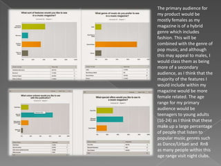
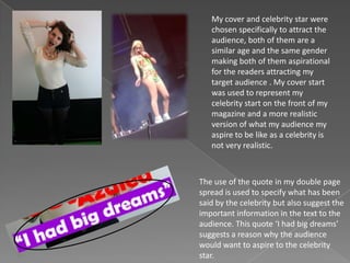
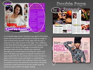
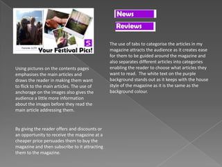
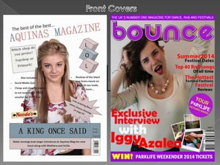
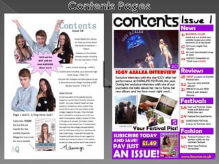
The summary includes researching the target audience which is determined to be mainly females aged 16-24 interested in dance/urban music and fashion. Design elements include a cover featuring singer Iggy Azalea, a contents page with article previews and a subscription option, and a double page article spread layout. Distribution and monetization strategies are also proposed, such as merchandising and using an existing music magazine distributor.
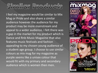
Conventions from similar magazines are employed while also making unique design choices. The portfolio demonstrates understanding of magazine design and targeting an audience.