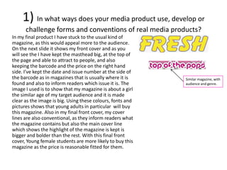
The document describes the progression of a student's media project from preliminary tasks to the final product. It discusses conventions used in magazines and how the student incorporated them. Key points:
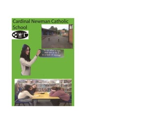
- The preliminary front cover lacked pictures, font styles, and a barcode. The final cover improved on these elements to look more professional.
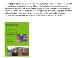
- The preliminary contents page lacked information and was boring. The final version added color, varied fonts, and included a more realistic page range.
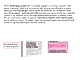
- Conventions like mastheads, cover lines, and double page spreads were researched and incorporated appropriately.
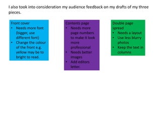
- Feedback helped improve elements like fonts, images, and layouts to better attract the target audience.