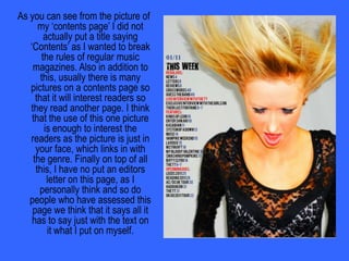
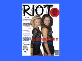
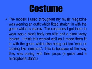
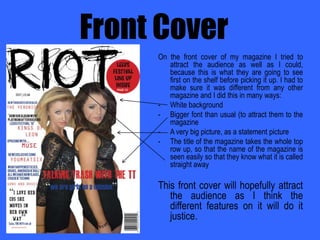
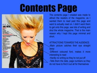
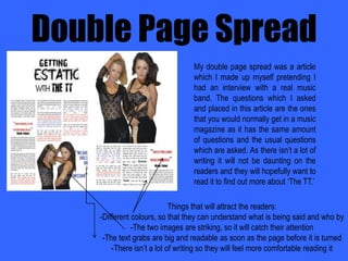
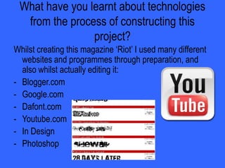
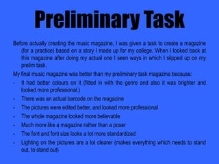
Music Magazine – EvaluationFirst DraftChloe Gregson
IntroductionTASK: I was given a task to create a music magazine using a programme called InDesign.I worked as an individual.
I shot pictures which was placed onto my magazine via a studio, which I took myself.
I edited the pictures using PhotoShop.In what ways does your media product use, develop or challenge forms and conventions of real media projects?The music magazine which I created was based on the genre of rock. This was evident by the colour scheme (ethos style), models and their costumes and text involved in the magazine throughout.It was vital that I used these basic elements of a magazine when I created mine as if these was not involved it would attract the wrong readers or not attract anyone at all. I had to make sure that the magazine fitted in with the magazines which are already on the shelves based on a rock genre.
Did you change anything to make your magazine challenge forms and conventions of real media products?Usually a music magazine’s contents page has many pictures and text boxes telling the reader about what is coming up in the magazine. I decided to break the regular rules of music magazines by only having one main picture on this page and having the writing in one simple block. Also in addition to this, I also did not include the word “contents” on my page as I thought the text said it all itself without the need of a title.
As you can see from the picture of my ‘contents page’ I did not actually put a title saying ‘Contents’ as I wanted to break the rules of regular music magazines. Also in addition to this, usually there is many pictures on a contents page so that it will interest readers so they read another page. I think that the use of this one picture is enough to interest the readers as the picture is just in your face, which links in with the genre. Finally on top of all this, I have no put an editors letter on this page, as I personally think and so do people who have assessed this page we think that it says all it has to say just with the text on it what I put on myself.
Did your choices here work effectively for your audiences?The choices I made whilst creating the magazine worked to my advantage as my audience feedback showed. One of the questions asked them “Does the contents page simply inform clearly or does it also manage to interest you in the rest of the magazine?” and the answers came back telling me that my magazine interested them into reading the rest as answers read:“I want to read on because of the stories being told on the contents page.”AND“This contents page interests me because it is very eye catching and makes me want to read on.”
How does your media product represent particular social groups?This magazine was created for mostly a boy audience as the genre rock is based around them, but because I didn’t want it to come across as a sexist magazine so the front cover would catch the female audience as it has two girls on the front (which hopefully will make them pick up this magazine and read it.)
CostumeThe models I used throughout my music magazine was wearing an outfit which fitted straight in with the genre which is ROCK. The costumes I got them to wear was a black body con skirt and a black lacey leotard.  I think this worked well as it made them fit in with the genre whilst also being not too ‘emo’ or looking like ‘moshers’. This is because of the way they was posing with their props (a guitar and a microphone stand.)
Make-upOn my models Nicole and Sarah Turner (who made up the band for my music magazine ‘The TT’ I used quite simple make-up on them as I thought the props we used on the photo shoot and also the outfit they wore made much more of a statement.I used their natural colour skin for the foundation but then made their eyes a lot darker by using lots of mascara and eyeliner. I also put lipstick on their lips, but only a little bit, so it makes them edgier but not too edgy.
Does your magazine fit in with the dominant mode of the representation of this group?“Is it adhering to stereotypes that we see commonly in the media  or is it offering an alternative or challenging representation?” is a question which I asked people when I showed them my magazine. This was some of their answers:“It is showing us that all rock stars do not have to crash a hotel room to become famous and hardcore.”And also…“It has changed my stereotypes of rockers as they look just like myself, and nothing different so people shouldn’t judge them.”
Who would be the audience for your media project?The audience for my music magazine would be put at the age rang between 12 and 25 year olds.REASONS:More likely to go to festivals
Rock has a younger target audience
Fans of rock are mostly teenagers and a minority of adultsWhy is this a good target audience?Rock has more young viewers/listeners than adultsThey are in the age range within all media elementsThey represent rock wellMost festivals are based around this age groupRock has a large mass audience
Are you likely to have any secondary target audience?For my magazine there might be some extra viewers who like to read a rock based magazine or listen to this sort of music (which is based in this magazine.) this might be for their love of music, or festivals but either way they will enjoy reading this. The reasons for this is that:They will like the music
They might have been brought up around this genre of music
They enjoy festivals such as Leeds and/or ReadingAudience Feedback(PICTURES OF ACTUAL FEEDBACK, EDITED – SAYING WHAT THEY’VE BEEN ASKED AND HOW THEY’VE ANSWERED IT)
How did you attract/address your audience?
Front CoverOn the front cover of my magazine I tried to attract the audience as well as I could, because this is what they are going to see first on the shelf before picking it up. I had to make sure it was different from any other magazine and I did this in many ways:White background
Bigger font than usual (to attract them to the magazine
A very big picture, as a statement picture
The title of the magazine takes the whole top row up, so that the name of the magazine is seen easily so that they know what it is called straight awayThis front cover will hopefully attract the audience as I think the different features on it will do it justice.

Music magazine evaluation

  • 1.
    Music Magazine –EvaluationFirst DraftChloe Gregson
  • 2.
    IntroductionTASK: I wasgiven a task to create a music magazine using a programme called InDesign.I worked as an individual.
  • 3.
    I shot pictureswhich was placed onto my magazine via a studio, which I took myself.
  • 4.
    I edited thepictures using PhotoShop.In what ways does your media product use, develop or challenge forms and conventions of real media projects?The music magazine which I created was based on the genre of rock. This was evident by the colour scheme (ethos style), models and their costumes and text involved in the magazine throughout.It was vital that I used these basic elements of a magazine when I created mine as if these was not involved it would attract the wrong readers or not attract anyone at all. I had to make sure that the magazine fitted in with the magazines which are already on the shelves based on a rock genre.
  • 5.
    Did you changeanything to make your magazine challenge forms and conventions of real media products?Usually a music magazine’s contents page has many pictures and text boxes telling the reader about what is coming up in the magazine. I decided to break the regular rules of music magazines by only having one main picture on this page and having the writing in one simple block. Also in addition to this, I also did not include the word “contents” on my page as I thought the text said it all itself without the need of a title.
  • 6.
    As you cansee from the picture of my ‘contents page’ I did not actually put a title saying ‘Contents’ as I wanted to break the rules of regular music magazines. Also in addition to this, usually there is many pictures on a contents page so that it will interest readers so they read another page. I think that the use of this one picture is enough to interest the readers as the picture is just in your face, which links in with the genre. Finally on top of all this, I have no put an editors letter on this page, as I personally think and so do people who have assessed this page we think that it says all it has to say just with the text on it what I put on myself.
  • 7.
    Did your choiceshere work effectively for your audiences?The choices I made whilst creating the magazine worked to my advantage as my audience feedback showed. One of the questions asked them “Does the contents page simply inform clearly or does it also manage to interest you in the rest of the magazine?” and the answers came back telling me that my magazine interested them into reading the rest as answers read:“I want to read on because of the stories being told on the contents page.”AND“This contents page interests me because it is very eye catching and makes me want to read on.”
  • 8.
    How does yourmedia product represent particular social groups?This magazine was created for mostly a boy audience as the genre rock is based around them, but because I didn’t want it to come across as a sexist magazine so the front cover would catch the female audience as it has two girls on the front (which hopefully will make them pick up this magazine and read it.)
  • 10.
    CostumeThe models Iused throughout my music magazine was wearing an outfit which fitted straight in with the genre which is ROCK. The costumes I got them to wear was a black body con skirt and a black lacey leotard. I think this worked well as it made them fit in with the genre whilst also being not too ‘emo’ or looking like ‘moshers’. This is because of the way they was posing with their props (a guitar and a microphone stand.)
  • 12.
    Make-upOn my modelsNicole and Sarah Turner (who made up the band for my music magazine ‘The TT’ I used quite simple make-up on them as I thought the props we used on the photo shoot and also the outfit they wore made much more of a statement.I used their natural colour skin for the foundation but then made their eyes a lot darker by using lots of mascara and eyeliner. I also put lipstick on their lips, but only a little bit, so it makes them edgier but not too edgy.
  • 13.
    Does your magazinefit in with the dominant mode of the representation of this group?“Is it adhering to stereotypes that we see commonly in the media or is it offering an alternative or challenging representation?” is a question which I asked people when I showed them my magazine. This was some of their answers:“It is showing us that all rock stars do not have to crash a hotel room to become famous and hardcore.”And also…“It has changed my stereotypes of rockers as they look just like myself, and nothing different so people shouldn’t judge them.”
  • 14.
    Who would bethe audience for your media project?The audience for my music magazine would be put at the age rang between 12 and 25 year olds.REASONS:More likely to go to festivals
  • 15.
    Rock has ayounger target audience
  • 16.
    Fans of rockare mostly teenagers and a minority of adultsWhy is this a good target audience?Rock has more young viewers/listeners than adultsThey are in the age range within all media elementsThey represent rock wellMost festivals are based around this age groupRock has a large mass audience
  • 17.
    Are you likelyto have any secondary target audience?For my magazine there might be some extra viewers who like to read a rock based magazine or listen to this sort of music (which is based in this magazine.) this might be for their love of music, or festivals but either way they will enjoy reading this. The reasons for this is that:They will like the music
  • 18.
    They might havebeen brought up around this genre of music
  • 19.
    They enjoy festivalssuch as Leeds and/or ReadingAudience Feedback(PICTURES OF ACTUAL FEEDBACK, EDITED – SAYING WHAT THEY’VE BEEN ASKED AND HOW THEY’VE ANSWERED IT)
  • 20.
    How did youattract/address your audience?
  • 21.
    Front CoverOn thefront cover of my magazine I tried to attract the audience as well as I could, because this is what they are going to see first on the shelf before picking it up. I had to make sure it was different from any other magazine and I did this in many ways:White background
  • 22.
    Bigger font thanusual (to attract them to the magazine
  • 23.
    A very bigpicture, as a statement picture
  • 24.
    The title ofthe magazine takes the whole top row up, so that the name of the magazine is seen easily so that they know what it is called straight awayThis front cover will hopefully attract the audience as I think the different features on it will do it justice.