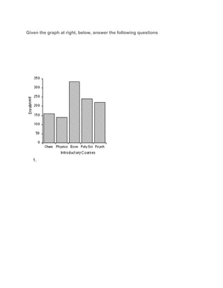
SlideShare a Scribd company logo
Review of Bar Graphs
Objectives
After completing this unit you should be able to:
● Identify the bar graph title.
● Identify labels for the bar graph axes.
● Identify information given by a designated bar
● Make statements about data trends from a bar graph.

What is a Bar Graph?
A bar graph is a visual display used to compare the amounts or frequency of occurrence of
different characteristics of data. This type of display allows us to:
● compare groups of data, and to
●  make generalizations about the data quickly.
● to organize data and information of the amount of things or people.
● it is a survey to collect data from different characteristics.
Price of Corn versus Quantity Demanded
This unit will introduce basic bar
graphs, how to read bar graphs. An
example of a bar graph is given on
the right.
When reading a bar graph there are
several things we must pay attention
to: the graph title, two axes,
including axes labels and scale, and
the bars. Since bar graphs are used
to graph frequencies or amounts of
data in discrete groups, we will
need to determine which axis is the
grouped data axis, as well as what
the specific groups are, and which
is the frequency axis.
``
Graph title, scale, labels,bars,axes.

Group data axis, frequency,discrete.

The height of the bars are particularly important since they give us information about specific
data.

Parts of a Bar Graph
Now let's look at the components of a bar graph individually. There is a lot of information in
this section so you may wish to jot down some short notes to yourself.

● Graph Title­­The graph title gives
an overview of the information
being presented in the graph. The
title is given at the top of the graph.
● Axes and their labels­­Each
graph has two axes. The axes
labels tell us what information is
presented on each axis. One axis
represents data groups, the other
represents the amounts or
frequency of data groups.
● Grouped Data Axis­­The
grouped data axis is always at the
base of the bars. This axis
displays the type of data being
graphed.
●

Frequency Data Axis­­The frequency axis has a scale that is a measure of the
frequency or amounts of the different data groups.
● Axes Scale­­ Scale is the range of values being presented along the frequency axis.
● Bars­­The bars are rectangular blocks that can have their base at either vertical axis
or horizontal axis (as in this example). Each bar represents the data for one of the data
groups.
Now let's look more closely at how the elements of a bar graph help us get a handle on the
information presented in a graph. While there are several ways to do this, here we will
present one way to get an overview of a graph using the graph above.
● Graph Title­­provides an overview of the type of information given in the bar graph.
● For the bar graph given, the title indicates that we are looking at data on:
● Vertical axis­­This axis is the frequency axis and contains the quantity demanded
given in units of bushels.
● Grouped Data Axis­­Since the the grouped data axis is always at the base of the
bars, the grouped data axis is the horizontal axis. The axis label tells us that along the
horizontal grouped data axis we have the price per bushel, with each data group being
a different dollar amount from $1 to $5.
● Two important pieces of information we must determine are the:
○ type of data being counted, and
○ how the data is grouped.
● Frequency Data Axis­­The scale is the range of frequency values shown on the
graph. The span of values represented is determined by the lowest and greatest
values you wish to include on the graph.

When looking
at this axis,
look to see
where the
range begins
and ends, as
well as at the
interval
between tick
marks. For a
further
discussion on
scale, read
the section on
Scale.
● The vertical
axis is the
quantity
demanded
given in units
of bushels.
● In this case,
the frequency
scale goes
from 0 to 80,
and uses an
interval of
units of 10.
The frequency
of our data
groups range
●

●
over nearly
the entire
scale so we
are able to
get a good
picture of our
data.
Example
Given the graph at right, below, answer the following questions

1.  

More Related Content

What's hot

SAP Lumira - Acquiring data
SAP Lumira - Acquiring dataSAP Lumira - Acquiring data
SAP Lumira - Acquiring data
Dmitry Anoshin
 
Statistical Graphics / Exploratory Data Analysis - DAY 2 - 8614 - B.Ed - AIOU
Statistical Graphics / Exploratory Data Analysis - DAY 2 - 8614 - B.Ed - AIOUStatistical Graphics / Exploratory Data Analysis - DAY 2 - 8614 - B.Ed - AIOU
Statistical Graphics / Exploratory Data Analysis - DAY 2 - 8614 - B.Ed - AIOU
EqraBaig
 
Statistics
StatisticsStatistics
Statistics
Shweta Jain
 
SAP Lumira - Building visualizations
SAP Lumira - Building visualizationsSAP Lumira - Building visualizations
SAP Lumira - Building visualizations
Dmitry Anoshin
 
Graphs
GraphsGraphs
Graphs
Dishasenee
 
Statistics
StatisticsStatistics
Statisticsdiereck
 
Top 7 types of Statistics Graphs for Data Representation
Top 7 types of Statistics Graphs for Data RepresentationTop 7 types of Statistics Graphs for Data Representation
Top 7 types of Statistics Graphs for Data Representation
Stat Analytica
 
Ix calc ii charts
Ix calc ii chartsIx calc ii charts
Ix calc ii charts
Archana Dwivedi
 
How to visualize web analytics data and choose a graph?
How to visualize web analytics data and choose a graph?How to visualize web analytics data and choose a graph?
How to visualize web analytics data and choose a graph?
Janvi Arora
 
Chart Components
Chart ComponentsChart Components
Chart Componentslindy23
 
Data analysis04 morethantwovariables
Data analysis04 morethantwovariablesData analysis04 morethantwovariables
Data analysis04 morethantwovariables
Universidade de São Paulo
 
Working with Pivot Tables
Working with Pivot TablesWorking with Pivot Tables
Working with Pivot Tables
Kingston Tagoe
 
Types of charts in Excel and How to use them
Types of charts in Excel and How to use themTypes of charts in Excel and How to use them
Types of charts in Excel and How to use them
Vijay Perepa
 
GIS Ostrava 2018 – Insights for ArGIS
GIS Ostrava 2018 – Insights for ArGISGIS Ostrava 2018 – Insights for ArGIS
GIS Ostrava 2018 – Insights for ArGIS
Jan Novotný
 
Charts in MS Excel
Charts in MS ExcelCharts in MS Excel
Charts in MS Excel
Rishi Kumar Gupta
 
Pivot table essential learning 1
Pivot table   essential learning 1Pivot table   essential learning 1
Pivot table essential learning 1Vijay Perepa
 
ASOCEU - Lesson 2 - Data Analysis (slides)
ASOCEU - Lesson 2 - Data Analysis (slides)ASOCEU - Lesson 2 - Data Analysis (slides)
ASOCEU - Lesson 2 - Data Analysis (slides)
A Scuola di OpenCoesione
 
Different types of charts
Different types of chartsDifferent types of charts
Different types of charts
Zakaria Salim
 
Creating a graph in excel
Creating a graph in excelCreating a graph in excel
Creating a graph in excel
orthms
 

What's hot (20)

SAP Lumira - Acquiring data
SAP Lumira - Acquiring dataSAP Lumira - Acquiring data
SAP Lumira - Acquiring data
 
Statistical Graphics / Exploratory Data Analysis - DAY 2 - 8614 - B.Ed - AIOU
Statistical Graphics / Exploratory Data Analysis - DAY 2 - 8614 - B.Ed - AIOUStatistical Graphics / Exploratory Data Analysis - DAY 2 - 8614 - B.Ed - AIOU
Statistical Graphics / Exploratory Data Analysis - DAY 2 - 8614 - B.Ed - AIOU
 
Statistics
StatisticsStatistics
Statistics
 
SAP Lumira - Building visualizations
SAP Lumira - Building visualizationsSAP Lumira - Building visualizations
SAP Lumira - Building visualizations
 
Graphs
GraphsGraphs
Graphs
 
Statistics
StatisticsStatistics
Statistics
 
Top 7 types of Statistics Graphs for Data Representation
Top 7 types of Statistics Graphs for Data RepresentationTop 7 types of Statistics Graphs for Data Representation
Top 7 types of Statistics Graphs for Data Representation
 
Ix calc ii charts
Ix calc ii chartsIx calc ii charts
Ix calc ii charts
 
How to visualize web analytics data and choose a graph?
How to visualize web analytics data and choose a graph?How to visualize web analytics data and choose a graph?
How to visualize web analytics data and choose a graph?
 
Chart Components
Chart ComponentsChart Components
Chart Components
 
Data analysis04 morethantwovariables
Data analysis04 morethantwovariablesData analysis04 morethantwovariables
Data analysis04 morethantwovariables
 
Working with Pivot Tables
Working with Pivot TablesWorking with Pivot Tables
Working with Pivot Tables
 
Types of charts in Excel and How to use them
Types of charts in Excel and How to use themTypes of charts in Excel and How to use them
Types of charts in Excel and How to use them
 
GIS Ostrava 2018 – Insights for ArGIS
GIS Ostrava 2018 – Insights for ArGISGIS Ostrava 2018 – Insights for ArGIS
GIS Ostrava 2018 – Insights for ArGIS
 
Charts in MS Excel
Charts in MS ExcelCharts in MS Excel
Charts in MS Excel
 
Pivot table essential learning 1
Pivot table   essential learning 1Pivot table   essential learning 1
Pivot table essential learning 1
 
ASOCEU - Lesson 2 - Data Analysis (slides)
ASOCEU - Lesson 2 - Data Analysis (slides)ASOCEU - Lesson 2 - Data Analysis (slides)
ASOCEU - Lesson 2 - Data Analysis (slides)
 
Different types of charts
Different types of chartsDifferent types of charts
Different types of charts
 
Spreadsheets 2
Spreadsheets 2Spreadsheets 2
Spreadsheets 2
 
Creating a graph in excel
Creating a graph in excelCreating a graph in excel
Creating a graph in excel
 

Similar to Reviewof bargraph

Bigdata
BigdataBigdata
105575916 maths-edit-new
105575916 maths-edit-new105575916 maths-edit-new
105575916 maths-edit-new
homeworkping7
 
Graphs and chars
Graphs and charsGraphs and chars
Graphs and chars
salemhusin
 
Các loại biểu đồ trình bày dữ liệu kinh doanh
Các loại biểu đồ trình bày dữ liệu kinh doanhCác loại biểu đồ trình bày dữ liệu kinh doanh
Các loại biểu đồ trình bày dữ liệu kinh doanh
Chng83
 
Bar Graph
Bar GraphBar Graph
Bar chart
Bar chartBar chart
Bar chart
DrGhadooRa
 
Data Visualization using different python libraries.pptx
Data Visualization using different python libraries.pptxData Visualization using different python libraries.pptx
Data Visualization using different python libraries.pptx
HamzaAli998966
 
Tableau Desktop Specialist Certification.pptx
Tableau Desktop Specialist Certification.pptxTableau Desktop Specialist Certification.pptx
Tableau Desktop Specialist Certification.pptx
HarshavardhiniYeluri
 
Diowane2003
Diowane2003Diowane2003
Diowane2003SFYC
 
Displaying data using charts and graphs
Displaying data using charts and graphsDisplaying data using charts and graphs
Displaying data using charts and graphsCharles Flynt
 
Data Handling
Data HandlingData Handling
Data Handling
SurajMahto21
 
DAV Seperate, Align, Staked.pptx
DAV Seperate, Align, Staked.pptxDAV Seperate, Align, Staked.pptx
DAV Seperate, Align, Staked.pptx
SamirSitaula1
 
Presentation de la DATA visualisation.pptx
Presentation de la DATA visualisation.pptxPresentation de la DATA visualisation.pptx
Presentation de la DATA visualisation.pptx
salmakoummich
 
Business Analytics 1 Module 3.pdf
Business Analytics 1 Module 3.pdfBusiness Analytics 1 Module 3.pdf
Business Analytics 1 Module 3.pdf
Jayanti Pande
 
Data visualization
Data visualizationData visualization
Data visualization
Baijayanti Chakraborty
 
Analytical thinking.pptx
Analytical thinking.pptxAnalytical thinking.pptx
Analytical thinking.pptx
IvaPeneva
 
Different Types of Graphs - Copy.pptx
Different Types of Graphs - Copy.pptxDifferent Types of Graphs - Copy.pptx
Different Types of Graphs - Copy.pptx
Chrysler Kayce
 
Graphing Data
Graphing DataGraphing Data
Graphing Datashas595
 
Top 8 Different Types Of Charts In Statistics And Their Uses
Top 8 Different Types Of Charts In Statistics And Their UsesTop 8 Different Types Of Charts In Statistics And Their Uses
Top 8 Different Types Of Charts In Statistics And Their Uses
Stat Analytica
 
UNIT_4_data visualization.pptx
UNIT_4_data visualization.pptxUNIT_4_data visualization.pptx
UNIT_4_data visualization.pptx
BhagyasriPatel2
 

Similar to Reviewof bargraph (20)

Bigdata
BigdataBigdata
Bigdata
 
105575916 maths-edit-new
105575916 maths-edit-new105575916 maths-edit-new
105575916 maths-edit-new
 
Graphs and chars
Graphs and charsGraphs and chars
Graphs and chars
 
Các loại biểu đồ trình bày dữ liệu kinh doanh
Các loại biểu đồ trình bày dữ liệu kinh doanhCác loại biểu đồ trình bày dữ liệu kinh doanh
Các loại biểu đồ trình bày dữ liệu kinh doanh
 
Bar Graph
Bar GraphBar Graph
Bar Graph
 
Bar chart
Bar chartBar chart
Bar chart
 
Data Visualization using different python libraries.pptx
Data Visualization using different python libraries.pptxData Visualization using different python libraries.pptx
Data Visualization using different python libraries.pptx
 
Tableau Desktop Specialist Certification.pptx
Tableau Desktop Specialist Certification.pptxTableau Desktop Specialist Certification.pptx
Tableau Desktop Specialist Certification.pptx
 
Diowane2003
Diowane2003Diowane2003
Diowane2003
 
Displaying data using charts and graphs
Displaying data using charts and graphsDisplaying data using charts and graphs
Displaying data using charts and graphs
 
Data Handling
Data HandlingData Handling
Data Handling
 
DAV Seperate, Align, Staked.pptx
DAV Seperate, Align, Staked.pptxDAV Seperate, Align, Staked.pptx
DAV Seperate, Align, Staked.pptx
 
Presentation de la DATA visualisation.pptx
Presentation de la DATA visualisation.pptxPresentation de la DATA visualisation.pptx
Presentation de la DATA visualisation.pptx
 
Business Analytics 1 Module 3.pdf
Business Analytics 1 Module 3.pdfBusiness Analytics 1 Module 3.pdf
Business Analytics 1 Module 3.pdf
 
Data visualization
Data visualizationData visualization
Data visualization
 
Analytical thinking.pptx
Analytical thinking.pptxAnalytical thinking.pptx
Analytical thinking.pptx
 
Different Types of Graphs - Copy.pptx
Different Types of Graphs - Copy.pptxDifferent Types of Graphs - Copy.pptx
Different Types of Graphs - Copy.pptx
 
Graphing Data
Graphing DataGraphing Data
Graphing Data
 
Top 8 Different Types Of Charts In Statistics And Their Uses
Top 8 Different Types Of Charts In Statistics And Their UsesTop 8 Different Types Of Charts In Statistics And Their Uses
Top 8 Different Types Of Charts In Statistics And Their Uses
 
UNIT_4_data visualization.pptx
UNIT_4_data visualization.pptxUNIT_4_data visualization.pptx
UNIT_4_data visualization.pptx
 

More from britt660

Touching spirit bear
Touching spirit bearTouching spirit bear
Touching spirit bearbritt660
 
Three skeloton key
Three skeloton keyThree skeloton key
Three skeloton keybritt660
 
P4 crawford editorialfeature
P4 crawford editorialfeatureP4 crawford editorialfeature
P4 crawford editorialfeaturebritt660
 
1 rainclouds
1 rainclouds1 rainclouds
1 raincloudsbritt660
 
1 rainclouds
1 rainclouds1 rainclouds
1 raincloudsbritt660
 
Weather performanceassessmentactivity5 (1)
Weather performanceassessmentactivity5 (1)Weather performanceassessmentactivity5 (1)
Weather performanceassessmentactivity5 (1)britt660
 
Translating verbalphrases
Translating verbalphrasesTranslating verbalphrases
Translating verbalphrasesbritt660
 
Exponential
ExponentialExponential
Exponentialbritt660
 
Inequalities group
Inequalities groupInequalities group
Inequalities groupbritt660
 
Combinations
CombinationsCombinations
Combinationsbritt660
 
Systemsof linear equations
Systemsof linear equationsSystemsof linear equations
Systemsof linear equationsbritt660
 

More from britt660 (13)

Touching spirit bear
Touching spirit bearTouching spirit bear
Touching spirit bear
 
Three skeloton key
Three skeloton keyThree skeloton key
Three skeloton key
 
Uganda
UgandaUganda
Uganda
 
P4 crawford editorialfeature
P4 crawford editorialfeatureP4 crawford editorialfeature
P4 crawford editorialfeature
 
1 rainclouds
1 rainclouds1 rainclouds
1 rainclouds
 
1 rainclouds
1 rainclouds1 rainclouds
1 rainclouds
 
Weather performanceassessmentactivity5 (1)
Weather performanceassessmentactivity5 (1)Weather performanceassessmentactivity5 (1)
Weather performanceassessmentactivity5 (1)
 
Ligers
LigersLigers
Ligers
 
Translating verbalphrases
Translating verbalphrasesTranslating verbalphrases
Translating verbalphrases
 
Exponential
ExponentialExponential
Exponential
 
Inequalities group
Inequalities groupInequalities group
Inequalities group
 
Combinations
CombinationsCombinations
Combinations
 
Systemsof linear equations
Systemsof linear equationsSystemsof linear equations
Systemsof linear equations
 

Recently uploaded

Operation Blue Star - Saka Neela Tara
Operation Blue Star   -  Saka Neela TaraOperation Blue Star   -  Saka Neela Tara
Operation Blue Star - Saka Neela Tara
Balvir Singh
 
June 3, 2024 Anti-Semitism Letter Sent to MIT President Kornbluth and MIT Cor...
June 3, 2024 Anti-Semitism Letter Sent to MIT President Kornbluth and MIT Cor...June 3, 2024 Anti-Semitism Letter Sent to MIT President Kornbluth and MIT Cor...
June 3, 2024 Anti-Semitism Letter Sent to MIT President Kornbluth and MIT Cor...
Levi Shapiro
 
Language Across the Curriculm LAC B.Ed.
Language Across the  Curriculm LAC B.Ed.Language Across the  Curriculm LAC B.Ed.
Language Across the Curriculm LAC B.Ed.
Atul Kumar Singh
 
Francesca Gottschalk - How can education support child empowerment.pptx
Francesca Gottschalk - How can education support child empowerment.pptxFrancesca Gottschalk - How can education support child empowerment.pptx
Francesca Gottschalk - How can education support child empowerment.pptx
EduSkills OECD
 
Biological Screening of Herbal Drugs in detailed.
Biological Screening of Herbal Drugs in detailed.Biological Screening of Herbal Drugs in detailed.
Biological Screening of Herbal Drugs in detailed.
Ashokrao Mane college of Pharmacy Peth-Vadgaon
 
Mule 4.6 & Java 17 Upgrade | MuleSoft Mysore Meetup #46
Mule 4.6 & Java 17 Upgrade | MuleSoft Mysore Meetup #46Mule 4.6 & Java 17 Upgrade | MuleSoft Mysore Meetup #46
Mule 4.6 & Java 17 Upgrade | MuleSoft Mysore Meetup #46
MysoreMuleSoftMeetup
 
Introduction to AI for Nonprofits with Tapp Network
Introduction to AI for Nonprofits with Tapp NetworkIntroduction to AI for Nonprofits with Tapp Network
Introduction to AI for Nonprofits with Tapp Network
TechSoup
 
The geography of Taylor Swift - some ideas
The geography of Taylor Swift - some ideasThe geography of Taylor Swift - some ideas
The geography of Taylor Swift - some ideas
GeoBlogs
 
The Challenger.pdf DNHS Official Publication
The Challenger.pdf DNHS Official PublicationThe Challenger.pdf DNHS Official Publication
The Challenger.pdf DNHS Official Publication
Delapenabediema
 
Adversarial Attention Modeling for Multi-dimensional Emotion Regression.pdf
Adversarial Attention Modeling for Multi-dimensional Emotion Regression.pdfAdversarial Attention Modeling for Multi-dimensional Emotion Regression.pdf
Adversarial Attention Modeling for Multi-dimensional Emotion Regression.pdf
Po-Chuan Chen
 
Additional Benefits for Employee Website.pdf
Additional Benefits for Employee Website.pdfAdditional Benefits for Employee Website.pdf
Additional Benefits for Employee Website.pdf
joachimlavalley1
 
Palestine last event orientationfvgnh .pptx
Palestine last event orientationfvgnh .pptxPalestine last event orientationfvgnh .pptx
Palestine last event orientationfvgnh .pptx
RaedMohamed3
 
The approach at University of Liverpool.pptx
The approach at University of Liverpool.pptxThe approach at University of Liverpool.pptx
The approach at University of Liverpool.pptx
Jisc
 
aaaaaaaaaaaaaaaaaaaaaaaaaaaaaaaaaaaaaaaaa
aaaaaaaaaaaaaaaaaaaaaaaaaaaaaaaaaaaaaaaaaaaaaaaaaaaaaaaaaaaaaaaaaaaaaaaaaaaaaaaaaa
aaaaaaaaaaaaaaaaaaaaaaaaaaaaaaaaaaaaaaaaa
siemaillard
 
Model Attribute Check Company Auto Property
Model Attribute  Check Company Auto PropertyModel Attribute  Check Company Auto Property
Model Attribute Check Company Auto Property
Celine George
 
1.4 modern child centered education - mahatma gandhi-2.pptx
1.4 modern child centered education - mahatma gandhi-2.pptx1.4 modern child centered education - mahatma gandhi-2.pptx
1.4 modern child centered education - mahatma gandhi-2.pptx
JosvitaDsouza2
 
The basics of sentences session 5pptx.pptx
The basics of sentences session 5pptx.pptxThe basics of sentences session 5pptx.pptx
The basics of sentences session 5pptx.pptx
heathfieldcps1
 
Acetabularia Information For Class 9 .docx
Acetabularia Information For Class 9  .docxAcetabularia Information For Class 9  .docx
Acetabularia Information For Class 9 .docx
vaibhavrinwa19
 
Phrasal Verbs.XXXXXXXXXXXXXXXXXXXXXXXXXX
Phrasal Verbs.XXXXXXXXXXXXXXXXXXXXXXXXXXPhrasal Verbs.XXXXXXXXXXXXXXXXXXXXXXXXXX
Phrasal Verbs.XXXXXXXXXXXXXXXXXXXXXXXXXX
MIRIAMSALINAS13
 
Thesis Statement for students diagnonsed withADHD.ppt
Thesis Statement for students diagnonsed withADHD.pptThesis Statement for students diagnonsed withADHD.ppt
Thesis Statement for students diagnonsed withADHD.ppt
EverAndrsGuerraGuerr
 

Recently uploaded (20)

Operation Blue Star - Saka Neela Tara
Operation Blue Star   -  Saka Neela TaraOperation Blue Star   -  Saka Neela Tara
Operation Blue Star - Saka Neela Tara
 
June 3, 2024 Anti-Semitism Letter Sent to MIT President Kornbluth and MIT Cor...
June 3, 2024 Anti-Semitism Letter Sent to MIT President Kornbluth and MIT Cor...June 3, 2024 Anti-Semitism Letter Sent to MIT President Kornbluth and MIT Cor...
June 3, 2024 Anti-Semitism Letter Sent to MIT President Kornbluth and MIT Cor...
 
Language Across the Curriculm LAC B.Ed.
Language Across the  Curriculm LAC B.Ed.Language Across the  Curriculm LAC B.Ed.
Language Across the Curriculm LAC B.Ed.
 
Francesca Gottschalk - How can education support child empowerment.pptx
Francesca Gottschalk - How can education support child empowerment.pptxFrancesca Gottschalk - How can education support child empowerment.pptx
Francesca Gottschalk - How can education support child empowerment.pptx
 
Biological Screening of Herbal Drugs in detailed.
Biological Screening of Herbal Drugs in detailed.Biological Screening of Herbal Drugs in detailed.
Biological Screening of Herbal Drugs in detailed.
 
Mule 4.6 & Java 17 Upgrade | MuleSoft Mysore Meetup #46
Mule 4.6 & Java 17 Upgrade | MuleSoft Mysore Meetup #46Mule 4.6 & Java 17 Upgrade | MuleSoft Mysore Meetup #46
Mule 4.6 & Java 17 Upgrade | MuleSoft Mysore Meetup #46
 
Introduction to AI for Nonprofits with Tapp Network
Introduction to AI for Nonprofits with Tapp NetworkIntroduction to AI for Nonprofits with Tapp Network
Introduction to AI for Nonprofits with Tapp Network
 
The geography of Taylor Swift - some ideas
The geography of Taylor Swift - some ideasThe geography of Taylor Swift - some ideas
The geography of Taylor Swift - some ideas
 
The Challenger.pdf DNHS Official Publication
The Challenger.pdf DNHS Official PublicationThe Challenger.pdf DNHS Official Publication
The Challenger.pdf DNHS Official Publication
 
Adversarial Attention Modeling for Multi-dimensional Emotion Regression.pdf
Adversarial Attention Modeling for Multi-dimensional Emotion Regression.pdfAdversarial Attention Modeling for Multi-dimensional Emotion Regression.pdf
Adversarial Attention Modeling for Multi-dimensional Emotion Regression.pdf
 
Additional Benefits for Employee Website.pdf
Additional Benefits for Employee Website.pdfAdditional Benefits for Employee Website.pdf
Additional Benefits for Employee Website.pdf
 
Palestine last event orientationfvgnh .pptx
Palestine last event orientationfvgnh .pptxPalestine last event orientationfvgnh .pptx
Palestine last event orientationfvgnh .pptx
 
The approach at University of Liverpool.pptx
The approach at University of Liverpool.pptxThe approach at University of Liverpool.pptx
The approach at University of Liverpool.pptx
 
aaaaaaaaaaaaaaaaaaaaaaaaaaaaaaaaaaaaaaaaa
aaaaaaaaaaaaaaaaaaaaaaaaaaaaaaaaaaaaaaaaaaaaaaaaaaaaaaaaaaaaaaaaaaaaaaaaaaaaaaaaaa
aaaaaaaaaaaaaaaaaaaaaaaaaaaaaaaaaaaaaaaaa
 
Model Attribute Check Company Auto Property
Model Attribute  Check Company Auto PropertyModel Attribute  Check Company Auto Property
Model Attribute Check Company Auto Property
 
1.4 modern child centered education - mahatma gandhi-2.pptx
1.4 modern child centered education - mahatma gandhi-2.pptx1.4 modern child centered education - mahatma gandhi-2.pptx
1.4 modern child centered education - mahatma gandhi-2.pptx
 
The basics of sentences session 5pptx.pptx
The basics of sentences session 5pptx.pptxThe basics of sentences session 5pptx.pptx
The basics of sentences session 5pptx.pptx
 
Acetabularia Information For Class 9 .docx
Acetabularia Information For Class 9  .docxAcetabularia Information For Class 9  .docx
Acetabularia Information For Class 9 .docx
 
Phrasal Verbs.XXXXXXXXXXXXXXXXXXXXXXXXXX
Phrasal Verbs.XXXXXXXXXXXXXXXXXXXXXXXXXXPhrasal Verbs.XXXXXXXXXXXXXXXXXXXXXXXXXX
Phrasal Verbs.XXXXXXXXXXXXXXXXXXXXXXXXXX
 
Thesis Statement for students diagnonsed withADHD.ppt
Thesis Statement for students diagnonsed withADHD.pptThesis Statement for students diagnonsed withADHD.ppt
Thesis Statement for students diagnonsed withADHD.ppt
 

Reviewof bargraph

  • 1. Review of Bar Graphs Objectives After completing this unit you should be able to: ● Identify the bar graph title. ● Identify labels for the bar graph axes. ● Identify information given by a designated bar ● Make statements about data trends from a bar graph. What is a Bar Graph? A bar graph is a visual display used to compare the amounts or frequency of occurrence of different characteristics of data. This type of display allows us to: ● compare groups of data, and to ●  make generalizations about the data quickly. ● to organize data and information of the amount of things or people. ● it is a survey to collect data from different characteristics. Price of Corn versus Quantity Demanded This unit will introduce basic bar graphs, how to read bar graphs. An example of a bar graph is given on the right. When reading a bar graph there are several things we must pay attention to: the graph title, two axes, including axes labels and scale, and the bars. Since bar graphs are used to graph frequencies or amounts of data in discrete groups, we will need to determine which axis is the grouped data axis, as well as what the specific groups are, and which is the frequency axis. ``
  • 2. Graph title, scale, labels,bars,axes. Group data axis, frequency,discrete. The height of the bars are particularly important since they give us information about specific data. Parts of a Bar Graph Now let's look at the components of a bar graph individually. There is a lot of information in this section so you may wish to jot down some short notes to yourself. ● Graph Title­­The graph title gives an overview of the information being presented in the graph. The title is given at the top of the graph. ● Axes and their labels­­Each graph has two axes. The axes labels tell us what information is presented on each axis. One axis represents data groups, the other represents the amounts or frequency of data groups. ● Grouped Data Axis­­The grouped data axis is always at the base of the bars. This axis displays the type of data being graphed. ● Frequency Data Axis­­The frequency axis has a scale that is a measure of the frequency or amounts of the different data groups. ● Axes Scale­­ Scale is the range of values being presented along the frequency axis. ● Bars­­The bars are rectangular blocks that can have their base at either vertical axis or horizontal axis (as in this example). Each bar represents the data for one of the data groups. Now let's look more closely at how the elements of a bar graph help us get a handle on the information presented in a graph. While there are several ways to do this, here we will present one way to get an overview of a graph using the graph above. ● Graph Title­­provides an overview of the type of information given in the bar graph. ● For the bar graph given, the title indicates that we are looking at data on: ● Vertical axis­­This axis is the frequency axis and contains the quantity demanded given in units of bushels. ● Grouped Data Axis­­Since the the grouped data axis is always at the base of the bars, the grouped data axis is the horizontal axis. The axis label tells us that along the
  • 3. horizontal grouped data axis we have the price per bushel, with each data group being a different dollar amount from $1 to $5. ● Two important pieces of information we must determine are the: ○ type of data being counted, and ○ how the data is grouped. ● Frequency Data Axis­­The scale is the range of frequency values shown on the graph. The span of values represented is determined by the lowest and greatest values you wish to include on the graph. When looking at this axis, look to see where the range begins and ends, as well as at the interval between tick marks. For a further discussion on scale, read the section on Scale. ● The vertical axis is the quantity demanded given in units of bushels. ● In this case, the frequency scale goes from 0 to 80, and uses an interval of units of 10. The frequency of our data groups range ● ●
  • 5.
  • 6.