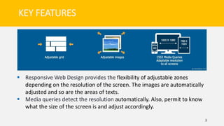
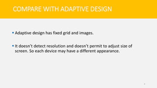
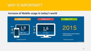
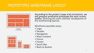
Responsive web design allows websites to automatically adjust to different screen sizes and devices. It uses flexible grids and images that resize depending on screen resolution. Media queries detect screen size and adjust layout accordingly. This provides a consistent user experience across devices like smartphones, tablets and desktops. It is important for responsive design because people increasingly access websites on various devices, and a single responsive site is more convenient and usable than separate mobile and desktop sites.