What is Responsive 
Design and how does it 
help your business?
In Jan. 2014 42% of US 
adults owned a tablet and 
were actively browsing 
the Internet 
on it. 
Till the end on 2014 
almost 1.76 billion people 
will own and use a 
smartphone.
Multi-screen is the new norm now. 
—We shop on our tablets while we watch TV. 
—We check our social stream on our phone while we work on 
our laptop.
Is your website prepared for the 
mobile revolution?
Here comes 
Responsive Design
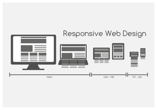
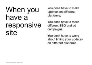
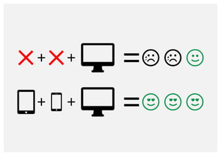
Responsive design is a web 
design approach aimed at 
creating sites that provide an 
optimal viewing experience 
across a wide range of devices.
The same site works on the 
mobile phone in your pocket, 
tablet in your backpack and 
computer at your office.
Responsive web design adapts 
the site’s layout, text, media, ads 
to the size of the window 
through which you are exploring 
the Internet.
GRAPEFRUIT | DESIGNING MOBILE APPS 
9
Here are some live 
examples
Full-screen harvard.edu website
Half-screen harvard.edu website
Mobile view of harvard.edu website
Full width view of time.com
Half-screen, mobile view, menu view and mobile view after TAP
Full-width view salesforce.com
Half-width view salesforce.com, mobile view and menu view
Want more examples? 
Visit these websites: 
http://www.ing.com/ 
http://www.oliverharvey.co.uk/ 
http://www.t-mobile.com/ 
http://www.catscarf.com/ 
http://group.renault.com/
Why is Responsive 
Design vital for your 
business?
1.The same brand 
experience on all the 
platforms
“The users expect to have 
a seamless experience 
across all their devices” 
– Google B2B campaign 
They want to: 
— see the same content; 
— navigate through a 
similar layout; 
— have access to the 
same options and 
possibilities across all 
their mediums.
Google made a 
research on customers 
opinions regarding 
mobile sites
When you have a mobile 
friendly site: 
74% say that they’re more 
likely to return to a mobile 
friendly site. 
67% say that they’re more 
likely to buy a site’s product 
when visiting a mobile 
friendly site.
When you don’t have a 
mobile friendly site: 
48% say that they feel 
frustrated and annoyed. 
36% say that they’ve 
wasted their time visiting 
that site. 
52% said that a bad mobile 
experience made them less 
likely to engage with that 
company.
2.Use less resources. 
Save more time
When you 
have a 
responsive 
site 
You don’t have to make 
updates on different 
platforms; 
You don’t have to make 
different SEO and ad 
campaigns; 
You don’t have to worry 
about timing your updates 
on different platforms.
Having one 
platform to 
rule them 
all 
Once you updated your 
content, all your clients 
receive the same 
information. 
Consumers expect to have 
the same content and offers 
on all the platforms. With 
responsive design you 
make them happy.
3.Responsive websites 
drive conversion
The total 
number 
of mobile 
users is 
huge 
They are cross-platform 
shoppers and they are 
visiting your site.
They 
gather 
info from 
various 
channels. 
Your website is a valuable 
resource and you have to 
exploit this opportunity.
27% of shoppers expect to 
increase their purchase via 
mobile phone. 
49% of retailers have 
purchasing capabilities on 
their mobile site. 
36% percent of customers 
find shopping via mobile 
easy. 
60% are interested in 
posting to social media 
while shopping in store.
So what does this mean for you ?
4.Google likes it
Just to be sure you 
know 
With an astounding global 
market share Google remains 
the main actor in the search 
market.
Being on the good side of 
Google means more organic 
search traffic and more leads for 
your company.
But why does Google like 
Responsive Design?
Using a single address for a 
piece of content makes it 
easier for your users to 
interact with, share and 
link.
A single address makes 
Google’s algorithms work 
easier and this means that 
your content gets indexed 
faster.
If you have a responsive 
design the users don’t get 
redirected to another 
website, thus the loading 
time decreases and the 
chance of a bounce 
appearing decreases. 
When you have one 
address, Google’s crawlers 
need to access your pages 
only once, thus saving 
resources for both your 
company and Google.
When you share from a mobile site, chances are that a 
person from a different medium, like a tablet or desktop, 
will access the link. They will get a bad version of your 
site and bounce immediately right out of it. This 
increase in bounce rate can hurt your Google ranking for 
that page and for your site.
5.Prepare for the 
unpredictable
We do not know what are the future screen 
dimensions that will appear on the 
mobile/tablet/pc market. This uncertainty does 
not scare us. We know that responsive design 
can tackle almost any screen resolution if it’s 
done right.
So how much does a 
Responsive Website 
cost?
Here are 2 examples 
from our experience 
We made for a client a 
desktop version of a site. 
After we delivered, they 
wanted a mobile friendly 
version. The cost increased 
by 30%. 
Another client requested a 
responsive website. The 
final cost was 10% less 
than if we would have made 
a desktop and a separate 
mobile site.
A responsive 
design might cost 
you more in the 
development 
stage of the 
project but on the 
long run: 
— It will save you money 
for site maintenance; 
— You will use less HR 
resources and the 
updates will be easier; 
— The stress and 
chances of mistakes 
will decrease; 
— Will generate more 
leads and it will be 
Google Friendly.
In the end we give you 
the same advice we 
give to our clients.
Choose Responsive 
Design.
Found this useful? 
Share it forward. 
Interesting web project? 
Send a pidgeon.
Resources 
http://www.emarketer.com/Article/Worldwide-Smartphone-Usage-Grow-25-2014/1010920 
http://www.marketingcharts.com/online/us-tablet-ownership-update-january-2014-39508/ 
http://googlemobileads.blogspot.ro/2012/09/mobile-friendly-sites-turn-visitors.html 
https://developers.google.com/webmasters/smartphone-sites/details 
http://www.accenture.com/Microsites/retail-research/Pages/consumer-research-results. 
aspx#results 
http://commons.wikimedia.org/wiki/File:Content-is-like-water-1980.jpg 
http://commons.wikimedia.org/wiki/File:Responsive_Web_Design_for_Desktop,_Notebook,_Tablet 
_and_Mobile_Phone.png 
http://www.flaticon.com/
Resources 
Sites given as example 
http://www.time.com 
http://www.Harvard.edu 
http://www.salesforce.com
Thank you. 
You rock !

What is Responsive Design and how does it help your business ?

  • 1.
    What is Responsive Design and how does it help your business?
  • 2.
    In Jan. 201442% of US adults owned a tablet and were actively browsing the Internet on it. Till the end on 2014 almost 1.76 billion people will own and use a smartphone.
  • 3.
    Multi-screen is thenew norm now. —We shop on our tablets while we watch TV. —We check our social stream on our phone while we work on our laptop.
  • 4.
    Is your websiteprepared for the mobile revolution?
  • 5.
  • 6.
    Responsive design isa web design approach aimed at creating sites that provide an optimal viewing experience across a wide range of devices.
  • 7.
    The same siteworks on the mobile phone in your pocket, tablet in your backpack and computer at your office.
  • 8.
    Responsive web designadapts the site’s layout, text, media, ads to the size of the window through which you are exploring the Internet.
  • 9.
  • 10.
    Here are somelive examples
  • 11.
  • 12.
  • 13.
    Mobile view ofharvard.edu website
  • 14.
    Full width viewof time.com
  • 15.
    Half-screen, mobile view,menu view and mobile view after TAP
  • 16.
  • 17.
    Half-width view salesforce.com,mobile view and menu view
  • 18.
    Want more examples? Visit these websites: http://www.ing.com/ http://www.oliverharvey.co.uk/ http://www.t-mobile.com/ http://www.catscarf.com/ http://group.renault.com/
  • 19.
    Why is Responsive Design vital for your business?
  • 20.
    1.The same brand experience on all the platforms
  • 21.
    “The users expectto have a seamless experience across all their devices” – Google B2B campaign They want to: — see the same content; — navigate through a similar layout; — have access to the same options and possibilities across all their mediums.
  • 22.
    Google made a research on customers opinions regarding mobile sites
  • 23.
    When you havea mobile friendly site: 74% say that they’re more likely to return to a mobile friendly site. 67% say that they’re more likely to buy a site’s product when visiting a mobile friendly site.
  • 24.
    When you don’thave a mobile friendly site: 48% say that they feel frustrated and annoyed. 36% say that they’ve wasted their time visiting that site. 52% said that a bad mobile experience made them less likely to engage with that company.
  • 25.
    2.Use less resources. Save more time
  • 26.
    When you havea responsive site You don’t have to make updates on different platforms; You don’t have to make different SEO and ad campaigns; You don’t have to worry about timing your updates on different platforms.
  • 27.
    Having one platformto rule them all Once you updated your content, all your clients receive the same information. Consumers expect to have the same content and offers on all the platforms. With responsive design you make them happy.
  • 28.
  • 29.
    The total number of mobile users is huge They are cross-platform shoppers and they are visiting your site.
  • 30.
    They gather infofrom various channels. Your website is a valuable resource and you have to exploit this opportunity.
  • 31.
    27% of shoppersexpect to increase their purchase via mobile phone. 49% of retailers have purchasing capabilities on their mobile site. 36% percent of customers find shopping via mobile easy. 60% are interested in posting to social media while shopping in store.
  • 32.
    So what doesthis mean for you ?
  • 34.
  • 35.
    Just to besure you know With an astounding global market share Google remains the main actor in the search market.
  • 36.
    Being on thegood side of Google means more organic search traffic and more leads for your company.
  • 37.
    But why doesGoogle like Responsive Design?
  • 38.
    Using a singleaddress for a piece of content makes it easier for your users to interact with, share and link.
  • 39.
    A single addressmakes Google’s algorithms work easier and this means that your content gets indexed faster.
  • 40.
    If you havea responsive design the users don’t get redirected to another website, thus the loading time decreases and the chance of a bounce appearing decreases. When you have one address, Google’s crawlers need to access your pages only once, thus saving resources for both your company and Google.
  • 41.
    When you sharefrom a mobile site, chances are that a person from a different medium, like a tablet or desktop, will access the link. They will get a bad version of your site and bounce immediately right out of it. This increase in bounce rate can hurt your Google ranking for that page and for your site.
  • 42.
    5.Prepare for the unpredictable
  • 44.
    We do notknow what are the future screen dimensions that will appear on the mobile/tablet/pc market. This uncertainty does not scare us. We know that responsive design can tackle almost any screen resolution if it’s done right.
  • 45.
    So how muchdoes a Responsive Website cost?
  • 46.
    Here are 2examples from our experience We made for a client a desktop version of a site. After we delivered, they wanted a mobile friendly version. The cost increased by 30%. Another client requested a responsive website. The final cost was 10% less than if we would have made a desktop and a separate mobile site.
  • 47.
    A responsive designmight cost you more in the development stage of the project but on the long run: — It will save you money for site maintenance; — You will use less HR resources and the updates will be easier; — The stress and chances of mistakes will decrease; — Will generate more leads and it will be Google Friendly.
  • 48.
    In the endwe give you the same advice we give to our clients.
  • 49.
  • 50.
    Found this useful? Share it forward. Interesting web project? Send a pidgeon.
  • 51.
    Resources http://www.emarketer.com/Article/Worldwide-Smartphone-Usage-Grow-25-2014/1010920 http://www.marketingcharts.com/online/us-tablet-ownership-update-january-2014-39508/ http://googlemobileads.blogspot.ro/2012/09/mobile-friendly-sites-turn-visitors.html https://developers.google.com/webmasters/smartphone-sites/details http://www.accenture.com/Microsites/retail-research/Pages/consumer-research-results. aspx#results http://commons.wikimedia.org/wiki/File:Content-is-like-water-1980.jpg http://commons.wikimedia.org/wiki/File:Responsive_Web_Design_for_Desktop,_Notebook,_Tablet _and_Mobile_Phone.png http://www.flaticon.com/
  • 52.
    Resources Sites givenas example http://www.time.com http://www.Harvard.edu http://www.salesforce.com
  • 53.