Download to read offline


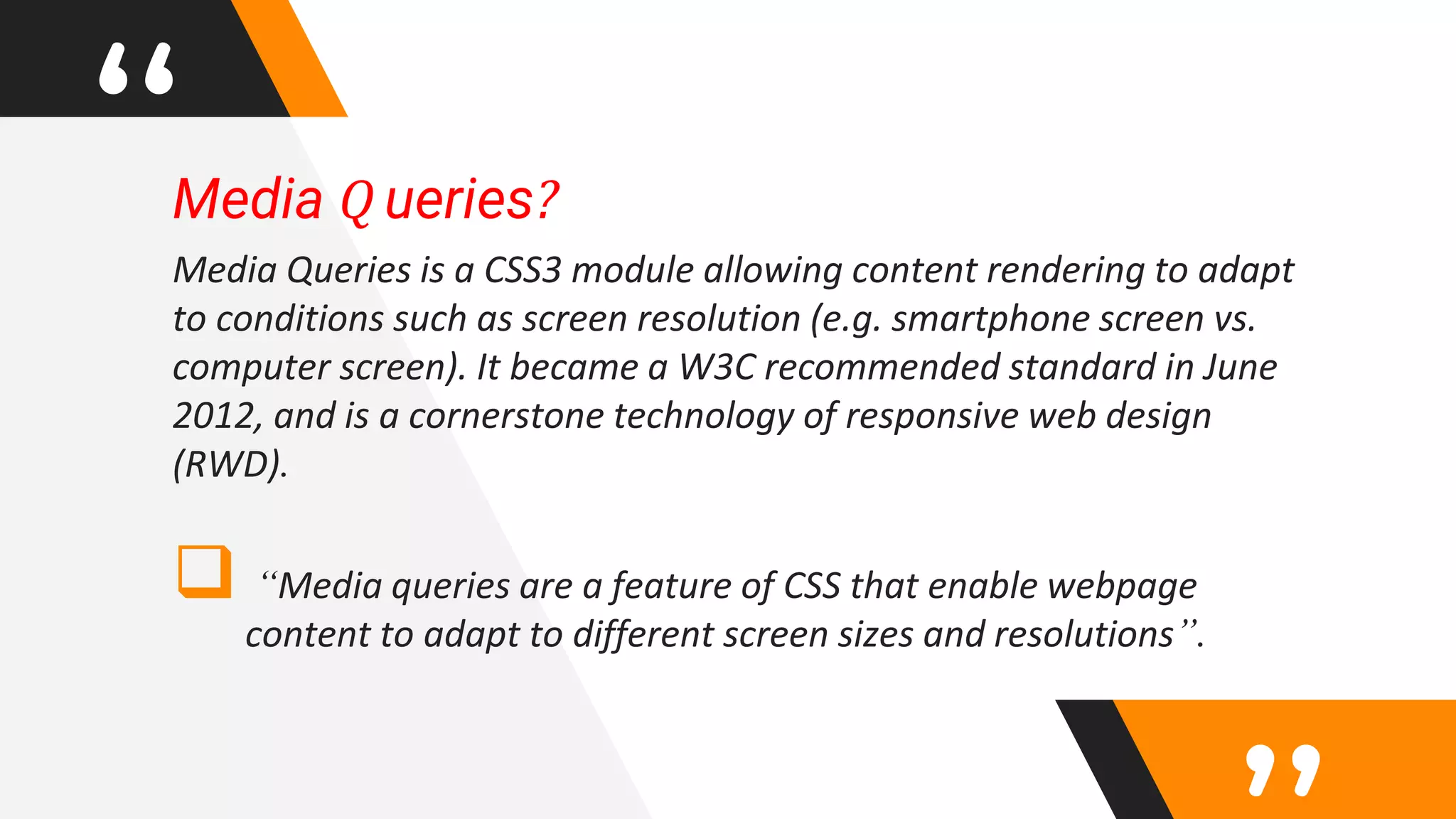
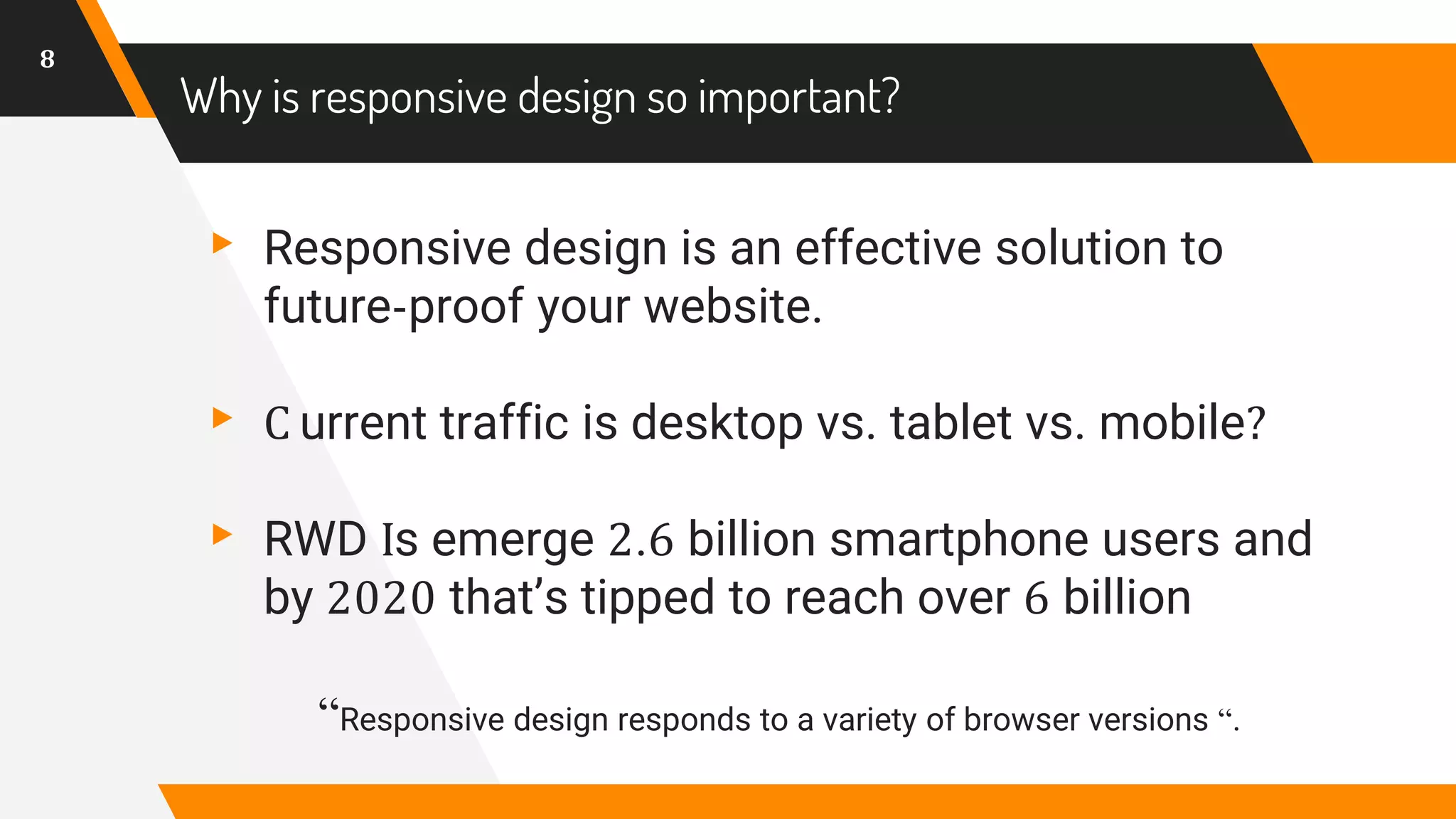


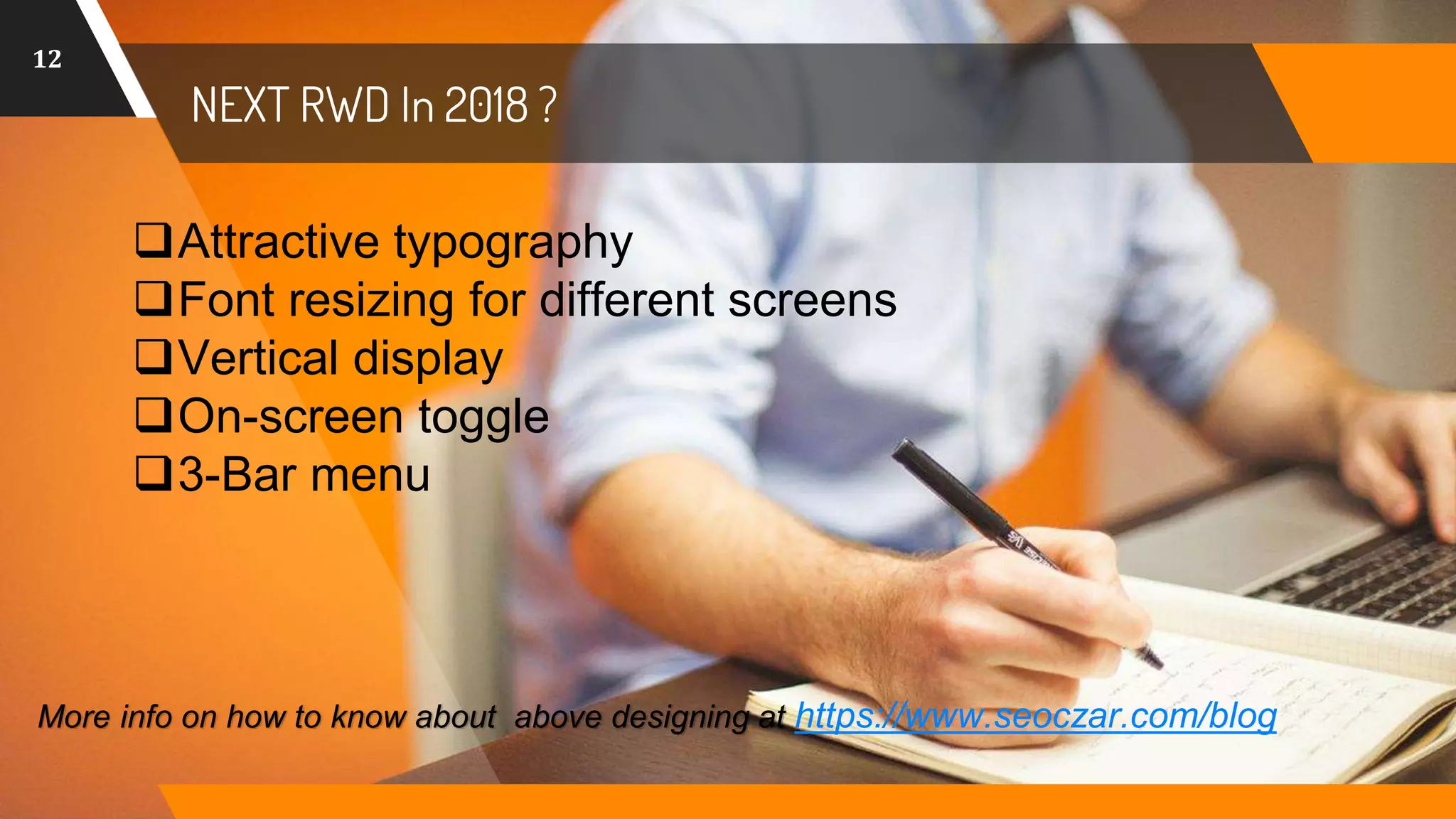


The document discusses responsive web design (RWD), emphasizing its importance for optimal website functionality across various devices through techniques like media queries. It highlights the significance of having a single URL and codebase that adjusts for different screen sizes, making it crucial for designers to adapt to changing user needs. The text also outlines trends for RWD in 2018, such as attractive typography and adaptive layouts.


![Vibe Coding vs. Spec-Driven Development [Free Meetup]](https://cdn.slidesharecdn.com/ss_thumbnails/vibecodingvsspecdrivendevelopment-251209105622-43f455e7-thumbnail.jpg?width=640&height=640&fit=bounds)
