Download as PDF, PPTX


![<h1>
<a href="/">
<!--[if IE 8]><div class="logo-ie"></div><![endif]-->
<svg id="logo" version="1.1" xmlns="http://www.w3.org/2000/svg"
xmlns:xlink="http://www.w3.org/1999/xlink" viewBox="0 0 244 41"
style="enable-background:new 0 0 244 41;" xml:space="preserve">
<path fill="#FFFFFF"
d="M0,40.66h5.73V23.45h9.89v-5.44H5.73V5.78h11.35V0.34H0V40.66z
M34.72,0c-4.67,0-9.61,3.28-9.61,9.85v21.29
c0,6.57,4.95,9.85,9.61,9.85c4.67,0,9.61-3.28,9.61-9.85V9.85C44.33,3.28
,39.39,0,34.72,0z M38.6,31.15 c0,2.78-1.8,
4.08-3.88,.14c-4.78,0-8.6,3.96-8.6,8.78v3.17h5.73V8.66
c0-1.87,1.12-2.89,2.81-2.89c2.81,0,2.81,2.43,2.81,4.47c0,2.21,0,3.34-1
.01,5.32l-10.34,19.65v5.44h17.09v-5.78h-10.34
l8.43-16.37C225.32,15.06,225.43,14.04,225.43,10.14z
M238.27,0.34l-5.73-0.02v6.16l5.73-0.03v34.21H244V0.34H238.27z"></path>
</svg>
</a>
</h1>](https://image.slidesharecdn.com/therearenobutsinprogressiveenhancementredev-151106102141-lva1-app6892/75/There-Are-No-Buts-in-Progressive-Enhancement-Oredev-2015-84-2048.jpg)


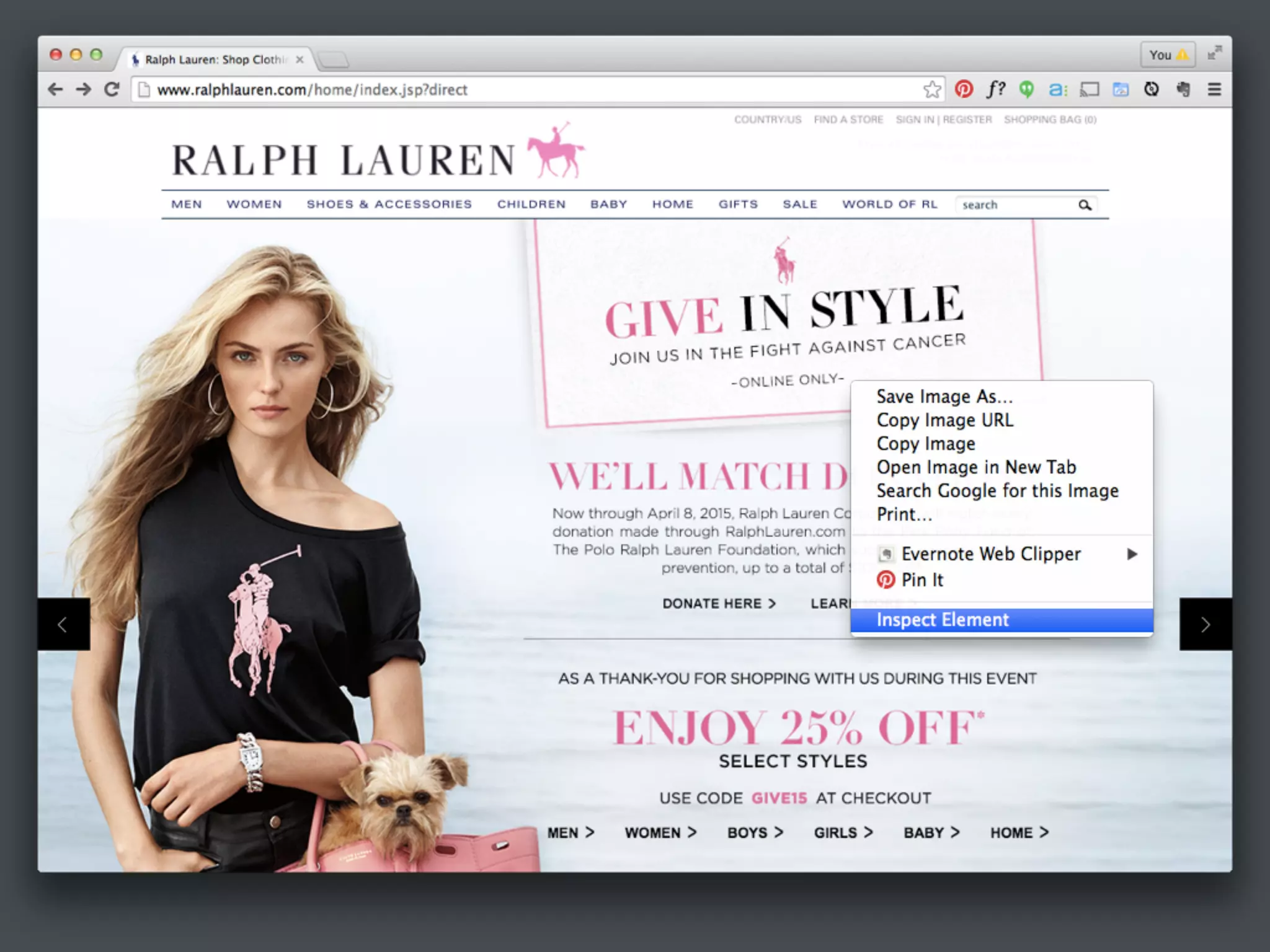


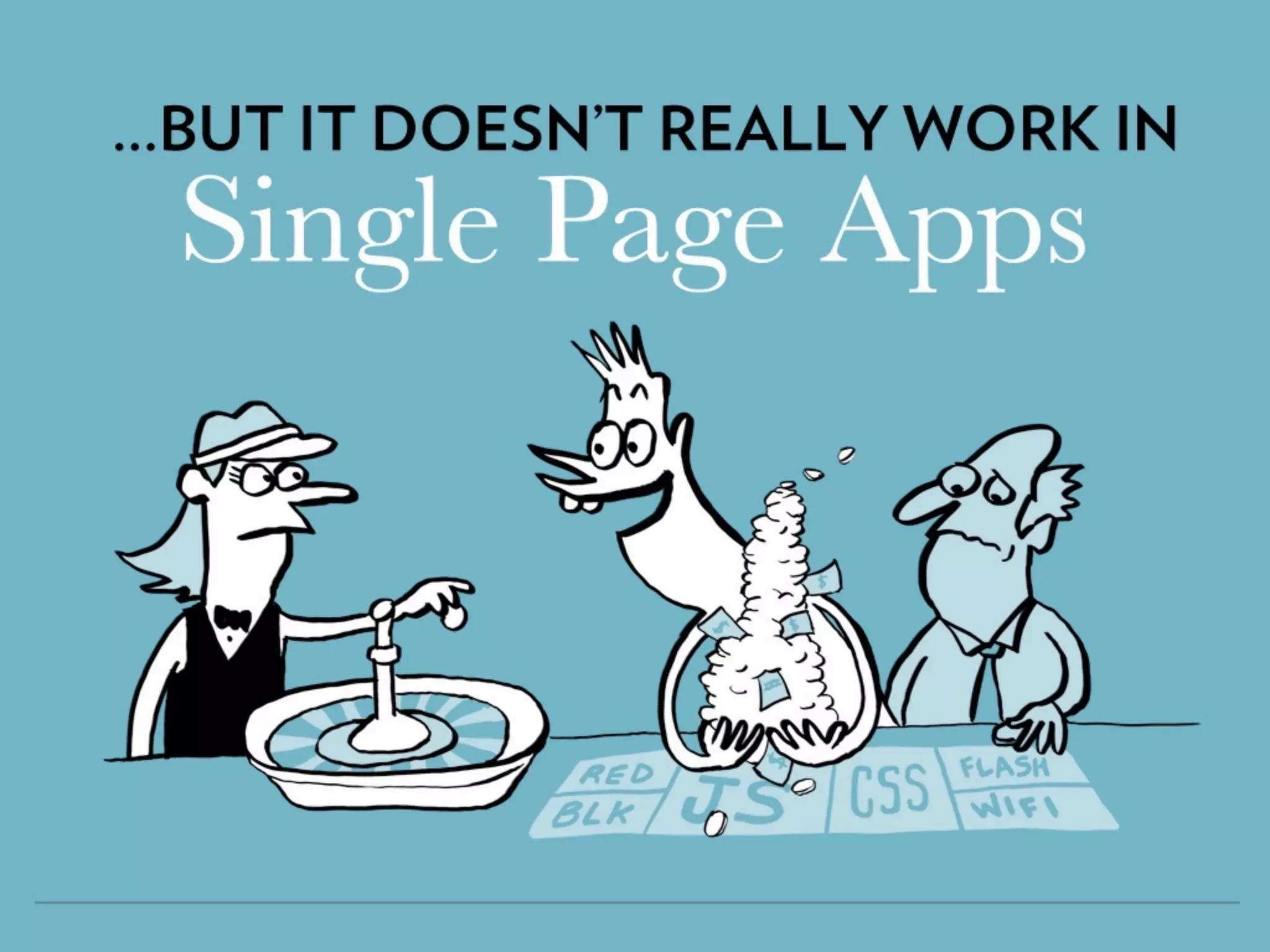


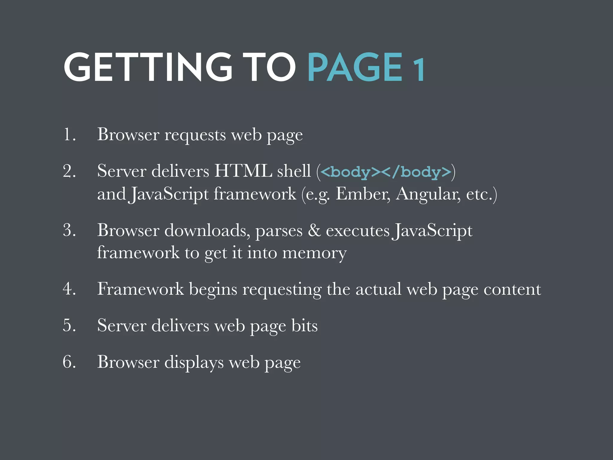

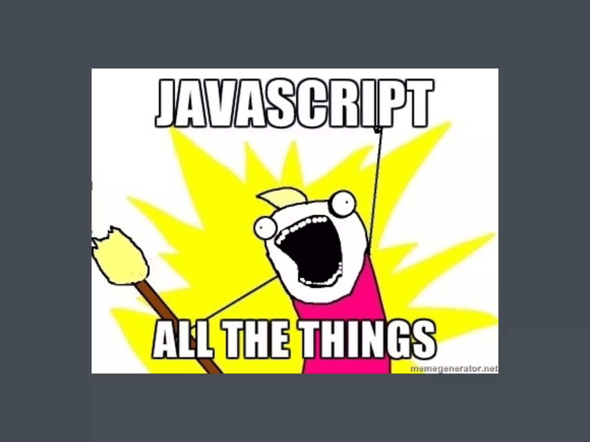


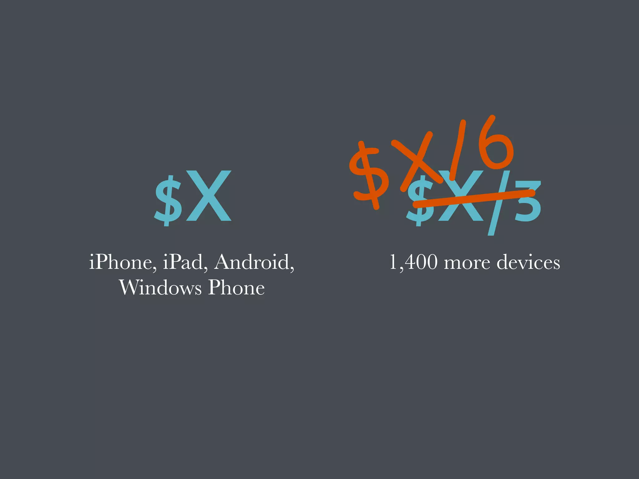

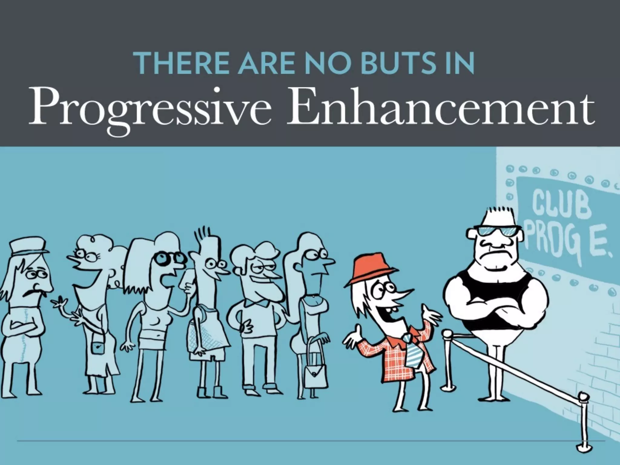
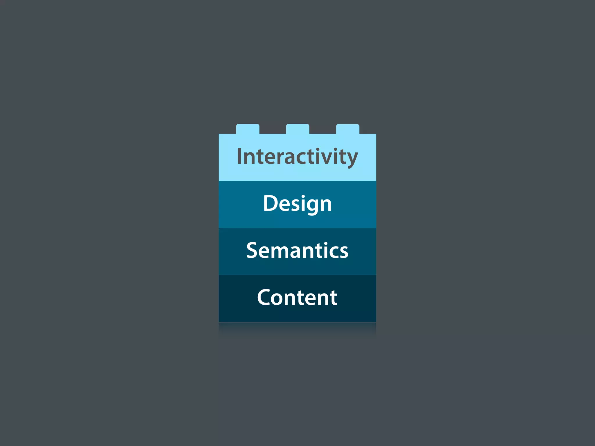
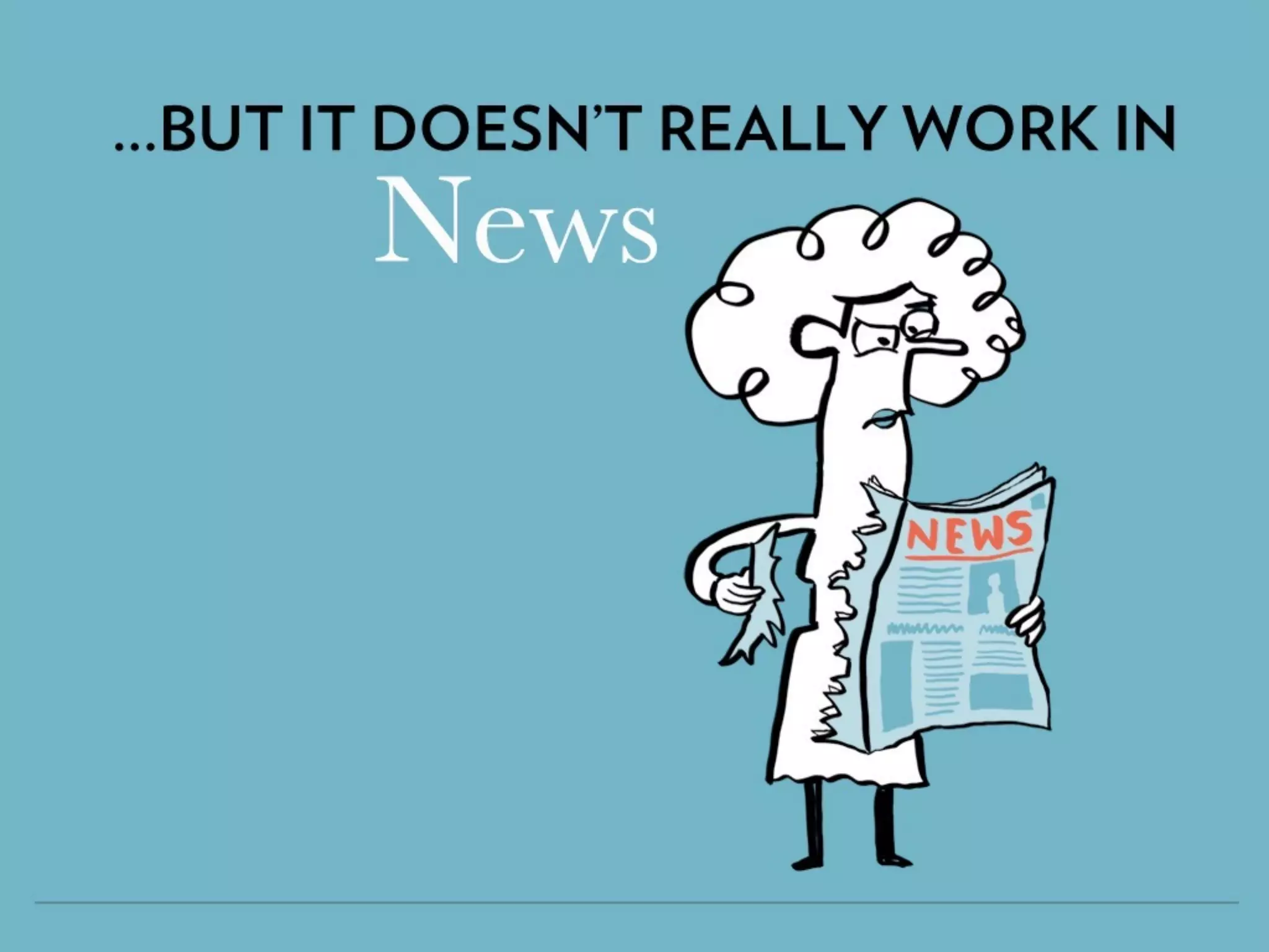
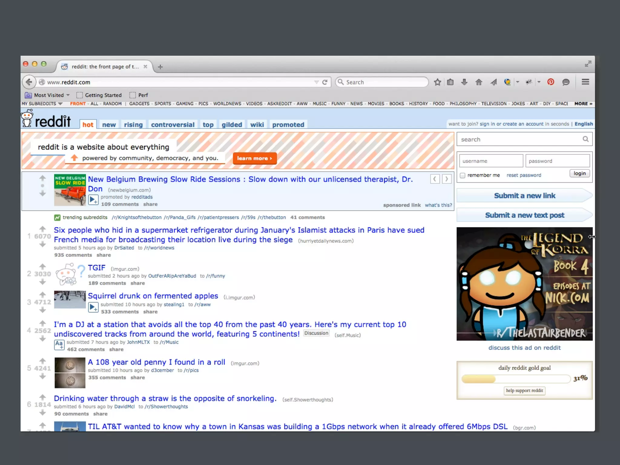
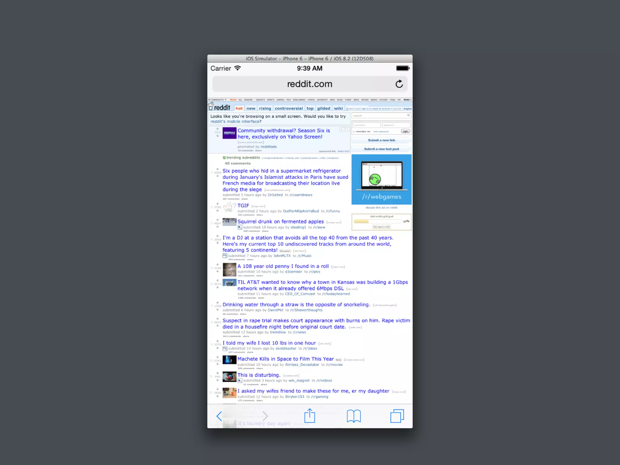
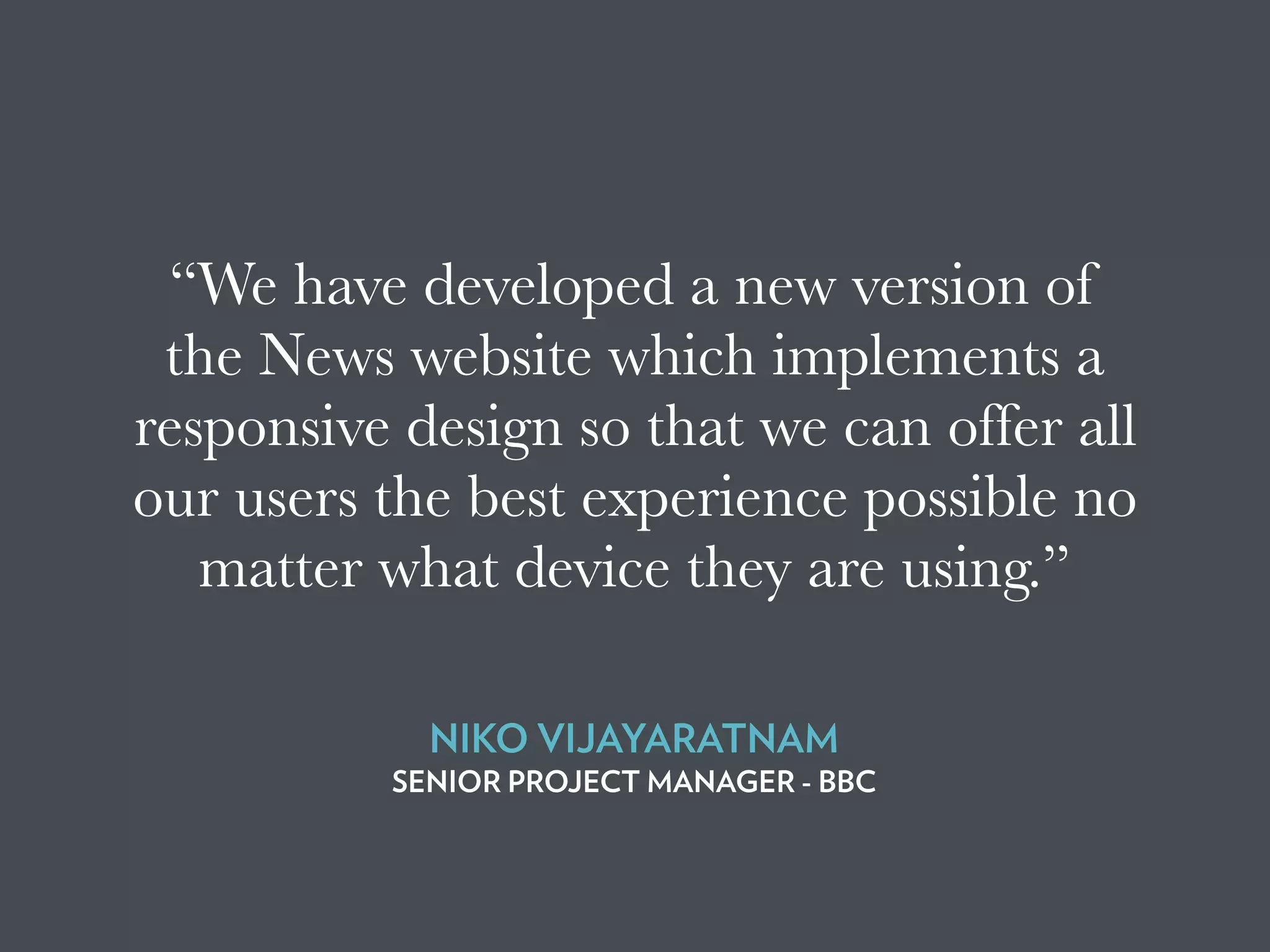
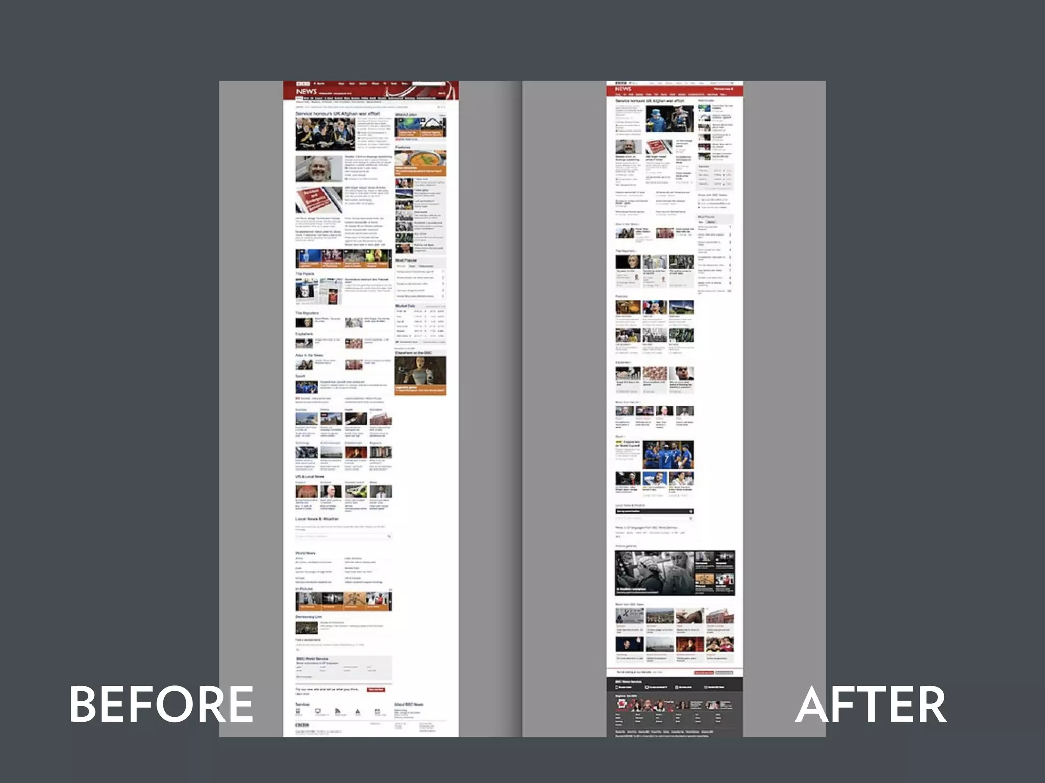
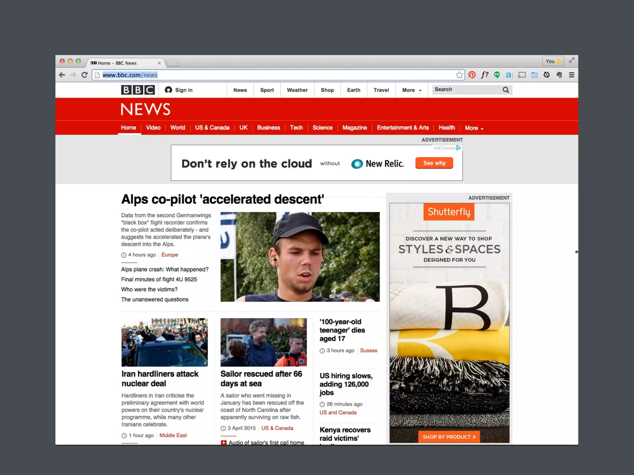
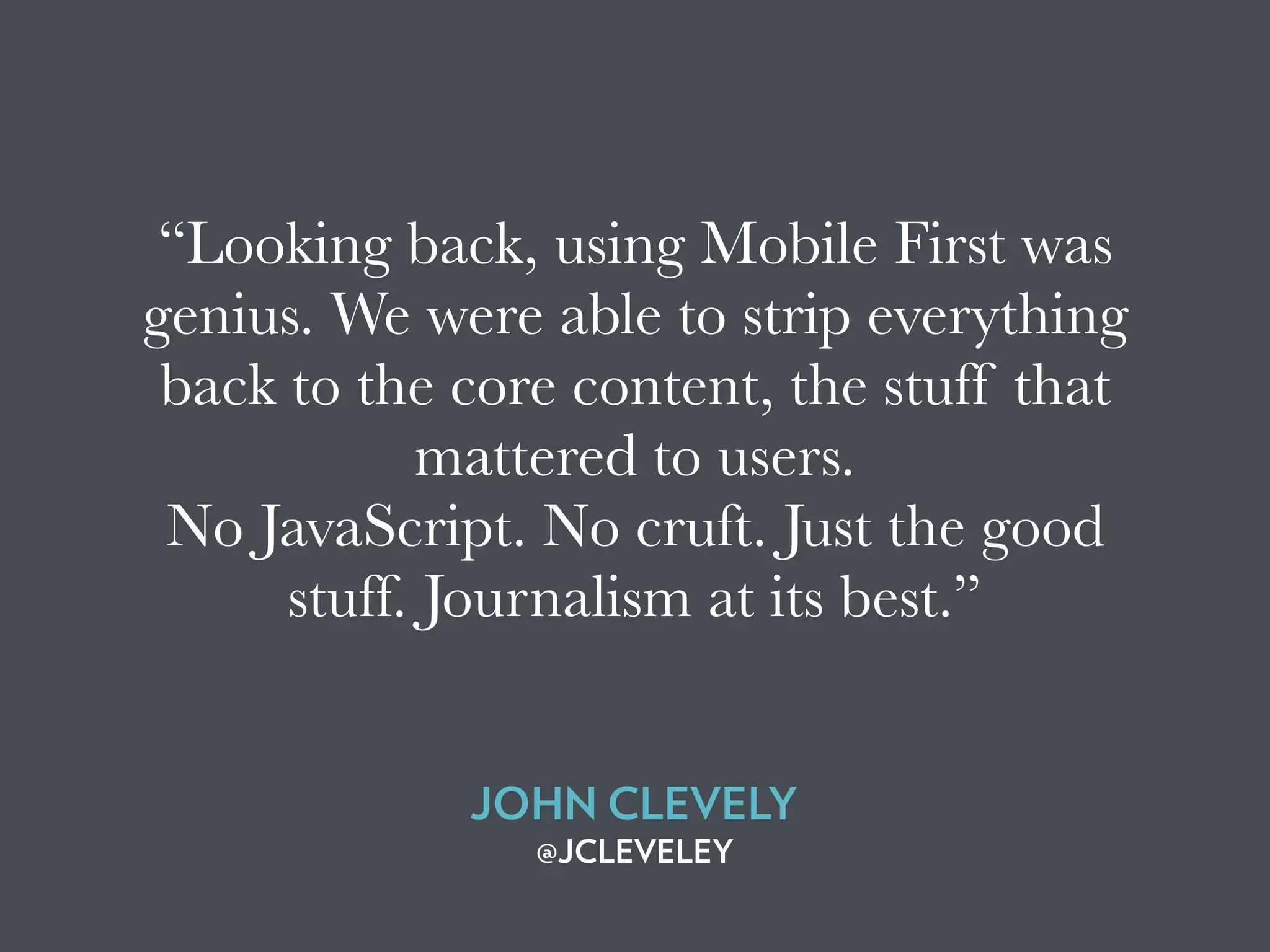
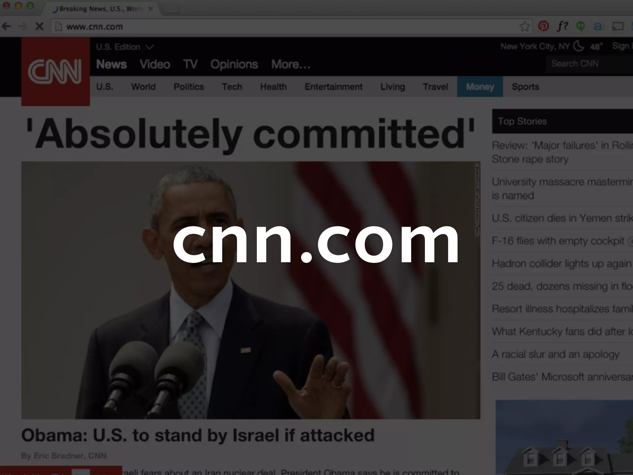
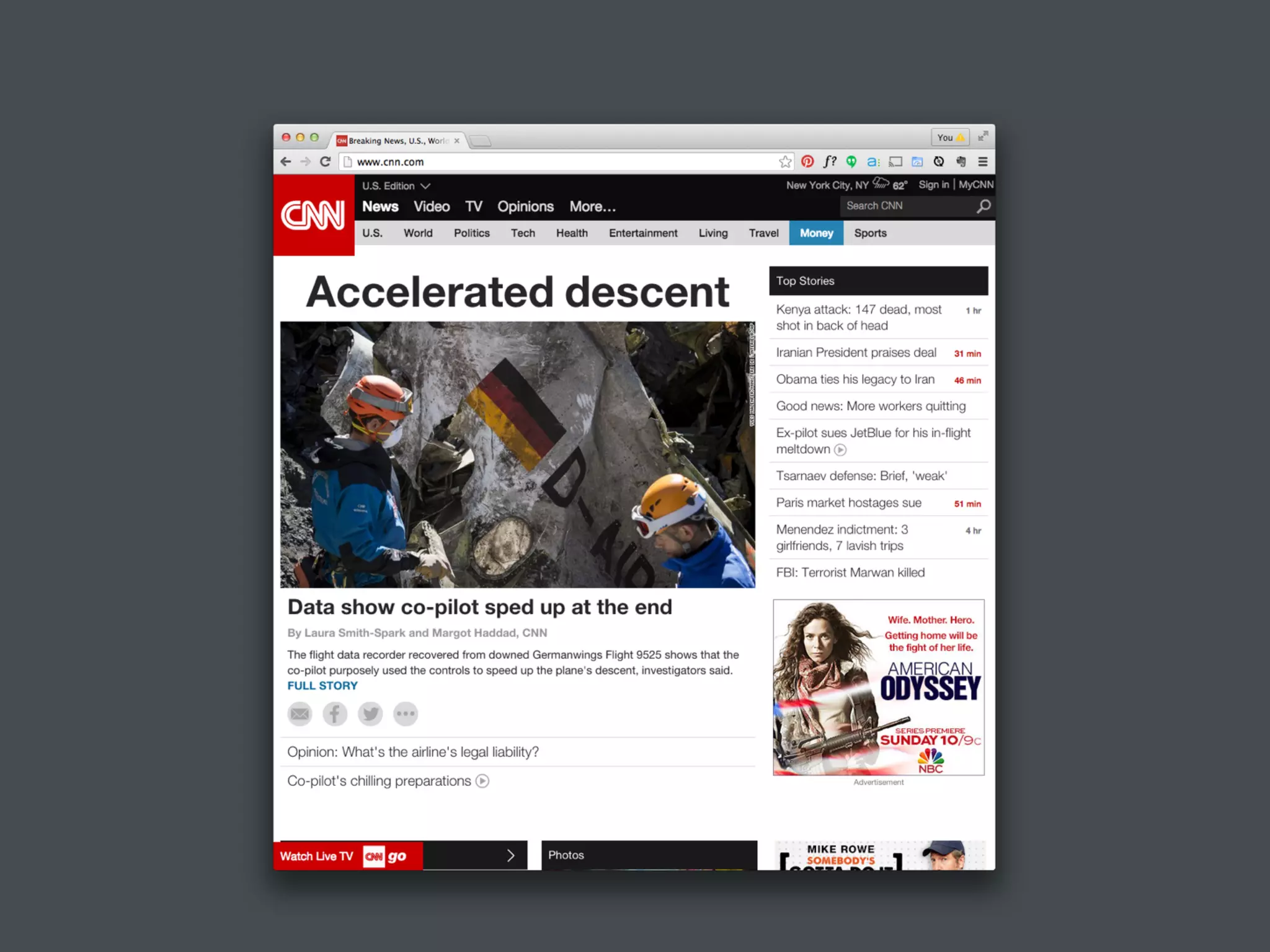
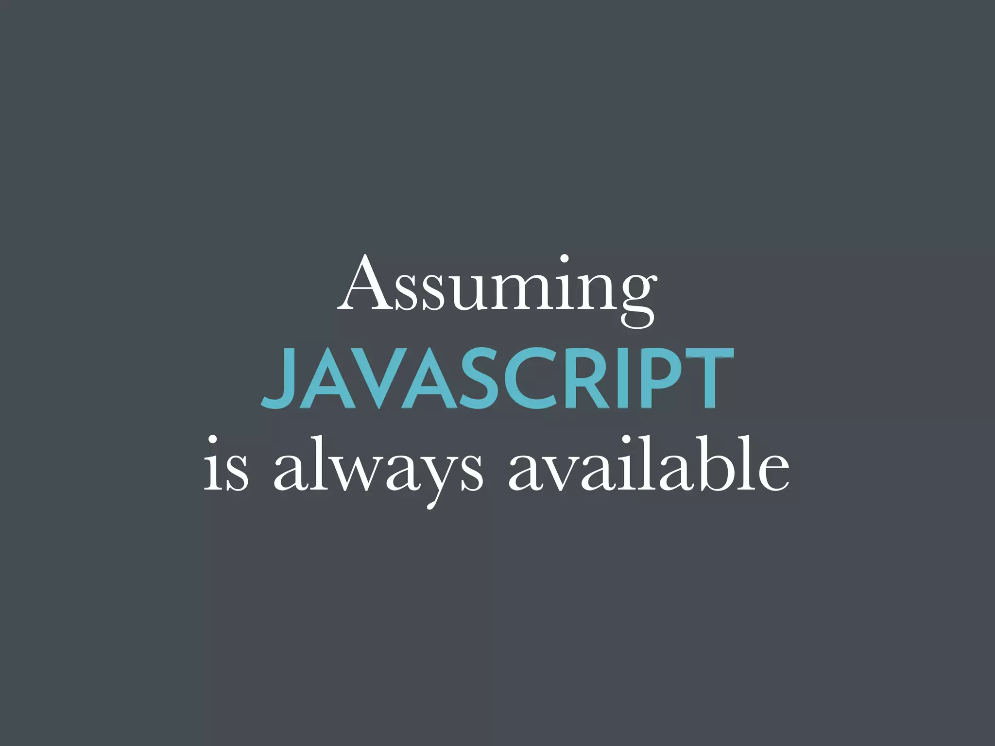
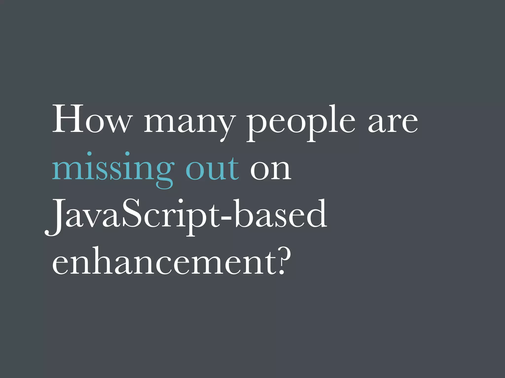
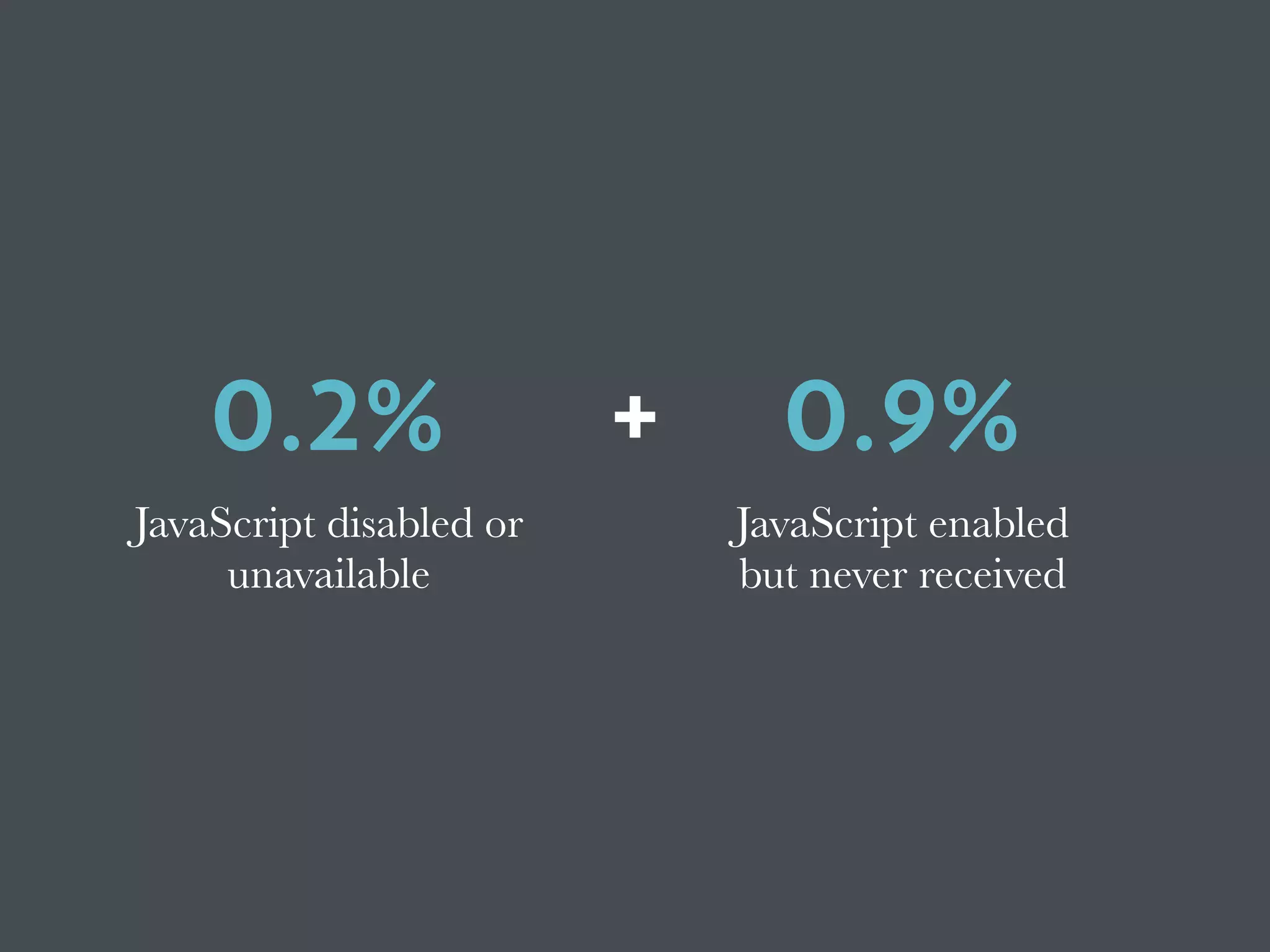
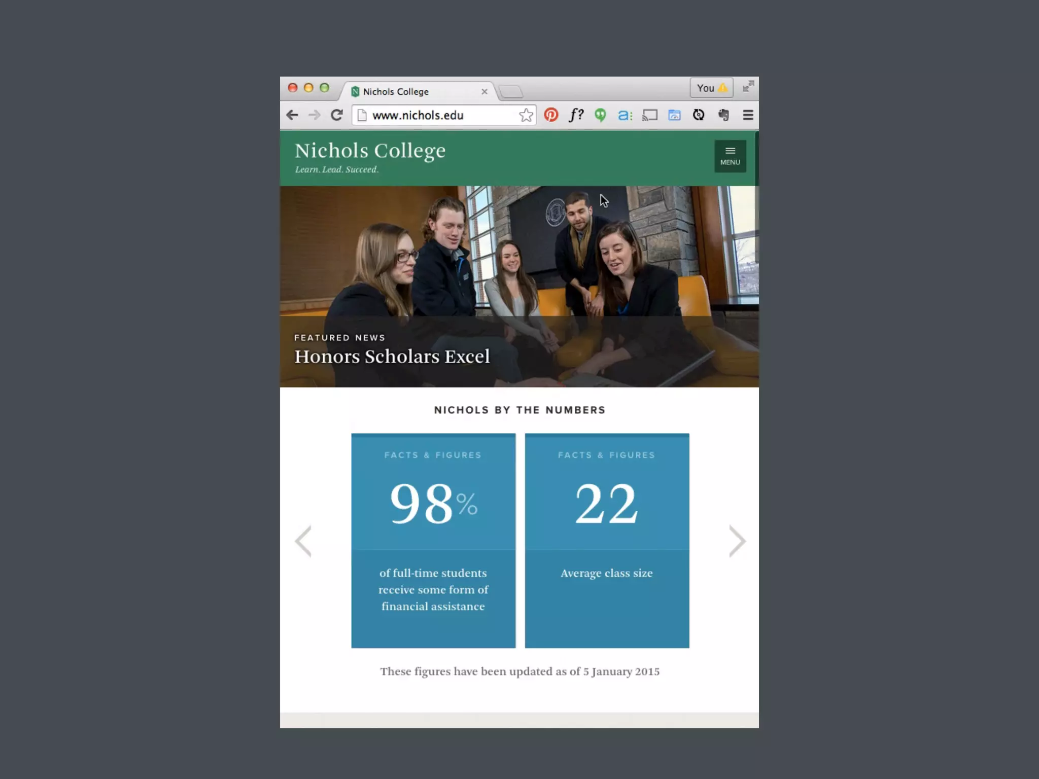
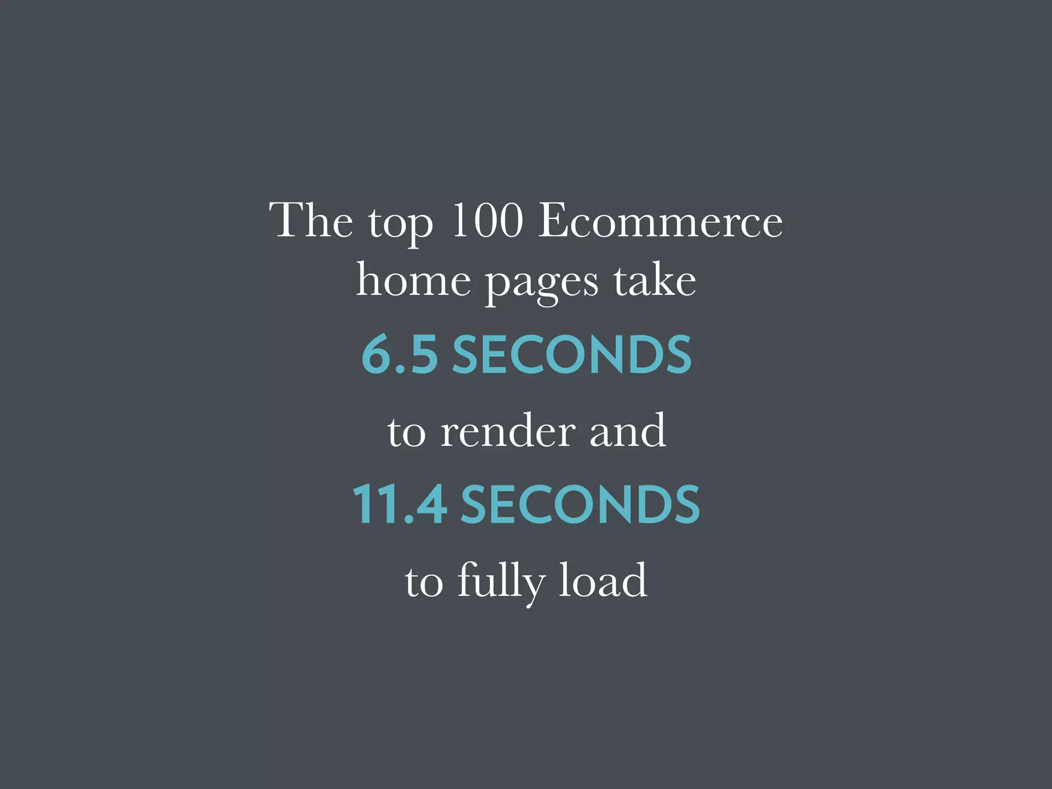
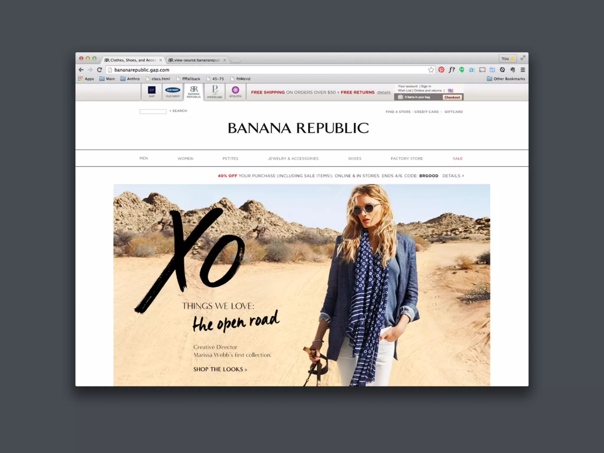
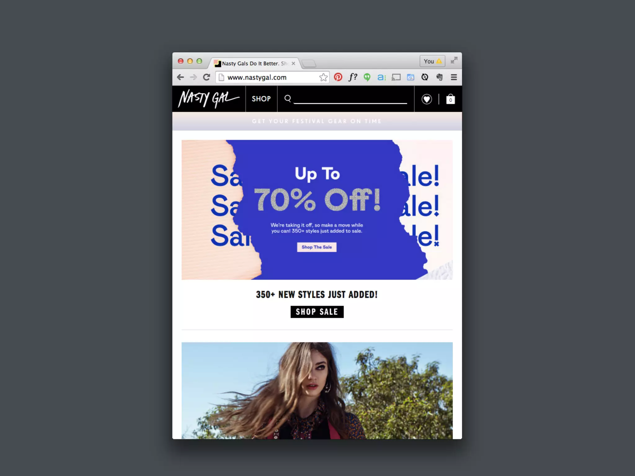
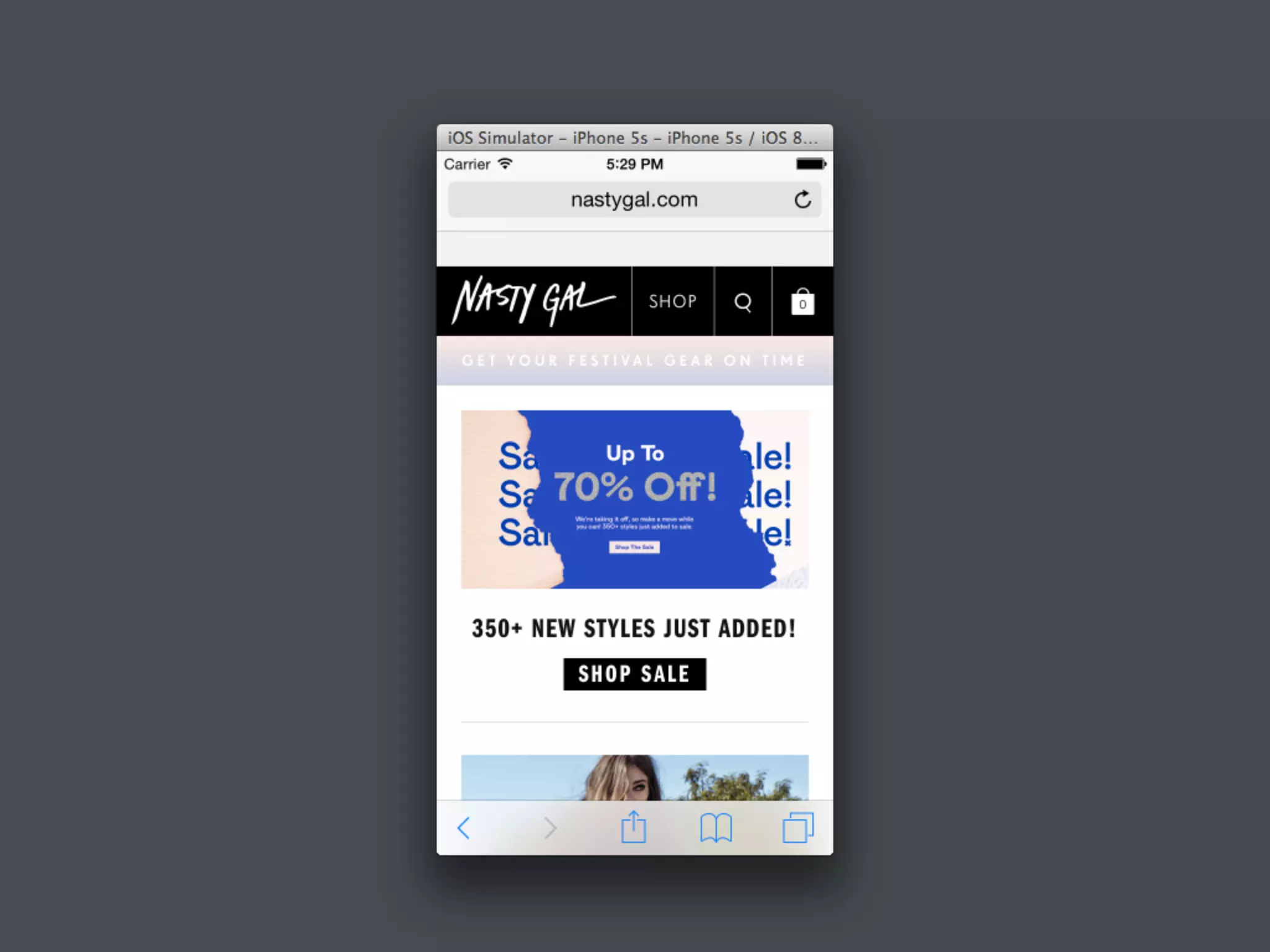
The document discusses the concept of progressive enhancement in web development, highlighting its importance in providing optimal user experience across various devices regardless of technological restrictions. It features examples from prominent organizations like BBC and CNN, emphasizing the benefits of mobile-first design, minimal reliance on JavaScript, and strategies for ensuring accessibility for users with different needs. Ultimately, it advocates for a more foundational approach to web design that enhances user experience without compromising content accessibility.
![Beyond Responsive [18F 2015]](https://cdn.slidesharecdn.com/ss_thumbnails/beyondresponsive18f2015-150812140602-lva1-app6891-thumbnail.jpg?width=640&height=640&fit=bounds)
![Planning Adaptive Interfaces [RWD Summit 2016]](https://cdn.slidesharecdn.com/ss_thumbnails/planningadaptiveinterfacesrwdsummit2016-160330235919-thumbnail.jpg?width=640&height=640&fit=bounds)


![Beyond Responsive [Web Design Day]](https://cdn.slidesharecdn.com/ss_thumbnails/beyondresponsive-webdesignday-150611184657-lva1-app6892-thumbnail.jpg?width=640&height=640&fit=bounds)


![Falling in Love with Forms [F0WD 2015]](https://cdn.slidesharecdn.com/ss_thumbnails/fallinginlovewithformsfowd2015-151103161415-lva1-app6892-thumbnail.jpg?width=640&height=640&fit=bounds)
![Falling in Love with Forms [Øredev 2015]](https://cdn.slidesharecdn.com/ss_thumbnails/fallinginlovewithformsredev2015-151106102126-lva1-app6892-thumbnail.jpg?width=640&height=640&fit=bounds)
![Ruining the User Experience [SXSW 2007]](https://cdn.slidesharecdn.com/ss_thumbnails/ruiningtheuserexperiencefinal-150528130049-lva1-app6891-thumbnail.jpg?width=640&height=640&fit=bounds)
![Designing the Conversation [SmashingConf 2016]](https://cdn.slidesharecdn.com/ss_thumbnails/designingtheconversationsmashingconf2016-160928152809-thumbnail.jpg?width=640&height=640&fit=bounds)
![Writing for Engagement [TechReady 22]](https://cdn.slidesharecdn.com/ss_thumbnails/writingforengagementtechready22-170111212357-thumbnail.jpg?width=640&height=640&fit=bounds)
![Designing the Conversation [SpeechTek 2016]](https://cdn.slidesharecdn.com/ss_thumbnails/designingtheconversationspeechtek2016-160525150459-thumbnail.jpg?width=640&height=640&fit=bounds)
![The Features of Highly Effective Forms [SmashingConf NYC 2016]](https://cdn.slidesharecdn.com/ss_thumbnails/thefeaturesofhighlyeffectiveformssmashingconfnyc2016-160615155113-thumbnail.jpg?width=640&height=640&fit=bounds)


![Beyond Responsive [Future of Web Design 2015]](https://cdn.slidesharecdn.com/ss_thumbnails/beyondresponsive-webdesignday-150611184657-lva1-app6892-151102130728-lva1-app6892-thumbnail.jpg?width=640&height=640&fit=bounds)

![Planning Adaptive Interfaces [EnhanceConf 2016]](https://cdn.slidesharecdn.com/ss_thumbnails/planningadaptiveinterfacesenhanceconf2016-160303145802-thumbnail.jpg?width=640&height=640&fit=bounds)


![Delivering Critical Information and Services [JavaScript & Friends 2021]](https://cdn.slidesharecdn.com/ss_thumbnails/deliveringcriticalinformationandservicesjavascriptfriends2021-210513212454-thumbnail.jpg?width=640&height=640&fit=bounds)
![Adapting to Reality [Guest Lecture, March 2021]](https://cdn.slidesharecdn.com/ss_thumbnails/adaptingtorealitybrowsertechnologiesguestlecture-210311215856-thumbnail.jpg?width=640&height=640&fit=bounds)
![Designing the Conversation [Beyond Tellerrand 2019]](https://cdn.slidesharecdn.com/ss_thumbnails/designingtheconversationbeyondtellerrand2019-191115005417-thumbnail.jpg?width=640&height=640&fit=bounds)
![Getting Started with Progressive Web Apps [Beyond Tellerrand 2019]](https://cdn.slidesharecdn.com/ss_thumbnails/gettingstartedwithprogressivewebapps-191113063610-thumbnail.jpg?width=640&height=640&fit=bounds)

![Media in the Age of PWAs [ImageCon 2019]](https://cdn.slidesharecdn.com/ss_thumbnails/mediaintheageofpwasimagecon2019-190502180729-thumbnail.jpg?width=640&height=640&fit=bounds)
![Adapting to Reality [Starbucks Lunch & Learn]](https://cdn.slidesharecdn.com/ss_thumbnails/adaptingtorealitystarbuckslunchlearn-190327234123-thumbnail.jpg?width=640&height=640&fit=bounds)
![Conversational Semantics for the Web [CascadiaJS 2018]](https://cdn.slidesharecdn.com/ss_thumbnails/conversationalsemanticsfortheweb-181116232055-thumbnail.jpg?width=640&height=640&fit=bounds)
![Better Performance === Greater Accessibility [Inclusive Design 24 2018]](https://cdn.slidesharecdn.com/ss_thumbnails/betterperformancegreateraccessibility-181113020711-thumbnail.jpg?width=640&height=640&fit=bounds)
![PWA: Where Do I Begin? [Microsoft Ignite 2018]](https://cdn.slidesharecdn.com/ss_thumbnails/pwa-wheredoibeginmicrosoftignite2018-180928155323-thumbnail.jpg?width=640&height=640&fit=bounds)
![Designing the Conversation [Concatenate 2018]](https://cdn.slidesharecdn.com/ss_thumbnails/designingtheconversationconcatenate2018-180810154426-thumbnail.jpg?width=640&height=640&fit=bounds)
![Designing the Conversation [Accessibility DC 2018]](https://cdn.slidesharecdn.com/ss_thumbnails/designingtheconversationaccessibilitydc2018-180806175332-thumbnail.jpg?width=640&height=640&fit=bounds)
![Performance as User Experience [AEADC 2018]](https://cdn.slidesharecdn.com/ss_thumbnails/performanceasuserexperienceaeadc2018-180806174424-thumbnail.jpg?width=640&height=640&fit=bounds)

![Performance as User Experience [AEA SEA 2018]](https://cdn.slidesharecdn.com/ss_thumbnails/performance-as-user-experience-180409182414-thumbnail.jpg?width=640&height=640&fit=bounds)
![Performance as User Experience [An Event Apart Denver 2017]](https://cdn.slidesharecdn.com/ss_thumbnails/performanceasuserexperienceaeaden2017-171212234737-thumbnail.jpg?width=640&height=640&fit=bounds)


![Designing the Conversation [Paris Web 2017]](https://cdn.slidesharecdn.com/ss_thumbnails/designingtheconversationparisweb-171011181500-thumbnail.jpg?width=640&height=640&fit=bounds)
![Exploring Adaptive Interfaces [Generate 2017]](https://cdn.slidesharecdn.com/ss_thumbnails/exploringadaptiveinterfacesgenerate2017-170922213042-thumbnail.jpg?width=640&height=640&fit=bounds)


![[BROCHURE] Italy Tour Project | @SlideON](https://cdn.slidesharecdn.com/ss_thumbnails/brochure8-251215152319-2805af68-thumbnail.jpg?width=640&height=640&fit=bounds)


