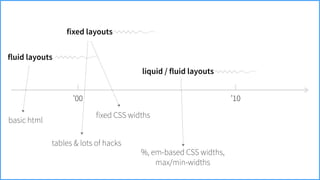
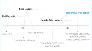
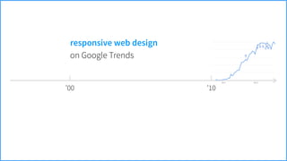
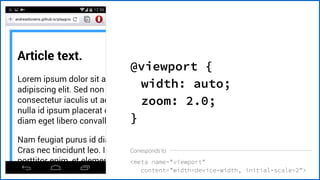
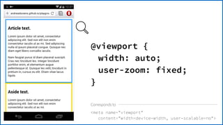
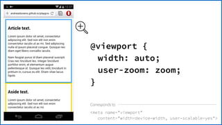
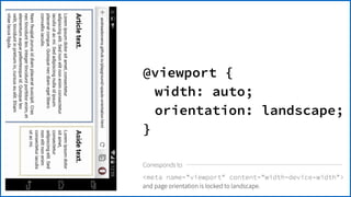
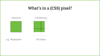
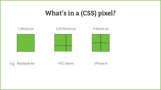
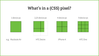
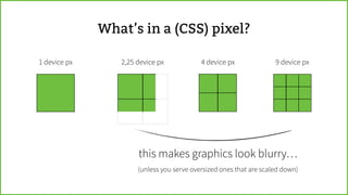
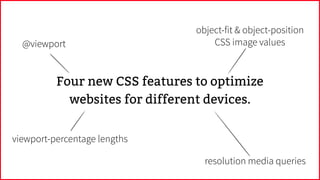
Intro to @viewport & other new
Responsive Web Design CSS features
Andreas Bovens | Opera Software | @andreasbovens | #SOTB4
What have we been up to?
Opera for Android
phones & tablets
Opera for
Windows & Mac
Opera Mini for
Java & BlackBerry
Opera Max for Android
http://operasoftware.github.io/upstreamtools/
Four new CSS features to optimize
websites for different devices.
Four new CSS features to optimize
websites for different devices.
@viewport
viewport-percentage lengths
resolution media queries
object-fit & object-position
CSS image values
’00
How did we get here?
’10
’00
fluid layouts
basic html
’10
’00
fluid layouts
fixed layouts
basic html
tables & lots of hacks
’10
’00
fluid layouts
fixed layouts
basic html
tables & lots of hacks
fixed CSS widths
’10
’00
fluid layouts
fixed layouts
liquid / fluid layouts
basic html
tables & lots of hacks
fixed CSS widths
%, em-based CSS widths, 

max/min-widths
’10
’00
fluid layouts
fixed layouts
liquid / fluid layouts
responsive web design
basic html
tables & lots of hacks
fixed CSS widths
%, em-based CSS widths, 

max/min-widths
%, em-based CSS widths, 

max/min-widths,
media queries and more
’10
responsive web designexample
’00 ’10
on Google Trends
responsive web design
’00 ’10
but interestingly enough, it’s not such a new idea…
on Google Trends
responsive web design
Karl Gerstner
“Programme entwerfen”
’64
“Gerstner defined a design “programme” as a set of rules for constructing a
range of visual solutions. Connecting his methodology with the new field of
computer programming, Gerstner presented examples of computer-
generated patterns that were made by mathematically describing visual
elements and combining them according to simple rules.”
!
— Ellen Lupton, Thinking with Type (2nd edition), 2010, Princeton Architectural Press, p165
Karl Gerstner, Programme entwerfen, 2007. Copyright 2007 Lars Müller Publishers — used with kind permission.
FFWD to today
Image from http://www.html5rocks.com/en/tutorials/tooling/synchronized-cross-device-testing/ by Addy Osmani for HTML5 Rocks. CC-BY 3.0.
media queries + meta viewport
article, aside {width: 100%;}
@media screen and (min-width: 480px) {
article {float: left; width: 68%;}
aside {float: right; width: 30%;}
}
@media screen and (min-width: 800px) {
article {padding: 20px;}
}
Dealbreaker…
Dealbreaker…
Mobile browsers apply a default
zoom to deal with legacy web
pages…
Dealbreaker…
Mobile browsers apply a default
zoom to deal with legacy web
pages…
Dealbreaker…
Mobile browsers apply a default
zoom to deal with legacy web
pages…
Triggering “wrong” media queries…
to the rescuemeta viewport
<meta name="viewport"
content="width=device-width">
to the rescuemeta viewport
<meta name="viewport"
content="width=device-width">
article, aside {width: 100%;}
@media screen and (min-width: 480px) {
article {float: left; width: 68%;}
aside {float: right; width: 30%;}
}
@media screen and (min-width: 800px) {
article {padding: 20px;}
}
meta viewportmedia queries +
<meta name="viewport"
content="width=device-width">
applied on screens
with width >= 800px
article, aside {width: 100%;}
@media screen and (min-width: 480px) {
article {float: left; width: 68%;}
aside {float: right; width: 30%;}
}
@media screen and (min-width: 800px) {
article {padding: 20px;}
}
meta viewportmedia queries +
<meta name="viewport"
content="width=device-width">
applied on screens
with width < 800px
article, aside {width: 100%;}
@media screen and (min-width: 480px) {
article {float: left; width: 68%;}
aside {float: right; width: 30%;}
}
@media screen and (min-width: 800px) {
article {padding: 20px;}
}
meta viewportmedia queries +
<meta name="viewport"
content="width=device-width">
applied on screens
with width < 480px
article, aside {width: 100%;}
@media screen and (min-width: 480px) {
article {float: left; width: 68%;}
aside {float: right; width: 30%;}
}
@media screen and (min-width: 800px) {
article {padding: 20px;}
}
meta viewportmedia queries +
<meta name="viewport"
content="width=device-width">
by setting 1:1 zoom,
media queries are
triggered as intended!
article, aside {width: 100%;}
@media screen and (min-width: 480px) {
article {float: left; width: 68%;}
aside {float: right; width: 30%;}
}
@media screen and (min-width: 800px) {
article {padding: 20px;}
}
meta viewportmedia queries +
After it was introduced in Safari, support for
viewport meta also landed in Opera,
Android browser, Firefox, Chrome, etc.
meta viewport
nice, but it’s not a real standard…
Safari had a long-time, infamous
scaling bug when changing orientation.
it’snota
realstandard…
Browser makers have to support both
comma & semicolon delimiters as everyone
mixes them up.
;
it’snota
realstandard…
Certain viewport edge cases are handled
differently by each browser.
it’snota
realstandard…
Certain properties are not supported
everywhere:
e.g. user-scalable=yes|no
it’snota
realstandard…
Android browser (& later Opera) added a
target-densitydpi property, which
was later discontinued.
it’snota
realstandard…
Internet Explorer interpretes
width=device-width as
width=320 for compatibility reasons.
it’snota
realstandard…
Safari on iPad applies a 1.333× zoom in
landscape mode even although
width=device-width is set.
it’snota
realstandard…
width=device-width, initial-scale=1
forces a 1× zoom. Say what?
it’snota
realstandard…Safari on iPad applies a 1.333× zoom in
landscape mode even although
width=device-width is set.
And when we thought things were
stable, Safari introduced a new,
minimal-ui property.
it’snota
realstandard…
You get the idea…
it’snota
realstandard…
So, we thought (in 2011):
Why not make a CSS spec for this?
Yes,
 CSS,
 because
 it’s
 layout!
So, we thought (in 2011):
Why not make a CSS spec for this?
CSS Device Adaptation / @viewport
Yes,
 CSS,
 because
 it’s
 layout!
So, we thought (in 2011):
Why not make a CSS spec for this?
http://dev.w3.org/csswg/css-device-adapt/
meta name=viewport content=width=device-width
@viewport {
width: auto;
}
Corresponds to
meta name=viewport
content=width=device-width, initial-scale=2
@viewport {
width: auto;
zoom: 2.0;
}
Corresponds to
meta name=viewport
content=width=device-width, user-scalable=no
@viewport {
width: auto;
user-zoom: fixed;
}
Corresponds to
meta name=viewport
content=width=device-width, user-scalable=yes
@viewport {
width: auto;
user-zoom: zoom;
}
Corresponds to
for widths up to 400px:
meta name=viewport content=width=400
for widths larger than 400px:
meta name=viewport content=width=device-width
Corresponds to
@viewport {
width: 400px auto;
}
meta name=viewport content=width=device-width
and page orientation is locked to landscape.
@viewport {
width: auto;
orientation: landscape;
}
Corresponds to
To try it out, turn on “experimental
web platform features” in
opera:flags or chrome:flags.
resolution media queries
https://en.wikipedia.org/wiki/List_of_displays_by_pixel_density
What’s in a (CSS) pixel?
1 device px
What’s in a (CSS) pixel?
Macbook Aire.g.
1 device px 2,25 device px
What’s in a (CSS) pixel?
Macbook Aire.g. HTC Desire
1 device px 2,25 device px 4 device px
What’s in a (CSS) pixel?
Macbook Aire.g. HTC Desire iPhone 4
1 device px 2,25 device px 4 device px 9 device px
What’s in a (CSS) pixel?
Macbook Aire.g. HTC Desire iPhone 4 HTC One
1 device px 2,25 device px 4 device px 9 device px
What’s in a (CSS) pixel?
this makes graphics look blurry…
(unless you serve oversized ones that are scaled down)
1 device px 2,25 device px 4 device px 9 device px
this makes graphics look blurry…
(responsive image spec)
hence:
1 device px 2,25 device px 4 device px 9 device px
this makes graphics look blurry…
resolution media queries
hence:
(responsive image spec)
1 device px 2,25 device px 4 device px 9 device px
1 dppx 1,5 dppx 2 dppx 3 dppx
What’s in a (CSS) pixel?
(can) use dots per ‘px’ unitsresolution media queries
body {background: url(bg.png) 0 0 repeat;}
@media (screen and min-resolution: 2dppx) {
body {background-size: 50% !important;}
}
@media (screen and min-resolution: 3dppx) {
body {background-size: 33.3% !important;}
}
resolution media queries
body {background: url(bg.png) 0 0 repeat;}
@media (screen and min-resolution: 2dppx) {
body {background-size: 50% !important;}
}
@media (screen and min-resolution: 3dppx) {
body {background-size: 33.3% !important;}
}
resolution media queries
Pattern from http://subtlepatterns.com/tree-bark/ by Getdiscount. CC-BY-SA 2.0.
body {background: url(bg.png) 0 0 repeat;}
@media (screen and min-resolution: 2dppx) {
body {background-size: 50% !important;}
}
@media (screen and min-resolution: 3dppx) {
body {background-size: 33.3% !important;}
}
resolution media queries
body {background: url(bg.png) 0 0 repeat;}
@media (screen and min-resolution: 2dppx) {
body {background-size: 50% !important;}
}
@media (screen and min-resolution: 3dppx) {
body {background-size: 33.3% !important;}
}
resolution media queries
Very useful to optimize background
graphics and other resources for hi-dpi
screens.
If this looks familiar…
It’s very similar to device-pixel-ratio,
but resolution is standardized, and
comes without quirky vendor prefixes.
!
However, for now, use both…
http://www.w3.org/TR/css3-values/#resolutionhttp://www.w3.org/TR/css3-mediaqueries/#resolution
object-fit  object-position CSS image values
Photo from https://secure.flickr.com/photos/61508583@N02/10873650644/ by Butz.2013. CC-BY 2.0.
eh…
img {
object-fit: fill;
}
img {
object-fit: contain;
}
img {
object-fit: cover;
overflow: hidden;
}
img {
object-fit: cover;
overflow: hidden;
object-position: 20% 50%;
}
img {
object-fit: cover;
overflow: hidden;
object-position: 60% 50%;
}
Very useful to make small adjustments to images.
Note: there is some overlap here with responsive
image use cases. Best practices need to emerge.
http://dev.w3.org/csswg/css-images-3/#the-object-fit
viewport-percentage lengths
100 × 100

Intro to @viewport & other new Responsive Web Design CSS features