Downloaded 301 times


![Build Mobile Web with HTML5
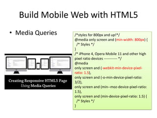
• CSS Reset
-webkit-text-size-adjust: none;
-webkit-user-select: none;
-webkit-touch-callout;
-webkit-tap-highlight-color: transparent;
audio, canvas, video { display: inline-
block;
}
article, aside, details, figcaption, figure,
footer, header, hgroup, nav, section {
display: block; }
input[type="search"]{ -webkit-
appearance: none/textfield;}](https://image.slidesharecdn.com/html5onmobilefordeveloper-120302031517-phpapp01/85/Html5-on-Mobile-For-Developer-12-320.jpg)
![Build Mobile Web with HTML5
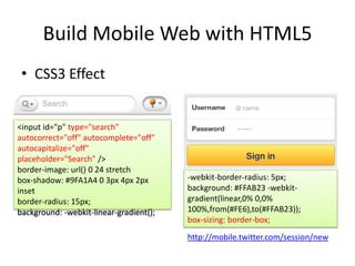
• Advanced Forms in Mobile
<input type="number" pattern="[0-9]*" />
<input type="email” required />
<input type="url" />
<input type="tel" />
<input type="time" />
<input type="date" />
<input type="month" />
<input type="week" />
<input type="datetime" />
<input type="datetime-local" />
<input type="color" />
http://jquerymobile.com/demos/1.1.0-
rc.1/docs/forms/textinputs/](https://image.slidesharecdn.com/html5onmobilefordeveloper-120302031517-phpapp01/85/Html5-on-Mobile-For-Developer-16-320.jpg)


The document discusses building mobile web applications using HTML5. It covers topics like HTML5 features that are well supported on mobile browsers like forms, communication, canvas, geolocation, audio and video. It provides examples of using CSS3 for styling, animation and media queries for responsive design. It also discusses utilizing HTML5 APIs for advanced interactions, graphics, offline support, performance and accessing device capabilities.


![Upload[1]](https://cdn.slidesharecdn.com/ss_thumbnails/upload1-150713003350-lva1-app6892-thumbnail.jpg?width=640&height=640&fit=bounds)

![Planning Adaptive Interfaces [RWD Summit 2016]](https://cdn.slidesharecdn.com/ss_thumbnails/planningadaptiveinterfacesrwdsummit2016-160330235919-thumbnail.jpg?width=640&height=640&fit=bounds)
![Beyond Responsive [18F 2015]](https://cdn.slidesharecdn.com/ss_thumbnails/beyondresponsive18f2015-150812140602-lva1-app6891-thumbnail.jpg?width=640&height=640&fit=bounds)