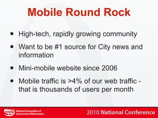
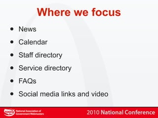
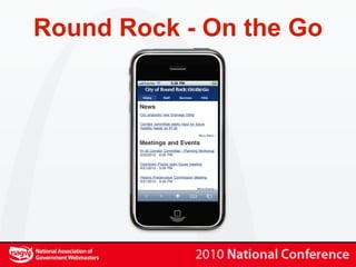
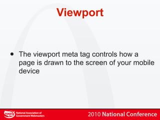
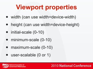
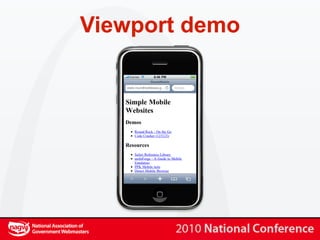
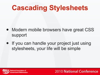
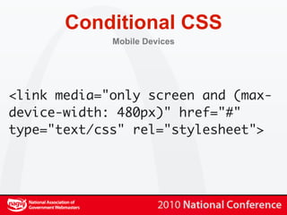
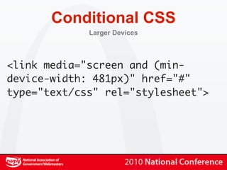
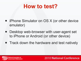
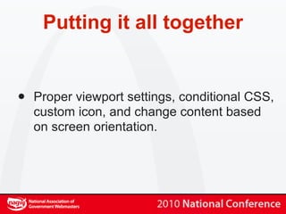
Brooks Bennett City of Round Rock


Simple Mobile Websites
    Taking your message on the road
What we will cover

•   Go over basic details specific to mobile
    web development, focusing on iPhone and
    Android

•   Play with some source code to see how
    simple this stuff really is

•   Put it all together into one final, fun demo
Mobile in the USA

•   More than 50 million smart-phones in use
    in USA at the end of 2009

•   No signs of slowdown in mobile data
    usage growth

•   Is mobile important? Yes, that is why you
    are here...
Mobile Round Rock
•   High-tech, rapidly growing community

•   Want to be #1 source for City news and
    information

•   Mini-mobile website since 2006

•   Mobile traffic is >4% of our web traffic -
    that is thousands of users per month
Why keep it simple?
•   Limited processors and limited connection
    speeds mean you must present ‘light’
    content

•   People are looking for specific information
    on the road

•   We are government. People want specific
    information from us and want to get on
    with their lives...
Where we focus
•   News

•   Calendar

•   Staff directory

•   Service directory

•   FAQs

•   Social media links and video
Round Rock - On the Go
Viewport


•   The viewport meta tag controls how a
    page is drawn to the screen of your mobile
    device
Viewport


•   If your website design is less than 980px
    wide, then setting the viewport is a really
    good idea so your current website can look
    as good as possible on mobile devices
Viewport properties
•   width (can use width=device-width)

•   height (can use width=device-height)

•   initial-scale (0-10)

•   minimum-scale (0-10)

•   maximum-scale (0-10)

•   user-scalable (0 or 1)
Viewport example


<meta name="viewport"
content="width=device-width;
initial-scale=1.0; maximum-
scale=1.0; user-scalable=0;"/>
Viewport demo
Cascading Stylesheets


•   Modern mobile browsers have great CSS
    support

•   If you can handle your project just using
    stylesheets, your life will be simple
Conditional CSS
             Mobile Devices


<link media="only screen and (max-
device-width: 480px)" href="#"
type="text/css" rel="stylesheet">
Conditional CSS
             Larger Devices


<link media="screen and (min-
device-width: 481px)" href="#"
type="text/css" rel="stylesheet">
Cascading Stylesheets


•   You can always sniff for a specific device
    and then use server-side coding to deliver
    the stylesheet that you want

•   More on this in a few minutes...
Stylesheet tricks
•   You can offer different styles for portrait and
    landscape orientations
@media all and (orientation: portrait) {

     body {

         background-color: #707CA7;

     }

}
Stylesheet tricks


•   iPhone 4 specific stylesheet
@media only screen and (min-resolution: 300dpi){

    // CSS for iPhone 4’s 320dpi screen

}
Home screen icons
•   Both iPhone and Android support the rel
    attributes “apple-touch-icon-precomposed”
    and “apple-touch-icon” of the link tag

•   The precomposed version does not give you
    the glossy overlay effect on iOS
<link rel="apple-touch-icon"
  href="apple-touch-icon-otg.png"/>
Icon sizes
         All devices listed use PNG files for icons


•   Android uses 48px * 48px

•   iPhone uses 57px * 57px

•   iPhone 4 uses 114px * 114px

•   I recommend using 114px * 114px or larger.
    The devices all scale them down fine
Icon demo
Devices to support

•   You thought supporting multiple desktop
    browsers was a mess...

•   PPK of quirksmode has a compatibility list
    @ http://quirksmode.org/m

•   http://detectmobilebrowser.com has some
    good scripts for testing
User-agent detection

•   We serve content for iPhone, iPod,
    Blackberry, Android, Palm Pre, and
    IEMobile

•   Be careful of sniffing for “Mobile Safari”
    because of iPad... We sniff for “iPod” and
    “iPhone”
What not to do (IMHO)

•   Force smartphone users to mobile site

•   Not allow a choice to view full site

•   Pre-load lots of content

•   Flash!
How to test?

•   iPhone Simulator on OS X (or other device
    emulator)

•   Desktop web-browser with user-agent set
    to iPhone or Android (or other device)

•   Track down the hardware and test natively
Putting it all together


•   Proper viewport settings, conditional CSS,
    custom icon, and change content based
    on screen orientation.
Code Cracker
   Hint: 123123
What’s next?

•   Check for geographic position using
    geolocation APIs

•   Augmented reality

•   Continue to keep up with new mobile
    technologies and trends
Brooks Bennett City of Round Rock


Simple Mobile Websites
   No go take your message on the road!

Simple mobile Websites

  • 1.
    Brooks Bennett Cityof Round Rock Simple Mobile Websites Taking your message on the road
  • 2.
    What we willcover • Go over basic details specific to mobile web development, focusing on iPhone and Android • Play with some source code to see how simple this stuff really is • Put it all together into one final, fun demo
  • 3.
    Mobile in theUSA • More than 50 million smart-phones in use in USA at the end of 2009 • No signs of slowdown in mobile data usage growth • Is mobile important? Yes, that is why you are here...
  • 4.
    Mobile Round Rock • High-tech, rapidly growing community • Want to be #1 source for City news and information • Mini-mobile website since 2006 • Mobile traffic is >4% of our web traffic - that is thousands of users per month
  • 5.
    Why keep itsimple? • Limited processors and limited connection speeds mean you must present ‘light’ content • People are looking for specific information on the road • We are government. People want specific information from us and want to get on with their lives...
  • 6.
    Where we focus • News • Calendar • Staff directory • Service directory • FAQs • Social media links and video
  • 7.
    Round Rock -On the Go
  • 8.
    Viewport • The viewport meta tag controls how a page is drawn to the screen of your mobile device
  • 9.
    Viewport • If your website design is less than 980px wide, then setting the viewport is a really good idea so your current website can look as good as possible on mobile devices
  • 10.
    Viewport properties • width (can use width=device-width) • height (can use width=device-height) • initial-scale (0-10) • minimum-scale (0-10) • maximum-scale (0-10) • user-scalable (0 or 1)
  • 11.
  • 12.
  • 13.
    Cascading Stylesheets • Modern mobile browsers have great CSS support • If you can handle your project just using stylesheets, your life will be simple
  • 14.
    Conditional CSS Mobile Devices <link media="only screen and (max- device-width: 480px)" href="#" type="text/css" rel="stylesheet">
  • 15.
    Conditional CSS Larger Devices <link media="screen and (min- device-width: 481px)" href="#" type="text/css" rel="stylesheet">
  • 16.
    Cascading Stylesheets • You can always sniff for a specific device and then use server-side coding to deliver the stylesheet that you want • More on this in a few minutes...
  • 17.
    Stylesheet tricks • You can offer different styles for portrait and landscape orientations @media all and (orientation: portrait) { body { background-color: #707CA7; } }
  • 18.
    Stylesheet tricks • iPhone 4 specific stylesheet @media only screen and (min-resolution: 300dpi){ // CSS for iPhone 4’s 320dpi screen }
  • 19.
    Home screen icons • Both iPhone and Android support the rel attributes “apple-touch-icon-precomposed” and “apple-touch-icon” of the link tag • The precomposed version does not give you the glossy overlay effect on iOS <link rel="apple-touch-icon" href="apple-touch-icon-otg.png"/>
  • 20.
    Icon sizes All devices listed use PNG files for icons • Android uses 48px * 48px • iPhone uses 57px * 57px • iPhone 4 uses 114px * 114px • I recommend using 114px * 114px or larger. The devices all scale them down fine
  • 21.
  • 22.
    Devices to support • You thought supporting multiple desktop browsers was a mess... • PPK of quirksmode has a compatibility list @ http://quirksmode.org/m • http://detectmobilebrowser.com has some good scripts for testing
  • 23.
    User-agent detection • We serve content for iPhone, iPod, Blackberry, Android, Palm Pre, and IEMobile • Be careful of sniffing for “Mobile Safari” because of iPad... We sniff for “iPod” and “iPhone”
  • 24.
    What not todo (IMHO) • Force smartphone users to mobile site • Not allow a choice to view full site • Pre-load lots of content • Flash!
  • 25.
    How to test? • iPhone Simulator on OS X (or other device emulator) • Desktop web-browser with user-agent set to iPhone or Android (or other device) • Track down the hardware and test natively
  • 26.
    Putting it alltogether • Proper viewport settings, conditional CSS, custom icon, and change content based on screen orientation.
  • 27.
    Code Cracker Hint: 123123
  • 28.
    What’s next? • Check for geographic position using geolocation APIs • Augmented reality • Continue to keep up with new mobile technologies and trends
  • 29.
    Brooks Bennett Cityof Round Rock Simple Mobile Websites No go take your message on the road!