1. Jackson Byrne
Researching student work
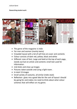
The genre of the magazine is indie
For men and women (mainly teens)
Crowded layout with a lot of sell lines on cover and contents
Colour consists of dark red, yellow, black and white
Different sizes of font. Large and bold at the top of each page,
stands out but on article and contents small text used for
information.
mid shots and close up images
Pictures taken outside and using a light room.
In total 13 images
Small variety of costume, all similar (indie style)
Reflection- gives me a good idea for the sort of layout I should
be going for and makes me need to think about what colour
schemes that will reflect on my genre.
2. Jackson Byrne
The genre of the magazine is Rock
For men and women (again mainly teens)
Plain backgrounds more spacious
Dark colours such as greys reds blacks and yellow
Once again different font sizes and same areas, Bold and large
on the cover and the titles of pages but small on other pages to
fit in information.
mid shot images
all pictures taken using a light room.
Only 6 images
Both main images in same costume a range found on the
contents page.
Reflection- gives me an idea of where images and text should
be placed and organized. What costume verities are needed
and where to put them in the magazine.
3. Jackson Byrne
The genre of the magazine is rock?
Looks to be aimed at women
Range of black and white backgrounds
Colours range between red white and black
A lot of bold font on all pages. But also small text full of
information on contents page and main article. Very unique
relatable font on all pages, relates to the genre of the
magazine.
mid shot and full body shots
all pictures taken inside a light room
8 images in total
different variety of costume but all related to its genre
Reflection- gives me an idea of what font type I need to use as
this font type relates well to its genre as well as the colour
scheme of the magazine is what I need to take into account for
my magazine.