1. Jordan Vernon
AS Media Studies
Foundation Portfolio
Masthead
Comment on how the design of the magazine cover attracts the target audience:
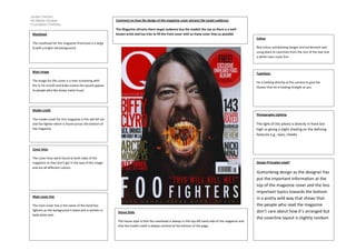
The Magazine attracts there target audience buy the models the use as there is a wellknown artist and has tries to fill the front cover with as many cover lines as possible
Colour
The masthead for this magazine frontcove is a large
Q with a bright red background
Red colour symbolising danger and excitement and
using.black to caontrast from the rest of the text and
a white main cover line
Main image
Typefaces
The image for this cover is a man screaming with
fire in his mouth and looks insane this would appeal
to people who like heavy metal music
He is looking directly at the camera to give the
illusion that he is looking straight at you
Model credit
Photography Lighting
The model credit for this magazine is this will kill me
and foo fighter which is found across the bottom of
the magazine
The light of this photo is directly in front but
high us giving a slight shading on the defining
features e.g., eyes, cheeks
Cover lines
The cover lines were found at both sides of the
magazine so they don’t get in the way of the image
and are all different colours
Design Principles Used?
Main cover line
Guttonbreg design as the designer has
put the important information at the
top of the magazine cover and the less
important topics towards the bottom
in a pretty wild way that shows that
the people who read the magazine
don’t care about how it’s arranged but
the coverline layout is slightly random
The main cover line is the name of the band foo
fighters as the background is black and is written in
bold white text.
House Style
The house style is that the masthead is always in the top left hand side of the magazine and
that the model credit is always centred at the bottom of the page.