PATTERN
LIBRARIES
CSSPATTERN
LIBRARIES
Who
is this guy?
Began in the web in 1995

Full CSS sites in 2002
Skills: UX, front-end dev, training

Recently: CSS pattern libraries
I have helped develop HTML/
CSS pattern libraries for very
large sites (media and university
sites) and complex applications
(banking applications).
In some cases, there are literally
hundreds of CSS, SCSS or
LESS files to review and
optimise as part of the process.
pages
Moving away from
A few years ago, many front end
developers approached
websites and web applications
as a series of “pages”.
Pages were often designed and
built as complete entities. This
meant that page components
were often closely tied to their
relevant pages.
More recently, the focus has
shifted from full page layouts to
re-usable components.
A re-usable component could
be a layout grid structure, a
button, an input, a drop-down, a
menu, a heading, a table, or
even a pullquote.
pattern libraries
HTML/CSS
HTML/CSS pattern libraries are
used to resolve commonly used
interface components. These
components are created as
HTML and CSS code and
documented, so that they can
be easily re-used as needed.
The terms “style guide” and
“pattern library” are often used
interchangeably.
A style guide is a set of
standards for implementing the
overall design, and can include
corporate branding, color
schemes, layout and more.
Style guides are used to ensure
uniformity of the design or
“brand” across all aspects of
the website or application.
On the other hand, HTML/CSS
pattern libraries generally
document code components
for all aspects of the website or
application.
On larger web projects, style
guides and HTML/CSS pattern
libraries are generally separate
entities.
For smaller web projects, style
guides and pattern libraries are
often combined into one
overall entity.
cons?
Pros and
Why use a pattern library at all?

!
Easier to build sites

Easier to maintain sites

Easier to hand over

Better workflow

Shared vocabulary

Promotes consistency
What are the downsides?

!
Time-consuming to write

Often done post-project

Serve current need only
Pre-existing
pattern libraries
There are a wide range of 

pre-existing pattern libraries
available today.
Some of these pattern libraries
have a simple purpose - such as
responsive grid systems.
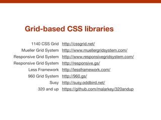
Grid-based CSS libraries
1140 CSS Grid
Mueller Grid System
Responsive Grid System

Responsive Grid System

Less Framework

960 Grid System

Susy
320 and up
http://cssgrid.net/

http://www.muellergridsystem.com/

http://www.responsivegridsystem.com/

http://responsive.gs/

http://lessframework.com/

http://960.gs/

http://susy.oddbird.net/

https://github.com/malarkey/320andup
Others are considered full
“frameworks” that offer a wide
range of components.
These can include:

!
Reset styles

Grid systems

Typography styles

Browser fixes

Common user-interface
component styles
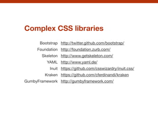
Complex CSS libraries
Bootstrap

Foundation

Skeleton

YAML

Inuit

Kraken

GumbyFramework

http://twitter.github.com/bootstrap/

http://foundation.zurb.com/

http://www.getskeleton.com/

http://www.yaml.de/

https://github.com/csswizardry/inuit.css/

https://github.com/cferdinandi/kraken

http://gumbyframework.com/
There are some great benefits to
using an existing framework:

!
ready-to-use solution

can pick & choose components

easy implementation

quick prototyping
great for teams
There may also be some
downsides:

!
may not suit your project

no need for a complex library

someone else’s conventions
generic look
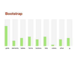
Bootstrap
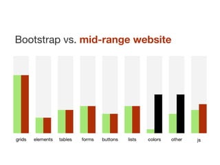
Bootstrap vs. mid-range website
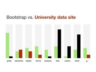
Bootstrap vs. University data site
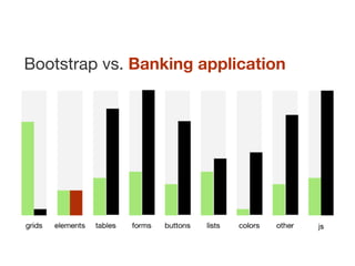
Bootstrap vs. Banking application
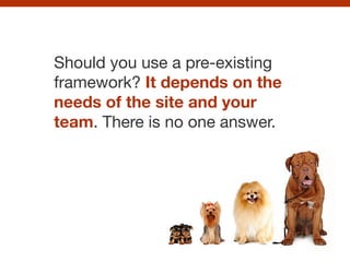
Should you use a pre-existing
framework? It depends on the
needs of the site and your
team. There is no one answer.
Assuming you want to create
your own CSS pattern library,
how do you go about it?
abstraction
Understanding
Abstraction is essential to any
CSS pattern library.
The process involves:

!
looking for components that may
be repeated within the layout

defining their characteristics
creating HTML/CSS patterns
for them
1.
!
2.
3.
An example:
coloured boxes
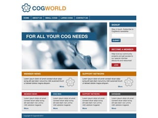
These boxes look like they have
similar characteristics. If they
were resolved into a pattern,
this would make our HTML and
CSS more efficient.
What are the key things to keep
in mind when creating any
pattern?
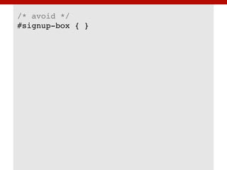
Avoid using IDs
All patterns needs to be class-
based so they can appear as
many times as needed within an
HTML document.
/* avoid */!
#signup-box { }!
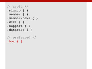
Avoid naming
based on content
We should avoid naming
patterns based on the content,
as we want to reuse these
patterns often within the layout.
/* avoid */!
.signup { }!
.member { }!
.member-news { }!
.wiki { }!
.support { }!
.database { }!
!
/* preferred */!
.box { }
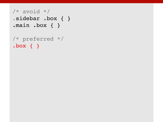
Avoid location-
based styles
All patterns should work
regardless of where they’re
placed within the layout.
/* avoid */!
.sidebar .box { }!
.main .box { }!
!
/* preferred */!
.box { }
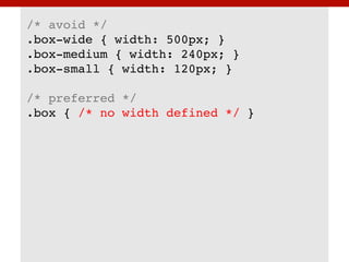
Avoid widths
Ideally, patterns should avoid
defining widths. Patterns should
be allowed to spread to the
width of any parent container.
/* avoid */!
.box-wide { width: 500px; }!
.box-medium { width: 240px; }!
.box-small { width: 120px; }!
!
/* preferred */!
.box { /* no width defined */ }
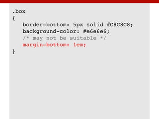
Keep patterns as
simple as possible
Patterns should be defined as
simply as possible. Otherwise
they can become restrictive.
.box!
{!
! border-bottom: 5px solid #C8C8C8;!
! background-color: #e6e6e6;!
! /* may not be suitable */!
! margin-bottom: 1em;!
}
Don’t undo
Patterns should not be written
to undo other rules. For
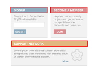
example, the <h3> element:
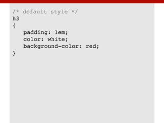
We could be tempted to style
the <h3> element with a
coloured background - as it
looks like this is the “default”
appearance for all <h3>
elements.
/* default style */!
h3!
{!
! padding: 1em;!
! color: white;!
! background-color: red;!
}
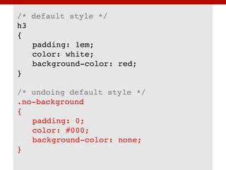
But what happens if we needed
to use an <h3> element later,
and it doesn’t have a
background-color? We might
have to write a rule to undo our
previous one.
/* default style */!
h3!
{!
! padding: 1em;!
! color: white;!
! background-color: red;!
}!
!
/* undoing default style */!
.no-background !
{!
! padding: 0;!
! color: #000;!
! background-color: none;!
}!
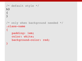
It is best to avoid over-styling
elements or patterns so that
they do not have to be undone
later.
/* default style */!
h3!
{!
}!
!
/* only when background needed */!
.class-name!
{!
! padding: 1em;!
! color: white;!
! background-color: red;!
}!
Avoid dependency
on HTML structure
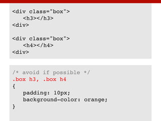
Patterns should not rely on the
HTML structure. What happens
if the structure changes in some
instances - like a different
heading level being used?
<div class="box">!
! <h3></h3>!
<div>!
!
<div class="box">!
! <h4></h4>!
<div>!
!
!
/* avoid if possible */!
.box h3, .box h4!
{!
! padding: 10px; !
! background-color: orange; !
}!
!
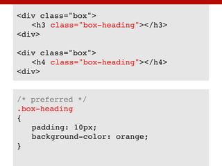
It is always better to create a
class-based pattern for any
specific styling needs.
<div class="box">!
! <h3 class="box-heading"></h3>!
<div>!
!
<div class="box">!
! <h4 class="box-heading"></h4>!
<div>!
!
!
/* preferred */!
.box-heading!
{!
! padding: 10px; !
! background-color: orange; !
}!
Modules,
modifiers & descendants
How can we let developers
know that our new class called
“box-heading” relates to the
“box” class?
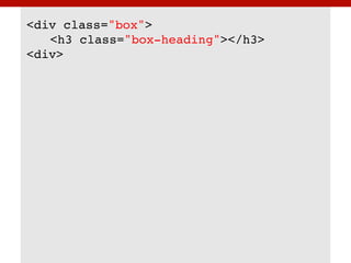
<div class="box">!
! <h3 class="box-heading"></h3>!
<div>!
We could use a naming
convention that was originally
defined as part of BEM:

!
http://bem.info/
And then extended by Nicolas
Gallagher:

!
http://nicolasgallagher.com/about-html-semantics-
front-end-architecture/
And then modified slightly
again by Harry Roberts:

!
http://csswizardry.com/2013/01/mindbemding-
getting-your-head-round-bem-syntax/
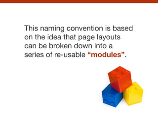
This naming convention is based
on the idea that page layouts
can be broken down into a
series of re-usable “modules”.
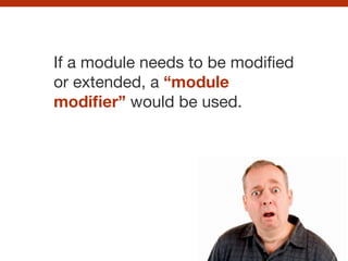
If a module needs to be modified
or extended, a “module
modifier” would be used.
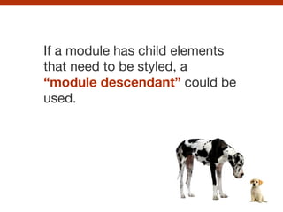
If a module has child elements
that need to be styled, a
“module descendant” could be
used.
These different types of class
names need to be relatable and
recognisable.
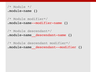
/* Module */!
.module-name {}!
!
/* Module modifier*/!
.module-name--modifier-name {}!
!
/* Module descendant*/!
.module-name__descendant-name {}!
!
/* Module descendant modifier*/!
.module-name__descendant--modifier {}!
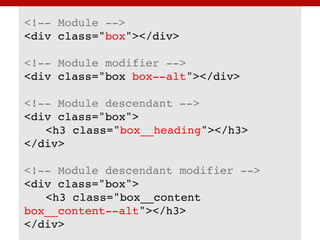
<!-- Module -->!
<div class="box"></div>!
!
<!-- Module modifier -->!
<div class="box box--alt"></div>!
!
<!-- Module descendant -->!
<div class="box">!
! <h3 class="box__heading"></h3>!
</div>!
!
<!-- Module descendant modifier -->!
<div class="box">!
! <h3 class="box__content
box__content--alt"></h3>!
</div>!
Module
descendants
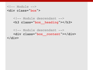
With this naming convention, we
can now add two “module
descendants” to our HTML
markup:
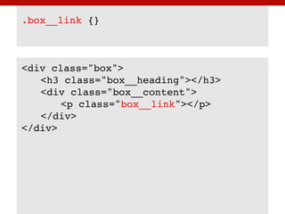
<!-- Module -->!
<div class="box">!
!
! <!-- Module descendant -->!
! <h3 class="box__heading"></h3>!
!
! <!-- Module descendant -->!
! <div class="box__content"></div>!
</div>!
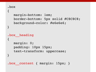
.box!
{!
! margin-bottom: 1em;!
! border-bottom: 5px solid #C8C8C8;!
! background-color: #e6e6e6;!
}!
!
.box__heading!
{!
! margin: 0;!
! padding: 10px 15px;!
! text-transform: uppercase;!
}!
!
.box__content { margin: 15px; }!
Module modifiers
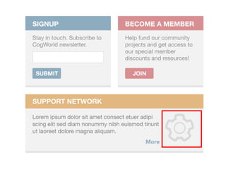
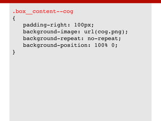
But what about the boxes that
are very similar, but have some
unique characteristics - like the
decorative cog image?
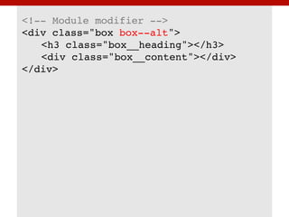
If we needed to modify or extend
the original module, we would
create a modifier class name.
<!-- Module modifier -->!
<div class="box box--alt">!
! <h3 class="box__heading"></h3>!
! <div class="box__content"></div>!
</div>!
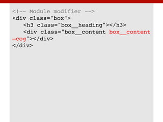
However, in this case, we need
to modify the “box__content”
class. We need to create a
“module descendant
modifier”.
<!-- Module modifier -->!
<div class="box">!
! <h3 class="box__heading"></h3>!
! <div class="box__content box__content
—cog"></div>!
</div>!
.box__content--cog!
{!
! padding-right: 100px;!
! background-image: url(cog.png);!
! background-repeat: no-repeat;!
! background-position: 100% 0;!
}!
Helper
classes
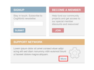
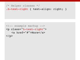
In one of the boxes, there is a
piece of text that is aligned to
the right. How do we solve this?