Chandleryu2011.06.30
The Grid’s the ThingCSS was not designed to describe 2D grids. Rather, CSS assumes that every page will be made up of a vertical stack of blocks, piled(堆叠) one on top of another, each containing either another stack of blocks, or text (called inline content) wrapped to fit inside the block.
.
Tables Do the TrickAbsolute positioning and floated blocks can be employed to force blocks to sit alongside other blocks—a purpose never envisioned by its creators.
The Layout We Want to Create
Current Techniques: Absolute
Current Techniques: Float
Current Techniques: oocss Float/* ====== Columns ====== */.main{overflow:hidden;_overflow:visible;_zoom:1;}.leftCol{float:left; width:250px;_margin-right:-3px;}.rightCol{float:right; width: 300px;_margin-left:-3px;}
Block Formatting Context只要条件合适,任何块级元素都可以建立一个新的Block Formatting Context,以下是触发属性:float:leftfloat:rightposition:absolutedisplay:inline-blockdisplay:inline-tabledisplay:table-celldisplay:tableoverflow:autooverflow:scrolloverflow:hidden(也就是除了overflow:visible;)
Table-relative valueInternet Explorer 8 will support many new values for the CSS display property, including the table-related values: table, table-row, and table-cell—and it’s the last major browser to come on board with this support.
Using CSS Tables
Using CSS Tables
Internet Explorer 8+, Firefox, Safari, OperaOur three-column equal-height layout is achieved without having to resort to tricks like faux(假的)columns using background images, worrying about positioning, or having to clear floats—revolutionary!
Hang on … Aren’t Tables for Layout Wrong? The table value of the display property, on the other hand, is simply an indi­cation of how something should look in the browser—it has no semantic meaning.
Anonymous Table Elementsif we use display: table-cell; without first containing the cell in a block set to display: table-row;, the row will be implied—the browser will act as though the declared row is actually there.
Anonymous Table Elements .main{overflow:hidden;_overflow:visible;_zoom:1;}Can be replaced by:.main{display:table-cell;_overflow:visible;_zoom:1;}Or.main{display:table;_overflow:visible;_zoom:1;}
Table-cell/table生成BFC的缺点无论是table-cell还是table,如果内部有元素宽度宽于table-cell/table的设定宽度,那么设定宽度无效。
Solution.col2 {display:tablecell; *zoom:1; background:green;}.col2_inner{width:500px;overflow:hidden;background:yellow;}
Flexible Layout
Flexible Layout
Nest
Position
Colspan/rowspanCSS tables lack any concept of row or column spanning, making it trickier to use one single layout structure than what might have been possible when using HTML tables. However, similar layouts can be achieved by using nested CSS tables.
Colspan/rowspan
Do I have to change the source order?search engine optimizationaccessibility
SEOThe truth is, however, that source order has little impact on either of those areas. Of far more importance than source order is a proper heading structure: a properly nested sequence of heading tags (<h1> to <h6>) to clearly identify the page topic and sections.
Skip Links
Support for CSS Tables
Option 1:Ignore Older BrowsersIf you’re designing for yourself and nobody else, this is an option you might want to consider—it’ll certainly save you some time, and if you’re looking to make a point, this is the most visible way to do it.
Option 2:A Simplified Layout
Option 3:ReproduceWhat you need to do is reproduce your table-based layout as closely as possible using the features available in IE6 and 7.
Why Not Stick with Floated Layouts?If we don’t start using those features now, then who’s holding back the Web? The users who haven’t upgraded their browsers? Until we build sites that take advantage of the new features added to the latest browsers, how can we expect those users to upgrade? Microsoft has done its part; now it’s our turn.
CSS3 Multi-column Layout Module
CSS3 Grid Positioning ModuleImagine being able to define a grid for your page, then snap elements to that grid!
CSS3 Grid Positioning ModuleIn the case of a body with no width applied, they’d evenly stretch if the window was resized.
CSS3 Grid Positioning ModuleSince this is a repeating pattern, we can also use the following notation instead of specifying all of the columns individually:
CSS3 Grid Positioning Module
CSS3 Template Layout Module
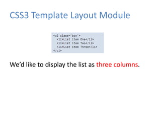
CSS3 Template Layout ModuleWe’d like to display the list as three columns.
CSS3 Template Layout ModuleTo set up the three-column template, we use the display property with a value of “abc”, a letter for each template slot(槽).
CSS3 Template Layout ModulePositioning Elements into the Slots
CSS3 Template Layout ModuleCSS3 templates can be even more complex than that. We don’t have enough room in this book to speculate on all the possibilities
CSS3 Template Layout Module
Everything You Know about CSS is WrongBy keeping your techniques up to date and not expecting life to remain the same, you can ensure that you’re not left behind as techniques and support move on.
Thank U
Everything You know about CSS is Wrong

Everything You know about CSS is Wrong