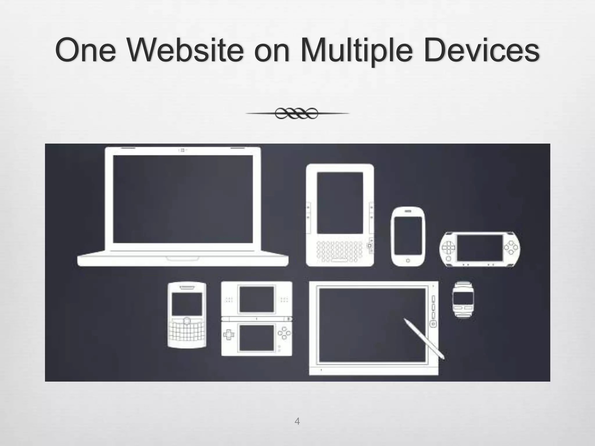
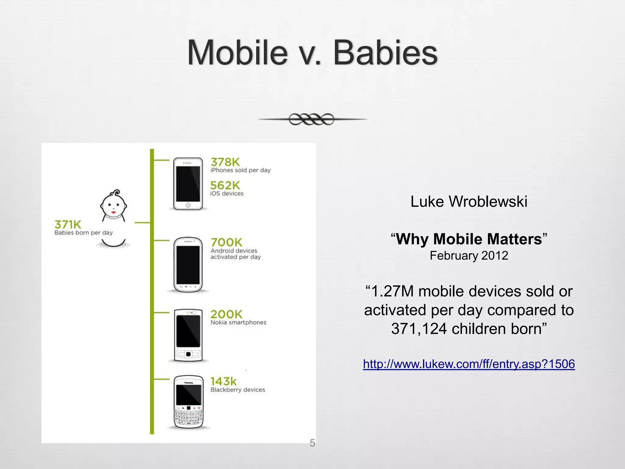
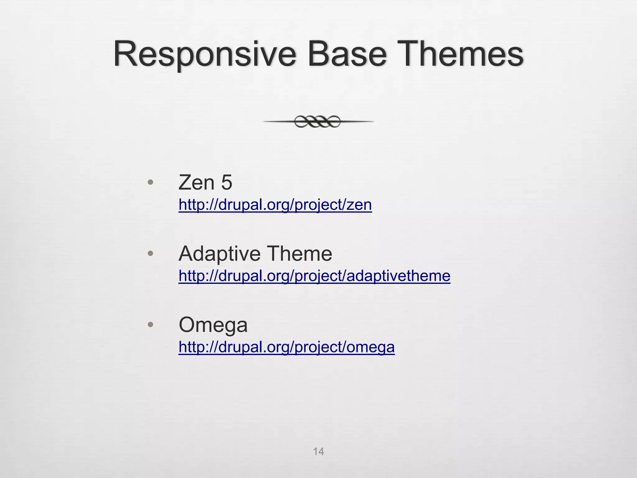
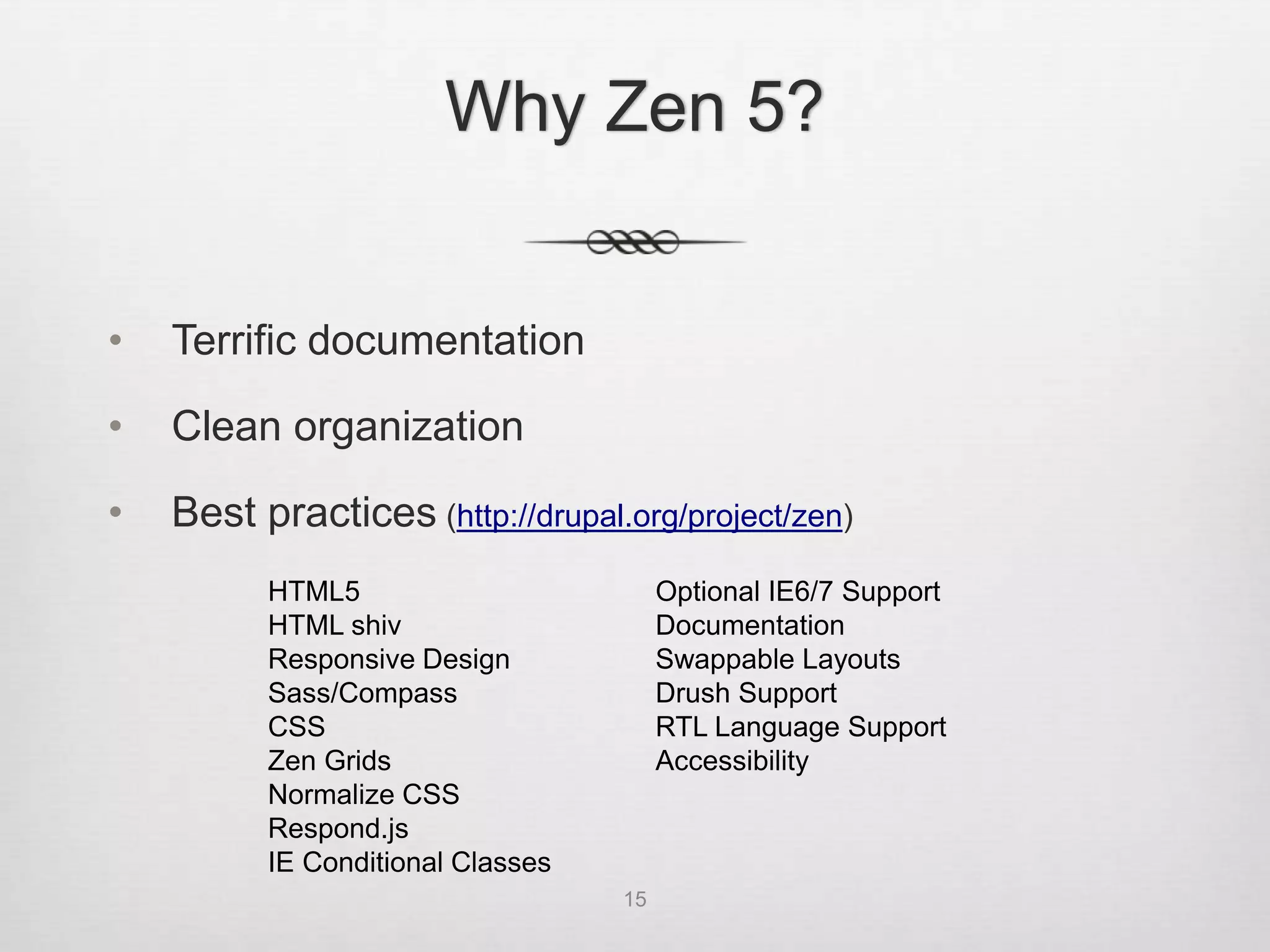
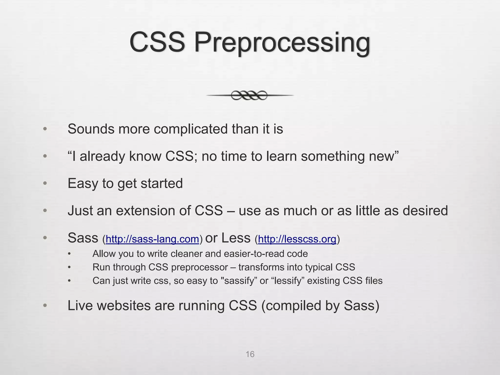
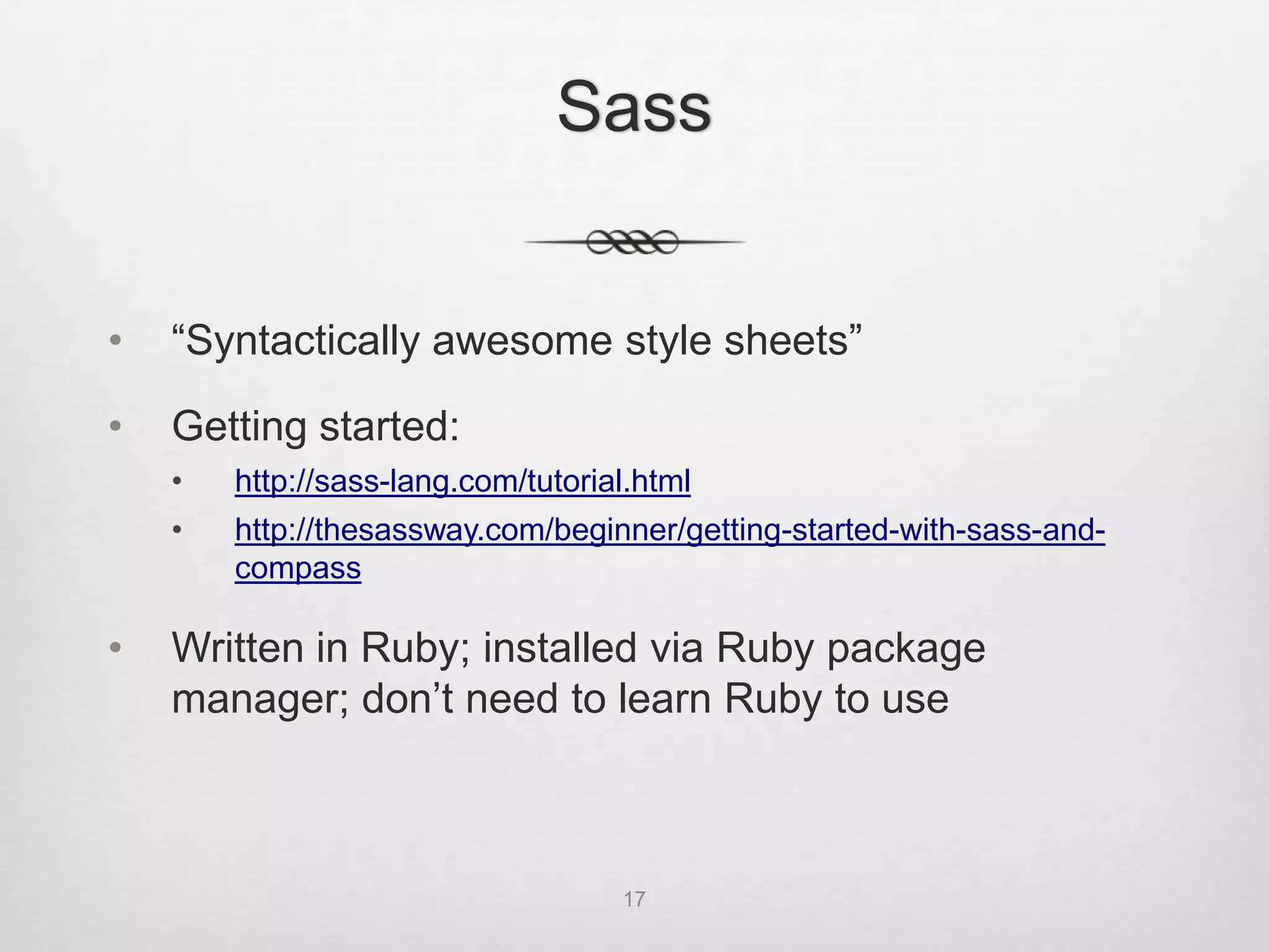
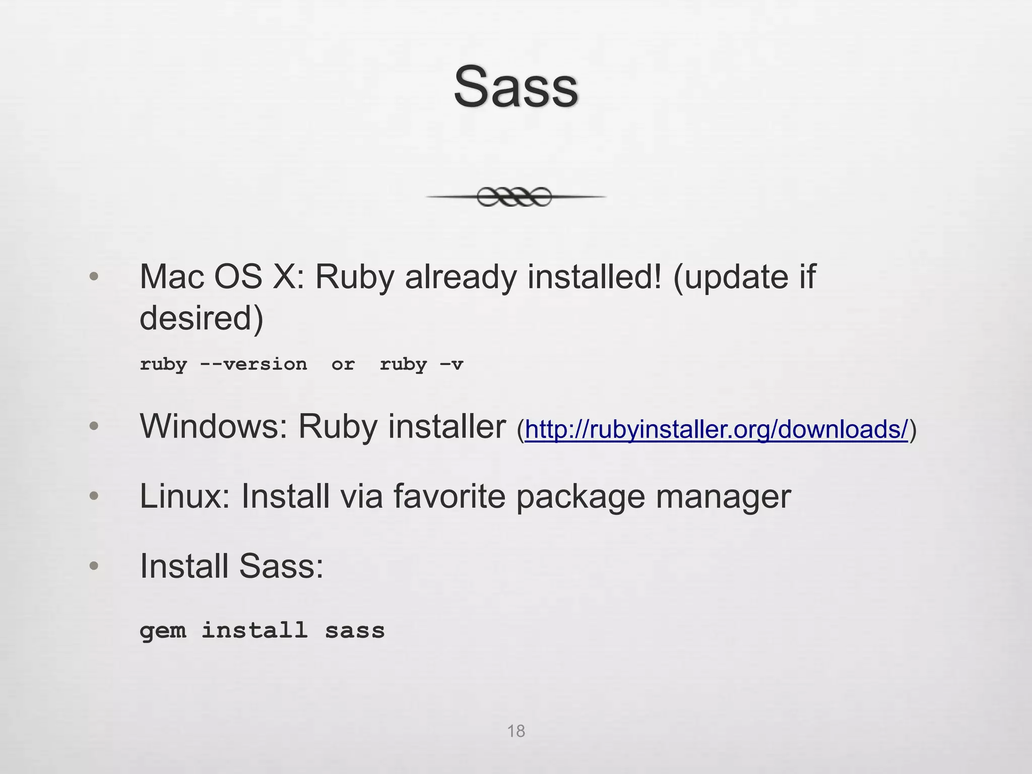
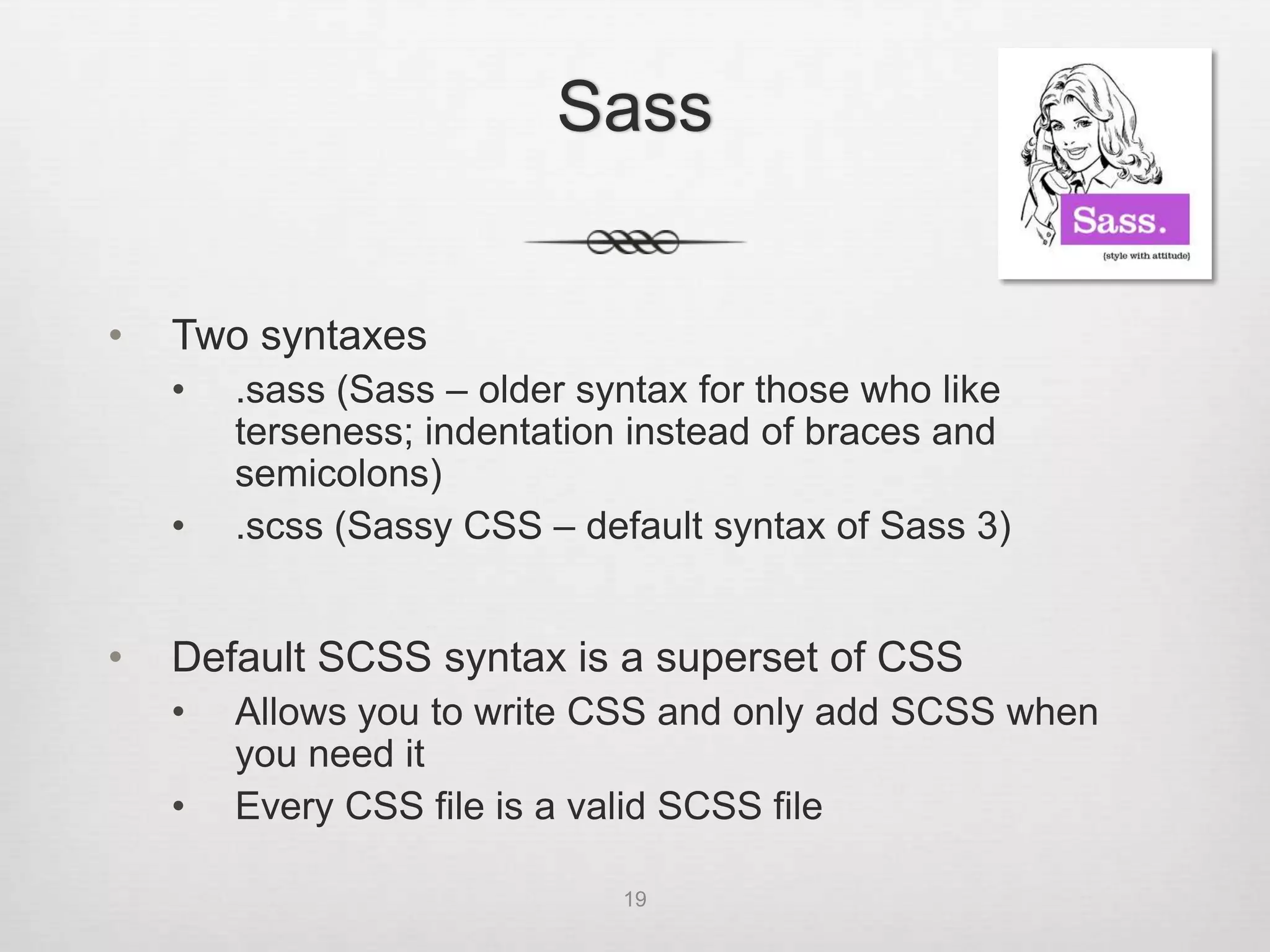
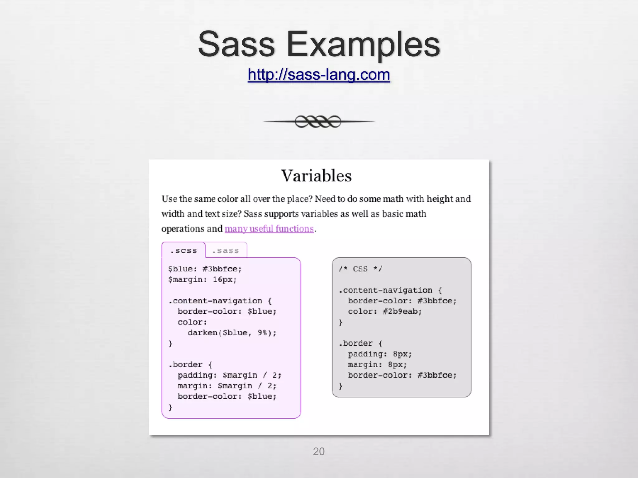
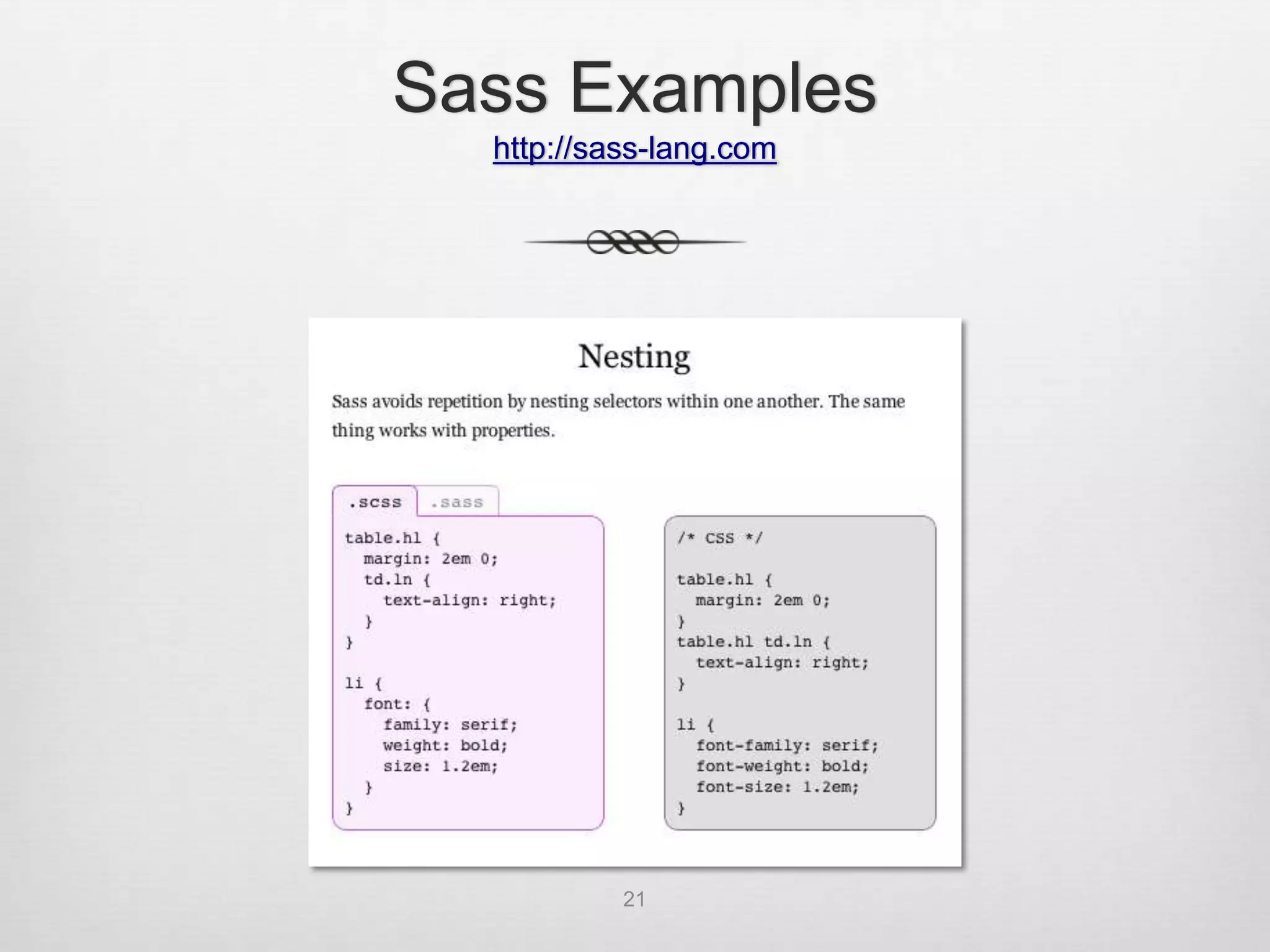
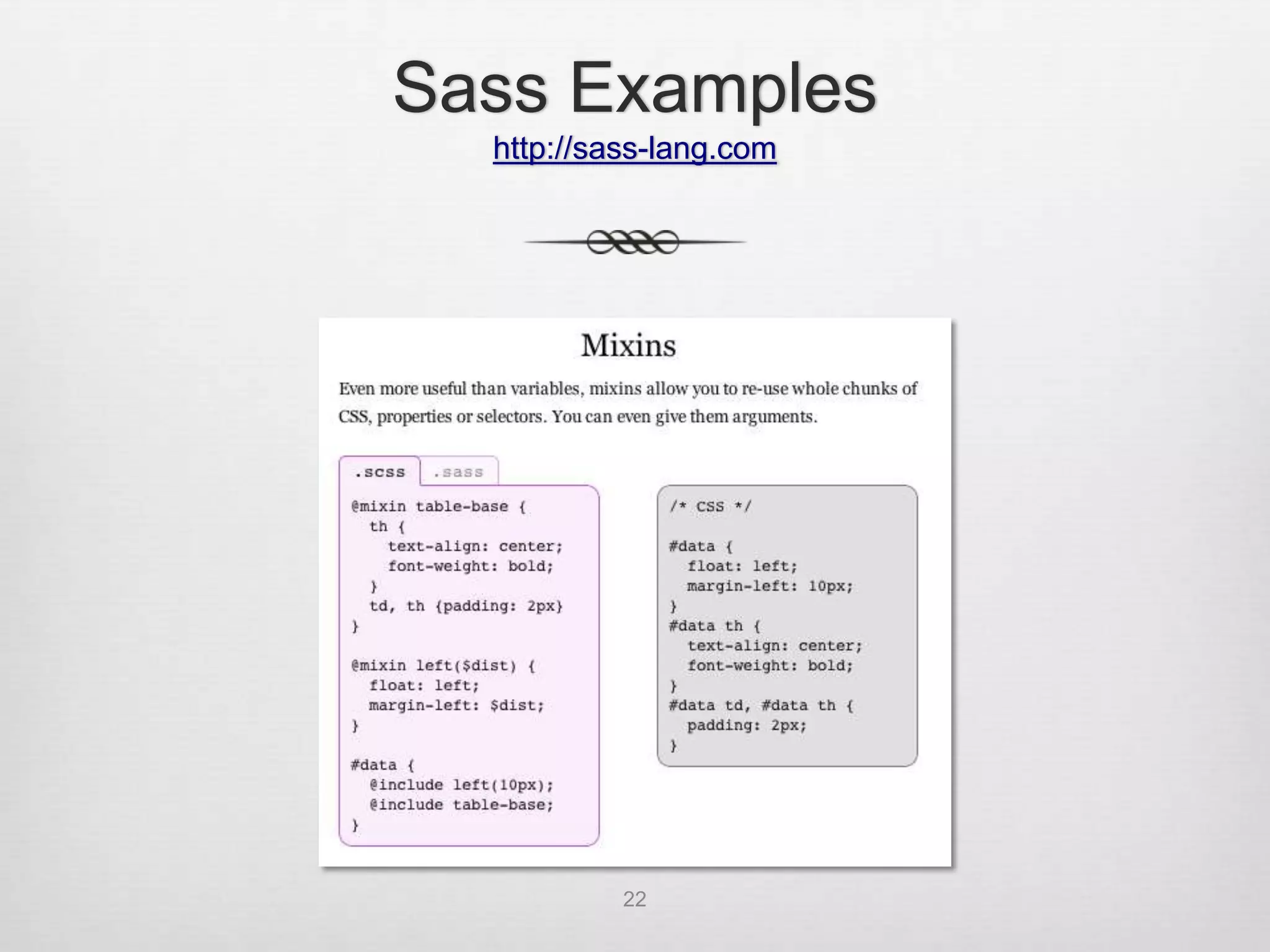
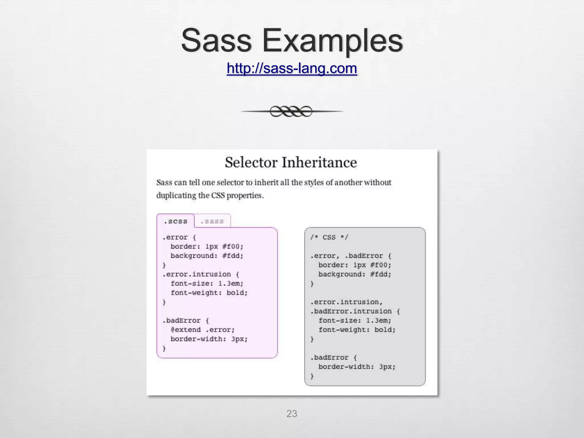
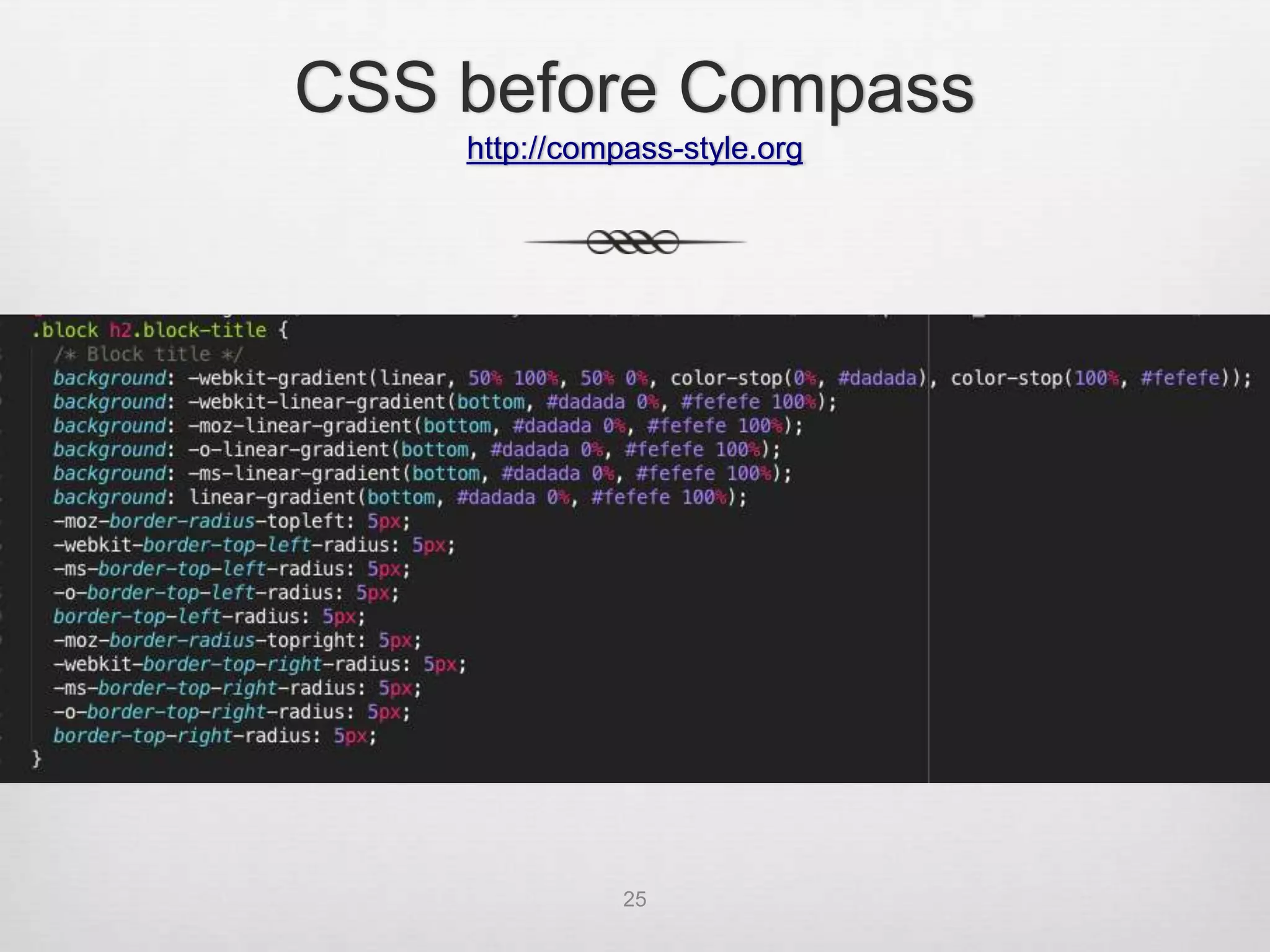
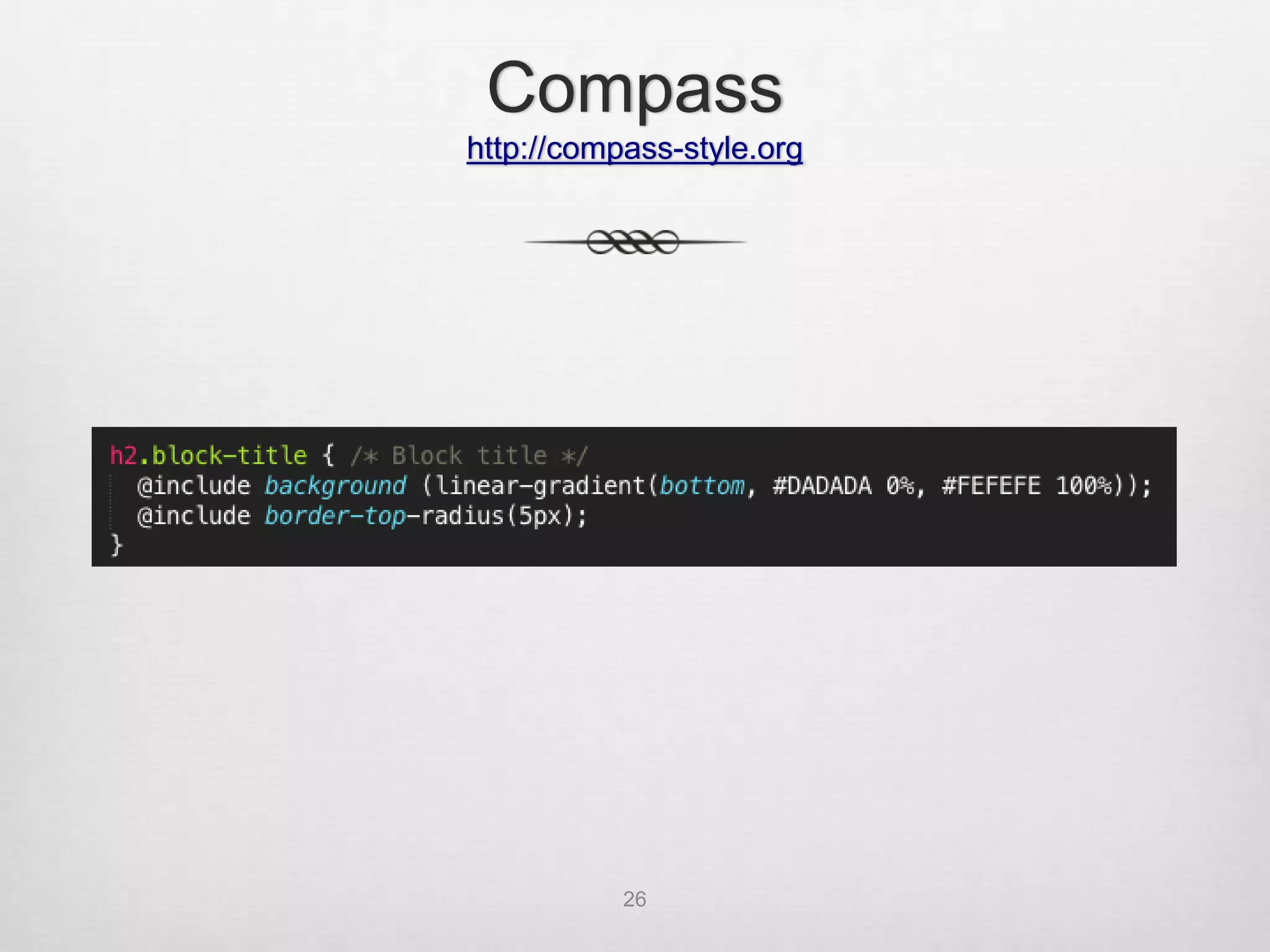
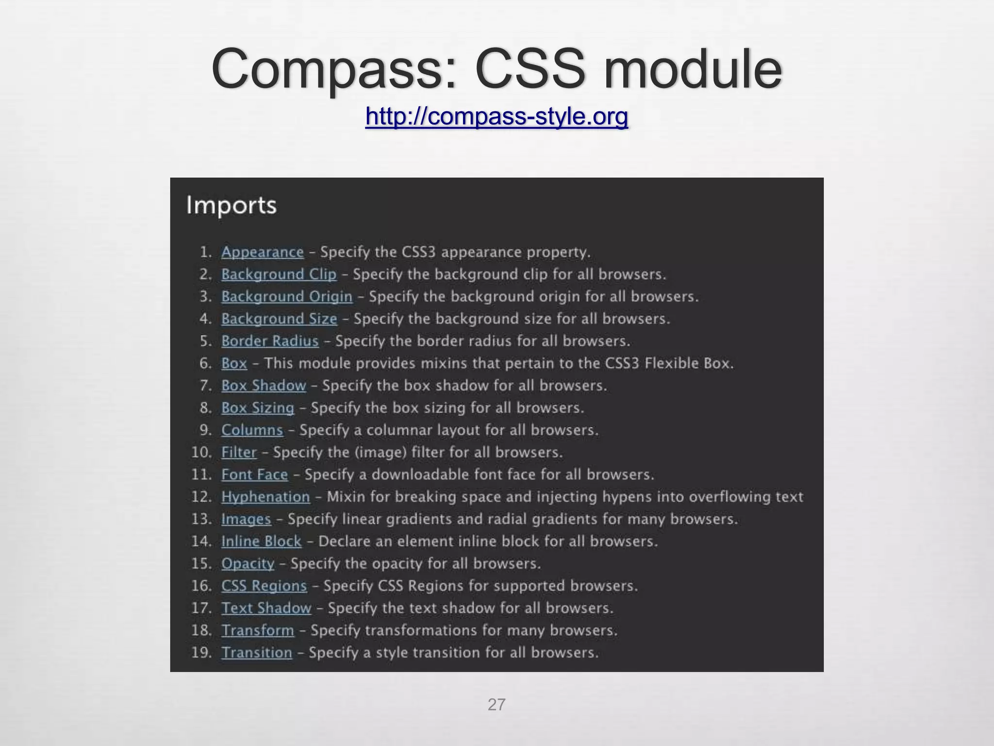
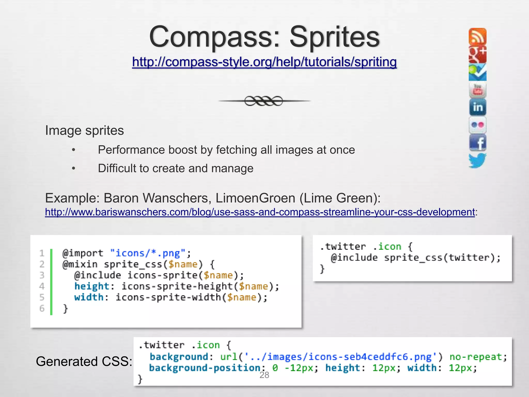
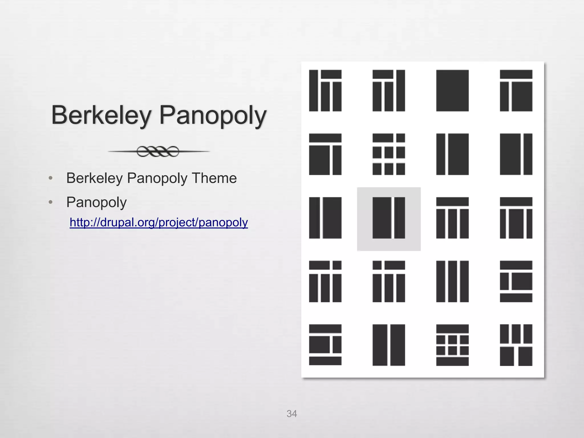
Slides


•   Slideshare
    http://www.slideshare.net/ucbdrupal/bdug-responsive-
    webtheming20120723

•   UC Berkeley: IST Drupal
    ist-drupal@lists.berkeley.edu


                              2
Agenda

•   Introduction
•   Responsive Web Design
•   Base Theme: Zen 5
•   CSS Preprocessing
•   Sass
•   Compass
•   Zen Starterkit
•   Demo
•   Preview Berkeley Panopoly theme
•   Q&A


              3
One Website on Multiple Devices


               4
Mobile v. Babies


                   Luke Wroblewski

               “Why Mobile Matters”
                      February 2012


           “1.27M mobile devices sold or
           activated per day compared to
               371,124 children born”

           http://www.lukew.com/ff/entry.asp?1506


       5
Responsive Web Design

•   Coined by Ethan Marcotte
    http://www.alistapart.com/articles/responsive-web-design


•   Three Parts:
    1. CSS3 media queries
    2. Fluid or flexible layouts
    3. Flexible images


•   Device Independence: Users viewing your site on a
    broad range of devices will be accessing the same
    content


                                                6
What does a
    responsive website look like?

•   Online tools
    •   http://responsinator.com
    •   http://responsivepx.com
    •   http://www.netmagazine.com/features/50-fantastic-tools-
        responsive-web-design

•   Design examples
    •   http://mediaqueri.es/

•   Navigation Patterns
    •   http://bradfrostweb.com/blog/web/responsive-nav-patterns
    •   http://filamentgroup.com/lab/responsive_design_approach_
        for_navigation
                                   7
Media Queries


•   CSS2 introduced the concept of media queries

•   HTML files with separate stylesheets for screen and
    print
    <link rel="stylesheet" type="text/css" media="screen" href="screen.css">
    <link rel="stylesheet" type="text/css" media="print" href="print.css">


•   CSS stylesheets
    @media screen {
      * { font-family: sans-serif }
    }


                                       8
Media Queries


•   CSS3: W3C extended the functionality of media queries
    •    Check for particular media features like width, height, and color
    •    Tailor styles to a specific range of devices without changing the
         content itself

•   Implemented via the @import rule in CSS
    @import url(style480min.css) screen and (min-width: 480px);


•   Used in the HTML <link> media attribute
    <link rel="stylesheet" type="text/css" media="screen and (min-width: 480px)"
    href="style480min.css" />


                                           9
Media Queries


•   Or most commonly used directly in a style sheet
    (from Zen responsive-sidebars.css):

    @media all and (min-width: 480px) {
      #main {
        padding-top: 3em;
        position: relative;
      }

        #navigation {
          position: absolute;
          top: 0;
          height: 3em;
          width: 100%;
        }
    }


                                          10
Fluid or Flexible Layouts


•   Before responsive web design: Fixed, fluid, elastic?


    Fixed:            Fluid:               Elastic:

    #container {      #container {         #container {
      width: 400px;     width: 40%;          width: 25em;
    }                 }                    }

                      Adjusts to           Size elements
    Control and       user’s screen        with ems (relative
    consistency       resolution           unit based on font
                                           size)


                               11
Responsive Grids


       12
Flexible Images and Media


•   Scaling images and video in CSS is straightforward
    by setting the max-width to 100%.
    img {
         max-width: 100%;
    }


•   Performance considerations: May be taking up
    bandwidth to serve a high-resolution image to a
    device that isn’t using it
    http://blog.cloudfour.com/responsive-imgs/


                                             13
Responsive Base Themes


 •   Zen 5
     http://drupal.org/project/zen


 •   Adaptive Theme
     http://drupal.org/project/adaptivetheme


 •   Omega
     http://drupal.org/project/omega


                         14
Why Zen 5?


•   Terrific documentation

•   Clean organization

•   Best practices (http://drupal.org/project/zen)
          HTML5                         Optional IE6/7 Support
          HTML shiv                     Documentation
          Responsive Design             Swappable Layouts
          Sass/Compass                  Drush Support
          CSS                           RTL Language Support
          Zen Grids                     Accessibility
          Normalize CSS
          Respond.js
          IE Conditional Classes
                                   15
CSS Preprocessing

•   Sounds more complicated than it is
•   “I already know CSS; no time to learn something new”
•   Easy to get started
•   Just an extension of CSS – use as much or as little as desired
•   Sass (http://sass-lang.com) or Less (http://lesscss.org)
    •    Allow you to write cleaner and easier-to-read code
    •    Run through CSS preprocessor – transforms into typical CSS
    •    Can just write css, so easy to "sassify” or “lessify” existing CSS files

•   Live websites are running CSS (compiled by Sass)


                                              16
Sass


•   “Syntactically awesome style sheets”

•   Getting started:
    •   http://sass-lang.com/tutorial.html
    •   http://thesassway.com/beginner/getting-started-with-sass-and-
        compass

•   Written in Ruby; installed via Ruby package
    manager; don’t need to learn Ruby to use


                                    17
Sass


•   Mac OS X: Ruby already installed! (update if
    desired)
    ruby --version   or   ruby –v


•   Windows: Ruby installer (http://rubyinstaller.org/downloads/)

•   Linux: Install via favorite package manager

•   Install Sass:
    gem install sass


                                    18
Sass


•   Two syntaxes
    •   .sass (Sass – older syntax for those who like
        terseness; indentation instead of braces and
        semicolons)
    •   .scss (Sassy CSS – default syntax of Sass 3)


•   Default SCSS syntax is a superset of CSS
    •   Allows you to write CSS and only add SCSS when
        you need it
    •   Every CSS file is a valid SCSS file

                              19
Sass Examples
  http://sass-lang.com


           20
Sass Examples
  http://sass-lang.com


           21
Sass Examples
  http://sass-lang.com


           22
Sass Examples
  http://sass-lang.com


           23
Compass
                           http://compass-style.org


•   Open Source CSS Authoring Framework
    •   Uses Sass
    •   Makes things easier
    •   Library of functions and add-ons to do common things

•   Install Compass:
    gem install compass

•   Using Compass (outside of Zen 5, Drupal):
    compass help
    Primary Commands:
      * clean   - Remove generated files and the sass cache
      * compile - Compile Sass stylesheets to CSS
      * create - Create a new compass project
      * init    - Add compass to an existing project
      * watch   - Compile Sass stylesheets to CSS when they change

                                       24
CSS before Compass
    http://compass-style.org


               25
Compass
http://compass-style.org


           26
Compass: CSS module
     http://compass-style.org


                27
Compass: Sprites
                  http://compass-style.org/help/tutorials/spriting


 Image sprites
      •    Performance boost by fetching all images at once
      •    Difficult to create and manage

 Example: Baron Wanschers, LimoenGroen (Lime Green):
 http://www.bariswanschers.com/blog/use-sass-and-compass-streamline-your-css-development:


Generated CSS:
                                            28
Zen 5

•   Already set up to use Sass and Compass
•   STARTERKIT
    (see zen/STARTERKIT/README.txt)
    •   Copy the STARTERKIT folder, place under sites/all/themes and rename
             Copy “sites/all/themes/zen/STARTERKIT”
             To “sites/all/themes/foo”

    •   Rename “STARTERKIT.info.txt” as “foo.info” and update name and description
    •   In template.php and theme-settings.php: Replace ALL occurrences of
        "STARTERKIT" with “foo”
    •   Set default theme at admin/appearance

•   Or use drush:
    drush zen "Foo Theme" foo

                                          29
Zen 5

•   Review Files
    •     Standard Drupal theme files
    •     Standard folders
    •     Sass-related files/folders

•   Using Sass and Compass with Zen 5
    From root of your sub-theme folder:

          compass clean //removes existing css files so they can be regenerated


          compass watch //watches the “sass” directory
                         //anytime a .scss file is changed, .css auto-generated
                         //includes debug feature for syntax errors during development
                         //launch compass watch and leave running (if needed, re-launch
          terminal)
                         //can look at css generated but eventually just work with scss files
                                            30
Zen Grids
http://zengrids.com


        31
Zen 5: Production


•   When ready to move to production…
    See http://drupal.org/node/1548946 and zen/STARTERKIT/sass/README.txt

•   Update CSS files, minify, and aggregate for
    performance:
    •   compass clean
    •   edit config.rb by uncommenting “#environment = :production”
    •   turn on CSS aggregation


                                    32
Tools


•   FireSass for Firebug: https://addons.mozilla.org/en-
    US/firefox/addon/firesass-for-firebug/

•   ZenGrids:
    http://zengrids.com

•   If you don’t like the command line:
    •    Compass.app: http://compass.handlino.com/ (Mac, Linux, PC)
    •    Fire.app: http://fireapp.handlino.com/ (Mac, Linux, PC)
    •    Codekit: http://incident57.com/codekit/ (Mac)


                                     33
Berkeley Panopoly

• Berkeley Panopoly Theme
• Panopoly
  http://drupal.org/project/panopoly


                                       34
Next Steps
          Pilots

      • Administration &
        Finance
      • Office of the
        Chancellor
      • BAS: Parking &
        Transportation
      • Campus IT


35

BDUG Responsive Web Theming - 7/23/12

  • 2.
    Slides • Slideshare http://www.slideshare.net/ucbdrupal/bdug-responsive- webtheming20120723 • UC Berkeley: IST Drupal ist-drupal@lists.berkeley.edu 2
  • 3.
    Agenda • Introduction • Responsive Web Design • Base Theme: Zen 5 • CSS Preprocessing • Sass • Compass • Zen Starterkit • Demo • Preview Berkeley Panopoly theme • Q&A 3
  • 4.
    One Website onMultiple Devices 4
  • 5.
    Mobile v. Babies Luke Wroblewski “Why Mobile Matters” February 2012 “1.27M mobile devices sold or activated per day compared to 371,124 children born” http://www.lukew.com/ff/entry.asp?1506 5
  • 6.
    Responsive Web Design • Coined by Ethan Marcotte http://www.alistapart.com/articles/responsive-web-design • Three Parts: 1. CSS3 media queries 2. Fluid or flexible layouts 3. Flexible images • Device Independence: Users viewing your site on a broad range of devices will be accessing the same content 6
  • 7.
    What does a responsive website look like? • Online tools • http://responsinator.com • http://responsivepx.com • http://www.netmagazine.com/features/50-fantastic-tools- responsive-web-design • Design examples • http://mediaqueri.es/ • Navigation Patterns • http://bradfrostweb.com/blog/web/responsive-nav-patterns • http://filamentgroup.com/lab/responsive_design_approach_ for_navigation 7
  • 8.
    Media Queries • CSS2 introduced the concept of media queries • HTML files with separate stylesheets for screen and print <link rel="stylesheet" type="text/css" media="screen" href="screen.css"> <link rel="stylesheet" type="text/css" media="print" href="print.css"> • CSS stylesheets @media screen { * { font-family: sans-serif } } 8
  • 9.
    Media Queries • CSS3: W3C extended the functionality of media queries • Check for particular media features like width, height, and color • Tailor styles to a specific range of devices without changing the content itself • Implemented via the @import rule in CSS @import url(style480min.css) screen and (min-width: 480px); • Used in the HTML <link> media attribute <link rel="stylesheet" type="text/css" media="screen and (min-width: 480px)" href="style480min.css" /> 9
  • 10.
    Media Queries • Or most commonly used directly in a style sheet (from Zen responsive-sidebars.css): @media all and (min-width: 480px) { #main { padding-top: 3em; position: relative; } #navigation { position: absolute; top: 0; height: 3em; width: 100%; } } 10
  • 11.
    Fluid or FlexibleLayouts • Before responsive web design: Fixed, fluid, elastic? Fixed: Fluid: Elastic: #container { #container { #container { width: 400px; width: 40%; width: 25em; } } } Adjusts to Size elements Control and user’s screen with ems (relative consistency resolution unit based on font size) 11
  • 12.
  • 13.
    Flexible Images andMedia • Scaling images and video in CSS is straightforward by setting the max-width to 100%. img { max-width: 100%; } • Performance considerations: May be taking up bandwidth to serve a high-resolution image to a device that isn’t using it http://blog.cloudfour.com/responsive-imgs/ 13
  • 14.
    Responsive Base Themes • Zen 5 http://drupal.org/project/zen • Adaptive Theme http://drupal.org/project/adaptivetheme • Omega http://drupal.org/project/omega 14
  • 15.
    Why Zen 5? • Terrific documentation • Clean organization • Best practices (http://drupal.org/project/zen) HTML5 Optional IE6/7 Support HTML shiv Documentation Responsive Design Swappable Layouts Sass/Compass Drush Support CSS RTL Language Support Zen Grids Accessibility Normalize CSS Respond.js IE Conditional Classes 15
  • 16.
    CSS Preprocessing • Sounds more complicated than it is • “I already know CSS; no time to learn something new” • Easy to get started • Just an extension of CSS – use as much or as little as desired • Sass (http://sass-lang.com) or Less (http://lesscss.org) • Allow you to write cleaner and easier-to-read code • Run through CSS preprocessor – transforms into typical CSS • Can just write css, so easy to "sassify” or “lessify” existing CSS files • Live websites are running CSS (compiled by Sass) 16
  • 17.
    Sass • “Syntactically awesome style sheets” • Getting started: • http://sass-lang.com/tutorial.html • http://thesassway.com/beginner/getting-started-with-sass-and- compass • Written in Ruby; installed via Ruby package manager; don’t need to learn Ruby to use 17
  • 18.
    Sass • Mac OS X: Ruby already installed! (update if desired) ruby --version or ruby –v • Windows: Ruby installer (http://rubyinstaller.org/downloads/) • Linux: Install via favorite package manager • Install Sass: gem install sass 18
  • 19.
    Sass • Two syntaxes • .sass (Sass – older syntax for those who like terseness; indentation instead of braces and semicolons) • .scss (Sassy CSS – default syntax of Sass 3) • Default SCSS syntax is a superset of CSS • Allows you to write CSS and only add SCSS when you need it • Every CSS file is a valid SCSS file 19
  • 20.
    Sass Examples http://sass-lang.com 20
  • 21.
    Sass Examples http://sass-lang.com 21
  • 22.
    Sass Examples http://sass-lang.com 22
  • 23.
    Sass Examples http://sass-lang.com 23
  • 24.
    Compass http://compass-style.org • Open Source CSS Authoring Framework • Uses Sass • Makes things easier • Library of functions and add-ons to do common things • Install Compass: gem install compass • Using Compass (outside of Zen 5, Drupal): compass help Primary Commands: * clean - Remove generated files and the sass cache * compile - Compile Sass stylesheets to CSS * create - Create a new compass project * init - Add compass to an existing project * watch - Compile Sass stylesheets to CSS when they change 24
  • 25.
    CSS before Compass http://compass-style.org 25
  • 26.
  • 27.
    Compass: CSS module http://compass-style.org 27
  • 28.
    Compass: Sprites http://compass-style.org/help/tutorials/spriting Image sprites • Performance boost by fetching all images at once • Difficult to create and manage Example: Baron Wanschers, LimoenGroen (Lime Green): http://www.bariswanschers.com/blog/use-sass-and-compass-streamline-your-css-development: Generated CSS: 28
  • 29.
    Zen 5 • Already set up to use Sass and Compass • STARTERKIT (see zen/STARTERKIT/README.txt) • Copy the STARTERKIT folder, place under sites/all/themes and rename Copy “sites/all/themes/zen/STARTERKIT” To “sites/all/themes/foo” • Rename “STARTERKIT.info.txt” as “foo.info” and update name and description • In template.php and theme-settings.php: Replace ALL occurrences of "STARTERKIT" with “foo” • Set default theme at admin/appearance • Or use drush: drush zen "Foo Theme" foo 29
  • 30.
    Zen 5 • Review Files • Standard Drupal theme files • Standard folders • Sass-related files/folders • Using Sass and Compass with Zen 5 From root of your sub-theme folder: compass clean //removes existing css files so they can be regenerated compass watch //watches the “sass” directory //anytime a .scss file is changed, .css auto-generated //includes debug feature for syntax errors during development //launch compass watch and leave running (if needed, re-launch terminal) //can look at css generated but eventually just work with scss files 30
  • 31.
  • 32.
    Zen 5: Production • When ready to move to production… See http://drupal.org/node/1548946 and zen/STARTERKIT/sass/README.txt • Update CSS files, minify, and aggregate for performance: • compass clean • edit config.rb by uncommenting “#environment = :production” • turn on CSS aggregation 32
  • 33.
    Tools • FireSass for Firebug: https://addons.mozilla.org/en- US/firefox/addon/firesass-for-firebug/ • ZenGrids: http://zengrids.com • If you don’t like the command line: • Compass.app: http://compass.handlino.com/ (Mac, Linux, PC) • Fire.app: http://fireapp.handlino.com/ (Mac, Linux, PC) • Codekit: http://incident57.com/codekit/ (Mac) 33
  • 34.
    Berkeley Panopoly • BerkeleyPanopoly Theme • Panopoly http://drupal.org/project/panopoly 34
  • 35.
    Next Steps Pilots • Administration & Finance • Office of the Chancellor • BAS: Parking & Transportation • Campus IT 35

Editor's Notes

  • #5 Image:http://almaer.com/blog/uploads/devices.png
  • #36 Image: http://mikeschuerman.theworldrace.org/blogphotos/theworldrace/mikeschuerman/cross-roads.jpg