Downloaded 29 times


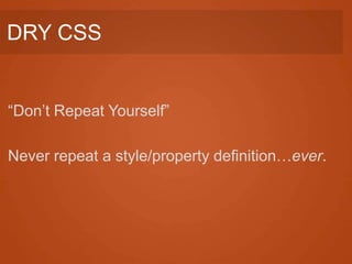


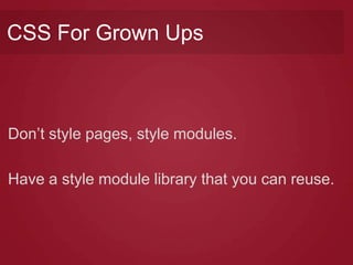


![Optimize Selectors
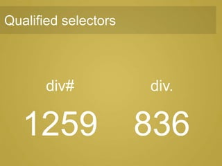
• Eliminate qualifier selectors [oocss]
• Eliminate the middleman
• Have the shortest chain possible
[oocss, smacss]](https://image.slidesharecdn.com/presentationscalableandmodularcssfitcam-130312103750-phpapp02/85/Scalable-and-Modular-CSS-FTW-93-320.jpg)
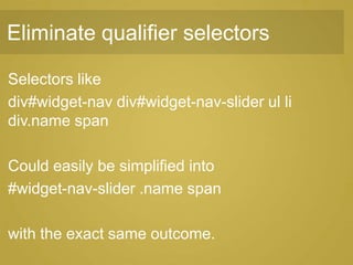
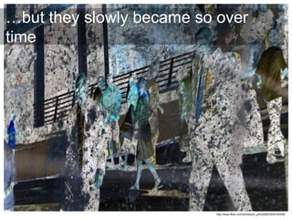
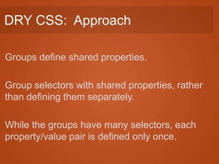
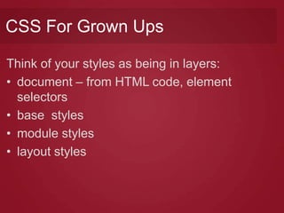
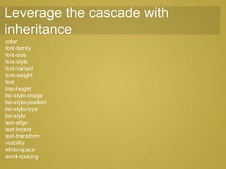
![Reduce the Redundant
• Leverage the cascade by relying on
inheritance [oocss]
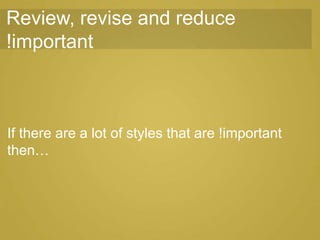
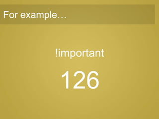
• Review, revise and reduce !important
[oocss, smacss]](https://image.slidesharecdn.com/presentationscalableandmodularcssfitcam-130312103750-phpapp02/85/Scalable-and-Modular-CSS-FTW-98-320.jpg)

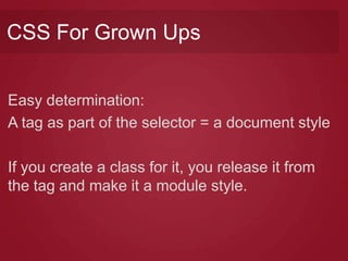
![(2) Intermediate phase
• Clear the cruft
• Create preliminary portable styles [cfgu]
• Begin instituting modules based on design
patterns [oocss, smacss, cfgu]
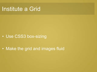
• Institute a Grid [oocss]](https://image.slidesharecdn.com/presentationscalableandmodularcssfitcam-130312103750-phpapp02/85/Scalable-and-Modular-CSS-FTW-104-320.jpg)
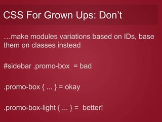
![Clear the cruft
• Eliminate inline styles & decrease use of
<span>
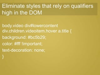
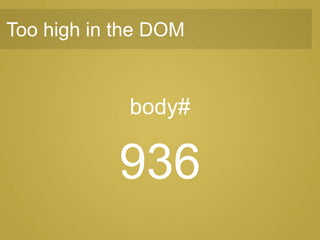
• Eliminate styles that rely on qualifiers high in
the DOM [oocss]
• Use classnames as key selector [smacss]
• Create preliminary portable styles [cfgu]](https://image.slidesharecdn.com/presentationscalableandmodularcssfitcam-130312103750-phpapp02/85/Scalable-and-Modular-CSS-FTW-105-320.jpg)
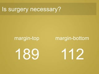
![Create preliminary portable styles
• Typographic classes for headings, etc.[cfgu]
• Surgical layout helpers [cfgu]](https://image.slidesharecdn.com/presentationscalableandmodularcssfitcam-130312103750-phpapp02/85/Scalable-and-Modular-CSS-FTW-108-320.jpg)
![(3) Advanced phase
• Continue modularizing page elements
[ocss, smacss, cfgu]
• Continue cleaning-up selectors and styles
• Separate CSS files by category [smacss]](https://image.slidesharecdn.com/presentationscalableandmodularcssfitcam-130312103750-phpapp02/85/Scalable-and-Modular-CSS-FTW-114-320.jpg)


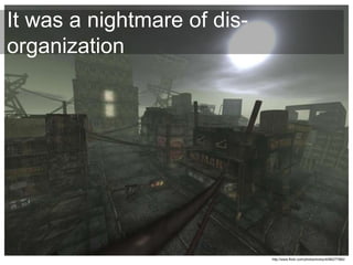
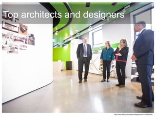
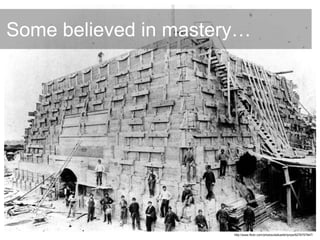
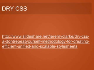
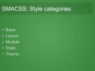
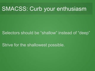
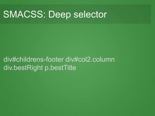
The document recounts the story of 'Metacoax', a conceptual journey through the evolution of CSS methodologies, focusing on scalable and modular CSS practices. It emphasizes key principles like DRY (Don't Repeat Yourself), OOCSS (Object-Oriented CSS), and SMACSS (Scalable and Modular Architecture for CSS) to enhance code efficiency and maintainability. Through various chapters, it shares insights from industry leaders and outlines necessary phases to overcome common CSS challenges and improve web design frameworks.


![지성봉 - WAI-ARIA 실전 공략 [WSConf. Seoul 2016/2017]](https://cdn.slidesharecdn.com/ss_thumbnails/wai-aria-161221054244-thumbnail.jpg?width=640&height=640&fit=bounds)
![김태훈 - Google AMP는 어떻게 빠른 성능을 내나 [WSConf. Seoul 2016/2017]](https://cdn.slidesharecdn.com/ss_thumbnails/ampwsconf-161221054612-thumbnail.jpg?width=640&height=640&fit=bounds)
![안형우 - 유지보수하기 쉬운 CSS 전략 [WSConf. Seoul 2016/2017]](https://cdn.slidesharecdn.com/ss_thumbnails/css-161222094443-thumbnail.jpg?width=640&height=640&fit=bounds)
![윤원진 - 반응형웹디자인(RWD)을 위한 넓고 얕은 지식 [WSConf. Seoul 2016]](https://cdn.slidesharecdn.com/ss_thumbnails/rwd-161221055137-thumbnail.jpg?width=640&height=640&fit=bounds)

![정찬명 - CSS Selectors in HTML [WSConf. Seoul 2016/2017]](https://cdn.slidesharecdn.com/ss_thumbnails/cssselectorsinhtml-161222095114-thumbnail.jpg?width=640&height=640&fit=bounds)
![이환 - 이미지는 마크업의 반이다. [WSConf. Seoul 2016/2017]](https://cdn.slidesharecdn.com/ss_thumbnails/random-170314075458-thumbnail.jpg?width=640&height=640&fit=bounds)
![김영욱 - Microsoft Bot Framework [WSConf. Seoul 2017]](https://cdn.slidesharecdn.com/ss_thumbnails/20170311microsoftbotframework-170314074641-thumbnail.jpg?width=640&height=640&fit=bounds)