Download as PDF, PPTX


![People hate pie charts
http://www.storytellingwithdata.com/blog/2011/07/death-to-pie-charts
especially Edward Tufte
A table is nearly always better than a dumb pie chart; the only worse design than a pie
chart is several of them[...] pie charts should never be used. - ”The Visual Display of
Quantitative Information”](https://image.slidesharecdn.com/2016-07-28rdvwpritchard-160802085022/85/RDVW-Hands-on-session-Python-30-320.jpg)


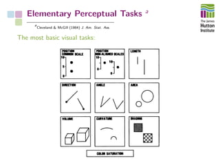
The document outlines a workshop on Python-based data visualization, emphasizing the importance of effective graphical representation for data communication. It discusses various visualization methods, their effectiveness, and describes hands-on sessions with Python libraries and exercises. Key points include the critique of commonly used visualizations such as pie charts and bar charts, advocating for evidence-based representation to enhance data interpretation.


![[2013.12.02] Mads Albertsen: Extracting Genomes from Metagenomes](https://cdn.slidesharecdn.com/ss_thumbnails/2013-131202013655-phpapp02-thumbnail.jpg?width=640&height=640&fit=bounds)


