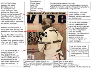
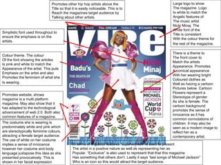
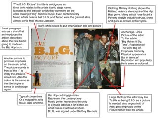
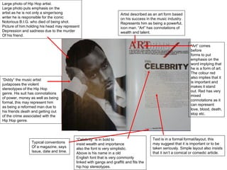
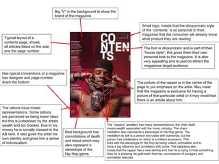
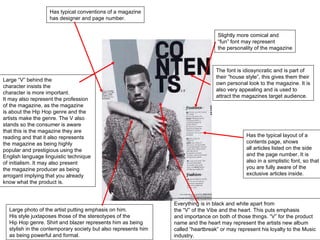
The document provides an analysis of the front cover design elements of several hip hop music magazines. It discusses the use of large, prominent images of iconic artists to draw attention and represent the target audience. Font styles, colors and layouts are also described as working to match the themes and aesthetics of the featured artists while reinforcing stereotypes associated with the hip hop genre through imagery like chains and grills. Common magazine design conventions are also noted, including issue details, additional article previews and an emphasis on exclusivity through featured content.