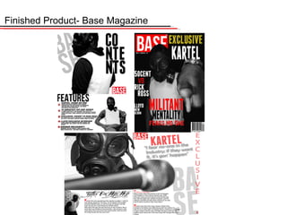
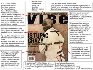
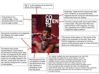
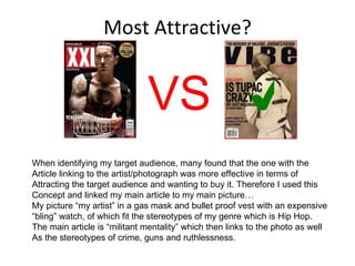
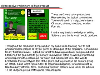
SlideShare a Scribd company logo
1 of 15
Evaluation Who? What? When? Where? Why? How?
Finished Product- Base Magazine
Conventions Of Real Media Products My magazine has many forms of conventions that are noticeable in other types of  Print media.  In terms of using features that other magazines have, this consists of things such As; page numbers, barcode, issue, date, large logo, other main articles presented and A key photograph of an idealistic character that people may aspire to be. This then Appeals to my target audience as I use a character who is easily recognised with a  Headline article and this will make them want to buy it.  My front page uses a lot of other magazine conventions as it consists of one main  Picture, large logo, one main article and all side articles. In terms of lexis, my magazine Also follows these conventions. The lexis must link to my magazine genre as well  As the stereotypes of any magazine. For example “exclusive” is a keyword that  A lot of magazines use to make their own magazine stand out from others as that Story or picture is only accessible in their magazine. My contents has its own  Idiosyncratic style in terms of font. The layout of the font is fairly original and will Be featured in every contents so it will become a feature that is recognised by all Readers. My contents also challenges the conventions of other products as the contents Is supposed to inform the reader to what is featured in the magazine, but my contents Still has emphasis on the key character as I have a large photo of the artist and the Information below. My double page spread also follows this layout, as the photo covers The majority of both of the pages.
Highlighting Conventions In My Product
BOLD ICONIC LOGO: Magazine title stands  Behind the person to  Put the emphasis on Tupac. The logo is bold And black to enhance the Colours from the background As well as making it stand out. Colour black has connotations of death and nothingness, in this case can be linked to main article and the idea of insanity.   The picture of the performer matches the key idea of the main article as being crazy as he's in a stray jacket. Colour white of the stray jacket is iconic and is easily recognised. The connotations of white juxtapose this costume as white has connotations of peace and angelic ideologies.   PUN; pun is used to add a sense of humour. E.g  “h-oops” when linking to basketball player Shaquille O'Neal. Target audience is represented here as the main story is about hip hop legend and a sub story of sport.  Red has connotations such as  Blood, death, stop and pain. This May be linked to the stereotypes of  Hip hop. Also at this present time When the picture was taken, east coast And west coast were at a musical culture war with 2 rappers fighting each other. (biggie, 2pac) Low key lighting on the Performers face but the Stray jacket is illuminated Almost as a technique of  Anchorage to link to main Article.  Image takes up large space Due to Tupac being such an  Iconic figure. Little amount of writing. It attracts the target audience to pick the magazine up. Common layout, consumer Knows where to look for Magazine logo. Logo stands out And attracts reader. “ Is tupac crazy?” bold and bigger font That  “…jus misunderstood” attracts reader To pick up the magazine, represents him As crazy.  Another iconic figure stands above the logo/title So that it is easily noticed. Only two other articles on front cover, Puts emphasis on tupac and represents target audience As both other articles are to do with sport. Target audience Seems to be predominately young and male.
The font is idiosyncratic and is part of their “ house style”, this gives them their own personal look to the magazine. It is also  very appealing and is used to attract the  magazines target audience.  Small logo, insists that the idiosyncratic style of the  “contents” is so personal to their  magazine that the consumer will already know what product they are reading.  The  “rappers” jewellery has many representations, the chain itself insists wealth associated with the music industry. The chain  medallion also represents a stereotype of Hip Hop genre. The medallion its self is a person encrusted with diamonds, but the person has a balaclava on which is a military accessory. This links with the stereotype of Hip Hop as being violent, animalistic and to have a big influence and correlation with crime. The balaclava also  insists that the rapper has a new identity and that he is trying to hide something. Also he is showing his gold teeth that has connotations of savagery and animalistic features. The picture of the rapper is in the centre of the page to put emphasis on the artist. May insist that the magazine is exclusive for having a  picture of that particular artist or it may insist that there is an article about him. The tattoos have mixed representations. Some tattoos are perceived as being lower class but this is juxtaposed by the artists wealth and tax bracket. Due to his money he is socially classed in the  AB rank. It also gives the artist his own identity and gives him a sense of individualism.  Typical layout of a contents page, shows  all articles listed on the side and the page number.  Big  “V” in the background to show the brand of the magazine Has typical conventions of a magazine has designer and page number  down the bottom. Red background has connotations of death  and blood which may also represent a  stereotype of the  Hip Hop genre.
Social Groups-Target Audience Although Hip Hop artists are commonly associated with crime, they are ranked in the A social status due to their high income. I have targeted ABC1 in which I am able to reach most “classes” of society. My artist follows these social groups in terms of props and appearance as he is wearing a gas mask and bullet proof jacket  Along with “bling”. This follows the stereotypes and conventions of the genre as well as The social groups. Also in terms of lexis, “Militant” is used on my front cover which Follows these stereotypes and the explicit lyrics that Hip Hop artists portray in  Contemporary Hip Hop. This appeals to my target audience as it portrays my artist to be “ tough” and “ruthless”. In a small picture featured on my double page spread of my artist  Standing against a brick wall, this has connotations of my artist being “street wise” and bricks denote being strong and have a hard structure which may link to my artist. The  Gas mask and bullet proof jacket is an idiosyncratic feature of my artist and follows the  Representation of the “Militant” article title. “ Kartel ”  is also linked with gangs and small Businesses which furthers the stereotype of Hip Hop being crime driven. Most people say that the Hip Hop industry targets predominantly teenaged males in which I followed their opinion, due to the stereotyped  “immaturity” and “anti-social” behavior of teenagers I think that is why they are attracted to the genre as it is commonly linked with crime, guns, cars and women of which boys are commonly stereotyped to like
i believe that it is important to identify my target audience in which then i can use to decide for my target audience for my own magazine. Graeme Burton identifies the difference between socially grouped audience via age, gender, social status, race, location etc. This is his first classification. His second consists of grouping media audiences via relationship with media for example film goers, games console players, consistent magazine buyers etc. He uses both of these ideas to identify his audience and enable him to determine a target audience for that type of media. I have used Graeme Burtons theory to help me identify my audience and help me determine what my target audience is for my Hip Hop magazine. I can base the identfication socially or relationship with the media in which is the 2 ideoligies Burton promotes. I  then follow generic conventions of this type of magazine and use stereotypes to enable me to reach my target audience. For example i will research VIBE magazine as this is the contemporary Hip Hop magazine, i will look at their target audience and from that i will then identify my target audience and then begin planning to be able to reach this target audience. Hartley further identifies the importance of:• self: audiences can be grouped by their aspirations, etc. for example, if you target ambitious people (musicians?), you can offer a motive such as performance enhancement.• nation: the country a group comes from and its style. Most western societies (e.g. Britain, America, France) follow common ideals, such as work hard to achieve your aims. Cultural Imperialism refers to the influence of American Media values on the world, e.g. Hip Hop=Big Chains and Crime are the common semantic field. Other cultures follow different values. I will be using contemporary western values. My magazine will need the use of both categories for me to determine the identity of my target audience. For example i will identify the difference between socially grouped audiences; age- 16-24 gender-Male Race-Mixed (all ethnicities) Household Income-£14k($)/£40k($) Location- America/England Social Status Classification-ABC1 I based my identification of audiences through the audiences relationship with the media. Due to the technological advancement of Web2.0 I wanted to adapt my magazine and promote a multi platform magazine. As print is in decline i should consider promoting an internet site on my magazine cover. I will have to look at the relationship between consumers using the internet to gain their contemporary music knowledge and their relationship with buying the magazines to get the knowledge. I will also have to look at the stereotypes and the conventions of the Hip Hop music genre. Target Audience And How I Chose It
Most Attractive? ✔ VS When identifying my target audience, many found that the one with the  Article linking to the artist/photograph was more effective in terms of Attracting the target audience and wanting to buy it. Therefore I used this Concept and linked my main article to my main picture… My picture “my artist” in a gas mask and bullet proof vest with an expensive “ bling” watch, of which fit the stereotypes of my genre which is Hip Hop. The main article is “militant mentality” which then links to the photo as well As the stereotypes of crime, guns and ruthlessness.
What Attracts You To A Magazine? What Price? This was another chart that determined the outcome of my magazine. This survey showed that the majority of people were more attracted to The colour and image more than anything else. This is why I put Emphasis on these 2 features. The colour acted as a sense of achorage As it linked the key article to the picture. This also helped to introduce My own idiosyncratic style making my magazine more appealing therefore Attracting my target audience and making it more “buyable”.
Distribution Of My Magazine As I want my magazine to be a multi-format product, I will target 2 distributor's; 1 for an online “ emagazine ”  and the other for my print magazine. I want my magazine to be adapt to the technological advancement of Web2.0 As print media is in decline. This means that my magazine can be accessible Anywhere through the use of the internet. This will need a slightly different design To fit the online typical conventions such as interactivity features.  I also want an international distributor to distribute my print type magazine, I want it To be international so that it can gain popularity, profit but also represent the Contemporary music genre of Hip Hop.  1. In terms of distribution I will use COMAG who are the worlds largest magazine Distributor. They are jointly owned by NATMAG and CONDE NAST. NATMAG Is owned by Heart Corporation. I chose this distributor as they are trust worthy, Popular, well known, and distribute many magazine world wide. They don’ t have Many music magazine distributions, and none of the Hip Hop genre, so I think This will create a symbiotic relation as they reach a wider audience, as well as  Myself benefitting by getting my magazine distributed world wide by a well known Prestigious magazine distributor. 2. Another distributor I would like to use is DENNIS. This is for one specific reason. I want my magazine to also adapt to the technological advancement of web2.0. So I want my magazine to be multi modal and not just have a print format. DENNIS Currently distribute a daily “ emag ”  called  “ monkey ”  this is rising popularity and has a target Audience of 18-24 which is around my region. DENNIS is a relatively small company but has A lot of potential, so I think this would benefit us both
Technology I Have Used Cameras, editing software, computers, mac’s, lighting equipment, props Throughout the media AS course I have used many different technologies to Help make my work the best it can be to my ability. I have used high mega-pixel Cameras for the best focus and better picture quality.editing software such as Adobe Photoshop Elements as well asComputers and mac’s to help me to edit these images to give it a sleek Professional look. I also used lighting equipment to create a sense of chiascuro Lighting and give the images a better,  professional effect. In terms of props I needed to use props that fit the conventions and stereotypes of my music genre. For example it has stereotypes of crime,  Guns, money, “bling” women etc. So I focused on the “crime, guns and money”. Above is an example of how I developed skills to be able to edit images on  Editing software. I used Adobe Photoshop Elements to do this.
Retrospective-Preliminary To Main Product These are 2 very basic productions Representing the typical conventions You would see in a magazine in terms Of layout, photos, structure, articles, Font etc. I had a very basic knowledge of editing Software and this is what I could produce. Throughout the production I improved on my basic skills, learning how to edit And manipulate images to fit your genre or ideologies of the magazine. For example On my final front cover, I edited my “artist” to have a plain black background and  I darkened the gas mask to get a more “malevolent” effect as well as brightening And sharpening the colours on his watch and bullet proof vest. This was to Emphasize the stereotypes that fit the genre and to juxtapose the colours giving An effect.. I also learnt “basic rules” to creating a magazine, for example not to Use too many different fonts, conflicting “kid-like” colours. Also to link the articles To the image to give a professional representation.
In my final piece I have used more bold, bright, and larger fonts to introduce The key articles in my magazine. This is used to help attract the target audience As well as give the product a professional look.  All of the colours I have used link to something else in the magazine to give it A professional appearance. For example the “Militant mentality” article links to the Logo of the magazine to show that it is only exclusive to this magazine aswell as Having pragmatics of blood and death which links to the Hip Hop stereotypes. The colours also link the what the artist is wearing putting emphasis on the photo. In terms of layout they both have the same conventions of a layout and look fairly  The same. I wanted to have my own idiosyncratic style in terms of layout. This is Easily noticeable on my contents page. But on my front cover I wanted my artist To be the emphasis, and from that I can attract my target audience.
Thank You

More Related Content

What's hot (17)

Media Evaluation
Media EvaluationMedia Evaluation
Media Evaluation
 
As media course work evaluation
As media course work  evaluationAs media course work  evaluation
As media course work evaluation
 
As media course work- evaluation
As media course work- evaluationAs media course work- evaluation
As media course work- evaluation
 
Planning for my music magazine
Planning for my music magazinePlanning for my music magazine
Planning for my music magazine
 
As media course work- evaluation
As media course work-  evaluationAs media course work-  evaluation
As media course work- evaluation
 
D:\Sarai\Evaluation
D:\Sarai\EvaluationD:\Sarai\Evaluation
D:\Sarai\Evaluation
 
Evaluation
EvaluationEvaluation
Evaluation
 
Evaluation
EvaluationEvaluation
Evaluation
 
As media course work- evaluation
As media course work- evaluationAs media course work- evaluation
As media course work- evaluation
 
As media course work evaluation
As media course work  evaluationAs media course work  evaluation
As media course work evaluation
 
Media As Corsework Pp
Media As Corsework PpMedia As Corsework Pp
Media As Corsework Pp
 
Magazine evaluation
Magazine evaluationMagazine evaluation
Magazine evaluation
 
Preliminary task and planning & research Joe Dolan
Preliminary task and planning & research Joe DolanPreliminary task and planning & research Joe Dolan
Preliminary task and planning & research Joe Dolan
 
Music magazine analysis
Music magazine analysisMusic magazine analysis
Music magazine analysis
 
Evaluation
EvaluationEvaluation
Evaluation
 
media studies evaluation task
media studies evaluation taskmedia studies evaluation task
media studies evaluation task
 
Media evaluation Q1
Media evaluation Q1Media evaluation Q1
Media evaluation Q1
 

Viewers also liked (16)

Locations
LocationsLocations
Locations
 
Mod sust
Mod sustMod sust
Mod sust
 
Some Contemporary R&B Artists
Some Contemporary R&B ArtistsSome Contemporary R&B Artists
Some Contemporary R&B Artists
 
Eng Search&Recruit
Eng  Search&RecruitEng  Search&Recruit
Eng Search&Recruit
 
Media
MediaMedia
Media
 
Outdoor Locations
Outdoor LocationsOutdoor Locations
Outdoor Locations
 
Asset Recovery Oct 2011 Author Gavin Shiu Kornerstone
Asset Recovery Oct 2011  Author Gavin Shiu KornerstoneAsset Recovery Oct 2011  Author Gavin Shiu Kornerstone
Asset Recovery Oct 2011 Author Gavin Shiu Kornerstone
 
Digital pianos Waldman
Digital pianos WaldmanDigital pianos Waldman
Digital pianos Waldman
 
The Mind Set4
The Mind Set4The Mind Set4
The Mind Set4
 
2009/2010 Annual Report
2009/2010 Annual Report2009/2010 Annual Report
2009/2010 Annual Report
 
Poster design process
Poster design processPoster design process
Poster design process
 
The fortunate princess
The fortunate princessThe fortunate princess
The fortunate princess
 
Jack and the Beanstalk
Jack and the BeanstalkJack and the Beanstalk
Jack and the Beanstalk
 
Guia didactica hort escolar
Guia  didactica hort escolarGuia  didactica hort escolar
Guia didactica hort escolar
 
Aml & Reporting Inno Xcell October 2010
Aml & Reporting  Inno Xcell October  2010Aml & Reporting  Inno Xcell October  2010
Aml & Reporting Inno Xcell October 2010
 
Rapunzel powerpoint
Rapunzel powerpointRapunzel powerpoint
Rapunzel powerpoint
 

Similar to Evaluation (20)

Evaluation questions
Evaluation questionsEvaluation questions
Evaluation questions
 
Radial Analasies
Radial AnalasiesRadial Analasies
Radial Analasies
 
Radial Analysis
Radial AnalysisRadial Analysis
Radial Analysis
 
Product Analysis
Product AnalysisProduct Analysis
Product Analysis
 
Evaluation on magazine
Evaluation on magazineEvaluation on magazine
Evaluation on magazine
 
Evaluation on magazine
Evaluation on magazineEvaluation on magazine
Evaluation on magazine
 
Evaluation on magazine
Evaluation on magazineEvaluation on magazine
Evaluation on magazine
 
Media evaluation
Media evaluationMedia evaluation
Media evaluation
 
Evaluation
EvaluationEvaluation
Evaluation
 
Music Magazine Evaluation (Finished)
Music Magazine Evaluation (Finished)Music Magazine Evaluation (Finished)
Music Magazine Evaluation (Finished)
 
Unit 30 l02
Unit 30 l02 Unit 30 l02
Unit 30 l02
 
Question 1 and 2
Question 1 and 2 Question 1 and 2
Question 1 and 2
 
Evaluation
EvaluationEvaluation
Evaluation
 
Unit 30 l02 new
Unit 30 l02 newUnit 30 l02 new
Unit 30 l02 new
 
As media studies evaluation
As media studies evaluationAs media studies evaluation
As media studies evaluation
 
As evaluation 2
As evaluation 2As evaluation 2
As evaluation 2
 
Evaluation final 1
Evaluation final 1Evaluation final 1
Evaluation final 1
 
Evaluation: Q
Evaluation: QEvaluation: Q
Evaluation: Q
 
Contents and Double page spread analysis
Contents and Double page spread analysisContents and Double page spread analysis
Contents and Double page spread analysis
 
Double page spread analysis
Double page spread analysisDouble page spread analysis
Double page spread analysis
 

More from Callum Wilson

More from Callum Wilson (8)

Genre Questionnaire
Genre QuestionnaireGenre Questionnaire
Genre Questionnaire
 
Title Slides For Film
Title Slides For FilmTitle Slides For Film
Title Slides For Film
 
Malice Review Final
Malice Review FinalMalice Review Final
Malice Review Final
 
Malice Review (Editing)
Malice Review (Editing)Malice Review (Editing)
Malice Review (Editing)
 
Evaluation
Evaluation Evaluation
Evaluation
 
Planning
PlanningPlanning
Planning
 
Identifying Target Audience
Identifying Target AudienceIdentifying Target Audience
Identifying Target Audience
 
Preliminary Task
Preliminary TaskPreliminary Task
Preliminary Task
 

Evaluation

  • 1. Evaluation Who? What? When? Where? Why? How?
  • 3. Conventions Of Real Media Products My magazine has many forms of conventions that are noticeable in other types of Print media. In terms of using features that other magazines have, this consists of things such As; page numbers, barcode, issue, date, large logo, other main articles presented and A key photograph of an idealistic character that people may aspire to be. This then Appeals to my target audience as I use a character who is easily recognised with a Headline article and this will make them want to buy it. My front page uses a lot of other magazine conventions as it consists of one main Picture, large logo, one main article and all side articles. In terms of lexis, my magazine Also follows these conventions. The lexis must link to my magazine genre as well As the stereotypes of any magazine. For example “exclusive” is a keyword that A lot of magazines use to make their own magazine stand out from others as that Story or picture is only accessible in their magazine. My contents has its own Idiosyncratic style in terms of font. The layout of the font is fairly original and will Be featured in every contents so it will become a feature that is recognised by all Readers. My contents also challenges the conventions of other products as the contents Is supposed to inform the reader to what is featured in the magazine, but my contents Still has emphasis on the key character as I have a large photo of the artist and the Information below. My double page spread also follows this layout, as the photo covers The majority of both of the pages.
  • 5. BOLD ICONIC LOGO: Magazine title stands Behind the person to Put the emphasis on Tupac. The logo is bold And black to enhance the Colours from the background As well as making it stand out. Colour black has connotations of death and nothingness, in this case can be linked to main article and the idea of insanity. The picture of the performer matches the key idea of the main article as being crazy as he's in a stray jacket. Colour white of the stray jacket is iconic and is easily recognised. The connotations of white juxtapose this costume as white has connotations of peace and angelic ideologies. PUN; pun is used to add a sense of humour. E.g “h-oops” when linking to basketball player Shaquille O'Neal. Target audience is represented here as the main story is about hip hop legend and a sub story of sport. Red has connotations such as Blood, death, stop and pain. This May be linked to the stereotypes of Hip hop. Also at this present time When the picture was taken, east coast And west coast were at a musical culture war with 2 rappers fighting each other. (biggie, 2pac) Low key lighting on the Performers face but the Stray jacket is illuminated Almost as a technique of Anchorage to link to main Article. Image takes up large space Due to Tupac being such an Iconic figure. Little amount of writing. It attracts the target audience to pick the magazine up. Common layout, consumer Knows where to look for Magazine logo. Logo stands out And attracts reader. “ Is tupac crazy?” bold and bigger font That “…jus misunderstood” attracts reader To pick up the magazine, represents him As crazy. Another iconic figure stands above the logo/title So that it is easily noticed. Only two other articles on front cover, Puts emphasis on tupac and represents target audience As both other articles are to do with sport. Target audience Seems to be predominately young and male.
  • 6. The font is idiosyncratic and is part of their “ house style”, this gives them their own personal look to the magazine. It is also very appealing and is used to attract the magazines target audience. Small logo, insists that the idiosyncratic style of the “contents” is so personal to their magazine that the consumer will already know what product they are reading. The “rappers” jewellery has many representations, the chain itself insists wealth associated with the music industry. The chain medallion also represents a stereotype of Hip Hop genre. The medallion its self is a person encrusted with diamonds, but the person has a balaclava on which is a military accessory. This links with the stereotype of Hip Hop as being violent, animalistic and to have a big influence and correlation with crime. The balaclava also insists that the rapper has a new identity and that he is trying to hide something. Also he is showing his gold teeth that has connotations of savagery and animalistic features. The picture of the rapper is in the centre of the page to put emphasis on the artist. May insist that the magazine is exclusive for having a picture of that particular artist or it may insist that there is an article about him. The tattoos have mixed representations. Some tattoos are perceived as being lower class but this is juxtaposed by the artists wealth and tax bracket. Due to his money he is socially classed in the AB rank. It also gives the artist his own identity and gives him a sense of individualism. Typical layout of a contents page, shows all articles listed on the side and the page number. Big “V” in the background to show the brand of the magazine Has typical conventions of a magazine has designer and page number down the bottom. Red background has connotations of death and blood which may also represent a stereotype of the Hip Hop genre.
  • 7. Social Groups-Target Audience Although Hip Hop artists are commonly associated with crime, they are ranked in the A social status due to their high income. I have targeted ABC1 in which I am able to reach most “classes” of society. My artist follows these social groups in terms of props and appearance as he is wearing a gas mask and bullet proof jacket Along with “bling”. This follows the stereotypes and conventions of the genre as well as The social groups. Also in terms of lexis, “Militant” is used on my front cover which Follows these stereotypes and the explicit lyrics that Hip Hop artists portray in Contemporary Hip Hop. This appeals to my target audience as it portrays my artist to be “ tough” and “ruthless”. In a small picture featured on my double page spread of my artist Standing against a brick wall, this has connotations of my artist being “street wise” and bricks denote being strong and have a hard structure which may link to my artist. The Gas mask and bullet proof jacket is an idiosyncratic feature of my artist and follows the Representation of the “Militant” article title. “ Kartel ” is also linked with gangs and small Businesses which furthers the stereotype of Hip Hop being crime driven. Most people say that the Hip Hop industry targets predominantly teenaged males in which I followed their opinion, due to the stereotyped “immaturity” and “anti-social” behavior of teenagers I think that is why they are attracted to the genre as it is commonly linked with crime, guns, cars and women of which boys are commonly stereotyped to like
  • 8. i believe that it is important to identify my target audience in which then i can use to decide for my target audience for my own magazine. Graeme Burton identifies the difference between socially grouped audience via age, gender, social status, race, location etc. This is his first classification. His second consists of grouping media audiences via relationship with media for example film goers, games console players, consistent magazine buyers etc. He uses both of these ideas to identify his audience and enable him to determine a target audience for that type of media. I have used Graeme Burtons theory to help me identify my audience and help me determine what my target audience is for my Hip Hop magazine. I can base the identfication socially or relationship with the media in which is the 2 ideoligies Burton promotes. I then follow generic conventions of this type of magazine and use stereotypes to enable me to reach my target audience. For example i will research VIBE magazine as this is the contemporary Hip Hop magazine, i will look at their target audience and from that i will then identify my target audience and then begin planning to be able to reach this target audience. Hartley further identifies the importance of:• self: audiences can be grouped by their aspirations, etc. for example, if you target ambitious people (musicians?), you can offer a motive such as performance enhancement.• nation: the country a group comes from and its style. Most western societies (e.g. Britain, America, France) follow common ideals, such as work hard to achieve your aims. Cultural Imperialism refers to the influence of American Media values on the world, e.g. Hip Hop=Big Chains and Crime are the common semantic field. Other cultures follow different values. I will be using contemporary western values. My magazine will need the use of both categories for me to determine the identity of my target audience. For example i will identify the difference between socially grouped audiences; age- 16-24 gender-Male Race-Mixed (all ethnicities) Household Income-£14k($)/£40k($) Location- America/England Social Status Classification-ABC1 I based my identification of audiences through the audiences relationship with the media. Due to the technological advancement of Web2.0 I wanted to adapt my magazine and promote a multi platform magazine. As print is in decline i should consider promoting an internet site on my magazine cover. I will have to look at the relationship between consumers using the internet to gain their contemporary music knowledge and their relationship with buying the magazines to get the knowledge. I will also have to look at the stereotypes and the conventions of the Hip Hop music genre. Target Audience And How I Chose It
  • 9. Most Attractive? ✔ VS When identifying my target audience, many found that the one with the Article linking to the artist/photograph was more effective in terms of Attracting the target audience and wanting to buy it. Therefore I used this Concept and linked my main article to my main picture… My picture “my artist” in a gas mask and bullet proof vest with an expensive “ bling” watch, of which fit the stereotypes of my genre which is Hip Hop. The main article is “militant mentality” which then links to the photo as well As the stereotypes of crime, guns and ruthlessness.
  • 10. What Attracts You To A Magazine? What Price? This was another chart that determined the outcome of my magazine. This survey showed that the majority of people were more attracted to The colour and image more than anything else. This is why I put Emphasis on these 2 features. The colour acted as a sense of achorage As it linked the key article to the picture. This also helped to introduce My own idiosyncratic style making my magazine more appealing therefore Attracting my target audience and making it more “buyable”.
  • 11. Distribution Of My Magazine As I want my magazine to be a multi-format product, I will target 2 distributor's; 1 for an online “ emagazine ” and the other for my print magazine. I want my magazine to be adapt to the technological advancement of Web2.0 As print media is in decline. This means that my magazine can be accessible Anywhere through the use of the internet. This will need a slightly different design To fit the online typical conventions such as interactivity features. I also want an international distributor to distribute my print type magazine, I want it To be international so that it can gain popularity, profit but also represent the Contemporary music genre of Hip Hop. 1. In terms of distribution I will use COMAG who are the worlds largest magazine Distributor. They are jointly owned by NATMAG and CONDE NAST. NATMAG Is owned by Heart Corporation. I chose this distributor as they are trust worthy, Popular, well known, and distribute many magazine world wide. They don’ t have Many music magazine distributions, and none of the Hip Hop genre, so I think This will create a symbiotic relation as they reach a wider audience, as well as Myself benefitting by getting my magazine distributed world wide by a well known Prestigious magazine distributor. 2. Another distributor I would like to use is DENNIS. This is for one specific reason. I want my magazine to also adapt to the technological advancement of web2.0. So I want my magazine to be multi modal and not just have a print format. DENNIS Currently distribute a daily “ emag ” called “ monkey ” this is rising popularity and has a target Audience of 18-24 which is around my region. DENNIS is a relatively small company but has A lot of potential, so I think this would benefit us both
  • 12. Technology I Have Used Cameras, editing software, computers, mac’s, lighting equipment, props Throughout the media AS course I have used many different technologies to Help make my work the best it can be to my ability. I have used high mega-pixel Cameras for the best focus and better picture quality.editing software such as Adobe Photoshop Elements as well asComputers and mac’s to help me to edit these images to give it a sleek Professional look. I also used lighting equipment to create a sense of chiascuro Lighting and give the images a better, professional effect. In terms of props I needed to use props that fit the conventions and stereotypes of my music genre. For example it has stereotypes of crime, Guns, money, “bling” women etc. So I focused on the “crime, guns and money”. Above is an example of how I developed skills to be able to edit images on Editing software. I used Adobe Photoshop Elements to do this.
  • 13. Retrospective-Preliminary To Main Product These are 2 very basic productions Representing the typical conventions You would see in a magazine in terms Of layout, photos, structure, articles, Font etc. I had a very basic knowledge of editing Software and this is what I could produce. Throughout the production I improved on my basic skills, learning how to edit And manipulate images to fit your genre or ideologies of the magazine. For example On my final front cover, I edited my “artist” to have a plain black background and I darkened the gas mask to get a more “malevolent” effect as well as brightening And sharpening the colours on his watch and bullet proof vest. This was to Emphasize the stereotypes that fit the genre and to juxtapose the colours giving An effect.. I also learnt “basic rules” to creating a magazine, for example not to Use too many different fonts, conflicting “kid-like” colours. Also to link the articles To the image to give a professional representation.
  • 14. In my final piece I have used more bold, bright, and larger fonts to introduce The key articles in my magazine. This is used to help attract the target audience As well as give the product a professional look. All of the colours I have used link to something else in the magazine to give it A professional appearance. For example the “Militant mentality” article links to the Logo of the magazine to show that it is only exclusive to this magazine aswell as Having pragmatics of blood and death which links to the Hip Hop stereotypes. The colours also link the what the artist is wearing putting emphasis on the photo. In terms of layout they both have the same conventions of a layout and look fairly The same. I wanted to have my own idiosyncratic style in terms of layout. This is Easily noticeable on my contents page. But on my front cover I wanted my artist To be the emphasis, and from that I can attract my target audience.