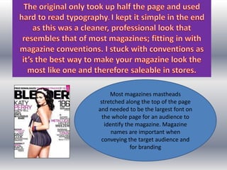
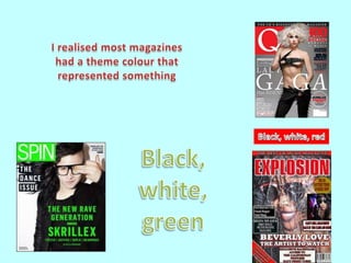
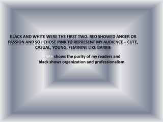
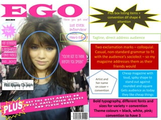
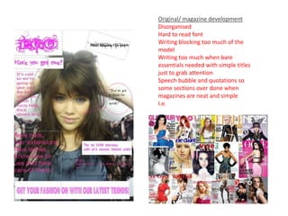
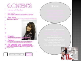
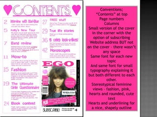
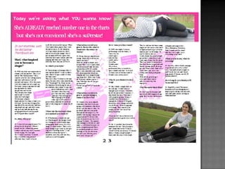
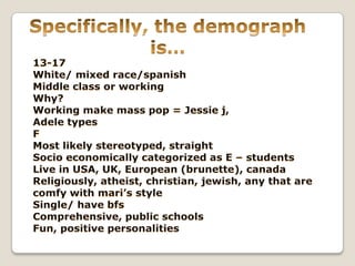
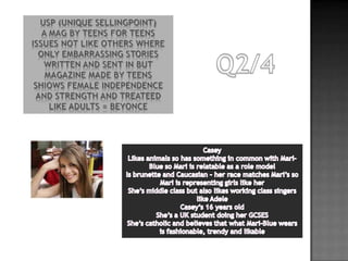
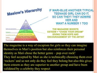
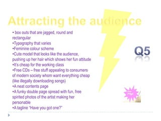
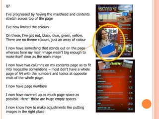
The evaluation is a creative task and the potential to show off your creative talents – use images,
audio, video and links to on line resources! Avoid just writing an essay, make it visually exciting!

1) In what ways does your media product use, develop or challenge forms and conventions of real
media products?

2) How does your media product represent particular social groups?
Represented dif from aimed for. Model portrayed = teen singer, pop selling to girls who like pop
singers role model. How media represents teens = bad i challenge that. Focus on music or other
stuff?? = register informal, cute lexis, semantic love, music terms?
Casual, natural -> lack of make-up, outside
Lifestyle = promoting angelic, sweet, honest but diplomatic. Hard working, fun, carefree

3)What kind of media institution might distribute your media product and why? Look at real mag
company

4)Who would be the audience for your media product?
How did you attract/address your audience? Slide 13 attract = range of fonts, clear to read, striking
main image.

5)What have you learnt about technologies from the process of constructing this product?

6)Looking back at your preliminary task, what do you feel you have learnt in the progression from it
to the full product?
Q1
In what ways does your media product use, develop or challenge forms and conventions of
real media products?
Most magazines mastheads
 stretched along the top of the page
and needed to be the largest font on
  the whole page for an audience to
   identify the magazine. Magazine
      names are important when
 conveying the target audience and
              for branding
White shows the purity of my readers and
black shows organization and professionalism
Plus box listing items =
          convention dif shape 4
                 attention


Tagline, direct address audience

 Two exclamation marks – colloquial.
 Casual, non-standard grammar to fit
 with the audience’s sociolect – so my
  magazine addresses them as their
            friends would
                    Cheap magazine with
  Artist and
                     loud, spiky shape to
  her name             stand out against
 on cover =         rounded and square
 convention        Gets audience as today
                   they like cheap things
Bold typography, different fonts and
   sizes for variety = convention
Theme colours = black, white, pink;
       convention to have 3
Conventions;
  Model engaging audience – looking to
                  camera
          Barcode in the corner
                    Price
                    Date
          Artist and artist name
                   Tagline
                  Box outs
               “Plus” listing
   “Hair extensions” all aligned neatly
      Keeping a few words to a line
                 FREE stuff
         Cheap price stands out
 Quotations of what the artist said next to
                     her
            Indexical – smiling
               Commercial
                  Mid shot

Conventions broken;
More than 3 words to a line because
the font would be too small if I tried
to organise it another way
Original/ magazine development
Disorganised
Hard to read font
Writing blocking too much of the
model
Writing too much when bare
essentials needed with simple titles
just to grab attention
Speech bubble and quotations so
some sections over done when
magazines are neat and simple
I.e.
Original;

            By looking at other magazines, I
              found everything to do with
            crushes, celebrities, life stories,
                horoscopes and fashion. I
           incorporated all these things into
             my work to make it a realistic
                       magazine


         The image didn’t fit around the
                       text
        I had the correct amount of page
       numbers in correlation to the price
                    No columns
            Image placed incorrectly
       Nothing surrounding the “contents”
         Not enough topics next to page
              numbers (blank spots)
       White – all white on the page needs
       to be covered like a real magazine

                      I.E. -->>


Kept
Conventions;
      “Contents” at top
        Page numbers
           Columns
 Small version of the cover
   in the corner with the
    option of subscribing
  Website address BUT not
on the cover – there wasn’t
          any space
  Same font for each new
             topic
  And same font for small
  typography explaining it
 but both different to each
            other.
   Stereotypical feminine
    views – fashion, pink,
 hearts and rounded, cute
              text
 Hearts and underlining for
   a nice, shapely outline
The pop channels would feature and promote Mari-Blue as
    they have artists like Carly Rae Jepsen.
    (She also looks like my model so I know this is the kind of
                                                                  B
    look my audience like)

    With over 13 million views and around 98% of people
                                                                  R
    watching liking the video it shows Carly’s popularity and
    how popular my artist would be.                               A
    Magazines can sponsor
    Shows. My marketing strategy would be to advertise
    “EGO” on the advert breaks for shows like Gossip Girl and
                                                                  N
    Glee as my target audience watch these shows as well as
    channels like ITV and E4.                                     D
    Consumer response? They love young, cute singers
                                                                  I
http://www.youtube.com/watch?v=fWNa
R-rxAic                                                           N
                                                                  G
The artist is 17 and therefore a role
  model to the younger girls and a
friend to the 17 year old audience.
Being within this age range myself
I’m surrounded by girls within this
 age group who like pop music and
 by choosing an audience who like
  this genre; my magazine gets an
 approximation of 20% of readers
 as 40% of people like mainstream
 and half of that group are female.
  By choosing this genre I can got
inspiration from a whole collection
    of magazines – adapting such
     things like a large letter and
     putting it in the background
 To make it more feminine, I used
   italics on “M” and put the letter
across the whole two pages so that
       it would tie the interview
               altogether
reached a peak circulation of 80,000
                 copies


Between 1990 and 2000, the number of
Teens ages 12 to 19 soared to 32 million,
an increase
of nearly 4.5 million
17 % growth rate far outpaced the growth
of the rest of the
population
Casual, sociolect
Model look like average teen, push up hair, styling it – appearance,
vanity
Coverlines
Use of shots and angles
35 slides

Slideshare
PREZI ANSWERS 2


Branding =
Maslow hierarchy
represents stereotype but fairly – ie. Lots of demi lovato fans, girls
seen as lovely, cute good represetnation
Register, colloquial, small voacbulary.
The magazine is a way of escapism for girls so they can imagine
themselves in Mari’s position but also reinforces their personal
identity as Mari chose the better genre – pop over rock!
They feel accepted by Mari as she is technically choosing them over
‘rockers’ and so not only do they feel they belong but also this gives
them esteem as they are superior to another group and have been
validated by a celebrity they respect
• box outs that are jagged, round and
rectangular
•Typography that varies
•Feminine colour scheme
•Cute model that looks like the audience,
pushing up her hair which shows her fun attitude
•It’s cheap for the working class
•Free CDs – free stuff appealing to consumers
of modern society whom want everything cheap
(like illegally downloading songs)
•A neat contents page
•A funky double page spread with fun, free
spirited photos of the artist making her
personable
•A tagline “Have you got one?”
Q7

I’ve progressed by having the masthead and contents
stretch across top of the page

I’ve now limited the colours

On these, I’ve got red, black, blue, green, yellow.
There are no theme colours, just an array of colour

I now have something that stands out on the page
whereas here my main image wasn’t big enough to
make itself clear as the main image

I now have two columns on my contents page as to fit
into magazine conventions – most don’t have a whole
page of A4 with the numbers and topics at opposite
                                                       *
ends of the whole page.
                                                       *
I now have page numbers

I now have covered up as much page space as
possible. Here* there are huge empty spaces

I now know how to make adjustments like putting
                                                           *
images in the right place

Evaluation media

  • 1.
    The evaluation isa creative task and the potential to show off your creative talents – use images, audio, video and links to on line resources! Avoid just writing an essay, make it visually exciting! 1) In what ways does your media product use, develop or challenge forms and conventions of real media products? 2) How does your media product represent particular social groups? Represented dif from aimed for. Model portrayed = teen singer, pop selling to girls who like pop singers role model. How media represents teens = bad i challenge that. Focus on music or other stuff?? = register informal, cute lexis, semantic love, music terms? Casual, natural -> lack of make-up, outside Lifestyle = promoting angelic, sweet, honest but diplomatic. Hard working, fun, carefree 3)What kind of media institution might distribute your media product and why? Look at real mag company 4)Who would be the audience for your media product? How did you attract/address your audience? Slide 13 attract = range of fonts, clear to read, striking main image. 5)What have you learnt about technologies from the process of constructing this product? 6)Looking back at your preliminary task, what do you feel you have learnt in the progression from it to the full product?
  • 2.
    Q1 In what waysdoes your media product use, develop or challenge forms and conventions of real media products?
  • 4.
    Most magazines mastheads stretched along the top of the page and needed to be the largest font on the whole page for an audience to identify the magazine. Magazine names are important when conveying the target audience and for branding
  • 6.
    White shows thepurity of my readers and black shows organization and professionalism
  • 7.
    Plus box listingitems = convention dif shape 4 attention Tagline, direct address audience Two exclamation marks – colloquial. Casual, non-standard grammar to fit with the audience’s sociolect – so my magazine addresses them as their friends would Cheap magazine with Artist and loud, spiky shape to her name stand out against on cover = rounded and square convention Gets audience as today they like cheap things Bold typography, different fonts and sizes for variety = convention Theme colours = black, white, pink; convention to have 3
  • 8.
    Conventions; Modelengaging audience – looking to camera Barcode in the corner Price Date Artist and artist name Tagline Box outs “Plus” listing “Hair extensions” all aligned neatly Keeping a few words to a line FREE stuff Cheap price stands out Quotations of what the artist said next to her Indexical – smiling Commercial Mid shot Conventions broken; More than 3 words to a line because the font would be too small if I tried to organise it another way
  • 10.
    Original/ magazine development Disorganised Hardto read font Writing blocking too much of the model Writing too much when bare essentials needed with simple titles just to grab attention Speech bubble and quotations so some sections over done when magazines are neat and simple I.e.
  • 11.
    Original; By looking at other magazines, I found everything to do with crushes, celebrities, life stories, horoscopes and fashion. I incorporated all these things into my work to make it a realistic magazine The image didn’t fit around the text I had the correct amount of page numbers in correlation to the price No columns Image placed incorrectly Nothing surrounding the “contents” Not enough topics next to page numbers (blank spots) White – all white on the page needs to be covered like a real magazine I.E. -->> Kept
  • 12.
    Conventions; “Contents” at top Page numbers Columns Small version of the cover in the corner with the option of subscribing Website address BUT not on the cover – there wasn’t any space Same font for each new topic And same font for small typography explaining it but both different to each other. Stereotypical feminine views – fashion, pink, hearts and rounded, cute text Hearts and underlining for a nice, shapely outline
  • 15.
    The pop channelswould feature and promote Mari-Blue as they have artists like Carly Rae Jepsen. (She also looks like my model so I know this is the kind of B look my audience like) With over 13 million views and around 98% of people R watching liking the video it shows Carly’s popularity and how popular my artist would be. A Magazines can sponsor Shows. My marketing strategy would be to advertise “EGO” on the advert breaks for shows like Gossip Girl and N Glee as my target audience watch these shows as well as channels like ITV and E4. D Consumer response? They love young, cute singers I http://www.youtube.com/watch?v=fWNa R-rxAic N G
  • 16.
    The artist is17 and therefore a role model to the younger girls and a friend to the 17 year old audience. Being within this age range myself I’m surrounded by girls within this age group who like pop music and by choosing an audience who like this genre; my magazine gets an approximation of 20% of readers as 40% of people like mainstream and half of that group are female. By choosing this genre I can got inspiration from a whole collection of magazines – adapting such things like a large letter and putting it in the background To make it more feminine, I used italics on “M” and put the letter across the whole two pages so that it would tie the interview altogether
  • 18.
    reached a peakcirculation of 80,000 copies Between 1990 and 2000, the number of Teens ages 12 to 19 soared to 32 million, an increase of nearly 4.5 million 17 % growth rate far outpaced the growth of the rest of the population
  • 19.
    Casual, sociolect Model looklike average teen, push up hair, styling it – appearance, vanity Coverlines Use of shots and angles 35 slides Slideshare PREZI ANSWERS 2 Branding = Maslow hierarchy represents stereotype but fairly – ie. Lots of demi lovato fans, girls seen as lovely, cute good represetnation Register, colloquial, small voacbulary.
  • 22.
    The magazine isa way of escapism for girls so they can imagine themselves in Mari’s position but also reinforces their personal identity as Mari chose the better genre – pop over rock! They feel accepted by Mari as she is technically choosing them over ‘rockers’ and so not only do they feel they belong but also this gives them esteem as they are superior to another group and have been validated by a celebrity they respect
  • 23.
    • box outsthat are jagged, round and rectangular •Typography that varies •Feminine colour scheme •Cute model that looks like the audience, pushing up her hair which shows her fun attitude •It’s cheap for the working class •Free CDs – free stuff appealing to consumers of modern society whom want everything cheap (like illegally downloading songs) •A neat contents page •A funky double page spread with fun, free spirited photos of the artist making her personable •A tagline “Have you got one?”
  • 25.
    Q7 I’ve progressed byhaving the masthead and contents stretch across top of the page I’ve now limited the colours On these, I’ve got red, black, blue, green, yellow. There are no theme colours, just an array of colour I now have something that stands out on the page whereas here my main image wasn’t big enough to make itself clear as the main image I now have two columns on my contents page as to fit into magazine conventions – most don’t have a whole page of A4 with the numbers and topics at opposite * ends of the whole page. * I now have page numbers I now have covered up as much page space as possible. Here* there are huge empty spaces I now know how to make adjustments like putting * images in the right place