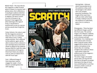
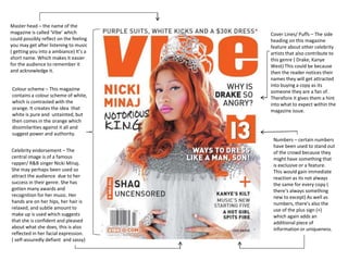
Colour Scheme- the colours used
for this magazine consists of
black, but then it is contrasted
with colours such a s white,
yellow and blue. This is effective
as the audience, again, will be
able to notice it from a distance (
eye-catching) Colours have been
shown to appeal to the audience
because they fit in with the codes
and conventions of this genre;
there hasn’t been any colours
such as; pink as it doesn’t fit in
with the music type.
Photography – There has been
two different images used for
this front cover. The central
image is of Lil Wayne ( celebrity
endearment – attract audience
as he is famous and well
established. He is holding up a
micro-phone with a thumps
down using this hands, which
suggest that he thinks no one
needs a microphone to be
heard. Also, he is looking
straight at the audience ( direct
– gaze) which makes the
audience part of the magazine -
personal to them )
The other image is of another
person who is DJ-ing and this
also links to the genre as people
listening to this type of music
love something that is care-free
and loud, creates a scene of
escapism from reality.
Master Head – The main title for
this magazine is called ‘Scratch’
which is shown in a massive, bold
yellow colour, this is effective as
it would gain audience attention
even from a good distance away.
In addition, the word ‘scratch’
may link to the genre rap,
because it may suggest that
when listening to this type of
music, it would leave a
mark/scratch on you as a person
and you would never forget the
music.
Font – Different/range of
fonts have been used to
engage the reader. ( from
block to something that links
with rapping.)
Writing Style – informal-
which may possibly link to
the audience a they could
be teenagers ( 16+) whom
don’t use complex
grammar/ vocabulary. The
length of the cover lines –
puffs are short, which keep
it simple, making it easy for
the audience to understand,
give a hint in to what to
expect.
Master head – the name of the
magazine is called ‘Vibe’ which
could possibly reflect on the feeling
you may get after listening to music
( getting you into a ambiance) It’s a
short name. Which makes it easier
for the audience to remember it
and acknowledge it.
Celebrity endorsement – The
central image is of a famous
rapper/ R&B singer Nicki Minaj.
She may perhaps been used so
attract the audience due to her
success in their genre. She has
gotten many awards and
recognition for her music. Her
hands are on her hips, her hair is
relaxed, and subtle amount to
make up is used which suggests
that she is confident and pleased
about what she does, this is also
reflected in her facial expression.
( self-assuredly defiant and sassy)
Colour scheme – This magazine
contains a colour scheme of white,
which is contrasted with the
orange. It creates the idea that
white is pure and untainted, but
then comes in the orange which
dissimilarities against it all and
suggest power and authority.
Cover Lines/ Puffs – The side
heading on this magazine
feature about other celebrity
artists that also contribute to
this genre ( Drake, Kanye
West) This could be because
then the reader notices their
names they will get attracted
into buying a copy as its
someone they are a fan of.
Therefore it gives them a hint
into what to expect within the
magazine issue.
Numbers – certain numbers
have been used to stand out
of the crowd because they
might have something that
is exclusive or a feature.
This would gain immediate
reaction as its not always
the same for every copy (
there's always something
new to except) As well as
numbers, there's also the
use of the plus sign (+)
which again adds an
additional piece of
information or uniqueness.
Photography – For this magazine,
Lil Wayne has been used as the
celebrity to endorse the
audience because he is well
recognized and has remained
popular and successful. He is
wearing an army-type jacket to
possibly convey the idea that life
is hard and perhaps listening to
rap would create a scene of
distraction from reality. ( life -will
-still -carry -on, with or without
you attitude) The tattoos also link
to the genre as rap is not a subtle
or soothing piece of music to
listen to, instead it’s the total
contract; loud and eccentric.
However, other images that are
included are possible freebies
that could be won e.g. t-shirts or
a pair of ‘cool’ shoes. Also other
images of other celebrity/
rappers to possible again the
audience attention as it may be
someone that they are a fan of.
Master Head – many other master
heads for other magazines that I
have researched contains mainly just
one word, however this magazine
front cover contains a phrase ‘ rap
us’ which is something different. This
is still short and simply which makes
it easy to remember or recognise
else where. In addition, its shown in
bold font that’s written in capital
letters.
Cover lines/ Puffs – the puffs for
this magazine are mainly single
phrases or a few words which
possibly link back to the target
audiences. Teenagers don’t really
want to read in todays society
and prefer pictures as they speak
louder than words in some cases.
Instead of having the whole
phrase ‘rest in peace = RIP this
magazine shows what each letter
stands for which shows that the
language is informal ( slang)
The background is plain, but not
just simple its got a mixture of
black with the dark green to
possibly show something
different to what the audience
have already experienced. Font
is all the same which makes it
easier to read and understand.
The date and issue numbers have been
added to the front cover to make the
audience aware of what is the latest
piece of magazine available ( keeps
them up to date) which is shown under
the master head in small size.

R&B Music Front Cover Annotations

  • 1.
    Colour Scheme- thecolours used for this magazine consists of black, but then it is contrasted with colours such a s white, yellow and blue. This is effective as the audience, again, will be able to notice it from a distance ( eye-catching) Colours have been shown to appeal to the audience because they fit in with the codes and conventions of this genre; there hasn’t been any colours such as; pink as it doesn’t fit in with the music type. Photography – There has been two different images used for this front cover. The central image is of Lil Wayne ( celebrity endearment – attract audience as he is famous and well established. He is holding up a micro-phone with a thumps down using this hands, which suggest that he thinks no one needs a microphone to be heard. Also, he is looking straight at the audience ( direct – gaze) which makes the audience part of the magazine - personal to them ) The other image is of another person who is DJ-ing and this also links to the genre as people listening to this type of music love something that is care-free and loud, creates a scene of escapism from reality. Master Head – The main title for this magazine is called ‘Scratch’ which is shown in a massive, bold yellow colour, this is effective as it would gain audience attention even from a good distance away. In addition, the word ‘scratch’ may link to the genre rap, because it may suggest that when listening to this type of music, it would leave a mark/scratch on you as a person and you would never forget the music. Font – Different/range of fonts have been used to engage the reader. ( from block to something that links with rapping.) Writing Style – informal- which may possibly link to the audience a they could be teenagers ( 16+) whom don’t use complex grammar/ vocabulary. The length of the cover lines – puffs are short, which keep it simple, making it easy for the audience to understand, give a hint in to what to expect.
  • 2.
    Master head –the name of the magazine is called ‘Vibe’ which could possibly reflect on the feeling you may get after listening to music ( getting you into a ambiance) It’s a short name. Which makes it easier for the audience to remember it and acknowledge it. Celebrity endorsement – The central image is of a famous rapper/ R&B singer Nicki Minaj. She may perhaps been used so attract the audience due to her success in their genre. She has gotten many awards and recognition for her music. Her hands are on her hips, her hair is relaxed, and subtle amount to make up is used which suggests that she is confident and pleased about what she does, this is also reflected in her facial expression. ( self-assuredly defiant and sassy) Colour scheme – This magazine contains a colour scheme of white, which is contrasted with the orange. It creates the idea that white is pure and untainted, but then comes in the orange which dissimilarities against it all and suggest power and authority. Cover Lines/ Puffs – The side heading on this magazine feature about other celebrity artists that also contribute to this genre ( Drake, Kanye West) This could be because then the reader notices their names they will get attracted into buying a copy as its someone they are a fan of. Therefore it gives them a hint into what to expect within the magazine issue. Numbers – certain numbers have been used to stand out of the crowd because they might have something that is exclusive or a feature. This would gain immediate reaction as its not always the same for every copy ( there's always something new to except) As well as numbers, there's also the use of the plus sign (+) which again adds an additional piece of information or uniqueness.
  • 3.
    Photography – Forthis magazine, Lil Wayne has been used as the celebrity to endorse the audience because he is well recognized and has remained popular and successful. He is wearing an army-type jacket to possibly convey the idea that life is hard and perhaps listening to rap would create a scene of distraction from reality. ( life -will -still -carry -on, with or without you attitude) The tattoos also link to the genre as rap is not a subtle or soothing piece of music to listen to, instead it’s the total contract; loud and eccentric. However, other images that are included are possible freebies that could be won e.g. t-shirts or a pair of ‘cool’ shoes. Also other images of other celebrity/ rappers to possible again the audience attention as it may be someone that they are a fan of. Master Head – many other master heads for other magazines that I have researched contains mainly just one word, however this magazine front cover contains a phrase ‘ rap us’ which is something different. This is still short and simply which makes it easy to remember or recognise else where. In addition, its shown in bold font that’s written in capital letters. Cover lines/ Puffs – the puffs for this magazine are mainly single phrases or a few words which possibly link back to the target audiences. Teenagers don’t really want to read in todays society and prefer pictures as they speak louder than words in some cases. Instead of having the whole phrase ‘rest in peace = RIP this magazine shows what each letter stands for which shows that the language is informal ( slang) The background is plain, but not just simple its got a mixture of black with the dark green to possibly show something different to what the audience have already experienced. Font is all the same which makes it easier to read and understand. The date and issue numbers have been added to the front cover to make the audience aware of what is the latest piece of magazine available ( keeps them up to date) which is shown under the master head in small size.