Question 1: In what ways does your
  media product use, develop or
challenge forms and conventions of
       real media products?

           - Austen Nuttall
Introduction
Both my digipak and music video have
  used, developed and challenged forms and
  conventions of real media texts.

This is either through the use of
  intertextuality, developing a concept from a real
  media text such as the use of lighting, and even
  taking inspiration from the ways which the artist
  is portrayed in the production.

To begin, I will discuss my print productions.
Digipak
I used the convention of the digipak layout by
using the standard 4 panel layout for my digipak
production.

The 4 panel layout is used on similar artist’s and
  band’s digipaks. For example, Steve Harley’s
  “Stranger Comes to Town”.
I chose not to use a 6 panel design layout.

The 6 panel design layout is too complicated and can
become too repetitive.

For example, on Joe Power’s digipak, the same
photograph of him is used on panel 4 and 6.
                                   2        3    4


                               5        6              1
Panel 1
I have developed the use of track titles on my
   digipak.

Newspapers are used throughout my music video
  as they are a source of the latest information; my
  chosen track title on my digipak production is
  similar to how the meaning and use of Lady
  Gaga’s “Paparazzi” is used on her digipak.
“Paparazzi” means a freelance photographer who
  pursues celebrities to get photographs of them.

                              In relation to Gaga’s
                              digipak, the title of the
                              track is represented by
                              the use of a photographer
                              and camera on the
                              digipak. I developed this
                              idea by using newspapers
                              on my digipak for the title -
  ``````````````````````````` “Information”.
The position of my artist’s name, “Brian Korteling”
  is located bottom right.

I have developed the way which mainstream artist's
   and band’s position their names.

For example, on Olly Mur’s digipaks, his name is
  placed top left.
Panel 2 and 3
2                   3
Art Deco
I have developed the art deco visual style for my
digipak, but specifically for panels 2 and 3.

“Art deco first appeared in France during the
1920s, flourished internationally during the 30s and
40s, then waned in the post-World War II era. It is an
eclectic style that combines traditional craft motifs with
Machine Age imagery and materials. The style is often
characterized by rich colours, bold geometric shapes, and
lavish ornamentation.”

- http://en.wikipedia.org/wiki/Art_Deco
The development is through the use of rich colours;
red, white and black. These have a strong affect on
the viewer – Why? More is explain in Question 2.

Examples of art deco:
Panel 4
I’ve used the positioning of the track list.

I’ve place an image of my artist on the right of
   panel 4 because we read from left to right.
   The customer will instantly see who the artist
   is and then what tracks are on the CD.
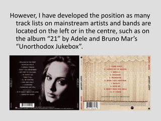
However, I have developed the position as many
 track lists on mainstream artists and bands are
 located on the left or in the centre, such as on
 the album “21” by Adele and Bruno Mar’s
 “Unorthodox Jukebox”.
The bar code is a convention of real media texts, which is
  used for quick transactions of the digipak in-store and
  is positioned either the right or left bottom corners.

I used the convention by positioning the bar code in the
   bottom right of my digipak.

However, I was tempted to challenge this by positioning
  the bar code in the bottom middle instead, as the
  overall presentation appeared more stylish.
Magazine Advert
Layout
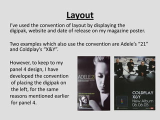
I’ve used the convention of layout by displaying the
digipak, website and date of release on my magazine poster.

Two examples which also use the convention are Adele’s “21”
and Coldplay’s “X&Y”.

However, to keep to my
panel 4 design, I have
developed the convention
 of placing the digipak on
 the left, for the same
reasons mentioned earlier
 for panel 4.
Music Video
Performer
I have used the convention of the music video
by including the artist in close ups throughout.

Andrew Goodwin’s theory states that the
“record label will include the need for lots of
close ups of the artist or band”…
The development of close ups of the performer is
through the use of a recurring motif (a close up
shot).
A motif is used in Coldplay’s “Shiver”. However, the
motif is the band playing instruments and not of a
single performer like my music video. (Video below
PowerPoint slide).


https://www.youtube.com/watch?v=LpwW4iraV3Q
Location
I have used a dark urban mise-en-scene. This challenges
   bright, hopeful, colourful locations seen within most
   mainstream artist’s/band’s music videos. Locations such as
   in a studio, a forest, at the coast, or on a summer’s day.

Below are examples from my music video. On the next
  slide, there are examples of real music videos.
Michael Bublé - "Haven't Met You Yet"
                                                    One Direction - “Kiss You”


                                        Ed Sheeran – “Open Your Ears”
Intertextuality
I have used intertextuality in my music video. Although
   weak, one intertextual reference is to Bob Dylan's
   "Subterranean Homesick Blues“.

The reference is the use of holding up a notice board. An
  example is below:
The strongest use of intertextuality is to Sinéad
  O'Connor‘s - “Nothing Compares 2U”.
The reference is through the use of a close up
  shot of the artist looking towards the
  audience, emotionally connecting to them.

Question one

  • 1.
    Question 1: Inwhat ways does your media product use, develop or challenge forms and conventions of real media products? - Austen Nuttall
  • 2.
    Introduction Both my digipakand music video have used, developed and challenged forms and conventions of real media texts. This is either through the use of intertextuality, developing a concept from a real media text such as the use of lighting, and even taking inspiration from the ways which the artist is portrayed in the production. To begin, I will discuss my print productions.
  • 3.
    Digipak I used theconvention of the digipak layout by using the standard 4 panel layout for my digipak production. The 4 panel layout is used on similar artist’s and band’s digipaks. For example, Steve Harley’s “Stranger Comes to Town”.
  • 4.
    I chose notto use a 6 panel design layout. The 6 panel design layout is too complicated and can become too repetitive. For example, on Joe Power’s digipak, the same photograph of him is used on panel 4 and 6. 2 3 4 5 6 1
  • 5.
  • 6.
    I have developedthe use of track titles on my digipak. Newspapers are used throughout my music video as they are a source of the latest information; my chosen track title on my digipak production is similar to how the meaning and use of Lady Gaga’s “Paparazzi” is used on her digipak.
  • 7.
    “Paparazzi” means afreelance photographer who pursues celebrities to get photographs of them. In relation to Gaga’s digipak, the title of the track is represented by the use of a photographer and camera on the digipak. I developed this idea by using newspapers on my digipak for the title - ``````````````````````````` “Information”.
  • 8.
    The position ofmy artist’s name, “Brian Korteling” is located bottom right. I have developed the way which mainstream artist's and band’s position their names. For example, on Olly Mur’s digipaks, his name is placed top left.
  • 9.
  • 10.
    Art Deco I havedeveloped the art deco visual style for my digipak, but specifically for panels 2 and 3. “Art deco first appeared in France during the 1920s, flourished internationally during the 30s and 40s, then waned in the post-World War II era. It is an eclectic style that combines traditional craft motifs with Machine Age imagery and materials. The style is often characterized by rich colours, bold geometric shapes, and lavish ornamentation.” - http://en.wikipedia.org/wiki/Art_Deco
  • 11.
    The development isthrough the use of rich colours; red, white and black. These have a strong affect on the viewer – Why? More is explain in Question 2. Examples of art deco:
  • 12.
  • 13.
    I’ve used thepositioning of the track list. I’ve place an image of my artist on the right of panel 4 because we read from left to right. The customer will instantly see who the artist is and then what tracks are on the CD.
  • 14.
    However, I havedeveloped the position as many track lists on mainstream artists and bands are located on the left or in the centre, such as on the album “21” by Adele and Bruno Mar’s “Unorthodox Jukebox”.
  • 15.
    The bar codeis a convention of real media texts, which is used for quick transactions of the digipak in-store and is positioned either the right or left bottom corners. I used the convention by positioning the bar code in the bottom right of my digipak. However, I was tempted to challenge this by positioning the bar code in the bottom middle instead, as the overall presentation appeared more stylish.
  • 16.
  • 17.
    Layout I’ve used theconvention of layout by displaying the digipak, website and date of release on my magazine poster. Two examples which also use the convention are Adele’s “21” and Coldplay’s “X&Y”. However, to keep to my panel 4 design, I have developed the convention of placing the digipak on the left, for the same reasons mentioned earlier for panel 4.
  • 18.
  • 19.
    Performer I have usedthe convention of the music video by including the artist in close ups throughout. Andrew Goodwin’s theory states that the “record label will include the need for lots of close ups of the artist or band”…
  • 20.
    The development ofclose ups of the performer is through the use of a recurring motif (a close up shot).
  • 21.
    A motif isused in Coldplay’s “Shiver”. However, the motif is the band playing instruments and not of a single performer like my music video. (Video below PowerPoint slide). https://www.youtube.com/watch?v=LpwW4iraV3Q
  • 22.
    Location I have useda dark urban mise-en-scene. This challenges bright, hopeful, colourful locations seen within most mainstream artist’s/band’s music videos. Locations such as in a studio, a forest, at the coast, or on a summer’s day. Below are examples from my music video. On the next slide, there are examples of real music videos.
  • 23.
    Michael Bublé -"Haven't Met You Yet" One Direction - “Kiss You” Ed Sheeran – “Open Your Ears”
  • 24.
    Intertextuality I have usedintertextuality in my music video. Although weak, one intertextual reference is to Bob Dylan's "Subterranean Homesick Blues“. The reference is the use of holding up a notice board. An example is below:
  • 25.
    The strongest useof intertextuality is to Sinéad O'Connor‘s - “Nothing Compares 2U”. The reference is through the use of a close up shot of the artist looking towards the audience, emotionally connecting to them.