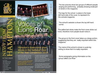
Arran Reyatt
The group on the front cover takes up a large portion,
suggesting that they are really important within this
magazine.
The yellow text sticks make the front cover sticks out
more, therefore more people would notice it.
The logo for the school is place is the lower
left hand side of the cover, to represent it’s
the schools magazine.
The school’s website is shown the top left hand
corner.
The two pictures show two groups of different people
singing and performing, probably showing small part
of what's in the magazine.
The name of the school is shown is quite big
writing to show that it is really important.
Some paragraphs giving information on the
group called Lion Roar
The sports team on the front cover take up a
large portion, suggesting that they are
important.
A couple pictures are on he front cover
showing small parts of what is inside the
magazine
The school’s website is shown the top left hand
corner.
The yellow text sticks make the front cover sticks
out more, therefore more people would notice it.
The name of the school is shown is quite big
writing to show that it is really important.
Some paragraphs giving information on the
sports team that are on the front cover.
The logo for the school is place is the lower
left hand side of the cover, to represent it’s
the schools magazine.
Task 2 Audience Research
Task 3: Analysis of Previous Work
• On the front cover there is a large image of a boy, this suggest that this boy is going to be quite important in a
article in the school magazine. I think most of the fonts used on the front cover give it a professional look to the
magazine. I think that the boy on the front cover should be dressed a lot more formal as the way he is dressed is
quite informal, and this doesn’t go with the rest of the front cover, because the front cover is quite formal. There are
a variety of fonts used on the front cover, I thinks this helps to keep the magazine interesting.
• The contents show that the magazine has a lot of content which is quite good, it shows that the is a lot to read
about in the magazine, which means readers are less likely to get bored. On the contents page is a large picture of
a group of young students and in the top right hand corner of the image is the number 20, which is referring to the
page number, also the image takes up at least half the page. The size of the image suggest that they are quite
important in the article on page 20, and feature heavily on I that article on that page.
Task 4: proposal form
Target Audience The entire school
Possible Title Ideas The Bulletin
Main image Medium close up
Main cover line School is dead
Additional key images Textbooks, Other stuff to do with the school
Additional cover lines 6th form life
Typography Calibri, Arial, Arial Black, Blue Highway
Background colour/Image Things to do with school
Technical Considerations Text rotation, Image scaling, font scaling, image and fonts
should go well with each other.
What Have I learnt?
Before I started the preliminary task I had no experience with using Photoshop,
and I had no idea how to use Photoshop. When I first used Photoshop, I
couldn’t do simple things like moving an image or enlarging an image
consistently and properly . There were other things I couldn't’ do like change
the page orientation, and there quite a few other things I didn’t know how do or
couldn’t properly on Photoshop. As I started to spend more time using
Photoshop, I became a bit better at using the it. I found it a lot easier to do all
the simple things that I couldn’t do before, which made the whole process of
making a draft of my front cover and content page a lot quicker. I also became
a bit better at editing things, and changing the way the look. For example I
learnt how give a title a drop shadow and add colour to it, it’s nothing big but it's
better than just having a plain black title of wording. I also became a bit better
at editing and changing an image, which at first I had no idea how to do. I could
make can now make an image look a bit more interesting. I feel like I have
learnt the basics of how to use Photoshop Overall my skills using Photoshop
are slowly improving as I learn more about the features of Photoshop and how
to use them correctly. it may take some time for me to completely learn all of
the aspects of Photoshop, but so far I have learnt a fair bit.
Process
•
The first thing I had to do before I could start making a draft on Photoshop
was to hand draw a rough draft of a front cover for my school magazine. I
made a few rough drafts before I went onto Photoshop. In each draft I
made I made various changes to the front cover and I chose which of
these I would incorporate into the final rough design of the front cover.
•
Next I started to design a draft my front cover on Photoshop. After I made
a draft of the front cover I looked at what I could change and improve. At
first my school magazine’s front cover just had the school badge, the name
of the magazine, some information to what would be in to magazine and a
white background. I added a large image of the entrance of my school and
an image of a certain student that goes to the school, this came from one
of my rough hand drawn drafts of the magazine.
•
After I made finished making a rough design of the front cover, I went onto
making a rough design of the contents page. My first draft had the school
badge, all of the contents and plain boring background. I added a
background of textbooks and I made the image a little bit transparent.

Preliminary Task

  • 1.
  • 2.
    The group onthe front cover takes up a large portion, suggesting that they are really important within this magazine. The yellow text sticks make the front cover sticks out more, therefore more people would notice it. The logo for the school is place is the lower left hand side of the cover, to represent it’s the schools magazine. The school’s website is shown the top left hand corner. The two pictures show two groups of different people singing and performing, probably showing small part of what's in the magazine. The name of the school is shown is quite big writing to show that it is really important. Some paragraphs giving information on the group called Lion Roar
  • 3.
    The sports teamon the front cover take up a large portion, suggesting that they are important. A couple pictures are on he front cover showing small parts of what is inside the magazine The school’s website is shown the top left hand corner. The yellow text sticks make the front cover sticks out more, therefore more people would notice it. The name of the school is shown is quite big writing to show that it is really important. Some paragraphs giving information on the sports team that are on the front cover. The logo for the school is place is the lower left hand side of the cover, to represent it’s the schools magazine.
  • 4.
  • 5.
    Task 3: Analysisof Previous Work • On the front cover there is a large image of a boy, this suggest that this boy is going to be quite important in a article in the school magazine. I think most of the fonts used on the front cover give it a professional look to the magazine. I think that the boy on the front cover should be dressed a lot more formal as the way he is dressed is quite informal, and this doesn’t go with the rest of the front cover, because the front cover is quite formal. There are a variety of fonts used on the front cover, I thinks this helps to keep the magazine interesting. • The contents show that the magazine has a lot of content which is quite good, it shows that the is a lot to read about in the magazine, which means readers are less likely to get bored. On the contents page is a large picture of a group of young students and in the top right hand corner of the image is the number 20, which is referring to the page number, also the image takes up at least half the page. The size of the image suggest that they are quite important in the article on page 20, and feature heavily on I that article on that page.
  • 6.
    Task 4: proposalform Target Audience The entire school Possible Title Ideas The Bulletin Main image Medium close up Main cover line School is dead Additional key images Textbooks, Other stuff to do with the school Additional cover lines 6th form life Typography Calibri, Arial, Arial Black, Blue Highway Background colour/Image Things to do with school Technical Considerations Text rotation, Image scaling, font scaling, image and fonts should go well with each other.
  • 10.
    What Have Ilearnt? Before I started the preliminary task I had no experience with using Photoshop, and I had no idea how to use Photoshop. When I first used Photoshop, I couldn’t do simple things like moving an image or enlarging an image consistently and properly . There were other things I couldn't’ do like change the page orientation, and there quite a few other things I didn’t know how do or couldn’t properly on Photoshop. As I started to spend more time using Photoshop, I became a bit better at using the it. I found it a lot easier to do all the simple things that I couldn’t do before, which made the whole process of making a draft of my front cover and content page a lot quicker. I also became a bit better at editing things, and changing the way the look. For example I learnt how give a title a drop shadow and add colour to it, it’s nothing big but it's better than just having a plain black title of wording. I also became a bit better at editing and changing an image, which at first I had no idea how to do. I could make can now make an image look a bit more interesting. I feel like I have learnt the basics of how to use Photoshop Overall my skills using Photoshop are slowly improving as I learn more about the features of Photoshop and how to use them correctly. it may take some time for me to completely learn all of the aspects of Photoshop, but so far I have learnt a fair bit.
  • 11.
    Process • The first thingI had to do before I could start making a draft on Photoshop was to hand draw a rough draft of a front cover for my school magazine. I made a few rough drafts before I went onto Photoshop. In each draft I made I made various changes to the front cover and I chose which of these I would incorporate into the final rough design of the front cover. • Next I started to design a draft my front cover on Photoshop. After I made a draft of the front cover I looked at what I could change and improve. At first my school magazine’s front cover just had the school badge, the name of the magazine, some information to what would be in to magazine and a white background. I added a large image of the entrance of my school and an image of a certain student that goes to the school, this came from one of my rough hand drawn drafts of the magazine. • After I made finished making a rough design of the front cover, I went onto making a rough design of the contents page. My first draft had the school badge, all of the contents and plain boring background. I added a background of textbooks and I made the image a little bit transparent.