Question 7
•Download as PPTX, PDF•
0 likes•93 views
The author summarizes the key differences between their preliminary college magazine cover and their developed music magazine cover. For the college magazine, the text layout was misaligned and unclear, and the image was poorly incorporated. In contrast, the music magazine had neatly right-aligned text, a more professional-looking masthead, an intentionally photographed image representing the genre, and a model pose depicting a musician. Overall, the author learned to better represent the target audience and make the design look more polished and like existing media examples in their developed music magazine cover compared to the preliminary college magazine cover.
Report
Share
Report
Share

Recommended
Question 7
The student summarizes the key differences between their preliminary college magazine cover and their developed music magazine cover. For the college magazine, the text layout was misaligned and unclear, and the image was poorly cut out. In contrast, the music magazine had neatly right-aligned text, a more professional-looking masthead, an effectively photographed model representing the genre, and overall greater development to appeal to the target audience. The student learned to pay closer attention to text layout, imagery, and properly representing the intended social group.
Evaluation
This document is an evaluation of a student's media magazine project. It summarizes the key ways the student's magazine uses and develops conventions of real media products, such as including the magazine title, issue date, and barcode on the front cover. It also represents particular social groups by featuring a young female model holding a guitar to appeal to music fans aged 17-20. The student analyzes how Bauer Media could be a suitable distributor for the magazine due to its experience with similar music magazines and multiple media platforms. The student learned important Photoshop and layout skills from constructing the magazine project.
Evaluation 7 f
The document summarizes what the author learned from creating a preliminary magazine that could be improved for their final pop music magazine product. Specifically, the author learned that for a pop music magazine to appeal to its target teenage audience it needs bright colors, original fonts, a cluttered but content-rich format, informal language, prominent images on the cover and throughout, and elements like banners and frames that relate to web/social media and retro styles enjoyed by teenagers. The author analyzed their preliminary draft and made changes like adding more colorful and varied photos, torn paper elements, and filling empty spaces to create a final magazine that better matches the conventions and interests of their target market.
Evaluation
1) The document evaluates the student's music magazine project for class by addressing several questions about how it uses and develops conventions of real music magazines.
2) The student discusses how their front cover, double page spread, and contents page follow conventions in their layout, use of images, and continuity between pages.
3) The magazine represents young adult females who enjoy reggae as happy yet strong through the imagery and colors used.
4) The student proposes distributing the magazine both in music shops and online for wider reach, especially among its target teenage and young adult female audience.
5) Through creating the magazine, the student learned new Photoshop skills like using tools and layers, as well as the importance of
Evaluation
1. The document discusses a music magazine created by the author for an assignment. The magazine covers R&B music and targets teenagers and young adults. The front cover features a young female model to attract this audience based on common conventions in music magazines.
2. The contents page includes two male models to show diversity and keep the magazine interesting for its target range of audiences. The magazine aims to attract fans of R&B music through the artists featured and language used.
3. An online format is proposed for the magazine to reach a wider international audience conveniently and at no cost to view, aligning with the target audiences' likely internet usage. Major publishers like Time Inc. could potentially distribute a magazine with a similar
Evaluation
This document evaluates the student's media studies magazine project. It summarizes how the student used conventions from real magazines in their design, like placing the title at the top and using two dominant colors. It describes changes made from an initial to final front cover design based on conventions. The student learned skills in Photoshop and representing social groups. They want Bauer Media to distribute the magazine due to their success distributing similar magazines. The intended audience is teenage girls and the magazine aims to attract readers through visuals, layout, and gossip content. The student learned technologies like Photoshop and how audience research improved their work from a preliminary to final project.
Final evaluation
The document summarizes the student's evaluation of their music magazine project. It describes the front cover featuring a photo of the student's friend, and covers design elements like the masthead, bar code, and article teasers. It also discusses the contents page layout, a sample double page article interviewing friends portrayed as a band, how the magazine represents conventions or challenges them, its target teenage audience, and what the student learned about magazine design and production software.
Evaluation Question Seven
Matteo Rimini evaluated his skills in designing two magazines using Photoshop. For a school magazine, he used a sixth form student model in a suit to represent the school. For a music magazine focused on rap/hip hop, he used a model around age 21 wearing gold chains. Both magazines effectively portrayed the target genre through props, fonts, and layouts inspired by existing magazines like GQ. Feedback showed the magazines clearly represented their intended genres.
Evaluation question 1
This document summarizes how the media product uses and challenges conventions of real magazines. It follows several conventions such as having a masthead in the top third that spans the width of the page. It also uses a consistent color scheme and includes common magazine elements like a cover image, slogans, and puffs. However, it challenges some conventions by having the masthead font repeated on the cover line, centering the cover image rather than placing it on the left, and not making the puff visually distinct. The double page spread layout includes text wrapping around an image in columns like typical magazines but challenges conventions by not dedicating a full page to the main image.
Music Magazine (Soundcheck) Evaluation
The document is a reflection from a student on their group magazine project. The student discusses how working in a group was initially a good idea but working individually may have been better. They also evaluate how their magazine both uses and challenges existing magazine genres by focusing solely on live music coverage of local bands. Finally, they reflect on what software skills they have learned through completing the project.
Music magazine evaluation
This document summarizes a student's music magazine project. The student developed their magazine to resemble real music magazines through their choice of title, written content like cover lines and masthead, and layout with a main image on the right and text on the left. Their front cover image of a teenage girl blowing a kiss was meant to attract their target audience of teenage girls. Through the process, the student learned how to use design software like QuarkXPress and Photoshop to construct the magazine. They also learned important lessons about photography, layout, fonts and addressing their audience.
Evaluation
The document is a media studies evaluation of a magazine produced by the author. It summarizes the conventions used from real magazines in the design of the cover, contents page, and spreads. This includes placement of the title, use of colors, images, and additional typical magazine elements. The intended audience is identified as teenage girls based on research, and techniques used to attract this audience through interesting images and topics are described. The technologies learned through creating the magazine, like Photoshop and blogging, are also summarized.
Media evaluation
The document discusses the process of creating two media products - a college magazine and a music magazine. It describes how conventions from real magazines, such as layout, target audiences, and elements like mastheads and cover pages, were researched and incorporated. Key lessons learned included the importance of layout, time management, effective use of images, and overcoming technical limitations to achieve the desired design elements. The progression from an initial task to the full products required significant time, precision, and iteration to develop attractive and cohesive designs.
My classical music magazine
The document describes changes made from the initial planning to the final product of a classical music magazine. Key changes included using a different font for the masthead to make it less overpowering, repositioning feature articles on the contents page to better fit the genre, and changing the double page spread layout to look simpler and more reflective of classical music. Conventions of music magazines, like white backgrounds and cut-out images on the cover, were followed while some elements like including a violin challenged expectations. The target audience of 25-55 year olds from a middle-class background was researched based on similar magazines.
Evaluation
The document is a media studies evaluation of a magazine produced by the author. It discusses the conventions used from real magazines in the design of the cover, content pages, and layout. This includes using two dominant colors, placement of the title, images, and additional typical magazine elements. The author compares their magazine to an existing magazine for guidance. The intended audience is identified as teenage girls based on research and the focus on fashion and gossip topics. Techniques used to attract this audience included attractive images and headlines about celebrities. The author reflects on skills learned in creating the magazine using software like Photoshop and conducting audience research.
Music mag evaluation script
The document summarizes the process of creating an R&B and rap magazine. It describes researching case studies from other magazines in the genre, incorporating codes and conventions like placement of the masthead and barcode. It discusses choosing a multi-ethnic model for the cover to distinguish the magazine from competitors aimed primarily at the Black community. The intended audience is teenagers and young adults interested in music, fashion, and celebrity gossip.
My Evaluation
This document contains a student's evaluation of their media production coursework for a music magazine. The student discusses how they used and challenged conventions of real music magazines in their design. They summarize how they incorporated elements like colors, layouts, and features typically seen in magazines like NME and Q. The student also reflects on what they learned about technologies like Photoshop and how their skills have progressed since their preliminary task.
Evaluation
The document discusses the inspiration and design choices for a music magazine front cover, contents page, and double page spread created by the author. The author was inspired by a Vogue magazine cover that used neutral colors and featured a sophisticated model. They aimed to create a magazine that was also sophisticated and aimed at young adults. Throughout the magazine, the author kept a consistent black and white color scheme and style to make it stand out from other colorful magazines. Feedback from test audiences validated that the model and image stood out as intended. The author acknowledged areas for potential improvement based on the feedback.
Question 1
This document summarizes how the media product uses and develops conventions from real music magazines. It analyzes the front cover, masthead, images, headlines, columns and other design elements. For each element, it provides examples of magazines that commonly use that convention. However, it also discusses some ways the media product challenges conventions, such as using unconventional color schemes and including social media links. Overall, the document demonstrates an in-depth understanding of how music magazine conventions are both applied and adapted in the original media product.
Media evaluation
- The document discusses the creation of a music magazine, including following conventions like mastheads and layouts while also challenging some conventions to make the magazine stand out.
- Research on existing magazines helped identify conventions to follow to make the magazine look professional. The magazine targets young adults and teenagers who listen to pop music.
- Feedback from the target audience provided insights on what they liked and disliked about the magazine, which the creator plans to apply to improve the magazine.
Media evaluation2
The document describes a music magazine media product. It discusses how the magazine uses conventions like headings placed around the main image. The magazine represents a particular social group of working class teens and young adults through the models' confident attitudes and fashionable clothing. The intended audience is young middle class girls and women ages 13 to 25 who listen to genres like R&B, hip hop, and pop. The magazine would likely be distributed by media companies like Bauer that focus on music reviews, new releases, and concert updates.
MOD magazine Evaluation
This magazine aims to represent the MOD genre of new age music with passion and individuality. The cover features an artist named Guy Starie inspired by iconic British musicians like Paul Weller and Noel Gallagher. The layout challenges conventions by using two fonts and splitting the page vertically to represent underground and mainstream music. The target audience includes those who read NME and Kerrang and support local and unique bands. The magazine aims to attract this audience through its MOD logo, illustrations, use of instruments, and focus on the British music scene.
Michael Bobin AS media coursework
The document discusses a media project the author created called "reLoad" which aims to look like an actual metal music magazine. Some key points:
- The project uses conventions of real metal magazines like pull quotes, page numbers, and copyright notices.
- It targets 15-25 year old males interested in metal music rather than mainstream tastes. Visuals like blood splatters and grunge imagery represent this social group.
- Future Publishing, which publishes major metal magazines, would be well-suited to distribute the project since it already targets that demographic.
- The author learned photography skills in capturing images for the project and improved at narrowing the target demographic compared to a school magazine created previously
Media updated evaluation
The student created a music magazine focused on R&B music. They aimed to follow conventions of real R&B magazines by including a young black male model on the front cover in trendy clothing. On the double page spread, they included two photos merged together in the bottom left corner, going against conventions, but allowing both models to be featured. They learned new skills in Photoshop and organizing a photoshoot to improve image quality from their preliminary task. The process taught them how to better follow conventions to make the magazine look more professional.
Evaluation
The document discusses the skills and knowledge the author gained from completing a preliminary task analyzing magazines. They learned about magazine conventions, improved their Photoshop and photography skills, and understand how to represent their target audience. Key things included analyzing current magazines, using an SLR camera to take professional photos, and learning to effectively use Photoshop to design the magazine. The author conducted a survey to understand their target audience of 15-23 year olds and represented them through images, colors, price, and topics discussed in the magazine.
Evaluation
1. The student created an R&B music magazine that represented teenage girls and females in the genre by featuring a black female model on the cover in a powerful pose covered up rather than revealingly dressed.
2. Potential distribution methods for the independent magazine included online through social media like Twitter and Facebook for their wide reach, especially among the target teenage/young adult audience, as well as in local shops.
3. The student addressed their intended female audience through the use of colors, images, and language found in other successful R&B magazines, while also incorporating some slang to appeal to the culture, and engaged readers through sharing the magazine online.
Evaluation
The document is a student's response to questions about their media product, which is a music magazine focused on the genre of dubstep.
The student summarizes that their magazine uses similar forms and conventions to other music magazines like Kerrang and NME through its basic block text and colors. It challenges conventions of DJ Magazine through its target audience of 16-25 year olds who enjoy dubstep music.
The student represents social groups between ages 16-25 who are interested in dubstep, seeing it as energetic music popular in nightclubs where young adults socialize.
The student proposes that IPC Media would be a suitable media institution to distribute their magazine as it distributes similar magazines in the UK, where
Media Main Task Coursework Evaluation
The document summarizes the development and evaluation of a magazine product created by the author for a media coursework assignment. The author analyzed existing R&B music magazines to follow conventions like mastheads and cover lines. While using typical conventions, the author also challenged some by featuring an Asian model and focusing on young women rather than being unisex. The intended audience is described as teenage and young adult girls, represented through styling, photography, and colorful design. Publishers of music magazines would be suitable to distribute the product digitally or in print. The process taught the author new skills in photography, design, and research to create a professional magazine.
Mi Vida Durante La Primer Parte Del AñO
El documento describe los primeros cuatro meses del año escolar del autor. En el primer mes tuvieron una maestra sustituta, pero en el segundo mes les asignaron al profesor Víctor y empezaron a aprender atajos de teclado. Aunque el examen del segundo mes fue complicado, a la mayoría les fue bien. En el tercer mes estudiaron virus y redes como LAN, MAN, WAN y PAN. Participaron en una marcha municipal y actualizaron su página web. Actualmente están en el cuarto mes, que es el examen semestral.
lFloor plans
This document provides floor plans and shots for filming two locations - a lounge and bedroom. It outlines the camera placements, actor placements, and key furnishings like a sofa, mantel, desk, bed, and wardrobe to capture for each of the 5 shots between the two rooms.
More Related Content
What's hot
Evaluation question 1
This document summarizes how the media product uses and challenges conventions of real magazines. It follows several conventions such as having a masthead in the top third that spans the width of the page. It also uses a consistent color scheme and includes common magazine elements like a cover image, slogans, and puffs. However, it challenges some conventions by having the masthead font repeated on the cover line, centering the cover image rather than placing it on the left, and not making the puff visually distinct. The double page spread layout includes text wrapping around an image in columns like typical magazines but challenges conventions by not dedicating a full page to the main image.
Music Magazine (Soundcheck) Evaluation
The document is a reflection from a student on their group magazine project. The student discusses how working in a group was initially a good idea but working individually may have been better. They also evaluate how their magazine both uses and challenges existing magazine genres by focusing solely on live music coverage of local bands. Finally, they reflect on what software skills they have learned through completing the project.
Music magazine evaluation
This document summarizes a student's music magazine project. The student developed their magazine to resemble real music magazines through their choice of title, written content like cover lines and masthead, and layout with a main image on the right and text on the left. Their front cover image of a teenage girl blowing a kiss was meant to attract their target audience of teenage girls. Through the process, the student learned how to use design software like QuarkXPress and Photoshop to construct the magazine. They also learned important lessons about photography, layout, fonts and addressing their audience.
Evaluation
The document is a media studies evaluation of a magazine produced by the author. It summarizes the conventions used from real magazines in the design of the cover, contents page, and spreads. This includes placement of the title, use of colors, images, and additional typical magazine elements. The intended audience is identified as teenage girls based on research, and techniques used to attract this audience through interesting images and topics are described. The technologies learned through creating the magazine, like Photoshop and blogging, are also summarized.
Media evaluation
The document discusses the process of creating two media products - a college magazine and a music magazine. It describes how conventions from real magazines, such as layout, target audiences, and elements like mastheads and cover pages, were researched and incorporated. Key lessons learned included the importance of layout, time management, effective use of images, and overcoming technical limitations to achieve the desired design elements. The progression from an initial task to the full products required significant time, precision, and iteration to develop attractive and cohesive designs.
My classical music magazine
The document describes changes made from the initial planning to the final product of a classical music magazine. Key changes included using a different font for the masthead to make it less overpowering, repositioning feature articles on the contents page to better fit the genre, and changing the double page spread layout to look simpler and more reflective of classical music. Conventions of music magazines, like white backgrounds and cut-out images on the cover, were followed while some elements like including a violin challenged expectations. The target audience of 25-55 year olds from a middle-class background was researched based on similar magazines.
Evaluation
The document is a media studies evaluation of a magazine produced by the author. It discusses the conventions used from real magazines in the design of the cover, content pages, and layout. This includes using two dominant colors, placement of the title, images, and additional typical magazine elements. The author compares their magazine to an existing magazine for guidance. The intended audience is identified as teenage girls based on research and the focus on fashion and gossip topics. Techniques used to attract this audience included attractive images and headlines about celebrities. The author reflects on skills learned in creating the magazine using software like Photoshop and conducting audience research.
Music mag evaluation script
The document summarizes the process of creating an R&B and rap magazine. It describes researching case studies from other magazines in the genre, incorporating codes and conventions like placement of the masthead and barcode. It discusses choosing a multi-ethnic model for the cover to distinguish the magazine from competitors aimed primarily at the Black community. The intended audience is teenagers and young adults interested in music, fashion, and celebrity gossip.
My Evaluation
This document contains a student's evaluation of their media production coursework for a music magazine. The student discusses how they used and challenged conventions of real music magazines in their design. They summarize how they incorporated elements like colors, layouts, and features typically seen in magazines like NME and Q. The student also reflects on what they learned about technologies like Photoshop and how their skills have progressed since their preliminary task.
Evaluation
The document discusses the inspiration and design choices for a music magazine front cover, contents page, and double page spread created by the author. The author was inspired by a Vogue magazine cover that used neutral colors and featured a sophisticated model. They aimed to create a magazine that was also sophisticated and aimed at young adults. Throughout the magazine, the author kept a consistent black and white color scheme and style to make it stand out from other colorful magazines. Feedback from test audiences validated that the model and image stood out as intended. The author acknowledged areas for potential improvement based on the feedback.
Question 1
This document summarizes how the media product uses and develops conventions from real music magazines. It analyzes the front cover, masthead, images, headlines, columns and other design elements. For each element, it provides examples of magazines that commonly use that convention. However, it also discusses some ways the media product challenges conventions, such as using unconventional color schemes and including social media links. Overall, the document demonstrates an in-depth understanding of how music magazine conventions are both applied and adapted in the original media product.
Media evaluation
- The document discusses the creation of a music magazine, including following conventions like mastheads and layouts while also challenging some conventions to make the magazine stand out.
- Research on existing magazines helped identify conventions to follow to make the magazine look professional. The magazine targets young adults and teenagers who listen to pop music.
- Feedback from the target audience provided insights on what they liked and disliked about the magazine, which the creator plans to apply to improve the magazine.
Media evaluation2
The document describes a music magazine media product. It discusses how the magazine uses conventions like headings placed around the main image. The magazine represents a particular social group of working class teens and young adults through the models' confident attitudes and fashionable clothing. The intended audience is young middle class girls and women ages 13 to 25 who listen to genres like R&B, hip hop, and pop. The magazine would likely be distributed by media companies like Bauer that focus on music reviews, new releases, and concert updates.
MOD magazine Evaluation
This magazine aims to represent the MOD genre of new age music with passion and individuality. The cover features an artist named Guy Starie inspired by iconic British musicians like Paul Weller and Noel Gallagher. The layout challenges conventions by using two fonts and splitting the page vertically to represent underground and mainstream music. The target audience includes those who read NME and Kerrang and support local and unique bands. The magazine aims to attract this audience through its MOD logo, illustrations, use of instruments, and focus on the British music scene.
Michael Bobin AS media coursework
The document discusses a media project the author created called "reLoad" which aims to look like an actual metal music magazine. Some key points:
- The project uses conventions of real metal magazines like pull quotes, page numbers, and copyright notices.
- It targets 15-25 year old males interested in metal music rather than mainstream tastes. Visuals like blood splatters and grunge imagery represent this social group.
- Future Publishing, which publishes major metal magazines, would be well-suited to distribute the project since it already targets that demographic.
- The author learned photography skills in capturing images for the project and improved at narrowing the target demographic compared to a school magazine created previously
Media updated evaluation
The student created a music magazine focused on R&B music. They aimed to follow conventions of real R&B magazines by including a young black male model on the front cover in trendy clothing. On the double page spread, they included two photos merged together in the bottom left corner, going against conventions, but allowing both models to be featured. They learned new skills in Photoshop and organizing a photoshoot to improve image quality from their preliminary task. The process taught them how to better follow conventions to make the magazine look more professional.
Evaluation
The document discusses the skills and knowledge the author gained from completing a preliminary task analyzing magazines. They learned about magazine conventions, improved their Photoshop and photography skills, and understand how to represent their target audience. Key things included analyzing current magazines, using an SLR camera to take professional photos, and learning to effectively use Photoshop to design the magazine. The author conducted a survey to understand their target audience of 15-23 year olds and represented them through images, colors, price, and topics discussed in the magazine.
Evaluation
1. The student created an R&B music magazine that represented teenage girls and females in the genre by featuring a black female model on the cover in a powerful pose covered up rather than revealingly dressed.
2. Potential distribution methods for the independent magazine included online through social media like Twitter and Facebook for their wide reach, especially among the target teenage/young adult audience, as well as in local shops.
3. The student addressed their intended female audience through the use of colors, images, and language found in other successful R&B magazines, while also incorporating some slang to appeal to the culture, and engaged readers through sharing the magazine online.
Evaluation
The document is a student's response to questions about their media product, which is a music magazine focused on the genre of dubstep.
The student summarizes that their magazine uses similar forms and conventions to other music magazines like Kerrang and NME through its basic block text and colors. It challenges conventions of DJ Magazine through its target audience of 16-25 year olds who enjoy dubstep music.
The student represents social groups between ages 16-25 who are interested in dubstep, seeing it as energetic music popular in nightclubs where young adults socialize.
The student proposes that IPC Media would be a suitable media institution to distribute their magazine as it distributes similar magazines in the UK, where
Media Main Task Coursework Evaluation
The document summarizes the development and evaluation of a magazine product created by the author for a media coursework assignment. The author analyzed existing R&B music magazines to follow conventions like mastheads and cover lines. While using typical conventions, the author also challenged some by featuring an Asian model and focusing on young women rather than being unisex. The intended audience is described as teenage and young adult girls, represented through styling, photography, and colorful design. Publishers of music magazines would be suitable to distribute the product digitally or in print. The process taught the author new skills in photography, design, and research to create a professional magazine.
What's hot (20)
Viewers also liked
Mi Vida Durante La Primer Parte Del AñO
El documento describe los primeros cuatro meses del año escolar del autor. En el primer mes tuvieron una maestra sustituta, pero en el segundo mes les asignaron al profesor Víctor y empezaron a aprender atajos de teclado. Aunque el examen del segundo mes fue complicado, a la mayoría les fue bien. En el tercer mes estudiaron virus y redes como LAN, MAN, WAN y PAN. Participaron en una marcha municipal y actualizaron su página web. Actualmente están en el cuarto mes, que es el examen semestral.
lFloor plans
This document provides floor plans and shots for filming two locations - a lounge and bedroom. It outlines the camera placements, actor placements, and key furnishings like a sofa, mantel, desk, bed, and wardrobe to capture for each of the 5 shots between the two rooms.
Digipak analysis
The document analyzes and summarizes the design elements of several album covers, including:
- Blink-182's "Take Off Your Pants and Jacket" which features images representing the album title on a black background.
- The Killers' "Sam's Town" which has a black and white monochrome concept highlighting the band's indie rock genre and features the band members on the back.
- Muse's "Resistance" depicts a figure on a path surrounded by shapes, with a grey background tying into the generic font used.
Patron Chaleco Chocolate Y Nata
Este documento proporciona instrucciones detalladas para tejer un chaleco de lana suave y cómodo en dos colores, chocolate y nata. El patrón incluye instrucciones para tejer la espalda, delantero y detalles como los elásticos de las sisas y el cuello. El chaleco resultante mide 50 cm de ancho y 59 cm de alto y es una prenda básica para entretiempo.
Aluminium india 2010
Bhoruka Aluminium is an ISO 9002 company with a wide range of products catering to the needs of customers worldwide. Our products are used in diverse segments ranging from constructions to consumer durables, transport to textiles and irrigation.
Hot desking changes
The document discusses edits made to a magazine front cover design based on feedback. Changes included replacing a bubbly red drop shadow with a cleaner black one, realigning text to be properly spaced from edges and each other, changing fonts for consistency, and reducing the size of one text element that was overwhelming. The edits improved the professionalism, organization, and balance of the design.
Production log 4
Aroosa learned about the format of section A exam questions this week. Next week she will practice answering essay questions from past exam papers to prepare for her upcoming test. Her goal is to understand the essay question style and improve her writing skills through practice.
La ilustración
Este documento resume la Ilustración, un movimiento intelectual y científico del siglo XVIII que buscaba ilustrar a la sociedad mediante la difusión del conocimiento. Algunos de sus principales representantes fueron pensadores británicos como Locke y filósofos franceses como Voltaire y Rousseau, así como economistas como los fisiócratas que promovían ideas liberales.
Lesson plan 5 the second president
John Adams was elected as the second US President in 1797 as a member of the Federalist Party. During his presidency, conflict arose with France after they rejected a treaty favoring England and began seizing American ships. When Adams tried to negotiate, French officials demanded bribes. In response, Adams avoided war by building up the Navy. The Federalist Party split over support for Adams as some wanted a war with France. Adams lost re-election in 1800 due to opposition to his Alien and Sedition Acts that restricted speech against the government. His defeat marked the decline of the Federalist Party and the end of the Federalist Era.
Presentation 9
The document summarizes key points from Fogarty and Tomlinson on differentiated instruction. It discusses 12 points of differentiation in how students learn best. These include the role of emotions and attention in learning. It also outlines the 3 elements of differentiated learning - providing options for content, process, and product. Teachers are encouraged to gradually implement differentiation strategies like learning centers, interest groups, and choice boards. The goal is to ensure all students have access to excellent learning opportunities tailored to their needs.
Motores de busqueda
El documento describe los diferentes tipos de motores de búsqueda, incluyendo índices temáticos que clasifican páginas por categorías, motores de búsqueda que indexan páginas y permiten búsquedas por palabras clave, metabuscadores que combinan resultados de otros motores de búsqueda, y motores de búsqueda geográficos y temáticos que organizan resultados por ubicación o tema.
Psicología tema 8
El documento discute las diferencias en el aprendizaje relacionadas con la edad, el sexo, la etnia y el estatus socioeconómico. Explica que el aprendizaje es más rápido en la infancia y depende de la motivación en la adultez. También señala que las diferencias en las pruebas de habilidades cognitivas entre grupos étnicos se deben principalmente a factores ambientales como la discriminación y la pobreza, no a factores biológicos. Además, destaca que el estatus socioeconómico
La tecnología a lo largo de mi vida.
Los niños de hoy en día pasan mucho tiempo jugando con ordenadores y dispositivos electrónicos en lugar de jugar afuera como solían hacer los niños de generaciones pasadas.
Explanation for final digi pack changes
The document summarizes changes made to the design of a DigiPak promotional package. The front cover image was changed to match the color scheme of the website. The CD disk cover design was updated with orange lines and text to better conform to pop genre conventions. The back cover font and test colors were changed to orange to match the rest of the DigiPak, and an image from the music video was added to tie the products together under a consistent house style and increase brand awareness.
Viewers also liked (18)
Similar to Question 7
Evaluation Question 7
1) Looking back at their preliminary college magazine task, the author feels they have improved various skills from gaining experience creating a full music magazine product.
2) Specifically, the author notes improvements in using Photoshop tools, capturing higher quality images, including more content, and following magazine design conventions better in the music magazine compared to the preliminary task.
3) Through the process of researching music magazines and improving various skills, the author concluded they have gained valuable experience creating professional-looking magazine products.
Question 7 prelim
The document discusses the progression of the author's skills from an initial school magazine preliminary task to a final music magazine product called "BOUNCE". Specifically:
1) The author's understanding of magazine design conventions improved, including using a bolder masthead that follows the house style, better positioned cover lines, and inclusion of additional elements like barcodes.
2) The author's photography skills progressed, such as taking closer pictures of subjects making eye contact with the camera to seem more professional.
3) Additional elements were included in the final magazine, like page numbers, issue dates, and an editor's letter, that were absent from the initial school magazine task.
Question 2
This document analyzes how the author's media product represents a particular social group. It compares an image the author created for their magazine cover to an image from an existing pop magazine. There are similarities in lighting, posing, and casual clothing. Differences include less makeup and a larger smile in the author's image to seem more natural and friendly for a college-aged audience. The document concludes the magazine represents a girl social group aged 16-20 through its portrayal of a college-aged model in casual clothing and a bubbly, pop theme.
Evaluation Question Seven
The student learned several key skills from designing a preliminary college magazine to a final music magazine:
1) Skills using Photoshop and InDesign improved, allowing for more professional designs.
2) An awareness of layout, spacing, and using color and fonts effectively developed.
3) The music magazine design incorporated these lessons, having a cleaner layout that drew attention to the key elements like the artist, with improved editing of images.
4) Creating the initial college magazine helped gain experience that made the final music magazine design higher quality and more conventional.
Evaluation question 7
Through creating a school magazine and music magazine, the author learned many important lessons about magazine design and production. Some key things learned were: choosing models that face the camera to engage readers; using proper layout, formatting, and editing; researching conventions like cover photos and mastheads; and selecting fonts, colors and stories that tie together professionally. Overall, the author gained valuable experience applying these techniques to make the music magazine higher quality and more professionally designed than the preliminary school magazine.
Evaluation question 7
Through creating a school magazine and music magazine, the author learned many important lessons about magazine design and production. Some key things learned were: choosing models that face the camera to engage readers; using proper layout, formatting, and editing to make the magazine look polished; matching fonts, colors and stories to the target audience; and improving overall quality through higher quality photography and design. The progression from the school magazine helped the author understand what is needed to create an effective magazine that would appeal to readers.
Evaluation
The student magazine represents their target college student audience through stereotypical articles about music, technology, and gaming on the front cover. While not all college students are interested in these topics, the student believes most would be. The youthful font may limit older or visually impaired readers. Positively, the magazine title "Voice" implies college youth have a voice.
The magazine aims to attract its college audience through a youthful feel. Models on the cover and in content are the average audience's age to seem relatable. Colors used were preferred by questionnaire respondents to catch eyes. Articles cover entertainment and college topics for a work-life balance appeal.
Areas for improvement include higher quality cover and content photos with
Evaluation
The document discusses the process of creating a magazine cover and layout. It describes how the author was inspired by a Vogue magazine cover in designing their own music magazine cover. Key aspects they replicated included the bold masthead, sophisticated main image, and column layout of the contents page. The author explains how they aimed to create a sophisticated, neutral design with a black and white color scheme. Feedback noted the contents page could be improved, so the author made changes like adding more color and spacing out the text. Overall, working on this preliminary project helped the author learn Photoshop skills to produce a higher quality final magazine cover.
Evaluation question 1
This document summarizes how the media product, a music magazine, uses conventions of real music magazines. It discusses including a masthead that represents the genre, using people around the target audience's age as celebrities to be relatable, including interviews and pull quotes like other magazines, and employing a classic double page spread layout with image on one side and columns of text on the other. The goal was to create a magazine that would look professional and appeal to the target teenage female audience by mirroring techniques found in existing popular music magazines.
Presentation
The document summarizes a student's media project creating a pop music magazine for girls aged 8-14. The student aimed to represent teenagers positively and challenge stereotypes. Through the process, the student learned how to use design software like InDesign and Photoshop more effectively. Feedback showed the magazine was successful at attracting its target audience and addressing them in an age-appropriate manner. The student was proud of the progression from their initial idea to the final product.
presentation
The document summarizes a student's media project creating a pop music magazine for girls aged 8-14. The student aimed to represent teenagers positively and challenge stereotypes. Through the process, the student learned how to use design software like InDesign and Photoshop more effectively. Feedback showed the magazine was successful at attracting its target audience and addressing them in an age-appropriate manner. The student was proud of the progression from their initial idea to the final product.
Evaluation
The document describes the process of creating a music magazine cover and layout. The creator was inspired by a Vogue magazine cover they saw, particularly liking how it was set out like a poster and had bold writing for stories. For their music magazine, they aimed for a sophisticated look with neutral colors and a serious model on the cover. Feedback noted the contents page could be improved, so the creator added more color and spacing to make it look more professional while keeping the overall style. Through this process, the creator learned Photoshop skills that improved their work.
Question 2 evaluation
The document discusses how the media product represents social groups. It specifically targets white British teenagers and young adults aged 17-25. Images in the magazine feature white British male models around the same age to allow the target audience to connect with and relate to the artists. The magazine also represents middle-class audiences. Photos are used to engage the male audience and create a sense of identification and relationship with the magazine. Shot types, layout, and ideology are designed to attract the target demographic and build fan loyalty.
Question 2 evaluation
The document discusses how the media product represents social groups. It specifically targets white British teenagers and young adults aged 17-25. Images in the magazine feature white British male models around the same age to allow the target audience to connect with and relate to the artists. The magazine also represents middle-class audiences. Photos are shot using eye-level shots to directly engage the audience, most of whom are male. Layout and design aim to attract young male readers through limited text and emphasis on images while maintaining a sophisticated style befitting the target demographic.
AS Media Evaluation
The document describes the student's music magazine project. It discusses how the magazine follows conventions of real music magazines in its layout and design, including the front cover, contents page, and double page spreads. The target audience is identified as teenagers who like alternative/alternative rock music. Photos were chosen to represent this group and were intended to look casual, carefree, and youthful. Colors and cover lines were used to attract this audience. Overall, the student learned skills in blogging, photography, and Photoshop to design and construct the magazine.
College Magazine evaluation power point
1) The student created a college magazine to represent students. The cover features opportunities for students like gig tickets and a story on a student becoming an illustrator, showing students work hard.
2) The student is pleased with the professional look of the cover and contents page which feature the same theme, fonts, and colors. Photos and layout make the contents page interesting.
3) The student feels the contents page could be improved by adding more colors and theme elements to reduce empty space. The cover photo could also be clearer. A distinct masthead font would make it more like a logo.
Actual evaluation
The document describes the design choices made for a student-created music magazine media product. Key design elements included a masthead in the top left corner for branding, sans-serif fonts for readability, white space around photos on the cover, and standard features like a barcode and price. The target audience was described as male and female music fans interested in genres like trance music who enjoy unique designs. Feedback is provided on skills learned from creating the magazine, including using software like Serif PagePlus and SurveyMonkey.
Evaluation
The document discusses the evaluation of the student's music magazine portfolio. It addresses how the magazine uses, develops, and challenges conventions of real music magazines in the front cover, double page spread, and contents page through layout, design elements, and continuity across pages. The student also discusses how the magazine represents young adult females through imagery and color, and how it would be distributed to its target audience online and in music shops to have wide accessibility. The student reflects on technologies learned through constructing the magazine in Photoshop.
Front cove revaluation
The document discusses the evaluation of the student's music magazine portfolio. It addresses how the magazine uses, develops, and challenges conventions of real music magazines in the front cover, double page spread, and contents page through layout, design elements, and continuity across pages. The student also discusses how the magazine represents young adult females through imagery and color, and how it would be distributed to its target audience online and in music shops to have wide accessibility. The student reflects on technologies learned through constructing the magazine in Photoshop.
Preliminary task
The document summarizes the differences between the mastheads, front covers, contents pages, images, and conclusions of a preliminary school magazine task and a final music magazine. For the mastheads, the preliminary task used a formal style while the music magazine used a more stylish font to match its target audience. The front cover of the music magazine was better structured with cover lines and information. The contents page of the music magazine was also more organized and visually appealing. The images in the music magazine showed more advanced lighting, posing, and styling techniques. In conclusion, the author felt they had improved based on lessons learned from the preliminary task.
Similar to Question 7 (20)
More from Ellcanning
Definition of music video
A music video is a short film that accompanies and promotes a piece of music. Music videos come in a variety of styles from live performances to animation and conceptual approaches. Researchers have identified common elements of music videos including a relationship between the lyrics/music and visuals, reference to genres through style and iconography, close-ups of artists, and intertextual references. Key genres identified are performance-based, documentary-style, effects-driven, dance-focused, and blended performance/visual approaches. Basic video structures include performance, narrative, and conceptual styles.
Recce checklist 1
The document lists items needed for a photography trip to Norwich Riverside including a phone, tripod, camera, notepad, beer, toilet, food and drink. Essential photography equipment is noted along with necessary provisions.
Music Analysis
The document discusses different elements of video production including lighting, camera shots, mise-en-scene, and narrative. It analyzes how the use of cool lighting tones and fast editing keep the audience engaged in an unexplained narrative. Close-up shots of the model are interesting because music videos often focus directly on the celebrity. Shots where the subject completely fills the frame direct attention to them and can convey feelings of helplessness. Long shots are used to set the atmosphere and environment for the music video.
Beyonce
Beyonce's music video for "Jealous" effectively uses visuals that directly relate to the song's lyrics, like showing her throwing a glass when the lyrics mention breaking a glass. This draws out more emotion from the powerful song. Beyonce is also very skilled at acting and conveying realism and raw emotion in her videos, which engages audiences and makes the narratives feel realistic. Technical elements like lighting, camera angles, and sound design help set the mood and tone for understanding the video as a narrative piece.
Recce 2
This document contains equipment, props, and technical lists for a shoot at Mundham Common in Mundham. The equipment list includes a phone, camera, notepad & pen, tripod, schedule, map, ID, and lighting. The props list contains a car, costume, deck of cards, rosé, and phone. The technical list includes a power supply, secure place, and laptop access.
Recce 2
This document provides an equipment list, schedule, props list, and notes about transport and potential technical issues for a photography shoot at Gorleston Beach in Gorleston. The equipment includes a phone, camera, tripod, notepad, pen and ID. Props include a car, costume, fairy lights, mason jar candles and rosé wine. Transport concerns note traffic, public access and toilets, as well as vehicle access and safety. Technical issues may include a lack of power and secure storage for equipment beyond the car.
Recce 2
This equipment list for a shoot at Freesia Way, Cringleford includes items for photography like a phone camera, tripod, and lighting as well as props like a moped, costume, and helmet. It also notes necessities for access like a toilet and supplies for technical issues like internet, a laptop, and a socket.
Recce
This document lists equipment, props, and technical items needed for a shoot at Hardwick House in Norwich. The equipment list includes a phone, camera, notepad, pen, tripod, schedule, map, ID, and lighting. The props list has alcohol, costume, mobile, and bed. Access is needed to a toilet, food, and water. Technical issues to address are internet access, a working laptop, and a power socket.
Recce
This document contains equipment, schedule, props, and access lists for a shoot at Hardwick House in Norwich. The equipment list includes a phone, camera, notepad, pen, tripod, schedule, map, ID, and lighting. The props list has alcohol, costume, mobile, and bed items. Access covers a toilet, food, and water. Technical issues note internet access, a laptop, and checking a socket.
Recce 1
Hardwick House in Norwich requires equipment, props, and has technical considerations for access. The document lists items needed and potential technical issues to address at the venue. Planning is needed to ensure a smooth production or event at the Hardwick House location.
Presentation1
The document outlines 4 potential black outfits and 4 more colorful, bold outfits for a music video that are intended to match specific points in the song lyrics and help tell a narrative. The black outfits are described as grungy and risky to create drama, while the colorful outfits add pop and craziness during a musical drop to shift the atmosphere. Most of the outfits are planned to be used where possible in the video.
What is a music video
A music video is a short film or video that accompanies a piece of music, primarily created to promote music sales but sometimes for artistic purposes alone. Music videos became popular in the 1980s through MTV but originated earlier. They come in many styles including animation, live filming, documentaries, narratives, and non-narratives using various film techniques and approaches singly or blended together. Some videos simply reflect a live performance of the song without a set concept. Common music video styles are performance, narrative, mixed performance and narrative, cameo appearances, animation, and parody.
Presentation
The document outlines 4 potential black outfits and 4 more bold and colorful outfits for a music video that are intended to match specific points in the song lyrics and create different vibes and atmospheres. The black outfits are grungy and risky to look dramatic, while the colorful outfits add pop during a song drop to change the mood. Most of the outfits are planned to be used where possible in the video.
Question 1
The document discusses the conventions used and challenged in a media magazine product. It summarizes that the magazine mostly conforms to conventions seen in other magazines through its layout, masthead positioning, use of coverlines and consistent camera shots of models making eye contact. However, some conventions are challenged through a simplified contents page that lists only key pages rather than being overly busy, and a double page spread that dedicates both pages to a full interview alongside images rather than splitting content across pages. The goal is to provide the reader with a crisp, easy to navigate product that still includes important information.
Sample Images for construction
The document discusses photographs taken for the contents page and spreads of a magazine. The photos are of a model wearing a dark black dress with mesh inserts and glitter in her hair and on her lips, meant to portray a fun, wild personality that breaks conventions. The magazine is aimed at young, independent women who enjoy their youth. While the cover photo has a different personality, interior photos show laughter and partying to represent the fun lifestyle of the target audience. Additional photos from concerts and festivals are also discussed as relevant to the music-focused magazine and personalities featured within.
AS Media Sample Images
The document discusses photographs the author has taken for a magazine they are creating. The photos are of a model wearing a dark dress with glitter in her hair and on her lips, meant to portray a wild, fun personality that breaks conventions. The magazine is aimed at young, independent women who enjoy partying. Additional photos from concerts and festivals are also discussed to represent the lifestyle of the target audience.
Hot desking changes
The document discusses edits made to a magazine front cover design based on feedback. Changes included replacing a bubbly red drop shadow with a cleaner black one, realigning text to be properly spaced from edges and each other, changing fonts for consistency, and reducing the size of one text element that was overwhelming. The edits improved the professionalism, organization, and balance of the design.
Feedback alterations
The document discusses changes made to a magazine cover design based on feedback. The key changes include changing the drop shadow color on a layer from red to black for a cleaner look, realigning text to be properly spaced from edges, changing fonts for better organization, and dropping the font size on one text element for better balance. The document reflects on how these changes based on feedback have improved the professional and organized appearance of the magazine cover design.
More from Ellcanning (19)
Recently uploaded
Heart Touching Romantic Love Shayari In English with Images
Explore our beautiful collection of Romantic Love Shayari in English to express your love. These heartfelt shayaris are perfect for sharing with your loved one. Get the best words to show your love and care.
A Brief Introduction About Hadj Ounis
Hadj Ounis's most notable work is his sculpture titled "Metamorphosis." This piece showcases Ounis's mastery of form and texture, as he seamlessly combines metal and wood to create a dynamic and visually striking composition. The juxtaposition of the two materials creates a sense of tension and harmony, inviting viewers to contemplate the relationship between nature and industry.
Domino Express Storyboard - TV Adv Toys 30"
Storyboard for a tv commercial about a toy "Domino Express"
In Focus_ The Evolution of Boudoir Photography in NYC.pdf
In Focus_ The Evolution of Boudoir Photography in NYC.pdfBoudoir Photography by Your Hollywood Portrait
Boudoir photography, a genre that captures intimate and sensual images of individuals, has experienced significant transformation over the years, particularly in New York City (NYC). Known for its diversity and vibrant arts scene, NYC has been a hub for the evolution of various art forms, including boudoir photography. This article delves into the historical background, cultural significance, technological advancements, and the contemporary landscape of boudoir photography in NYC.HOW TO USE PINTEREST_by: Clarissa Credito
This tutorial offers a step-by-step guide on how to effectively use Pinterest. It covers the basics such as account creation and navigation, as well as advanced techniques including creating eye-catching pins and optimizing your profile. The tutorial also explores collaboration and networking on the platform. With visual illustrations and clear instructions, this tutorial will equip you with the skills to navigate Pinterest confidently and achieve your goals.
2024 MATFORCE Youth Poster Contest Winners
This document announces the winners of the 2024 Youth Poster Contest organized by MATFORCE. It lists the grand prize and age category winners for grades K-6, 7-12, and individual age groups from 5 years old to 18 years old.
一比一原版美国亚利桑那大学毕业证(ua毕业证书)如何办理
一模一样【微信:A575476】【美国亚利桑那大学毕业证(ua毕业证书)成绩单Offer】【微信:A575476】(留信学历认证永久存档查询)采用学校原版纸张、特殊工艺完全按照原版一比一制作(包括:隐形水印,阴影底纹,钢印LOGO烫金烫银,LOGO烫金烫银复合重叠,文字图案浮雕,激光镭射,紫外荧光,温感,复印防伪)行业标杆!精益求精,诚心合作,真诚制作!多年品质 ,按需精细制作,24小时接单,全套进口原装设备,十五年致力于帮助留学生解决难题,业务范围有加拿大、英国、澳洲、韩国、美国、新加坡,新西兰等学历材料,包您满意。
【业务选择办理准则】
一、工作未确定,回国需先给父母、亲戚朋友看下文凭的情况,办理一份就读学校的毕业证【微信:A575476】文凭即可
二、回国进私企、外企、自己做生意的情况,这些单位是不查询毕业证真伪的,而且国内没有渠道去查询国外文凭的真假,也不需要提供真实教育部认证。鉴于此,办理一份毕业证【微信:A575476】即可
三、进国企,银行,事业单位,考公务员等等,这些单位是必需要提供真实教育部认证的,办理教育部认证所需资料众多且烦琐,所有材料您都必须提供原件,我们凭借丰富的经验,快捷的绿色通道帮您快速整合材料,让您少走弯路。
留信网认证的作用:
1:该专业认证可证明留学生真实身份
2:同时对留学生所学专业登记给予评定
3:国家专业人才认证中心颁发入库证书
4:这个认证书并且可以归档倒地方
5:凡事获得留信网入网的信息将会逐步更新到个人身份内,将在公安局网内查询个人身份证信息后,同步读取人才网入库信息
6:个人职称评审加20分
7:个人信誉贷款加10分
8:在国家人才网主办的国家网络招聘大会中纳入资料,供国家高端企业选择人才
→ 【关于价格问题(保证一手价格)
我们所定的价格是非常合理的,而且我们现在做得单子大多数都是代理和回头客户介绍的所以一般现在有新的单子 我给客户的都是第一手的代理价格,因为我想坦诚对待大家 不想跟大家在价格方面浪费时间
对于老客户或者被老客户介绍过来的朋友,我们都会适当给一些优惠。
选择实体注册公司办理,更放心,更安全!我们的承诺:可来公司面谈,可签订合同,会陪同客户一起到教育部认证窗口递交认证材料,客户在教育部官方认证查询网站查询到认证通过结果后付款,不成功不收费!
Dino Ranch Storyboard / Kids TV Advertising
Storyboard produced for the TV commercial of a toy from the children's show “Dino Ranch”
一比一原版加拿大多伦多大学毕业证(uoft毕业证书)如何办理
一模一样【微信:A575476】【加拿大多伦多大学毕业证(uoft毕业证书)成绩单Offer】【微信:A575476】(留信学历认证永久存档查询)采用学校原版纸张、特殊工艺完全按照原版一比一制作(包括:隐形水印,阴影底纹,钢印LOGO烫金烫银,LOGO烫金烫银复合重叠,文字图案浮雕,激光镭射,紫外荧光,温感,复印防伪)行业标杆!精益求精,诚心合作,真诚制作!多年品质 ,按需精细制作,24小时接单,全套进口原装设备,十五年致力于帮助留学生解决难题,业务范围有加拿大、英国、澳洲、韩国、美国、新加坡,新西兰等学历材料,包您满意。
【业务选择办理准则】
一、工作未确定,回国需先给父母、亲戚朋友看下文凭的情况,办理一份就读学校的毕业证【微信:A575476】文凭即可
二、回国进私企、外企、自己做生意的情况,这些单位是不查询毕业证真伪的,而且国内没有渠道去查询国外文凭的真假,也不需要提供真实教育部认证。鉴于此,办理一份毕业证【微信:A575476】即可
三、进国企,银行,事业单位,考公务员等等,这些单位是必需要提供真实教育部认证的,办理教育部认证所需资料众多且烦琐,所有材料您都必须提供原件,我们凭借丰富的经验,快捷的绿色通道帮您快速整合材料,让您少走弯路。
留信网认证的作用:
1:该专业认证可证明留学生真实身份
2:同时对留学生所学专业登记给予评定
3:国家专业人才认证中心颁发入库证书
4:这个认证书并且可以归档倒地方
5:凡事获得留信网入网的信息将会逐步更新到个人身份内,将在公安局网内查询个人身份证信息后,同步读取人才网入库信息
6:个人职称评审加20分
7:个人信誉贷款加10分
8:在国家人才网主办的国家网络招聘大会中纳入资料,供国家高端企业选择人才
→ 【关于价格问题(保证一手价格)
我们所定的价格是非常合理的,而且我们现在做得单子大多数都是代理和回头客户介绍的所以一般现在有新的单子 我给客户的都是第一手的代理价格,因为我想坦诚对待大家 不想跟大家在价格方面浪费时间
对于老客户或者被老客户介绍过来的朋友,我们都会适当给一些优惠。
选择实体注册公司办理,更放心,更安全!我们的承诺:可来公司面谈,可签订合同,会陪同客户一起到教育部认证窗口递交认证材料,客户在教育部官方认证查询网站查询到认证通过结果后付款,不成功不收费!
Fashionista Chic Couture Mazes and Coloring AdventureA
Fashionista Chic Couture Maze & Coloring Adventures is a coloring and activity book filled with many maze games and coloring activities designed to delight and engage young fashion enthusiasts. Each page offers a unique blend of fashion-themed mazes and stylish illustrations to color, inspiring creativity and problem-solving skills in children.
哪里购买美国乔治城大学毕业证硕士学位证书原版一模一样
原版一模一样【微信:741003700 】【美国乔治城大学毕业证硕士学位证书】【微信:741003700 】学位证,留信认证(真实可查,永久存档)offer、雅思、外壳等材料/诚信可靠,可直接看成品样本,帮您解决无法毕业带来的各种难题!外壳,原版制作,诚信可靠,可直接看成品样本。行业标杆!精益求精,诚心合作,真诚制作!多年品质 ,按需精细制作,24小时接单,全套进口原装设备。十五年致力于帮助留学生解决难题,包您满意。
本公司拥有海外各大学样板无数,能完美还原海外各大学 Bachelor Diploma degree, Master Degree Diploma
1:1完美还原海外各大学毕业材料上的工艺:水印,阴影底纹,钢印LOGO烫金烫银,LOGO烫金烫银复合重叠。文字图案浮雕、激光镭射、紫外荧光、温感、复印防伪等防伪工艺。材料咨询办理、认证咨询办理请加学历顾问Q/微741003700
留信网认证的作用:
1:该专业认证可证明留学生真实身份
2:同时对留学生所学专业登记给予评定
3:国家专业人才认证中心颁发入库证书
4:这个认证书并且可以归档倒地方
5:凡事获得留信网入网的信息将会逐步更新到个人身份内,将在公安局网内查询个人身份证信息后,同步读取人才网入库信息
6:个人职称评审加20分
7:个人信誉贷款加10分
8:在国家人才网主办的国家网络招聘大会中纳入资料,供国家高端企业选择人才
➒➌➎➏➑➐➋➑➐➐ Dpboss Satta Matka Matka Guessing Kalyan Chart Indian Matka Satta ...
➒➌➎➏➑➐➋➑➐➐ Dpboss Satta Matka Matka Guessing Kalyan Chart Indian Matka Satta ...➒➌➎➏➑➐➋➑➐➐Dpboss Matka Guessing Satta Matka Kalyan Chart Indian Matka
➒➌➎➏➑➐➋➑➐➐ Dpboss Satta Matta Matka Kalyan Chart Indian Matka Dpboss Matka Kalyan panel Chart Matka Guessing Satta Matka 一比一原版(UniSA毕业证)南澳大学毕业证成绩单如何办理
UniSA毕业证【微信95270640】(南澳大学毕业证高仿学位证书((+《Q微信95270640》)))购买UniSA毕业证修改UniSA成绩单购买南澳大学毕业证办UniSA文凭办高仿毕业证南澳大学毕业证购买修改成绩单挂科退学如何进行学历认证留学退学办毕业证书/ 出国留学无法毕业买毕业证留学被劝退买毕业证(非正常毕业教育部认证咨询) University of South Australia
办国外南澳大学南澳大学毕业证假文凭教育部学历学位认证留信认证大使馆认证留学回国人员证明修改成绩单信封申请学校offer录取通知书在读证明offer letter。
快速办理高仿国外毕业证成绩单:
1南澳大学毕业证+成绩单+留学回国人员证明+教育部学历认证(全套留学回国必备证明材料给父母及亲朋好友一份完美交代);
2雅思成绩单托福成绩单OFFER在读证明等留学相关材料(申请学校转学甚至是申请工签都可以用到)。
3.毕业证 #成绩单等全套材料从防伪到印刷从水印到钢印烫金高精仿度跟学校原版100%相同。
专业服务请勿犹豫联系我!联系人微信号:95270640诚招代理:本公司诚聘当地代理人员如果你有业余时间有兴趣就请联系我们。
国外南澳大学南澳大学毕业证假文凭办理过程:
1客户提供办理信息:姓名生日专业学位毕业时间等(如信息不确定可以咨询顾问:我们有专业老师帮你查询);
2开始安排制作毕业证成绩单电子图;
3毕业证成绩单电子版做好以后发送给您确认;
4毕业证成绩单电子版您确认信息无误之后安排制作成品;
5成品做好拍照或者视频给您确认;
6快递给客户(国内顺丰国外DHLUPS等快读邮寄)。让我们的父母幸福快乐地度过一生挽着清风芒耀似金的骄阳如将之绽放的花蕾一般静静的从远方的山峦间缓缓升起这一片寂静的城市默默的等待着它的第一缕光芒将之唤醒那飘散在它前方的几层薄云像是新娘的婚纱一般为它的光芒添上了几分淡淡的浮晕在悄无声息间这熙和的阳光默默的照射在大地上像是母亲的手轻轻抚摸熟睡中的孩子般柔情似水五月的盛夏从这一缕柔情中揭开了第一抹的清香清晨本是繁华喧闹的街道此时只有稀薄的人群围着冒着层聋
Recently uploaded (20)
Heart Touching Romantic Love Shayari In English with Images
Heart Touching Romantic Love Shayari In English with Images
In Focus_ The Evolution of Boudoir Photography in NYC.pdf
In Focus_ The Evolution of Boudoir Photography in NYC.pdf
Fashionista Chic Couture Mazes and Coloring AdventureA
Fashionista Chic Couture Mazes and Coloring AdventureA
➒➌➎➏➑➐➋➑➐➐ Dpboss Satta Matka Matka Guessing Kalyan Chart Indian Matka Satta ...
➒➌➎➏➑➐➋➑➐➐ Dpboss Satta Matka Matka Guessing Kalyan Chart Indian Matka Satta ...
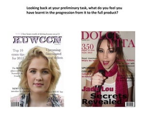
Question 7
- 1. Looking back at your preliminary task, what do you feel you have learnt in the progression from it to the full product?
- 2. As you can see, the differences between both my college magazine front cover and my music magazine front cover have a lot of developments and variations. To begin with, if we focus on the language and text on both covers, you will be able to see that my college magazine is very vague an d basic. The alignment of the text isn’t correct, as some is centred and some is on the left. This makes the work look very mismatched and unorganised, which could also lead to the front cover looking quite childish. If my preliminary task had been to create a magazine for primary school children, this could have been more appropriate as it would have represented that social group. However, because it was aimed at college students whose age range varies between 14 and 40, it would have been much suitable to ‘right align’ my text as I have with my music magazine. If you compare the coverlines in both, you will see that my music magazine looks a lot neater and more professional.
- 3. Following on from my last point, I think there is also a clear difference in the degree of development with my masthead. Whilst I have kept the date in the same area, the colours and effects I have used are completely different because they are trying to get a different effect. My college magazine is clearly not aimed at 21-25 year olds by the use of a heavy drop shadow effect and the typeface used. It’s very bubbly and fun which represents the target audience of college students. However, my music magazine still uses a Serif font but the typeface is my slimmer and sleeker. This in itself contributes to the representation of my target audience. It looks very feminine and girly, especially in the colour it is in, and this has been done to attract the right social groups.
- 4. As you can see with the images I have used, the photograph I took for my music magazine is much more effective. The camera shot is a medium close up rather than a close up which I think gives the audience a lot more to look at and to focus on. The model is wearing a specific costume and is holding a prop that represents my genre of music – indie. This makes the music magazine look more professional and the use of colour has also been tied in with the text throughout my work, which also gives it credibility. My college magazine image has been poorly cut out and placed onto a white background rather than me having photographed it on a white background. This detracts from the efficiency of font cover, whereas my music magazine image has been shot onto the background I wanted. Again, making it look much more professional. I also did not choose the clothing for my model in my college magazine and therefore I could not properly represent college students.
- 5. Another thing that I have developed whilst constructing my music magazine is the way in which I have presented and posed my model. Here you can see that my model looks like a musician as she is holding a microphone and is singing into it. This is something I could compare to existing media products because I think that the pose could be found in other magazines like NME or Rolling Stone. I have specifically set my model up to look like this so that it attracts an audience. Whereas in my college magazine, the original photo was of the model standing against a tree which I later cropped and cut out. This has no relevance to college life at all and therefore upon seeing it, an audience wouldn’t recognise that it was about college.
- 6. The developments between my contents pages are very vast as there are some aspects I enjoy about both of them. To start with, the use of my images are a lot more effective in my music magazine than they were in my college magazine. The reason being is that when taking my photos for my college magazine, I didn’t really think about what would be appropriate to include. As you can see, all 4 images used do not tie in with college or necessarily college life at all. The pictures consist of my model standing against a tree, shopping and eating food. Whilst these may be things a college student can do, it doesn’t actually show the audience anything about college life inside of the campus, and therefore it isn’t going to attract the intended audience. Another fault I have is the fact I have used the model in every single photo across my contents page which should really have only been used in one, if any at all. In existing media products, you do not see the main feature appearing in every single photo on the contents page.
- 7. My music magazine is a lot more efficient in terms of it’s images because I have used ones that relate back to the coverlines on my front cover and other ones besides my model. I have included my musician in two images across the double page spread but this is because on my front cover, I had coverlines associated with her, so they are there for a particular purpose. I have included a variation of coverlines which will attract the audience in and I have made sure to address all the issues previously mentioned on my front cover. The layout is completely different to that of my college magazine which I enjoy looking at because it is quite different. It has a very simplistic yet effective design which will be easy for the reader to navigate around and collect all the information they need. Whist I do like the layout of my folios on my college magazine and I think it looks very similar to most magazines, I wanted my music magazine to represent my genre, which I think it does.