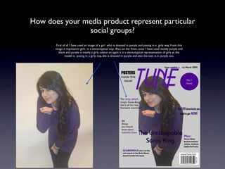
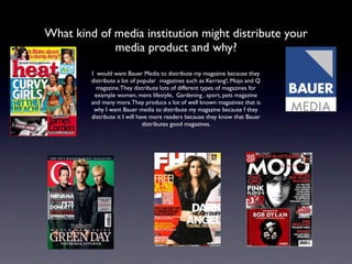
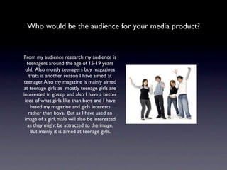
AS Media Studies
   Evaluation

  By: Nelab Rahmani
In what ways does your media product use, develop or
               challenge forms and conventions of real media
                                 products?
I have used many conventions in my magazine that are similar to real media products. For example on my front cover I have put the
title of the magazine at the top of the magazine because most magazines put it at the top of the magazine.  I have also put an image
of my model behind the title and I made the text around the image to come on top of the image, most magazines have similar
conventions. I have mainly used two colours, purple and black as most magazines use about two or three colours. I have also used the
usual conventions like the date, issue number and the barcode.I also used the usual conventions like the date, issue number and the
barcode.

Front cover before:                                                                                                                   Final front cover:


This is how my magazine looked before but as you can see I had to change it a lot. For example I had to change the image because most music magazines
either use a medium close up or a medium long shot. I used a medium shot so I had to change it, also the model I used didn’t have the look for the front
   cover so I changed the model. I had to change the colours because most music magazines mainly use 2 or 3 colours and at first I had used 4 colours
which was too much then I reduced it to blue and black but then I had to change it again because the blue wouldn’t look nice with the new model, that is
why I changed it to purple and black. I also made the title bigger as most magazines make the title big so that it stands out. I also added more sell lines to
 make it look realistic and so that there isn’t a lot of spaces left on the cover. So I had to improve it to make it conventional. I did this using photoshop.
I have mainly used this Blender magazine front cover as a guide to produce my own front cover, that is
   why my magazine looks similar to this magazine. I have used a female model similarly to the Blender
  magazine. The framing I used is similar to the framing used in the Blender magazine. Also you can see
  from the Blender magazine that there is only two colours used, blue and black, that is why I made my
  text two colours two, purple and black. So overall my magazine is very conventional and uses typical
conventions which are used in professional music magazines. I haven’t used anything unconventional that
                                 challenge professional music magazines.
How does your media product represent particular
               social groups?
        First of all I have used an image of a girl who is dressed in purple and posing in a girly way. From this
       image it represents girls in a stereotypical way. Also on the front cover I have used mostly purple and
          black and purple is mainly a girly colour so again it is a stereotypical representation of girls as the
               model is posing in a girly way, she is dressed in purple and also the text is in purple too.
What kind of media institution might distribute your
             media product and why?
         I would want Bauer Media to distribute my magazine because they
         distribute a lot of popular magazines such as Kerrang!, Mojo and Q
           magazine.They distribute lots of different types of magazines for
          example women, mens lifestyle, Gardening , sport, pets magazine
         and many more.They produce a lot of well known magazines that is
          why I want Bauer media to distribute my magazine because f they
         distribute it I will have more readers because they know that Bauer
                                distributes good magazines.
Who would be the audience for your media product?


From my audience research my audience is
  teenagers around the age of 15-19 years
 old. Also mostly teenagers buy magazines
   thats is another reason I have aimed at
teenager. Also my magazine is mainly aimed
at teenage girls as mostly teenage girls are
interested in gossip and also I have a better
 idea of what girls like than boys and I have
    based my magazine and girls interests
   rather than boys. But as I have used an
 image of a girl, male will also be interested
   as they might be attracted to the image.
    But mainly it is aimed at teenage girls.
How did you attract/address your audience?

I have used many techniques to attract the readers attention. For example on the front cover I have
 used an attractive image of my model that would attract any one passing by. Also the layout seems
 to attract the audience too. I have used direct mode of address which again will attract the readers
 attention. The sell lines will also attract the readers attention for example, “Glamorous stars on the
   red carpet in the Brits Music award inside this issue” readers will want to know about the award
 and what the artists wear so having this sell line on the cover would make the reader want to read
 the magazine. On the contents page I have put many features that will attract the readers attention
  for example I have information about competitions which would interest the reader because they
   would want to know about competitions. Also I have got features such as “Amy jailed again” and
  “recent relationship affairs” these features will interest the reader because it is gossip and people
                   mostly like gossip so they will interested in reading the magazine.
What have you learnt about technologies from the
     process of constructing this product?


     I have learnt how to use many technologies for example I have learnt how to use Photoshop
     to edit my picture and making the layout of my contents, front cover and double page
     spread. I learnt how to use layers so that images and text can overlap and create gradient
     affects for the background which makes it look more realistic and professional.
     I also learnt how to create and use a Blog to put my work on and show the steps and
     research I did to produce my magazine.
     I also learnt to use Slideshare which is an online storage site to put documents such as
     presentations and word documents onto my blog.
Looking back at your preliminary task, what do you feel
 you have learnt in the progression from it to the full
                       product?


  From the preliminary task I have learnt how to layout text and images around the age to make it look better.
 I learnt how to improve my Photoshop skills to make everything realistic. Also for my preliminary task I didn’t
  do any audience research so I didn’t know what to put on the cover or contents page but for my production
    task I did research so I knew what people wanted and what type of things I should include in my magazine.
   This made me realise how important audience research is when producing a magazine. Also we didn’t have
     much time when producing the preliminary task compared to the production task so we had to rush the
     preliminary task that is why it wasn’t as good as the music magazine. This shows that time management is
 important when producing a music magazine. Also when we had to take an image we didn’t have time to edit
                       the image in the preliminary task while for the production task we did.

Evaluation

  • 1.
    AS Media Studies Evaluation By: Nelab Rahmani
  • 2.
    In what waysdoes your media product use, develop or challenge forms and conventions of real media products? I have used many conventions in my magazine that are similar to real media products. For example on my front cover I have put the title of the magazine at the top of the magazine because most magazines put it at the top of the magazine.  I have also put an image of my model behind the title and I made the text around the image to come on top of the image, most magazines have similar conventions. I have mainly used two colours, purple and black as most magazines use about two or three colours. I have also used the usual conventions like the date, issue number and the barcode.I also used the usual conventions like the date, issue number and the barcode. Front cover before: Final front cover: This is how my magazine looked before but as you can see I had to change it a lot. For example I had to change the image because most music magazines either use a medium close up or a medium long shot. I used a medium shot so I had to change it, also the model I used didn’t have the look for the front cover so I changed the model. I had to change the colours because most music magazines mainly use 2 or 3 colours and at first I had used 4 colours which was too much then I reduced it to blue and black but then I had to change it again because the blue wouldn’t look nice with the new model, that is why I changed it to purple and black. I also made the title bigger as most magazines make the title big so that it stands out. I also added more sell lines to make it look realistic and so that there isn’t a lot of spaces left on the cover. So I had to improve it to make it conventional. I did this using photoshop.
  • 3.
    I have mainlyused this Blender magazine front cover as a guide to produce my own front cover, that is why my magazine looks similar to this magazine. I have used a female model similarly to the Blender magazine. The framing I used is similar to the framing used in the Blender magazine. Also you can see from the Blender magazine that there is only two colours used, blue and black, that is why I made my text two colours two, purple and black. So overall my magazine is very conventional and uses typical conventions which are used in professional music magazines. I haven’t used anything unconventional that challenge professional music magazines.
  • 4.
    How does yourmedia product represent particular social groups? First of all I have used an image of a girl who is dressed in purple and posing in a girly way. From this image it represents girls in a stereotypical way. Also on the front cover I have used mostly purple and black and purple is mainly a girly colour so again it is a stereotypical representation of girls as the model is posing in a girly way, she is dressed in purple and also the text is in purple too.
  • 5.
    What kind ofmedia institution might distribute your media product and why? I would want Bauer Media to distribute my magazine because they distribute a lot of popular magazines such as Kerrang!, Mojo and Q magazine.They distribute lots of different types of magazines for example women, mens lifestyle, Gardening , sport, pets magazine and many more.They produce a lot of well known magazines that is why I want Bauer media to distribute my magazine because f they distribute it I will have more readers because they know that Bauer distributes good magazines.
  • 6.
    Who would bethe audience for your media product? From my audience research my audience is teenagers around the age of 15-19 years old. Also mostly teenagers buy magazines thats is another reason I have aimed at teenager. Also my magazine is mainly aimed at teenage girls as mostly teenage girls are interested in gossip and also I have a better idea of what girls like than boys and I have based my magazine and girls interests rather than boys. But as I have used an image of a girl, male will also be interested as they might be attracted to the image. But mainly it is aimed at teenage girls.
  • 7.
    How did youattract/address your audience? I have used many techniques to attract the readers attention. For example on the front cover I have used an attractive image of my model that would attract any one passing by. Also the layout seems to attract the audience too. I have used direct mode of address which again will attract the readers attention. The sell lines will also attract the readers attention for example, “Glamorous stars on the red carpet in the Brits Music award inside this issue” readers will want to know about the award and what the artists wear so having this sell line on the cover would make the reader want to read the magazine. On the contents page I have put many features that will attract the readers attention for example I have information about competitions which would interest the reader because they would want to know about competitions. Also I have got features such as “Amy jailed again” and “recent relationship affairs” these features will interest the reader because it is gossip and people mostly like gossip so they will interested in reading the magazine.
  • 8.
    What have youlearnt about technologies from the process of constructing this product? I have learnt how to use many technologies for example I have learnt how to use Photoshop to edit my picture and making the layout of my contents, front cover and double page spread. I learnt how to use layers so that images and text can overlap and create gradient affects for the background which makes it look more realistic and professional. I also learnt how to create and use a Blog to put my work on and show the steps and research I did to produce my magazine. I also learnt to use Slideshare which is an online storage site to put documents such as presentations and word documents onto my blog.
  • 9.
    Looking back atyour preliminary task, what do you feel you have learnt in the progression from it to the full product? From the preliminary task I have learnt how to layout text and images around the age to make it look better. I learnt how to improve my Photoshop skills to make everything realistic. Also for my preliminary task I didn’t do any audience research so I didn’t know what to put on the cover or contents page but for my production task I did research so I knew what people wanted and what type of things I should include in my magazine. This made me realise how important audience research is when producing a magazine. Also we didn’t have much time when producing the preliminary task compared to the production task so we had to rush the preliminary task that is why it wasn’t as good as the music magazine. This shows that time management is important when producing a music magazine. Also when we had to take an image we didn’t have time to edit the image in the preliminary task while for the production task we did.