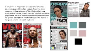
This document summarizes how the media product uses and challenges conventions of real magazines. It follows several conventions such as having a masthead in the top third that spans the width of the page. It also uses a consistent color scheme and includes common magazine elements like a cover image, slogans, and puffs. However, it challenges some conventions by having the masthead font repeated on the cover line, centering the cover image rather than placing it on the left, and not making the puff visually distinct. The double page spread layout includes text wrapping around an image in columns like typical magazines but challenges conventions by not dedicating a full page to the main image.