Evaluation of my AS Media Studies Music Magazine Question 1 - In what ways does your media product use, develop and challenge forms of real media products?
Evaluation of my AS Media Studies Music Magazine Question 1 - In what ways does your media product use, develop and challenge forms of real media products?
This is my AS Media coursework Log Book. It was a task which I needed to complete before completing any production work, which helped me therefore choose the music genre etc.
Energy Efficiency & Demand Response in Competitive Electricity marketsRahul Walawalkar
Various electric grid independent system
operators (ISOs) and Regional Transmission
Organizations (RTOs), along with FERC
have been promoting policies to increase
demand response capabilities in the
deregulated energy markets in recent years.
Commercial & Industrial (C&I) customers
are one of the key targets for achieving
significant demand response in the
deregulated electricity markets, due to their
size, and the potential for a small number of
users representing a large percentage
impact on demand reduction on the grid.
Various ISOs such as NYISO, PJM, ISO NE
have developed demand response
programs that offer financial incentives to
end users under the umbrella of Emergency
and / or Economic Demand response
programs.
SAP-ohjelmistojen laadun kehittäminen monitoimittajaympäristössä - case Elisamikkomr
Presentation from the SAP Finug technology seminar (Sep 23-24 2010) highlighting the QM challenges and solutions in a multi vendor environment, Finnish only.
Apresentação sobre o serviço foursquare, mostrando como funciona, dados e alguns cases do Brasil e do exterior. No final, eu falo sobre os concorrentes do serviço.
This is my first evaluation question answering: In what ways does your media product use, develop or challenge forms and conventions of real media products?
How have I used and challenged forms and conventions?
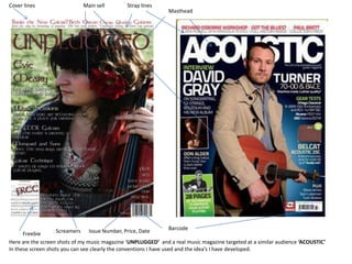
1. Cover lines Main sell Strap lines Masthead Barcode Issue Number, Price, Date Screamers Freebie Here are the screen shots of my music magazine ‘UNPLUGGED’ and a real music magazine targeted at a similar audience ‘ACOUSTIC’ In these screen shots you can see clearly the conventions I have used and the idea’s I have developed.
2. My genre is a folky/acoustic one and there for I am aiming to attract musicians, as well as people just generally interested in this genre, who perceive themselves to have a different image and taste in music to the majority of people. They follow the less main-stream music and fashions and stick to what they like. In order to make my magazine appeal to these radicals then I have had to use and develop some of the forms and conventions used in real media products in order to attract them. But I have also developed these idea’s so as to keep the readers interested, as genres are forever evolving and changing. The Front cover of most acoustic magazine’s use the main sell holding or playing a guitar, but in my magazine I have chosen to develop this idea using the guitar and make my main sell hold a violin instead. By doing this I have widened my audience as I am now possibly appealing to more people who may enjoy the violin and not just sticking to the acoustic guitar which is the most popular acoustic instrument and there for appealing to people of both acoustic and folky styles. Fonts Most acoustic magazine’s use a typical Ariel font but in my magazine I have chosen to use a font linked closely to the theme of my magazine. So I have used a different font and there for challenged the forms and conventions of real media products.
3. The picture on the left is a picture included in the magazine Acoustic. Like in other real magazines black and white photographs are used frequently as they look arty and appeal to the reader. So I have also included this feature in my magazine as you can see by the picture on the right.
4. Here are the Mastheads from both the real magazine ‘ACOUSTIC’ and my magazine ‘UNPLUGGED’ The magazine ‘ACOUSTIC’uses an all capitals and bold font for its Masthead and the main sell goes over the top of the Masthead. I have also used capitals for my Masthead as it works well and makes it more noticeable to the readers eye. Unlike the real magazine I have avoided using a white colour text for the Masthead and have used this red/brown colour Instead, as seen in the screen shot. As well as the actual Masthead conventions I have also used the bar above the Masthead seen on both magazines. This bar draws attention to some of the main selling features of the magazine and there for is a good feature to include as it appeals to the audience. I have used a house colour through out my magazine, as does the real media product, as this gives an overall more professional appearance to the magazine. The colours I have used through out on my Front cover, Contents Page and Double Page Spread can be seen in the screen shots to the side.
5. I have included a main picture of the feature artist I have included a page border I have grabbed text from the article and enlarged it This is a screen shot of my double page spread. Here you can see that I have used the same layout for my page as every other real media product does. I have split the page into columns and included pictures around the text. I have also used the feature pf adding another article to the same page, as it stands out against the other article. I have also added something less usual, which is a picture with a low opacity in the background, this is a feature which could appeal to my target audience.
6. Headings separating the different sections of the magazine Main feature artists being advertised well and drawing the reader to the magazine Freebies included in the magazine to appeal to the reader Pictures of articles included in the magazine This is a screen shot of my contents page. I have used the same colours (the house colours) as I have on the front cover, so as to carry on the theme of the magazine so it continues to appeal to the readers. I have also included the same borders as I have on my double page spread, as well the same fonts used through out the magazine. This is a convention used in all successful magazines.