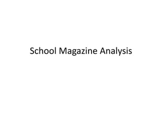
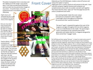
The document analyzes and critiques the design elements of a school magazine cover and contents page. On the cover, bright colors and text are used to emphasize an excited tone, while images and puns aim to elicit emotion and humor from readers. However, the text is too large and colors too contrasting compared to professional magazines. The contents page justifies text to the bottom and includes large photos, but it could be improved by simplifying the design and focusing on text and image quality. Overall, the analysis identifies amateur aspects that do not meet professional magazine standards.


![[EN].CleverGroup Vietnam Profile 20251202](https://cdn.slidesharecdn.com/ss_thumbnails/en-260120091417-fe6f88ec-thumbnail.jpg?width=640&height=640&fit=bounds)


