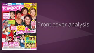
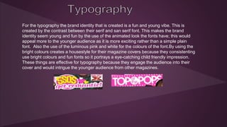
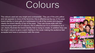
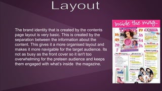
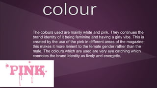
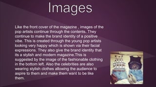
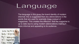
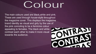
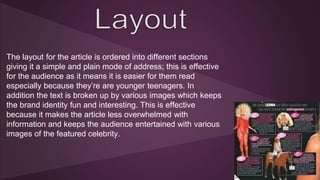
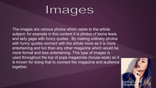
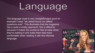
The document analyzes the brand identity and mode of address used in Top of the Pops magazine covers and articles. It summarizes that the magazine aims to have a fun, young, feminine brand identity appealing to teenagers. This is achieved through the use of bright colors, playful fonts, informal language, abbreviated words, positive celebrity images and cluttered layouts on the covers. The contents pages and articles also feature this style with girly colors and separation of information to engage younger readers.


![My mood board]](https://cdn.slidesharecdn.com/ss_thumbnails/mymoodboard-110329090917-phpapp02-thumbnail.jpg?width=640&height=640&fit=bounds)


