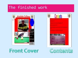
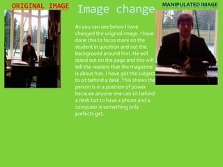
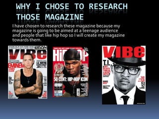
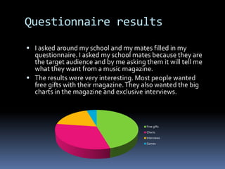
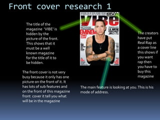
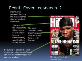
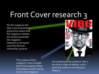
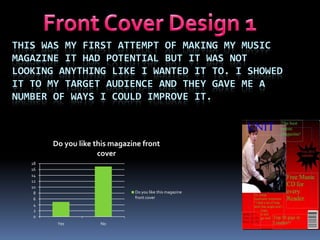
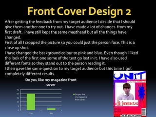
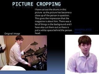
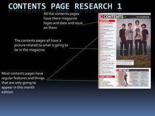
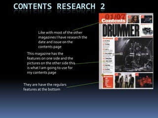
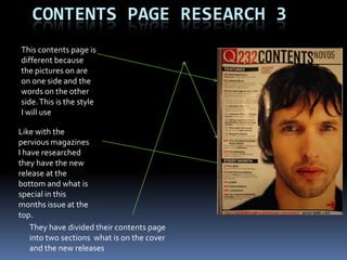
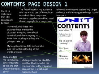
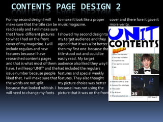
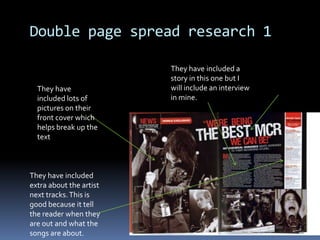
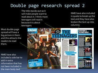
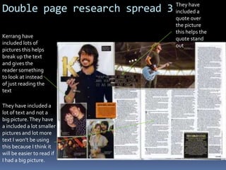
Media preliminary taskBy Hugo Reid
School MagazineI am going to create a School Magazine for my preliminary task. This will give me all the skills I need to know when I go on and make my music magazine. This will also help me get to know that computer software and how to use it quickly and easily. My music magazine will be better because I will have all the skills to do it easily.
DraftingI am going to need to get an idea of what I am going to be designing so I will need to draw drafts of what my front cover will look like. I will need to this so I know roughly how my front cover will look. The front cover will change because this is only a draft and I can change it when I want.
ResearchI have looked at different things that fit my target audience. I know because I have spoken to them that they want certain things in the school magazine because it will mainly be read by the pupils. My research told me that I should include:Pictures
Interviews
Sports Reports
Unknown facts about the school
Your questions answeredAll the magazine  front cover have a main title and a big front cover pictureDatesYou can tell it is a school magazine because of the environment is off a school and the magazine gives you the idea that it is a school magazineDates
The finished workFront CoverContents
Image changeOriginal Image    Manipulated ImageAs you can see below I have changed the original image. I have done this to focus more on the student in question and not the background around him. He will stand out on the page and this will tell the readers that the magazine is about him. I have got the subject to sit behind a desk. This shows the person is in a position of power because anyone one can sit behind a desk but to have a phone and a computer is something only prefects get.
What I have LearnedMaking the school magazine really helped me get around the software that I plan to use in my music magazine. It also gave me practise for working out the layout of a typical magazine. You will find that my music magazine has a lot better features than my school magazine. This is because once I finished my school magazine I had gained a lot of experience of using the software and creating a user friendly and cool magazine for my intended audience.
Music Magazine
Magazine front cover ResearchI will go into shops and have a look at current music magazines and see what they include that mine should include. Before I researched this I really didn’t have any ideas about actually creating a magazine even though I had read a lot of music magazines.
Why I chose to research those MagazineI have chosen to research these magazine because my magazine is going to be aimed at a teenage audience and people that like hip hop so I will create my magazine towards them.
Questionnaire resultsI asked around my school and my mates filled in my questionnaire. I asked my school mates because they are the target audience and by me asking them it will tell me what they want from a music magazine.The results were very interesting. Most people wanted free gifts with their magazine. They also wanted the big charts in the magazine and exclusive interviews.
Front cover research 1The title of the magazine  ‘VIBE’ is hidden by the picture of the front. This shows that it must be a well known magazine for the title of it to be hidden.The creators have put Real Rap as a cover line this shows if you want rap then you have to buy this magazineThe front cover is not very busy because it only has one picture on the front of it. It has lots of sub features and on the front of this magazine front  cover it tell you what will be in the magazineThe main feature is looking at you. This is his mode of address.
Front Cover research 2Incentive for readers if they buy the magazine then they get 20 classic downloadsYou can’t see the whole of the title so it must be well known because otherwise they would not have hidden the title.The word ‘SPECIAL’ shows that it’s a special issue and it will have special features.By putting 50 cent on the front shows that he is the main feature and that is what the magazine is going to be aboutThe barcode is in an unusual place
Front Cover research 3On this magazine the title is not covered by a picture this means that the magazine creators are trying to promote the magazine. However on an earlier issue the title was covered by a pictureThe creators of this magazine  have included lots of sub heading telling the audience what is going to be in the magazine.He is looking at the audience  this is the direct mode of address  and it gives the audience something to relate to
Front Cover Design 1This was my first attempt of making my music magazine It had potential but It was not looking anything like I wanted it to. I showed it to my target audience and they gave me a number of ways I could improve it.
Front Cover Design 2After getting the feedback from my target audience I decide that I should give them another one to try out. I have made a lot of changes  from my first draft. I have still kept the same masthead but all the things have changed.First of all I cropped the picture so you could just the person face. This is a close up shot.I have changed the background colour to pink and blue. Even though I liked the look of the first one some of the text go lost in it. I have also used different fonts so they stand out to the person reading it. I then gave the same question to my target audience but this time I  got completely different results.
Picture croppingI have cut out the drums in this picture  so the picture has become a close up of the person in question. This gives the impression that the magazine is about him. There was a lot of things in the background and I have also cut them out so there is just a white space behind the person head. Manipulated  imageOriginal  Image
Contents page Research 1All the contents pages have there magazine logos and date and issue on themThe contents pages all have a picture related to what is going to be in the magazineMost contents pages have regular features and things that are only going to appear in this month edition.
Contents research 2Like with most of the other magazines I have research the date and issue on the contents pageThis magazine has the features on one side and the pictures on the other side this is what I am going to use for my contents page They are have the regulars features at the bottom
Contents page research 3This contents page is different because the pictures on are on one side and the words on the other side. This is the style I will useLike with the pervious magazines I have researched they have the new release at the bottom and what is special in this months issue at the top. They have divided their contents page into two sections  what is on the cover and the new releases
Contents page Design 1I showed my contents page to my target audience and they suggested ways I could improve itThe first thing that my audience told me was to use different front to make it like a magazine contents page because I had used the wrong style for a magazineI need to make sure that title could easily be readI have included these two pictures these are not the pictures I am going to use but I have included them anyway so I know how much space they are going to take upMy target audience told me to make sure the font is not to big so the words are split They also told me to include a different photo to the one that was on the front coverMy target audience liked the way that I had included the issue number in the magazine because this is what most magazine have
Contents page design 2For my second design I will make sure that the title can be read easily and I will make sure that I have  different pictures to what I had on the front cover of my magazine. I will include regulars and new features because I have researched contents pages and that is what most of them have. I will keep ‘UNIT’ and the issue number because people liked that. I will make sure that the words are not split because that looked rubbish. I will need to change my fonts to make it look like a proper music magazine.I showed my second design to my target audience and they agreed that it was a lot better then my first one  because the title stood out and could be easily read. My target audience also liked they way I had included the regulars features and special weekly features. They also thought my picture choice was better because I was not using the picture that it was on the front cover and there fore it gave it more verity.
Double page spread research 1They have included a story in this one but I will include an interview in mine.They have included lots of pictures on their front cover which helps break up the text They have included extra about the artist next tracks. This is good because it tell the reader when they are out and what the songs are about.
Double page research spread 2The title stands out so it will make people want to read about it. I think more teenagers will read it because it is about teenagersNME have also included in quote to break up the text and they have also broken the text up into columns Most double page spread will have a big picture in them and this attracts the readers to read them.NME have also included a side bar to add in extra information that has not been included in the main body text
Double page research spread 3They have included a quote over the picture this helps the quote stand outKerrang have included lots of pictures this helps break up the text and gives the reader something to look at instead of just reading the textThey have included a lot of text and not a big picture. They have a included a lot smaller pictures and lot more text I won’t be using this because I think it will be easier to read if I had a big picture.
What I have learnedAll the double page spreads have text going across the double page and not pictures like my first version. I also noticed that the double pages contained big headlines to draw the reader in apart from Kerrang but even Kerrang had a picture of someone famous holding the ‘K’ sign and even though it does not have a headline but does have pictures and it and does have a box at the bottom for extra information.
double page spread 1I created my first double page spread and I felt that it was good. However when I looked at other double page spreads it did not compare well with them and did not look like a music magazine at all. I also noticed that I had not included any page number so I would need to included them on my next version.
Version 1

Coursework

  • 1.
  • 2.
    School MagazineI amgoing to create a School Magazine for my preliminary task. This will give me all the skills I need to know when I go on and make my music magazine. This will also help me get to know that computer software and how to use it quickly and easily. My music magazine will be better because I will have all the skills to do it easily.
  • 3.
    DraftingI am goingto need to get an idea of what I am going to be designing so I will need to draw drafts of what my front cover will look like. I will need to this so I know roughly how my front cover will look. The front cover will change because this is only a draft and I can change it when I want.
  • 4.
    ResearchI have lookedat different things that fit my target audience. I know because I have spoken to them that they want certain things in the school magazine because it will mainly be read by the pupils. My research told me that I should include:Pictures
  • 5.
  • 6.
  • 7.
  • 8.
    Your questions answeredAllthe magazine front cover have a main title and a big front cover pictureDatesYou can tell it is a school magazine because of the environment is off a school and the magazine gives you the idea that it is a school magazineDates
  • 9.
  • 10.
    Image changeOriginal Image Manipulated ImageAs you can see below I have changed the original image. I have done this to focus more on the student in question and not the background around him. He will stand out on the page and this will tell the readers that the magazine is about him. I have got the subject to sit behind a desk. This shows the person is in a position of power because anyone one can sit behind a desk but to have a phone and a computer is something only prefects get.
  • 11.
    What I haveLearnedMaking the school magazine really helped me get around the software that I plan to use in my music magazine. It also gave me practise for working out the layout of a typical magazine. You will find that my music magazine has a lot better features than my school magazine. This is because once I finished my school magazine I had gained a lot of experience of using the software and creating a user friendly and cool magazine for my intended audience.
  • 12.
  • 13.
    Magazine front coverResearchI will go into shops and have a look at current music magazines and see what they include that mine should include. Before I researched this I really didn’t have any ideas about actually creating a magazine even though I had read a lot of music magazines.
  • 14.
    Why I choseto research those MagazineI have chosen to research these magazine because my magazine is going to be aimed at a teenage audience and people that like hip hop so I will create my magazine towards them.
  • 15.
    Questionnaire resultsI askedaround my school and my mates filled in my questionnaire. I asked my school mates because they are the target audience and by me asking them it will tell me what they want from a music magazine.The results were very interesting. Most people wanted free gifts with their magazine. They also wanted the big charts in the magazine and exclusive interviews.
  • 16.
    Front cover research1The title of the magazine ‘VIBE’ is hidden by the picture of the front. This shows that it must be a well known magazine for the title of it to be hidden.The creators have put Real Rap as a cover line this shows if you want rap then you have to buy this magazineThe front cover is not very busy because it only has one picture on the front of it. It has lots of sub features and on the front of this magazine front cover it tell you what will be in the magazineThe main feature is looking at you. This is his mode of address.
  • 17.
    Front Cover research2Incentive for readers if they buy the magazine then they get 20 classic downloadsYou can’t see the whole of the title so it must be well known because otherwise they would not have hidden the title.The word ‘SPECIAL’ shows that it’s a special issue and it will have special features.By putting 50 cent on the front shows that he is the main feature and that is what the magazine is going to be aboutThe barcode is in an unusual place
  • 18.
    Front Cover research3On this magazine the title is not covered by a picture this means that the magazine creators are trying to promote the magazine. However on an earlier issue the title was covered by a pictureThe creators of this magazine have included lots of sub heading telling the audience what is going to be in the magazine.He is looking at the audience this is the direct mode of address and it gives the audience something to relate to
  • 19.
    Front Cover Design1This was my first attempt of making my music magazine It had potential but It was not looking anything like I wanted it to. I showed it to my target audience and they gave me a number of ways I could improve it.
  • 20.
    Front Cover Design2After getting the feedback from my target audience I decide that I should give them another one to try out. I have made a lot of changes from my first draft. I have still kept the same masthead but all the things have changed.First of all I cropped the picture so you could just the person face. This is a close up shot.I have changed the background colour to pink and blue. Even though I liked the look of the first one some of the text go lost in it. I have also used different fonts so they stand out to the person reading it. I then gave the same question to my target audience but this time I got completely different results.
  • 21.
    Picture croppingI havecut out the drums in this picture so the picture has become a close up of the person in question. This gives the impression that the magazine is about him. There was a lot of things in the background and I have also cut them out so there is just a white space behind the person head. Manipulated imageOriginal Image
  • 22.
    Contents page Research1All the contents pages have there magazine logos and date and issue on themThe contents pages all have a picture related to what is going to be in the magazineMost contents pages have regular features and things that are only going to appear in this month edition.
  • 23.
    Contents research 2Likewith most of the other magazines I have research the date and issue on the contents pageThis magazine has the features on one side and the pictures on the other side this is what I am going to use for my contents page They are have the regulars features at the bottom
  • 24.
    Contents page research3This contents page is different because the pictures on are on one side and the words on the other side. This is the style I will useLike with the pervious magazines I have researched they have the new release at the bottom and what is special in this months issue at the top. They have divided their contents page into two sections what is on the cover and the new releases
  • 25.
    Contents page Design1I showed my contents page to my target audience and they suggested ways I could improve itThe first thing that my audience told me was to use different front to make it like a magazine contents page because I had used the wrong style for a magazineI need to make sure that title could easily be readI have included these two pictures these are not the pictures I am going to use but I have included them anyway so I know how much space they are going to take upMy target audience told me to make sure the font is not to big so the words are split They also told me to include a different photo to the one that was on the front coverMy target audience liked the way that I had included the issue number in the magazine because this is what most magazine have
  • 26.
    Contents page design2For my second design I will make sure that the title can be read easily and I will make sure that I have different pictures to what I had on the front cover of my magazine. I will include regulars and new features because I have researched contents pages and that is what most of them have. I will keep ‘UNIT’ and the issue number because people liked that. I will make sure that the words are not split because that looked rubbish. I will need to change my fonts to make it look like a proper music magazine.I showed my second design to my target audience and they agreed that it was a lot better then my first one because the title stood out and could be easily read. My target audience also liked they way I had included the regulars features and special weekly features. They also thought my picture choice was better because I was not using the picture that it was on the front cover and there fore it gave it more verity.
  • 27.
    Double page spreadresearch 1They have included a story in this one but I will include an interview in mine.They have included lots of pictures on their front cover which helps break up the text They have included extra about the artist next tracks. This is good because it tell the reader when they are out and what the songs are about.
  • 28.
    Double page researchspread 2The title stands out so it will make people want to read about it. I think more teenagers will read it because it is about teenagersNME have also included in quote to break up the text and they have also broken the text up into columns Most double page spread will have a big picture in them and this attracts the readers to read them.NME have also included a side bar to add in extra information that has not been included in the main body text
  • 29.
    Double page researchspread 3They have included a quote over the picture this helps the quote stand outKerrang have included lots of pictures this helps break up the text and gives the reader something to look at instead of just reading the textThey have included a lot of text and not a big picture. They have a included a lot smaller pictures and lot more text I won’t be using this because I think it will be easier to read if I had a big picture.
  • 30.
    What I havelearnedAll the double page spreads have text going across the double page and not pictures like my first version. I also noticed that the double pages contained big headlines to draw the reader in apart from Kerrang but even Kerrang had a picture of someone famous holding the ‘K’ sign and even though it does not have a headline but does have pictures and it and does have a box at the bottom for extra information.
  • 31.
    double page spread1I created my first double page spread and I felt that it was good. However when I looked at other double page spreads it did not compare well with them and did not look like a music magazine at all. I also noticed that I had not included any page number so I would need to included them on my next version.
  • 32.