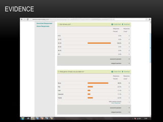
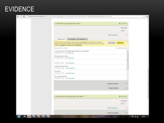
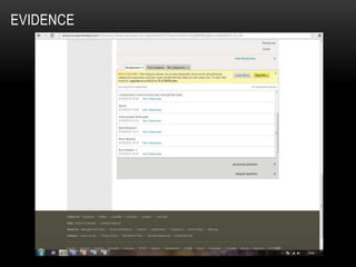
2. The reviews from the magazine advert I created are very positive. One of the comments stated that “The magazine
advert looks very professional and the colour scheme works well”. This comment is positive and shows me that my
research and planning has worked. When I set out to create a magazine advert I wanted it to stand out and I really
had to think about the colour scheme and what would fit into a typical club genre. Hearing that my magazine advert
looks professional allows me to feel like I have achieved my goal. Other comments were as followed, “I like the
effects put onto the characters face, it allows him to stand out and catches the reader‟s attention”, “I like the aspect of
the magazine advert and it really does fit into the club theme. As for improvements I would have added a price and an
image of the album cover” and “The main characters image in the middle catches your eye and I also think the
„Signum‟ logo really stands out and I love the cross colour effect used on the text, makes it look 3D”. From looking
back at these comments I feel I have accomplished my target of following the theory of Dyer, by showing the star
Image. The majority of the statements were complementing on the main character and the effects used on the image
to make him really stand out from the rest of the advert. One possible improvement was to add the image of the
album cover into the advert. I have taken this advice on board but I wouldn‟t like to use it for this magazine advert as
the digipak is the same image as the advert and I would feel like it was repeating itself. Overall I feel that the
comments made fare and show many different opinions, however, if I ever had the opportunity to change anything on
the advert I wouldn‟t want to as I personally feel it fits into the specific genre perfectly.
3. The feedback from my digipak was very positive; some comments made about my digipak were very similar
to my magazine advert. The majority of my comments made were to complement once again the image used
in the centre of the digipak but also the style of text used. One person in particular said “I love the split
picture of the DJ decks on the inside of the digipak. When you open the digipak with the images on it makes
you think you are stepping into a club and stepping into the DJ shoes” This comment took me by surprise,
the reason for this was because I loved their theory about stepping to the DJ shoes. I never had this
intention but the digipak does allow you to think about what it represents and this is a positive thing for a
customer as they can relate it back to them. When it came to criticising my digipak I didn‟t receive any major
problems, they were mainly personal opinions. Personal opinions are very important to me as they allow
another pair of eyes to look at my product and can give more advice towards my product. A few people
picked up on me having two disc slots on my digipak but on the back of the digipak there were only a list of
songs for one CD. My main theory behind this was to have the second disc as a bonus disc and have all the
music videos to each song on the disc. Once I explained this point, people suggested that I should have
advertised it on the front of the digipak, or to have added a sticker to the front to make it look more
exclusive. If I had the change to go back and change this point I would, as I feel it is quite important to the
customers to know what they will be receiving for their money.
4. When looking at the feedback received from my music video, I am very happy with the results. Many
people spoke about how they enjoyed the video and one of the most recurring comments was about
the plane landing shot and how good it looked. I too am very happy with the plane shot and the
placing of the camera. Another comment that grabbed my attention was “I liked the different cuts
through the video and the sped up clips.” The whole point of a club track in particular is to be
constantly cutting between different shot in time with the music. For the draft version of the video I
didn‟t really understand this point and many of the shots were too long. When it came back to editing
the shots I managed to utilise jump cut to give the effect of different shots. Criticism on the video main
focused on my main character walking through the city. Many people felt that he should be running
through the city to keep in time with the music and to fit into the fast pace music. This point is shown
here “I would have liked it if u ran instead as it would have kept with the quickness of the music and
cuts”. This point has been taken into consideration and if I had the opportunity to reshoot I would
defiantly add running shots as I too feel it would keep with the quickness of the video. My feedback I
received though „Survey Monkey‟ told me that everyone that took the surveys enjoyed watching the
video and everyone liked the use of quick cuts, fireworks and aeroplane shots. Overall I am very
happy with the positive and negative points made about my video and would defiantly take them into
consideration if an opportunity to reshoot arose.