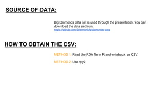
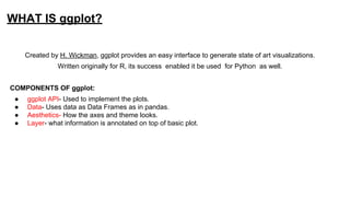
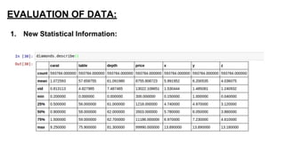
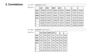
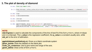
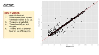
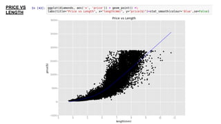
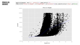
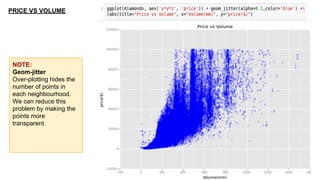
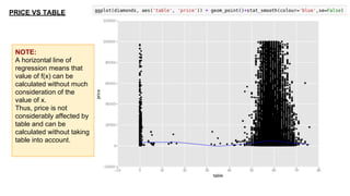
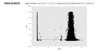
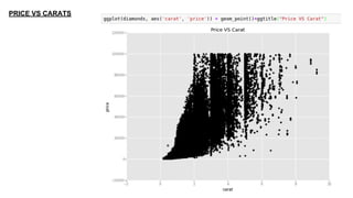
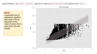
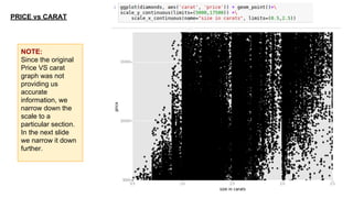
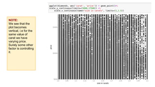
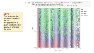
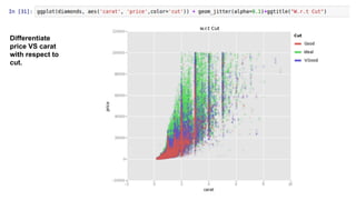
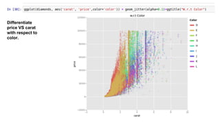
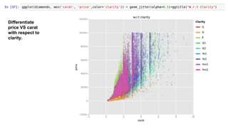
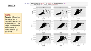
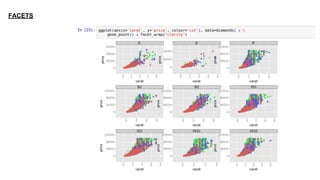
This document provides an introduction to using ggplot in Python. It discusses installing ggplot and importing necessary packages. It then uses a diamonds dataset to demonstrate how to explore the data, prepare it for analysis, evaluate relationships between variables like price and carat size, and use facets to differentiate results. The goal is to help beginners understand basic ggplot functions and how to visualize and analyze data.
January 2016 Meetup: Speeding up (big) data manipulation with data.table packageZurich_R_User_Group
Abstract: Both practitioners and researchers spend significant amount of their time on data preparation, cleaning and exploration. It gets more complicated and interesting if a dataset is big, or if it has a lot of groups in it which require per-group analysis. In this talk I will introduce an innovative data.table package as an alternative to the standard data.frame which significantly cuts your programming and execution time with easier code. It is also the first step to working with big data in R. The talk will be beneficial for R users from all disciplines, as well as for big data professionals looking for more explicit data exploration tools.
Graph Analytics - From the Whiteboard to Your Toolbox - Sam LermaPyData
However, the the graph theory jargon can make graph analytics seem more intimidating for self-study than is necessary. In this talk, the audience will be exposed to some of the basic concepts of graph theory (no prerequisite math knowledge needed!) and a few of the Python tools available for graph analysis.
TECHWEEKENDS Presents;
De-cluttering Machine Learning in collaboration with IEEE GGSIPU
Are you clueless when you hear people saying words like Unsupervised Learning and Regression? Worry not❗, GDSC USICT is there for you!!
We are organizing a session on Machine Learning where you will Learn the basics of Machine Learning while developing a Hands-On Project from Scratch and seeing the results in real time. You will also learn different algorithms and models and various Data Preparation Techniques.
Can you teach coding to kids in a mobile game app in local languages. Do you need to be good in English to learn coding in R or Python?
How young can we train people in coding-
something we worked on for six months but now we are giving up due to lack of funds is this idea.
Feel free to use it, it is licensed cc-by-sa
Show drafts
volume_up
Empowering the Data Analytics Ecosystem: A Laser Focus on Value
The data analytics ecosystem thrives when every component functions at its peak, unlocking the true potential of data. Here's a laser focus on key areas for an empowered ecosystem:
1. Democratize Access, Not Data:
Granular Access Controls: Provide users with self-service tools tailored to their specific needs, preventing data overload and misuse.
Data Catalogs: Implement robust data catalogs for easy discovery and understanding of available data sources.
2. Foster Collaboration with Clear Roles:
Data Mesh Architecture: Break down data silos by creating a distributed data ownership model with clear ownership and responsibilities.
Collaborative Workspaces: Utilize interactive platforms where data scientists, analysts, and domain experts can work seamlessly together.
3. Leverage Advanced Analytics Strategically:
AI-powered Automation: Automate repetitive tasks like data cleaning and feature engineering, freeing up data talent for higher-level analysis.
Right-Tool Selection: Strategically choose the most effective advanced analytics techniques (e.g., AI, ML) based on specific business problems.
4. Prioritize Data Quality with Automation:
Automated Data Validation: Implement automated data quality checks to identify and rectify errors at the source, minimizing downstream issues.
Data Lineage Tracking: Track the flow of data throughout the ecosystem, ensuring transparency and facilitating root cause analysis for errors.
5. Cultivate a Data-Driven Mindset:
Metrics-Driven Performance Management: Align KPIs and performance metrics with data-driven insights to ensure actionable decision making.
Data Storytelling Workshops: Equip stakeholders with the skills to translate complex data findings into compelling narratives that drive action.
Benefits of a Precise Ecosystem:
Sharpened Focus: Precise access and clear roles ensure everyone works with the most relevant data, maximizing efficiency.
Actionable Insights: Strategic analytics and automated quality checks lead to more reliable and actionable data insights.
Continuous Improvement: Data-driven performance management fosters a culture of learning and continuous improvement.
Sustainable Growth: Empowered by data, organizations can make informed decisions to drive sustainable growth and innovation.
By focusing on these precise actions, organizations can create an empowered data analytics ecosystem that delivers real value by driving data-driven decisions and maximizing the return on their data investment.
Chatty Kathy - UNC Bootcamp Final Project Presentation - Final Version - 5.23...John Andrews
SlideShare Description for "Chatty Kathy - UNC Bootcamp Final Project Presentation"
Title: Chatty Kathy: Enhancing Physical Activity Among Older Adults
Description:
Discover how Chatty Kathy, an innovative project developed at the UNC Bootcamp, aims to tackle the challenge of low physical activity among older adults. Our AI-driven solution uses peer interaction to boost and sustain exercise levels, significantly improving health outcomes. This presentation covers our problem statement, the rationale behind Chatty Kathy, synthetic data and persona creation, model performance metrics, a visual demonstration of the project, and potential future developments. Join us for an insightful Q&A session to explore the potential of this groundbreaking project.
Project Team: Jay Requarth, Jana Avery, John Andrews, Dr. Dick Davis II, Nee Buntoum, Nam Yeongjin & Mat Nicholas
Explore our comprehensive data analysis project presentation on predicting product ad campaign performance. Learn how data-driven insights can optimize your marketing strategies and enhance campaign effectiveness. Perfect for professionals and students looking to understand the power of data analysis in advertising. for more details visit: https://bostoninstituteofanalytics.org/data-science-and-artificial-intelligence/
2. INTRODUCTION:
This ppt will cover the basic functions of ggplot in python. This will help
beginners to understand what the functions mean and how to use them.
SELF HELP: If you don’t remember the function or wish to know more about it, you can use the
help function in python by simply typing the function name followed by a ?
EXAMPLE:
INPUT:
OUTPUT:
4. SOURCE OF DATA:
Big Diamonds data set is used through the presentation. You can
download the data set from:
https://github.com/SolomonMg/diamonds-data
HOW TO OBTAIN THE CSV:
METHOD 1: Read the RDA file in R and writeback as CSV.
METHOD 2: Use rpy2.
5. WHAT IS ggplot?
Created by H. Wickman, ggplot provides an easy interface to generate state of art visualizations.
Written originally for R, its success enabled it be used for Python as well.
COMPONENTS OF ggplot:
● ggplot API- Used to implement the plots.
● Data- Uses data as Data Frames as in pandas.
● Aesthetics- How the axes and theme looks.
● Layer- what information is annotated on top of basic plot.
6. TIME TAKEN TO EXECUTE
A FUNCTION:
Source: http://stackoverflow.com/questions/6786990/find-out-time-it-took-for-a-python-script-to-complete-
execution
8. EXPLORE THE DATA:
1. len()- Number of rows in the dataset
2. column()- What are names of the columns.
9. WHAT DOES THE COLUMNS CONTAIN:
1. Carat- Weight of the diamond (1 carat=0.2g)
2. Cut- Quality of cut
3. Color- Color of diamond (J-worst D-best)
4. Clarity- A measure of how clear the diamond is.
5. Cert- The level of certification granted.
6. x- Length in mm.
7. y- Breadth in mm.
8. z- Height in mm.
9. Measurement- Volume in terms of x*y*z.
10. Table- Width of top of diamond relative to widest point.
11. Depth- Numerically = (2*z) /(x+y)
10. 3. head()/tail()- To know the first few & last few values, respectively.
NOTE: The dataset contains
both quantitative(numeric)
and qualitative fields.
12. 5. Describe()- Give the mathematical details of fields with numerical value.
NOTE: The mean of x,y are approximately
same. Do diamonds have proportionate
length/breadth?
13. 7. unique()- To know the unique(1 or many) values that make up the dataset.
18. 3. The plot of density of diamond
NOTE:
stat.lingress is used to calculate the components of the line of best fit of the form y=mx+c, where m=slope
and c=y-intercept. The r_value is the regression coefficient, the p_value s a constant usually zero, while
std_err is the error of estimation.
ggplot(dataset,aesthetics(y,x)- Gives us a blank coordinate system
geom_points- Plots the dataset on the blank plot.
scale_y/x_continous- Use to give name and range of the axis.
geom_abline- Draw a line of form y=mx+c.
19. OUTPUT:
HOW IT WORKS:
1. ggplot is invoked.
2. A blank coordinate system
with labeled axes is put up.
3. The points are plotted.
4. The axis redefined and
cropped.
5. The line draw as another
layer on top of the points.
21. PRICE VS
BREADTH
NOTE:
labs-use to label the
graph and the
axises.
x-lab and y-lab can
also be separately
used.
stats_smooth
provides a
mechanism to plot
the line of
regression and help
determine the
relation among the
variants.
25. PRICE VS TABLE
NOTE:
A horizontal line of
regression means that
value of f(x) can be
calculated without much
consideration of the
value of x.
Thus, price is not
considerably affected by
table and can be
calculated without taking
table into account.
28. NOTE:
A quadratic line of
regression signifies
that value of price
depends on the
value of carat. But is
only carat, lets see
closely.
29. PRICE vs CARAT
NOTE:
Since the original
Price VS carat
graph was not
providing us
accurate
information, we
narrow down the
scale to a
particular section.
In the next slide
we narrow it down
further.
30. NOTE:
We see that the
plot becomes
vertical, i.e for the
same value of
carat we have
varying price.
Surely some other
factor is controlling
it.
31. NOTE:
This is plotting the
price with respect to
the cut.
We see that for a
given carat value the
quality of changes
the price.
35. NOTE:
Facets- It features
the same set of
data with respect to
a given factor. This
helps us determine
which value of
factor affects f(x)
the most,
FACETS
37. This presentation is a part of the larger pool of learning resources provided by
DecisionStats.org
FURTHER SOURCES:
1. https://decisionstats.org
2. https://github.com/SolomonMg/diamonds-data
3. https://themessier.wordpress.com/2015/06/17/ggplot-in-python-part-1
4. http://nbviewer.ipython.org/gist/sara-02/d5a61234ef32e60bddda
5. http://nbviewer.ipython.org/gist/sara-02/d38da4a2023da169ac13
6. https://gist.github.com/sara-02/4eb520fd1b82521e8a11
CITATION:
1. http://ggplot.yhathq.com/
2. https://github.com/yhat/ggplot
FOR QUERIES:
info@decisionstats.org
sarahmasud02@gmail.com