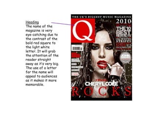
SlideShare a Scribd company logo
1 of 5
Heading
The name of the
magazine is very
eye-catching due to
the contrast of the
bold red square to
the light white
letter. It will grab
the attention of the
reader straight
away as it’s very big.
The use of a letter
for the name will
appeal to audiences
as it makes it more
memorable.
Main Image
The main image has a big
impact on the reader as it’s
quite different to other
cover images. The pose
used is very seductive and
will appeal more to male
audiences or big fans of
Cheryl. Bright red lipstick
has intentionally been used
to draw the reader’s
attention to her lips
emphasising the
seductiveness of the image.
The water dripping over her
like rain will appeal to
audiences as this is
something different and
creative about a cover
image. It’s also used to
make Cheryl look more sexy.
Main story
The main story is very eye-
catching due to the use of
the colour scheme and the
size of the text. The text
has been shaped like a
pyramid so that the words
get bigger towards the
bottom, this would grab the
reader’s attention as they’ll
notice the image then the
words underneath it. The
use of red and white makes
the words stand out against
the black of Cheryl’s hair
and clothes grabbing the
reader’s attention even
more.
Colour Scheme
The colour scheme of
red, black and white is very
effective as it makes the
magazine look more
professional. Many other
magazines use this colour
scheme so it would appeal
to the target audience as
it’s something
familiar, which through my
research I found most
people like. The colours red
and black are also colours
associated with sexiness
and seductiveness so this
relates to the image and
gives the magazine a more
seductive look altogether.
Stories
The stories have been
strategically placed around
the side of the front cover
so as to not overlap the
main image too much. The
use of the colours red and
white from the colour
scheme make the stories
stand out against the dark
background. The fact that
different text sizes have
been used for the story on
the right side makes the
magazine and the story look
more exciting and
interesting.

More Related Content

What's hot

Media magazine analysis
Media magazine analysisMedia magazine analysis
Media magazine analysisLaraMedia
 
5 magazine double page spreads
5 magazine double page spreads5 magazine double page spreads
5 magazine double page spreadsrobyngarcia
 
Magazine Cover Analysis
Magazine Cover AnalysisMagazine Cover Analysis
Magazine Cover Analysisminalfaisal
 
Fashion Magazine CP Analysis
Fashion Magazine CP AnalysisFashion Magazine CP Analysis
Fashion Magazine CP AnalysisJoynesEllie
 
Semiotic analysis of a magazine cover
Semiotic analysis of a magazine coverSemiotic analysis of a magazine cover
Semiotic analysis of a magazine coveremjcampbell
 
Draft media
Draft mediaDraft media
Draft mediaAmelliaS
 
Preliminary task
Preliminary taskPreliminary task
Preliminary tasksophiet27
 
Front cover powerpoint
Front cover powerpointFront cover powerpoint
Front cover powerpointdanielaab17
 
Magazine Cover Analysis
Magazine Cover Analysis Magazine Cover Analysis
Magazine Cover Analysis emilygrimshaw
 
Spin magazine text analysis
Spin magazine  text analysisSpin magazine  text analysis
Spin magazine text analysis0506980
 
Media coursework 9 analysis'
Media coursework 9 analysis'Media coursework 9 analysis'
Media coursework 9 analysis'Mcyuzuzo
 
Media coursework 9 analysis'
Media coursework 9 analysis'Media coursework 9 analysis'
Media coursework 9 analysis'Mcyuzuzo
 
Magazine Cover Analysis
Magazine Cover AnalysisMagazine Cover Analysis
Magazine Cover AnalysisAnna Salman
 
Front cover powerpoint
Front cover powerpointFront cover powerpoint
Front cover powerpointdanielaab17
 
Music magazine analysis
Music magazine analysisMusic magazine analysis
Music magazine analysisclaudiadsousa
 
Content Page Analysis
Content Page AnalysisContent Page Analysis
Content Page Analysisminalfaisal
 

What's hot (20)

Research
Research Research
Research
 
Media magazine analysis
Media magazine analysisMedia magazine analysis
Media magazine analysis
 
5 magazine double page spreads
5 magazine double page spreads5 magazine double page spreads
5 magazine double page spreads
 
Magazine Cover Analysis
Magazine Cover AnalysisMagazine Cover Analysis
Magazine Cover Analysis
 
Fashion Magazine CP Analysis
Fashion Magazine CP AnalysisFashion Magazine CP Analysis
Fashion Magazine CP Analysis
 
Semiotic analysis of a magazine cover
Semiotic analysis of a magazine coverSemiotic analysis of a magazine cover
Semiotic analysis of a magazine cover
 
Draft media
Draft mediaDraft media
Draft media
 
Preliminary task
Preliminary taskPreliminary task
Preliminary task
 
Front cover powerpoint
Front cover powerpointFront cover powerpoint
Front cover powerpoint
 
A2exsw
A2exswA2exsw
A2exsw
 
Magazine Cover Analysis
Magazine Cover Analysis Magazine Cover Analysis
Magazine Cover Analysis
 
Spin magazine text analysis
Spin magazine  text analysisSpin magazine  text analysis
Spin magazine text analysis
 
Media coursework 9 analysis'
Media coursework 9 analysis'Media coursework 9 analysis'
Media coursework 9 analysis'
 
Media coursework 9 analysis'
Media coursework 9 analysis'Media coursework 9 analysis'
Media coursework 9 analysis'
 
Magazine Cover Analysis
Magazine Cover AnalysisMagazine Cover Analysis
Magazine Cover Analysis
 
Magazine cover analysis
Magazine cover analysisMagazine cover analysis
Magazine cover analysis
 
Front cover powerpoint
Front cover powerpointFront cover powerpoint
Front cover powerpoint
 
Music magazine analysis
Music magazine analysisMusic magazine analysis
Music magazine analysis
 
Content Page Analysis
Content Page AnalysisContent Page Analysis
Content Page Analysis
 
Magazine cover analysis
Magazine cover analysisMagazine cover analysis
Magazine cover analysis
 

Viewers also liked (14)

Introducción a los Sistemas Operativos
Introducción a los Sistemas OperativosIntroducción a los Sistemas Operativos
Introducción a los Sistemas Operativos
 
Exploration network chapter7
Exploration network chapter7Exploration network chapter7
Exploration network chapter7
 
LEE JUN KI
LEE JUN KILEE JUN KI
LEE JUN KI
 
Dois santos
Dois santosDois santos
Dois santos
 
Exploration network chapter8
Exploration network chapter8Exploration network chapter8
Exploration network chapter8
 
Gestión de Almacenamiento
Gestión de AlmacenamientoGestión de Almacenamiento
Gestión de Almacenamiento
 
LaTeX für Geisteswissenschaftler
LaTeX für GeisteswissenschaftlerLaTeX für Geisteswissenschaftler
LaTeX für Geisteswissenschaftler
 
Audyt strony www.rozliczsie.pl
Audyt strony www.rozliczsie.plAudyt strony www.rozliczsie.pl
Audyt strony www.rozliczsie.pl
 
Yourprezi
YourpreziYourprezi
Yourprezi
 
Slideshare showcase
Slideshare showcaseSlideshare showcase
Slideshare showcase
 
Transistores
TransistoresTransistores
Transistores
 
руководство Cas ad
руководство Cas adруководство Cas ad
руководство Cas ad
 
Maquinari. hardware
Maquinari. hardwareMaquinari. hardware
Maquinari. hardware
 
здоровье
здоровьездоровье
здоровье
 

Similar to Q front cover anaylsis

Media powerpoint (magazine covers)
Media powerpoint (magazine covers)Media powerpoint (magazine covers)
Media powerpoint (magazine covers)ayeshaaliox
 
Fashion Magazine Deconstuction
Fashion Magazine DeconstuctionFashion Magazine Deconstuction
Fashion Magazine Deconstuctionabbyrevell
 
Research into codes and conventions
Research into codes and conventionsResearch into codes and conventions
Research into codes and conventionsKatherynclare
 
Music magazine Analysis
Music magazine AnalysisMusic magazine Analysis
Music magazine AnalysisJasminHylton
 
SIMILAR PRODUCT RESEARCH (SPR) OF 3 FEATURE ARTICLES
SIMILAR PRODUCT RESEARCH (SPR) OF 3 FEATURE ARTICLESSIMILAR PRODUCT RESEARCH (SPR) OF 3 FEATURE ARTICLES
SIMILAR PRODUCT RESEARCH (SPR) OF 3 FEATURE ARTICLESsammieharris
 
Top of the Pops analysis
Top of the Pops analysisTop of the Pops analysis
Top of the Pops analysislivd2
 
Analysing Magazine Pages
Analysing Magazine PagesAnalysing Magazine Pages
Analysing Magazine PagesCharlotte93
 
Analysis of three double page spreads from music magazines
Analysis of three double page spreads from music magazinesAnalysis of three double page spreads from music magazines
Analysis of three double page spreads from music magazineszoewarwood
 
Contents Page Analysis
Contents Page AnalysisContents Page Analysis
Contents Page Analysisrebeccadahl98
 
Contents Page Analysis
Contents Page AnalysisContents Page Analysis
Contents Page Analysisrebeccadahl98
 
Music magazine Analysis
Music magazine Analysis Music magazine Analysis
Music magazine Analysis izzyrowland
 
Double page spread
Double page spreadDouble page spread
Double page spreadtafigaza
 
Abbey Glancy Print Portfolio
Abbey Glancy Print PortfolioAbbey Glancy Print Portfolio
Abbey Glancy Print PortfolioAbbey Glancy
 
Front cover evaluation
Front cover evaluationFront cover evaluation
Front cover evaluationcansu12
 

Similar to Q front cover anaylsis (20)

Media powerpoint (magazine covers)
Media powerpoint (magazine covers)Media powerpoint (magazine covers)
Media powerpoint (magazine covers)
 
Media powerpoint
Media powerpointMedia powerpoint
Media powerpoint
 
Fashion Magazine Deconstuction
Fashion Magazine DeconstuctionFashion Magazine Deconstuction
Fashion Magazine Deconstuction
 
Research into codes and conventions
Research into codes and conventionsResearch into codes and conventions
Research into codes and conventions
 
Dps research
Dps researchDps research
Dps research
 
Music magazine Analysis
Music magazine AnalysisMusic magazine Analysis
Music magazine Analysis
 
NME Analysis
NME AnalysisNME Analysis
NME Analysis
 
SIMILAR PRODUCT RESEARCH (SPR) OF 3 FEATURE ARTICLES
SIMILAR PRODUCT RESEARCH (SPR) OF 3 FEATURE ARTICLESSIMILAR PRODUCT RESEARCH (SPR) OF 3 FEATURE ARTICLES
SIMILAR PRODUCT RESEARCH (SPR) OF 3 FEATURE ARTICLES
 
Top of the Pops analysis
Top of the Pops analysisTop of the Pops analysis
Top of the Pops analysis
 
Analysing Magazine Pages
Analysing Magazine PagesAnalysing Magazine Pages
Analysing Magazine Pages
 
Analysis of three double page spreads from music magazines
Analysis of three double page spreads from music magazinesAnalysis of three double page spreads from music magazines
Analysis of three double page spreads from music magazines
 
Contents Page Analysis
Contents Page AnalysisContents Page Analysis
Contents Page Analysis
 
Contents Page Analysis
Contents Page AnalysisContents Page Analysis
Contents Page Analysis
 
Music magazine Analysis
Music magazine Analysis Music magazine Analysis
Music magazine Analysis
 
Double page spread
Double page spreadDouble page spread
Double page spread
 
Abbey Glancy Print Portfolio
Abbey Glancy Print PortfolioAbbey Glancy Print Portfolio
Abbey Glancy Print Portfolio
 
Front cover evaluation
Front cover evaluationFront cover evaluation
Front cover evaluation
 
Nme magazine
Nme magazineNme magazine
Nme magazine
 
Media double page
Media double pageMedia double page
Media double page
 
Evaluation
EvaluationEvaluation
Evaluation
 

Q front cover anaylsis

  • 1. Heading The name of the magazine is very eye-catching due to the contrast of the bold red square to the light white letter. It will grab the attention of the reader straight away as it’s very big. The use of a letter for the name will appeal to audiences as it makes it more memorable.
  • 2. Main Image The main image has a big impact on the reader as it’s quite different to other cover images. The pose used is very seductive and will appeal more to male audiences or big fans of Cheryl. Bright red lipstick has intentionally been used to draw the reader’s attention to her lips emphasising the seductiveness of the image. The water dripping over her like rain will appeal to audiences as this is something different and creative about a cover image. It’s also used to make Cheryl look more sexy.
  • 3. Main story The main story is very eye- catching due to the use of the colour scheme and the size of the text. The text has been shaped like a pyramid so that the words get bigger towards the bottom, this would grab the reader’s attention as they’ll notice the image then the words underneath it. The use of red and white makes the words stand out against the black of Cheryl’s hair and clothes grabbing the reader’s attention even more.
  • 4. Colour Scheme The colour scheme of red, black and white is very effective as it makes the magazine look more professional. Many other magazines use this colour scheme so it would appeal to the target audience as it’s something familiar, which through my research I found most people like. The colours red and black are also colours associated with sexiness and seductiveness so this relates to the image and gives the magazine a more seductive look altogether.
  • 5. Stories The stories have been strategically placed around the side of the front cover so as to not overlap the main image too much. The use of the colours red and white from the colour scheme make the stories stand out against the dark background. The fact that different text sizes have been used for the story on the right side makes the magazine and the story look more exciting and interesting.