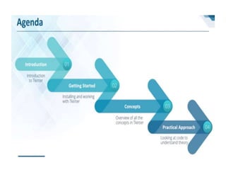
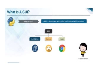
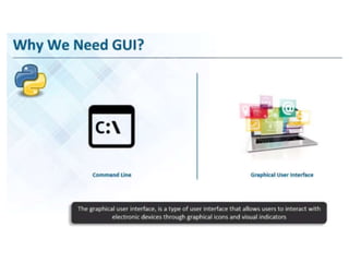
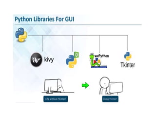
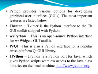
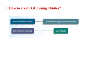
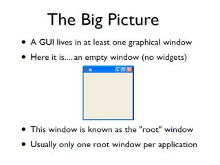
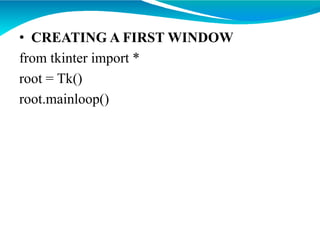
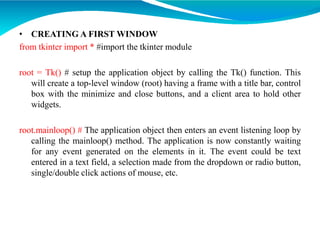
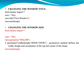
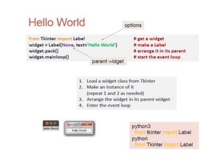
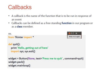
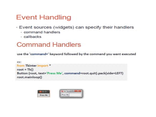
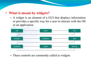
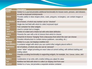
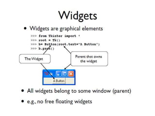
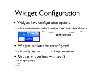
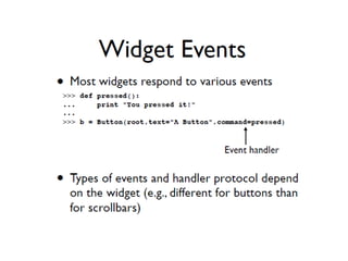
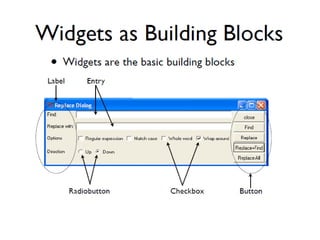
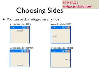
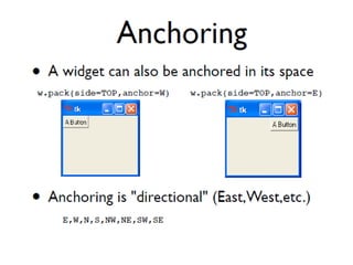
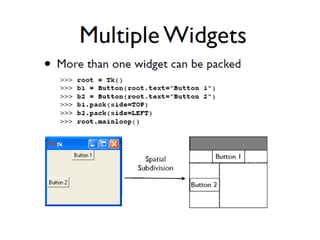
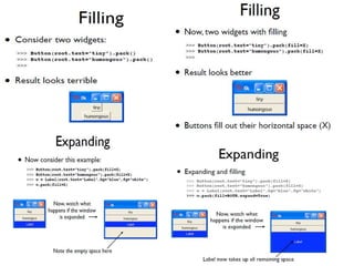
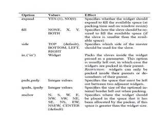
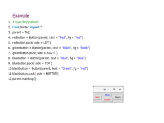
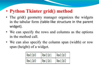
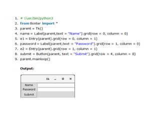
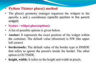
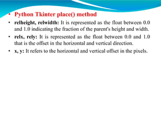
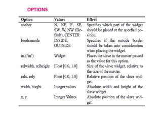
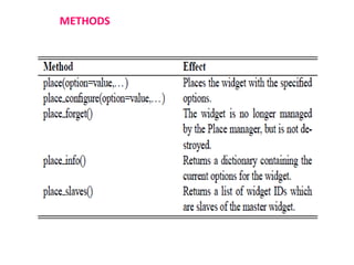
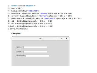
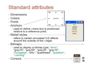
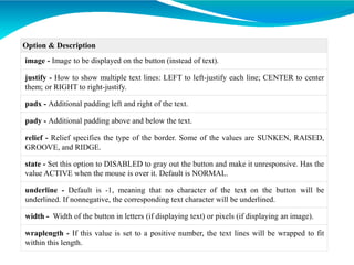
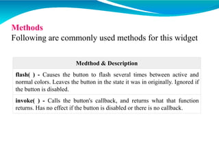
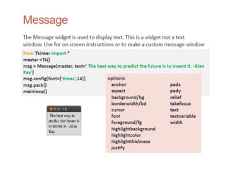
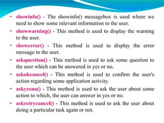
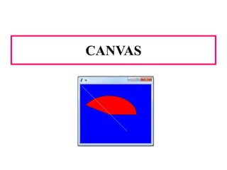
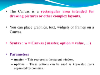
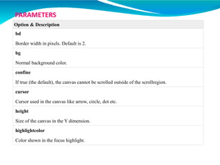
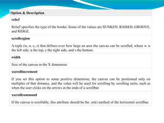
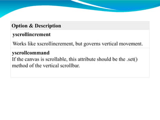
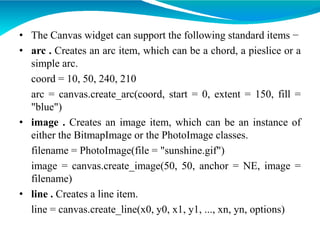
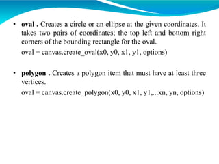
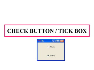
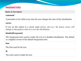
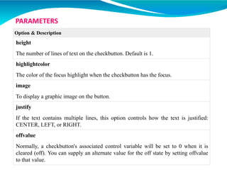
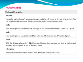
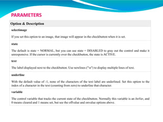
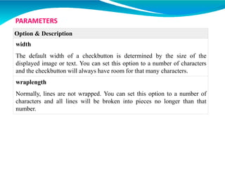
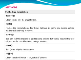
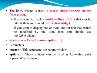
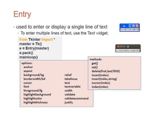
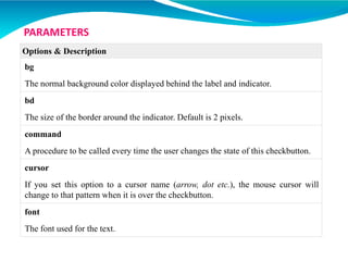
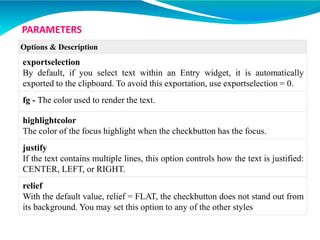
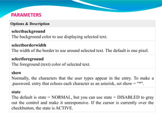
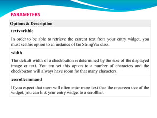
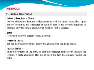
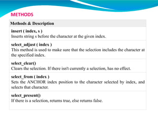
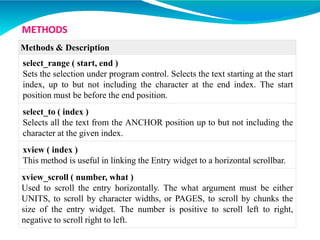
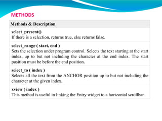
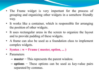
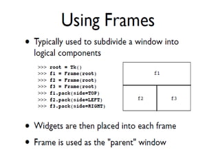
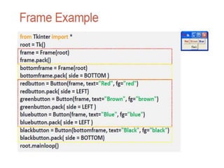
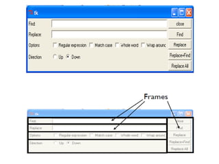
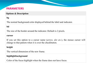
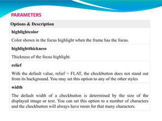
( ** Python Certification Training: https://www.edureka.co/python ** )
This Edureka PPT on Tkinter tutorial covers all the basic aspects of creating and making use of your own simple Graphical User Interface (GUI) using Python. It establishes all of the concepts needed to get started with building your own user interfaces while coding in Python.
This presentation educates you about Python - GUI Programming(Tkinter), Tkinter Programming with syntaxe example, Tkinter Widgets with Operator & Description, Standard attributes.
For more topics stay tuned with learnbay.
This presentation provides the information on python including the topics Python features, applications, variables and operators in python, control statements, numbers, strings, print formatting, list and list comprehension, dictionaries, tuples, files, sets, boolean, mehtods and functions, lambda expressions and a sample project using Python.
YouTube Link: https://youtu.be/mHezNgNBnuA
** Python Certification Training: https://www.edureka.co/python **
This Edureka PPT on 'Date and Time in Python' will train you to use the datetime and time modules to fetch, set and modify date and time in python.
Below are the topics covered in this PPT:
The time module
Built-in functions
Examples
The datetime module
Built-in functions
Examples
Follow us to never miss an update in the future.
YouTube: https://www.youtube.com/user/edurekaIN
Instagram: https://www.instagram.com/edureka_learning/
Facebook: https://www.facebook.com/edurekaIN/
Twitter: https://twitter.com/edurekain
LinkedIn: https://www.linkedin.com/company/edureka
Castbox: https://castbox.fm/networks/505?country=in
All data values in Python are encapsulated in relevant object classes. Everything in Python is an object and every object has an identity, a type, and a value. Like another object-oriented language such as Java or C++, there are several data types which are built into Python. Extension modules which are written in C, Java, or other languages can define additional types.
To determine a variable's type in Python you can use the type() function. The value of some objects can be changed. Objects whose value can be changed are called mutable and objects whose value is unchangeable (once they are created) are called immutable.
A JavaScript function is a block of code designed to perform a particular task.
Why Functions?
You can reuse code: Define the code once, and use it many times. You can use the same code many times with different arguments, to produce different results.
This presentation educates you about objectives of python with example syntax, OOP Terminology, Creating Classes, Creating Instance Objects, Accessing Attributes and Built-In Class Attributes.
Prepared as part of the IT for Business Intelligence course of MBA @VGSOM, IIT Kharagpur. The tutorial describes how to create an interactive map using the open source software QGIS.
Welcome to TechSoup New Member Orientation and Q&A (May 2024).pdfTechSoup
In this webinar you will learn how your organization can access TechSoup's wide variety of product discount and donation programs. From hardware to software, we'll give you a tour of the tools available to help your nonprofit with productivity, collaboration, financial management, donor tracking, security, and more.
How to Make a Field invisible in Odoo 17Celine George
It is possible to hide or invisible some fields in odoo. Commonly using “invisible” attribute in the field definition to invisible the fields. This slide will show how to make a field invisible in odoo 17.
The Art Pastor's Guide to Sabbath | Steve ThomasonSteve Thomason
What is the purpose of the Sabbath Law in the Torah. It is interesting to compare how the context of the law shifts from Exodus to Deuteronomy. Who gets to rest, and why?
Ethnobotany and Ethnopharmacology:
Ethnobotany in herbal drug evaluation,
Impact of Ethnobotany in traditional medicine,
New development in herbals,
Bio-prospecting tools for drug discovery,
Role of Ethnopharmacology in drug evaluation,
Reverse Pharmacology.
Read| The latest issue of The Challenger is here! We are thrilled to announce that our school paper has qualified for the NATIONAL SCHOOLS PRESS CONFERENCE (NSPC) 2024. Thank you for your unwavering support and trust. Dive into the stories that made us stand out!
2024.06.01 Introducing a competency framework for languag learning materials ...Sandy Millin
http://sandymillin.wordpress.com/iateflwebinar2024
Published classroom materials form the basis of syllabuses, drive teacher professional development, and have a potentially huge influence on learners, teachers and education systems. All teachers also create their own materials, whether a few sentences on a blackboard, a highly-structured fully-realised online course, or anything in between. Despite this, the knowledge and skills needed to create effective language learning materials are rarely part of teacher training, and are mostly learnt by trial and error.
Knowledge and skills frameworks, generally called competency frameworks, for ELT teachers, trainers and managers have existed for a few years now. However, until I created one for my MA dissertation, there wasn’t one drawing together what we need to know and do to be able to effectively produce language learning materials.
This webinar will introduce you to my framework, highlighting the key competencies I identified from my research. It will also show how anybody involved in language teaching (any language, not just English!), teacher training, managing schools or developing language learning materials can benefit from using the framework.
Instructions for Submissions thorugh G- Classroom.pptxJheel Barad
This presentation provides a briefing on how to upload submissions and documents in Google Classroom. It was prepared as part of an orientation for new Sainik School in-service teacher trainees. As a training officer, my goal is to ensure that you are comfortable and proficient with this essential tool for managing assignments and fostering student engagement.
Instructions for Submissions thorugh G- Classroom.pptx
PYTHON - TKINTER - GUI - PART 1.ppt
1. PYTHON – TKINTER – TUTORIAL
PART - 1
Prepared by
Ms. S. SHANMUGA PRIYA
Senior Assistant Professor
Department of CSE
New Horizon College of Engineering
7. • Python provides various options for developing
graphical user interfaces (GUIs). The most important
features are listed below.
• Tkinter − Tkinter is the Python interface to the Tk
GUI toolkit shipped with Python.
• wxPython − This is an open-source Python interface
for wxWidgets GUI toolkit.
• PyQt −This is also a Python interface for a popular
cross-platform Qt GUI library.
• JPython − JPython is a Python port for Java, which
gives Python scripts seamless access to the Java class
libraries on the local machine http://www.jython.org.
9. • What is Tkinter?
• Tkinter is the standard (default) GUI library for Python.
• It is based on the Tk toolkit, originally designed for the Tool
Command Language (Tcl).
• Due to Tk’s popularity, it has been ported to a variety of other
scripting languages, including Perl (Perl/Tk), Ruby (Ruby/Tk),
and Python (Tkinter).
• Popular open-source scripting language/GUI widget set
developed by John Ousterhout (90s)
• Python when combined with Tkinter provides a fast and easy
way to create GUI applications.
• Cross-platform (Unix/Windows/MacOS)
• It's small (~25 basic widgets)
12. • CREATING A FIRST WINDOW
from tkinter import *
root = Tk()
root.mainloop()
13. • CREATING A FIRST WINDOW
from tkinter import * #import the tkinter module
root = Tk() # setup the application object by calling the Tk() function. This
will create a top-level window (root) having a frame with a title bar, control
box with the minimize and close buttons, and a client area to hold other
widgets.
root.mainloop() # The application object then enters an event listening loop by
calling the mainloop() method. The application is now constantly waiting
for any event generated on the elements in it. The event could be text
entered in a text field, a selection made from the dropdown or radio button,
single/double click actions of mouse, etc.
14. • CHANGING THE WINDOW TITLE
from tkinter import *
root = Tk()
root.title("First Window")
root.mainloop()
• CHANGING THE WINDOW SIZE
from tkinter import *
root = Tk()
root.geometry("500x300")
# geometry("widthxheight+XPOS+YPOS") - geometry() method defines the
width, height and coordinates of the top left corner of the frame
root.mainloop()
23. • What is meant by widgets?
– A widget is an element of a GUI that displays information
or provides a specific way for a user to interact with the OS
or an application.
– These controls are commonly called as widgets
31. • The Tkinter geometry specifies the method by
using which, the widgets are represented on
display (windows).
• The python Tkinter provides the following
geometry methods.
–The pack() method
–The grid() method
–The place() method
32. • Python Tkinter pack() method
• The pack() widget is used to organize widget in the
block.
• The positions widgets added to the python application
using the pack() method can be controlled by using
the various options specified in the method call.
• However, the controls are less and widgets are
generally added in the less organized manner.
37. • SYNTAX : widget.pack(options)
• A list of possible options that can be passed in pack()
is given below.
– expand: If the expand is set to true, the widget expands to
fill any space.
– fill: By default, the fill is set to NONE. However, we can
set it to X or Y to determine whether the widget contains
any extra space.
– size: it represents the side of the parent to which the widget
is to be placed on the window.
38.
39.
40.
41. • Python Tkinter grid() method
• The grid() geometry manager organizes the widgets
in the tabular form (table-like structure in the parent
widget).
• We can specify the rows and columns as the options
in the method call.
• We can also specify the column span (width) or row
span (height) of a widget.
42. • SYNTAX: widget.grid(options)
• A list of possible options that can be passed inside the grid() method is given below.
• Column - The column number in which the widget is to be placed. The leftmost
column is represented by 0.
• Columnspan - The width of the widget. It represents the number of columns up to
which, the column is expanded.
• ipadx, ipady - It represents the number of pixels to pad the widget inside the
widget's border.
• padx, pady - It represents the number of pixels to pad the widget outside the
widget's border.
• Row - The row number in which the widget is to be placed. The topmost row is
represented by 0.
• Rowspan - The height of the widget, i.e. the number of the row up to which the
widget is expanded.
• Sticky - If the cell is larger than a widget, then sticky is used to specify the position
of the widget inside the cell. It may be the concatenation of the sticky letters
representing the position of the widget. It may be N, E, W, S, NE, NW, NS, EW,
ES.
47. • Python Tkinter place() method
• The place() geometry manager organizes the widgets to the
specific x and y coordinates (specific position in the parent
widget).
• Syntax - widget.place(options)
• A list of possible options is given below.
• Anchor: It represents the exact position of the widget within
the container. The default value (direction) is NW (the upper
left corner)
• bordermode: The default value of the border type is INSIDE
that refers to ignore the parent's inside the border. The other
option is OUTSIDE.
• height, width: It refers to the height and width in pixels.
48. • Python Tkinter place() method
• relheight, relwidth: It is represented as the float between 0.0
and 1.0 indicating the fraction of the parent's height and width.
• relx, rely: It is represented as the float between 0.0 and 1.0
that is the offset in the horizontal and vertical direction.
• x, y: It refers to the horizontal and vertical offset in the pixels.
54. • As a tuple whose first element is the font family, followed by a size in points,
optionally followed by a string containing one or more of the style modifiers bold,
italic, underline and overstrike.
• Example
– ("Helvetica", "16") for a 16-point Helvetica regular.
– ("Times", "24", "bold italic") for a 24-point Times bold italic.
• Here is the list of options −
– family − The font family name as a string.
– size − The font height as an integer in points. To get a font n pixels high, use -n.
– weight − "bold" for boldface, "normal" for regular weight.
– slant − "italic" for italic, "roman" for unslanted.
– underline − 1 for underlined text, 0 for normal.
– overstrike − 1 for overstruck text, 0 for normal.
• Example
– helv36 = tkFont.Font(family="Helvetica",size=36,weight="bold")
56. • The Button widget is used to add buttons in a Python
application.
• These buttons can display text or images that convey the
purpose of the buttons.
• You can attach a function or a method to a button which is
called automatically when you click the button.
• Syntax : w = Button (master, option = value, ...)
• Parameters
– master − This represents the parent window.
– Options These options can be used as key-value pairs
separated by commas.
57. Option & Description
activebackground - Background color when the button is under the cursor.
activeforeground - Foreground color when the button is under the cursor.
bd - Border width in pixels. Default is 2.
dg - Normal background color.
command - Function or method to be called when the button is clicked.
fg - Normal foreground (text) color.
font - Text font to be used for the button's label.
height - Height of the button in text lines (for textual buttons) or pixels (for
images).
highlightcolor - The color of the focus highlight when the widget has focus.
PARAMETERS
58. Option & Description
image - Image to be displayed on the button (instead of text).
justify - How to show multiple text lines: LEFT to left-justify each line; CENTER to center
them; or RIGHT to right-justify.
padx - Additional padding left and right of the text.
pady - Additional padding above and below the text.
relief - Relief specifies the type of the border. Some of the values are SUNKEN, RAISED,
GROOVE, and RIDGE.
state - Set this option to DISABLED to gray out the button and make it unresponsive. Has the
value ACTIVE when the mouse is over it. Default is NORMAL.
underline - Default is -1, meaning that no character of the text on the button will be
underlined. If nonnegative, the corresponding text character will be underlined.
width - Width of the button in letters (if displaying text) or pixels (if displaying an image).
wraplength - If this value is set to a positive number, the text lines will be wrapped to fit
within this length.
59. Medthod & Description
flash( ) - Causes the button to flash several times between active and
normal colors. Leaves the button in the state it was in originally. Ignored if
the button is disabled.
invoke( ) - Calls the button's callback, and returns what that function
returns. Has no effect if the button is disabled or there is no callback.
Methods
Following are commonly used methods for this widget
62. • showinfo() - The showinfo() messagebox is used where we
need to show some relevant information to the user.
• showwarning() - This method is used to display the warning
to the user.
• showerror() - This method is used to display the error
message to the user.
• askquestion() - This method is used to ask some question to
the user which can be answered in yes or no.
• askokcancel() - This method is used to confirm the user's
action regarding some application activity.
• askyesno() - This method is used to ask the user about some
action to which, the user can answer in yes or no.
• askretrycancel() - This method is used to ask the user about
doing a particular task again or not.
64. • The Canvas is a rectangular area intended for
drawing pictures or other complex layouts.
• You can place graphics, text, widgets or frames on a
Canvas.
• Syntax : w = Canvas ( master, option = value, ... )
• Parameters
– master − This represents the parent window.
– options − These options can be used as key-value pairs
separated by commas.
65. Option & Description
bd
Border width in pixels. Default is 2.
bg
Normal background color.
confine
If true (the default), the canvas cannot be scrolled outside of the scrollregion.
cursor
Cursor used in the canvas like arrow, circle, dot etc.
height
Size of the canvas in the Y dimension.
highlightcolor
Color shown in the focus highlight.
PARAMETERS
66. Option & Description
relief
Relief specifies the type of the border. Some of the values are SUNKEN, RAISED, GROOVE,
and RIDGE.
scrollregion
A tuple (w, n, e, s) that defines over how large an area the canvas can be scrolled, where w is
the left side, n the top, e the right side, and s the bottom.
width
Size of the canvas in the X dimension.
xscrollincrement
If you set this option to some positive dimension, the canvas can be positioned only on
multiples of that distance, and the value will be used for scrolling by scrolling units, such as
when the user clicks on the arrows at the ends of a scrollbar.
xscrollcommand
If the canvas is scrollable, this attribute should be the .set() method of the horizontal scrollbar.
67. Option & Description
yscrollincrement
Works like xscrollincrement, but governs vertical movement.
yscrollcommand
If the canvas is scrollable, this attribute should be the .set()
method of the vertical scrollbar.
68. • The Canvas widget can support the following standard items −
• arc . Creates an arc item, which can be a chord, a pieslice or a
simple arc.
coord = 10, 50, 240, 210
arc = canvas.create_arc(coord, start = 0, extent = 150, fill =
"blue")
• image . Creates an image item, which can be an instance of
either the BitmapImage or the PhotoImage classes.
filename = PhotoImage(file = "sunshine.gif")
image = canvas.create_image(50, 50, anchor = NE, image =
filename)
• line . Creates a line item.
line = canvas.create_line(x0, y0, x1, y1, ..., xn, yn, options)
69. • oval . Creates a circle or an ellipse at the given coordinates. It
takes two pairs of coordinates; the top left and bottom right
corners of the bounding rectangle for the oval.
oval = canvas.create_oval(x0, y0, x1, y1, options)
• polygon . Creates a polygon item that must have at least three
vertices.
oval = canvas.create_polygon(x0, y0, x1, y1,...xn, yn, options)
71. • Some widgets (like text entry widgets, radio buttons and so
on) can be connected directly to application variables by using
special options: variable, textvariable, onvalue, offvalue,
and value.
• This connection works both ways: if the variable changes for
any reason, the widget it's connected to will be updated to
reflect the new value.
• These Tkinter control variables are used like regular Python
variables to keep certain values.
• It's not possible to hand over a regular Python variable to a
widget through a variable or textvariable option.
72.
73. • The only kinds of variables for which this works are variables
that are subclassed from a class called Variable, defined in the
Tkinter module.
• Syntax:
x = StringVar() # Holds a string; default value “
x = IntVar() # Holds an integer; default value 0
x = DoubleVar() # Holds a float; default value 0.0
x = BooleanVar() # Holds a boolean, returns 0 for False and 1 for True
• Methods:
– get( ) To read the current value of such a variable, call the method
get().
– set( ) The value of such a variable can be changed with the set()
method.
75. • The Checkbutton widget is used to display a number of
options to a user as toggle buttons.
• The user can then select one or more options by clicking the
button corresponding to each option.
• You can also display images in place of text.
• A caption describing the meaning of the checkbox is usually
shown adjacent to the checkbox.
• The state of a checkbox is changed by clicking the mouse on
the box.
• Alternatively it can be done by clicking on the caption, or by
using a keyboard shortcut, for example, the space bar.
A Checkbox has two states: on or off.
76. • The Tkinter Checkbutton widget can contain text, but
only in a single font, or images, and a button can be
associated with a Python function or method.
• When a button is pressed, Tkinter calls the
associated function or method.
• The text of a button can span more than one line.
• Syntax: w = Checkbutton ( master, option, ... )
• Parameters
– master − This represents the parent window.
– options − These options can be used as key-value pairs separated by
commas.
77. Option & Description
activebackground
Background color when the checkbutton is under the cursor.
activeforeground
Foreground color when the checkbutton is under the cursor.
bg
The normal background color displayed behind the label and indicator.
bitmap
To display a monochrome image on a button.
bd
The size of the border around the indicator. Default is 2 pixels.
PARAMETERS
78. Option & Description
command
A procedure to be called every time the user changes the state of this checkbutton.
cursor
If you set this option to a cursor name (arrow, dot etc.), the mouse cursor will
change to that pattern when it is over the checkbutton.
disabledforeground
The foreground color used to render the text of a disabled checkbutton. The default
is a stippled version of the default foreground color.
font
The font used for the text.
fg
The color used to render the text.
PARAMETERS
79. Option & Description
height
The number of lines of text on the checkbutton. Default is 1.
highlightcolor
The color of the focus highlight when the checkbutton has the focus.
image
To display a graphic image on the button.
justify
If the text contains multiple lines, this option controls how the text is justified:
CENTER, LEFT, or RIGHT.
offvalue
Normally, a checkbutton's associated control variable will be set to 0 when it is
cleared (off). You can supply an alternate value for the off state by setting offvalue
to that value.
PARAMETERS
80. Option & Description
onvalue
Normally, a checkbutton's associated control variable will be set to 1 when it is set (on). You
can supply an alternate value for the on state by setting onvalue to that value.
padx
How much space to leave to the left and right of the checkbutton and text. Default is 1 pixel.
pady
How much space to leave above and below the checkbutton and text. Default is 1 pixel.
relief
With the default value, relief = FLAT, the checkbutton does not stand out from its background.
You may set this option to any of the other styles
selectcolor
The color of the checkbutton when it is set. Default is selectcolor = "red".
PARAMETERS
81. Option & Description
selectimage
If you set this option to an image, that image will appear in the checkbutton when it is set.
state
The default is state = NORMAL, but you can use state = DISABLED to gray out the control and make it
unresponsive. If the cursor is currently over the checkbutton, the state is ACTIVE.
text
The label displayed next to the checkbutton. Use newlines ("n") to display multiple lines of text.
underline
With the default value of -1, none of the characters of the text label are underlined. Set this option to the
index of a character in the text (counting from zero) to underline that character.
variable
The control variable that tracks the current state of the checkbutton. Normally this variable is an IntVar, and
0 means cleared and 1 means set, but see the offvalue and onvalue options above.
PARAMETERS
82. Option & Description
width
The default width of a checkbutton is determined by the size of the
displayed image or text. You can set this option to a number of characters
and the checkbutton will always have room for that many characters.
wraplength
Normally, lines are not wrapped. You can set this option to a number of
characters and all lines will be broken into pieces no longer than that
number.
PARAMETERS
83. Methods & Description
deselect()
Clears (turns off) the checkbutton.
flash()
Flashes the checkbutton a few times between its active and normal colors,
but leaves it the way it started.
invoke()
You can call this method to get the same actions that would occur if the user
clicked on the checkbutton to change its state.
select()
Sets (turns on) the checkbutton.
toggle()
Clears the checkbutton if set, sets it if cleared.
METHODS
85. • The Entry widget is used to accept single-line text strings
from a user.
– If you want to display multiple lines of text that can be
edited, then you should use the Text widget.
– If you want to display one or more lines of text that cannot
be modified by the user, then you should use
the Label widget.
• Syntax: w = Entry( master, option, ... )
• Parameters
• master − This represents the parent window.
• options − These options can be used as key-value pairs
separated by commas.
86.
87. Options & Description
bg
The normal background color displayed behind the label and indicator.
bd
The size of the border around the indicator. Default is 2 pixels.
command
A procedure to be called every time the user changes the state of this checkbutton.
cursor
If you set this option to a cursor name (arrow, dot etc.), the mouse cursor will
change to that pattern when it is over the checkbutton.
font
The font used for the text.
PARAMETERS
88. Options & Description
exportselection
By default, if you select text within an Entry widget, it is automatically
exported to the clipboard. To avoid this exportation, use exportselection = 0.
fg - The color used to render the text.
highlightcolor
The color of the focus highlight when the checkbutton has the focus.
justify
If the text contains multiple lines, this option controls how the text is justified:
CENTER, LEFT, or RIGHT.
relief
With the default value, relief = FLAT, the checkbutton does not stand out from
its background. You may set this option to any of the other styles
PARAMETERS
89. Options & Description
selectbackground
The background color to use displaying selected text.
selectborderwidth
The width of the border to use around selected text. The default is one pixel.
selectforeground
The foreground (text) color of selected text.
show
Normally, the characters that the user types appear in the entry. To make a
.password. entry that echoes each character as an asterisk, set show = "*".
state
The default is state = NORMAL, but you can use state = DISABLED to gray
out the control and make it unresponsive. If the cursor is currently over the
checkbutton, the state is ACTIVE.
PARAMETERS
90. Options & Description
textvariable
In order to be able to retrieve the current text from your entry widget, you
must set this option to an instance of the StringVar class.
width
The default width of a checkbutton is determined by the size of the displayed
image or text. You can set this option to a number of characters and the
checkbutton will always have room for that many characters.
xscrollcommand
If you expect that users will often enter more text than the onscreen size of the
widget, you can link your entry widget to a scrollbar.
PARAMETERS
91. Methods & Description
delete ( first, last = None )
Deletes characters from the widget, starting with the one at index first, up to
but not including the character at position last. If the second argument is
omitted, only the single character at position first is deleted.
get()
Returns the entry's current text as a string.
icursor ( index )
Set the insertion cursor just before the character at the given index.
index ( index )
Shift the contents of the entry so that the character at the given index is the
leftmost visible character. Has no effect if the text fits entirely within the
entry.
METHODS
92. Methods & Description
insert ( index, s )
Inserts string s before the character at the given index.
select_adjust ( index )
This method is used to make sure that the selection includes the character at
the specified index.
select_clear()
Clears the selection. If there isn't currently a selection, has no effect.
select_from ( index )
Sets the ANCHOR index position to the character selected by index, and
selects that character.
select_present()
If there is a selection, returns true, else returns false.
METHODS
93. Methods & Description
select_range ( start, end )
Sets the selection under program control. Selects the text starting at the start
index, up to but not including the character at the end index. The start
position must be before the end position.
select_to ( index )
Selects all the text from the ANCHOR position up to but not including the
character at the given index.
xview ( index )
This method is useful in linking the Entry widget to a horizontal scrollbar.
xview_scroll ( number, what )
Used to scroll the entry horizontally. The what argument must be either
UNITS, to scroll by character widths, or PAGES, to scroll by chunks the
size of the entry widget. The number is positive to scroll left to right,
negative to scroll right to left.
METHODS
94. Methods & Description
select_present()
If there is a selection, returns true, else returns false.
select_range ( start, end )
Sets the selection under program control. Selects the text starting at the start
index, up to but not including the character at the end index. The start
position must be before the end position.
select_to ( index )
Selects all the text from the ANCHOR position up to but not including the
character at the given index.
xview ( index )
This method is useful in linking the Entry widget to a horizontal scrollbar.
METHODS
97. • The Frame widget is very important for the process of
grouping and organizing other widgets in a somehow friendly
way.
• It works like a container, which is responsible for arranging
the position of other widgets.
• It uses rectangular areas in the screen to organize the layout
and to provide padding of these widgets.
• A frame can also be used as a foundation class to implement
complex widgets.
• Syntax : w = Frame ( master, option, ... )
• Parameters
– master − This represents the parent window.
– options − These options can be used as key-value pairs
separated by commas.
98.
99.
100.
101.
102. Options & Description
bg
The normal background color displayed behind the label and indicator.
bd
The size of the border around the indicator. Default is 2 pixels.
cursor
If you set this option to a cursor name (arrow, dot etc.), the mouse cursor will
change to that pattern when it is over the checkbutton.
height
The vertical dimension of the new frame.
highlightbackground
Color of the focus highlight when the frame does not have focus.
PARAMETERS
103. Options & Description
highlightcolor
Color shown in the focus highlight when the frame has the focus.
highlightthickness
Thickness of the focus highlight.
relief
With the default value, relief = FLAT, the checkbutton does not stand out
from its background. You may set this option to any of the other styles
width
The default width of a checkbutton is determined by the size of the
displayed image or text. You can set this option to a number of characters
and the checkbutton will always have room for that many characters.
PARAMETERS