Download to read offline
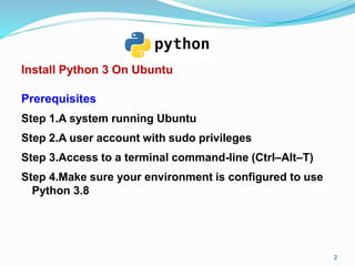
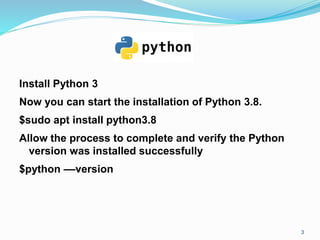
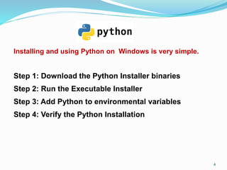


The document discusses installing Python 3 on Ubuntu and Windows systems. It provides step-by-step instructions for installing Python 3.8 using apt on Ubuntu and downloading/running the installer on Windows. Basic Python data visualization techniques like line plots, bar charts, histograms, box plots, and scatter plots are then introduced using the Matplotlib library. Code examples are given for creating each type of plot.