3. 3(Example Code: gui_inialization)
To create a GUI with Python, you need to use a GUI toolkit.
Tkinter, a popular cross-platform toolkit.
If you’re running an operating system other than Windows, you may
need to download and install additional software to use the Tkinter
toolkit.
You create GUI elements by instantiating objects from classes of the
tkinter module, which is part of the Tkinter toolkit.
The first thing is import the tkinter module:
from tkinter import *
Second, create a root window object of the tkinter class Tk
root = Tk()
Finally, start up the window’s event loop to start up the GUI
root.mainloop()
GUI Initialization
4. 4
Element tkinter Class Description
Frame Frame Holds other GUI elements
Label Label
Label Frame Displays uneditable text or icons
Button Button Performs an action when the user activates it
Text entry Entry Accepts and displays one line of text
Text box Text Accepts and displays multiple lines of text
Check button Checkbutto
n
Allows the user to select or not select an option
Radio button Radiobutto
n
Allows, as a group, the user to select one option
from several
GUI Elements
5. 5
(Example Code: labeler)
Creating a Frame
A Frame is a widget that can hold other widgets (such as Label
widgets).
# create a frame in the window to hold other widgets
app = Frame(root)
Next, invoke the grid() method of the new object
app.grid()
grid() is a method that all widgets have. It’s associated with a
layout manager, which lets you arrange widgets.
GUI Frame
6. 6
(Example Code: labeler) # Create another label
Creating a Label
create a Label widget by instantiating an object of the Label class:
# create a label in the frame
lbl = Label(app, text = "I'm a label!")
lbl.grid()
By passing app to the Label object’s constructor, I make the frame
that app refers to the master of the Label widget. As a result, the label
is placed in the frame.
The object’s grid() method, ensures that the label will be visible.
GUI Label
7. 7
(Example Code: lazy_buttons_class)
# create more buttons in the frame
(Example Code: lazy_buttons)
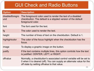
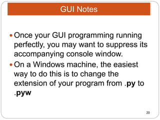
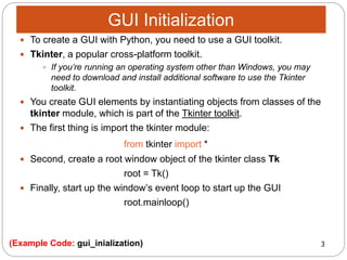
USING BUTTONS
A Button widget can be activated by the user to perform some action.
You create a Button widget by instantiating an object of the Button class.
# create a button in the frame (First procedure)
bttn1 = Button(app, text = "I do nothing!")
bttn1.grid()
# create a second button in the frame (Second procedure)
bttn2 = Button(app)
bttn2.grid()
bttn2.configure(text = "Me too!")
# create a third button in the frame (Third procedure)
bttn3 = Button(app)
bttn3.grid()
bttn3["text"]= "Same here!“
GUI Buttons
8. 8(# Try changing the messagebox functions)(Example Code: messagebox)
Creating a Message Box
The messagebox module is used to display
message boxes in your applications. This module
provides a number of functions that you can use to
display an appropriate message.
Some of these functions are:
showinfo,
showwarning,
showerror,
askquestion,
askokcancel,
askyesno,
askretryignore.
GUI messagebox
9. 9
# try changing and/or adding the options
(Example Code: radio_buttons_def)(Example Code: check_radio_buttons)
USING CHECK BUTTONS
Check buttons allow a user to select any number of
choices from a group.
Checkbutton(master, text = "Check Button 1", variable =
CheckVar1, onvalue = 11, offvalue = 0, height=5, width =
20)
CREATING RADIO BUTTONS
In order to implement this functionality, each group of
radiobuttons must be associated to the same variable and
each one of the buttons must symbolize a single value.
Radiobutton(master, text="Radio Button",
variable=CheckVar3, height=5, width = 20)
GUI Check and Radio Buttons
10. 10
# try changing and/or adding the options(Example Code: check_radio_buttons)
Option Description
activebackgro
und
Background color when the checkbutton is under the cursor.
activeforegrou
nd
Foreground color when the checkbutton is under the cursor.
bg The normal background color displayed behind the label and
indicator.
bitmap To display a monochrome image on a button.
bd The size of the border around the indicator. Default is 2 pixels.
command A procedure to be called every time the user changes the state of
this checkbutton.
cursor If you set this option to a cursor name (arrow, dot etc.), the mouse
cursor will change to that pattern when it is over the checkbutton.
GUI Check and Radio Buttons
11. 11
# try changing and/or adding the options(Example Code: check_radio_buttons)
Option Description
disabledforegro
und
The foreground color used to render the text of a disabled
checkbutton. The default is a stippled version of the default
foreground color.
font The font used for the text.
fg The color used to render the text.
height The number of lines of text on the checkbutton. Default is 1.
highlightcolor The color of the focus highlight when the checkbutton has the
focus.
image To display a graphic image on the button.
justify If the text contains multiple lines, this option controls how the text
is justified: CENTER, LEFT, or RIGHT.
offvalue Normally, a checkbutton's associated control variable will be set to
0 when it is cleared (off). You can supply an alternate value for the
off state by setting offvalue to that value.
GUI Check and Radio Buttons
12. 12
GUI Check and Radio Buttons
Option Description
onvalue Normally, a checkbutton's associated control variable will be set to 1 when
it is set (on). You can supply an alternate value for the on state by setting
onvalue to that value.
padx How much space to leave to the left and right of the checkbutton and text.
Default is 1 pixel.
pady How much space to leave above and below the checkbutton and text.
Default is 1 pixel.
relief With the default value, relief=FLAT, the checkbutton does not stand out
from its background. You may set this option to any of the other styles
selectcolor The color of the checkbutton when it is set. Default is selectcolor="red".
selectimage If you set this option to an image, that image will appear in the
checkbutton when it is set.
state The default is state=NORMAL, but you can use state=DISABLED to gray
out the control and make it unresponsive. If the cursor is currently over
the checkbutton, the state is ACTIVE.
13. 13
GUI Check and Radio Buttons
Option Description
text The label displayed next to the checkbutton. Use newlines ("n")
to display multiple lines of text.
underline With the default value of -1, none of the characters of the text
label are underlined. Set this option to the index of a character in
the text (counting from zero) to underline that character.
variable The control variable that tracks the current state of the
checkbutton. Normally this variable is an IntVar, and 0 means
cleared and 1 means set, but see the offvalue and onvalue
options above.
width The default width of a checkbutton is determined by the size of
the displayed image or text. You can set this option to a number of
characters and the checkbutton will always have room for that
many characters.
wraplength Normally, lines are not wrapped. You can set this option to a
number of characters and all lines will be broken into pieces no
longer than that number.
# try changing and/or adding the options(Example Code: check_radio_buttons)
14. 14
(Example Code: text_entry)
The Entry widget is a standard tkinter widget
used to enter or display a single line of text.
The entry widget is used to enter text strings. This
widget allows the user to enter one line of text, in
a single font.
Example:
e = Entry(master)
e.pack()
GUI Text Entry
15. 15
(Example Code: type_text)
The Text widget provides formatted text display. It allows
you to display and edit text with various styles and
attributes.
You can also use elegant structures like tabs and marks to
locate specific sections of the text, and apply changes to
those areas.
Moreover, you can embed windows and images in the text
because this widget was designed to handle both plain
and formatted text.
Example: text = Text(root)
text.pack()
GUI Type Text
16. 16
(Example Code: grid_geometry_manager)
The Grid geometry manager puts the widgets in a
2-dimensional table. The master widget is split
into a number of rows and columns, and each
“cell” in the resulting table can hold a widget.
Example:
e1.grid(row=0, column=1)
e2.grid(row=1, column=1)
GUI Grid Geometry Manager
17. 17
(Example Code: photoImage_class) (Image: python_image)
The PhotoImage class is used to display images (either
grayscale or true color images) in labels, buttons,
canvases, and text widgets.
You can use the PhotoImage class whenever you need to
display an icon or an image in a Tkinter application.
The PhotoImage class can read GIF and PGM/PPM
images from files in the same folder of the .py file
Example:
img = PhotoImage(file="Python.gif")
GUI PhotoImage Class
18. 18
(Example Code: listBox) # Create another list
The Listbox widget is a standard Tkinter widget used to
display a list of alternatives.You can use the PhotoImage
class whenever you need to display an icon or an image in
a Tkinter application.
The listbox can only contain text items, and all items must
have the same font and color.
Depending on the widget configuration, the user can
choose one or more alternatives from the list.
Example:
li = 'Carl Patrick Lindsay Helmut Chris.split()
listb = Listbox(root)
GUI ListBox
19. 19
(Example Code: gui_definition)
To make the elements of the Tkinter interact, first,
determine a definition (def).
Transfer the definition (def) to the element.
Example:
# def starts a function, or define a function
def GoWork():
sum = 3*5
print (sum)
# transfer the def to interact with a button
Button(window, text = ‘Press me', command = GoWork)
GUI Development Definition
20. 20
Once your GUI programming running
perfectly, you may want to suppress its
accompanying console window.
On a Windows machine, the easiest
way to do this is to change the
extension of your program from .py to
.pyw
GUI Notes