Preliminary Photoshoot plan powerpoint
•Download as PPTX, PDF•
2 likes•2,626 views
AS Media Photoshoot plan for my preliminary task
Report
Share
Report
Share
Recommended
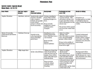
Production schedule shooting plan photoshoot
The production schedule outlines the details of a photo shoot for a Pop Magazine spread over two days at the Ruby house location in Leeds. On the first day, Chantelle Heffron will direct a front cover shoot in two parts, a double page spread shoot in two parts, and additional scenes. The second day will include a contents page shoot in two parts and backup pictures. All scenes require models, clothing props, and basic photography equipment and have similar health and safety considerations.
Longwall Mining- An experience of Longwall mining in Padmavathikhani Chinese ...
Padmavathikhani Longwall Project is a typical project of its kind where first longwall face was started in 1996 as per Indo-Chinese Agreement. So far
Where do you see yourself in five years - interview questions - Manu Melwin Joy
Where do you see yourself in five years? This interview question is not designed to test your psychic powers. No interviewer expects candidates to be able to describe EXACTLY what they will be doing in 1,820 days. In fact, a truthful answer about what you HOPE to be doing can easily sabotage your odds of landing a job offer.
Brand Identity Positioning PowerPoint Presentation Slides
This complete deck is oriented to make sure you do not lag in your presentations. Our creatively crafted slides come with apt research and planning. This exclusive deck with twenty five slides is here to help you to strategize, plan, analyse, or segment the topic with clear understanding and apprehension. Utilize ready to use presentation slides on Brand Identity Positioning Powerpoint Presentation Slides with all sorts of editable templates, charts and graphs, overviews, analysis templates. It is usable for marking important decisions and covering critical issues. Display and present all possible kinds of underlying nuances, progress factors for an all inclusive presentation for the teams. This presentation deck can be used by all professionals, managers, individuals, internal external teams involved in any company organization
Rf engineer performance appraisal
This document contains information about performance evaluation methods for RF engineers, including example phrases and forms. It provides resources for developing a comprehensive performance evaluation, including:
1. A 4-page sample performance evaluation form for an RF engineer with rating scales and categories like skills, strengths, areas for improvement, and signatures.
2. Examples of positive and negative performance review phrases for an RF engineer's attitude, creativity, decision-making, interpersonal skills, and other qualities.
3. An overview of the top 12 methods for evaluating an RF engineer's performance, such as management by objectives, critical incident, behaviorally anchored rating scales, and 360-degree/multi-rater feedback.
10 Reasons You Should Use Slideshare to Market Your Business
This document provides 10 reasons why businesses should use SlideShare to market themselves. SlideShare receives over 60 million unique visitors per month, providing exposure to potential customers. It allows businesses to attract targeted customers through relevant tags and generate leads by adding forms to presentations. SlideShare also offers analytics, easy uploading and formatting of content, search engine optimization benefits through inbound links, and the ability to build an engaged audience and make social connections.
Crissie Fuller - Social Media Portfolio
The document profiles a blogging, digital, and social media consultant who has extensive experience in social media marketing, blogging, digital strategy, and branding. She has a successful career in digital marketing and expertise building online communities and driving traffic and sales through platforms like Facebook, Twitter, Pinterest, and blogs. Her case studies demonstrate growing followers and engagement across various social networks and platforms for brands like DwellStudio and Independent Fashion Bloggers.
Plain Language Writing for Maximum Impact
The document provides an overview of strategies for writing in plain language to maximize impact. It discusses what plain language is and why it matters, focusing on helping readers find information, understand messages, and take action. The document then covers various plain language strategies for sentence structure, word choice, verb use, formatting, and visual elements. It emphasizes using short sentences, active voice, familiar words, and formatting like white space and headings to improve readability and comprehension.
Recommended
Production schedule shooting plan photoshoot
The production schedule outlines the details of a photo shoot for a Pop Magazine spread over two days at the Ruby house location in Leeds. On the first day, Chantelle Heffron will direct a front cover shoot in two parts, a double page spread shoot in two parts, and additional scenes. The second day will include a contents page shoot in two parts and backup pictures. All scenes require models, clothing props, and basic photography equipment and have similar health and safety considerations.
Longwall Mining- An experience of Longwall mining in Padmavathikhani Chinese ...
Padmavathikhani Longwall Project is a typical project of its kind where first longwall face was started in 1996 as per Indo-Chinese Agreement. So far
Where do you see yourself in five years - interview questions - Manu Melwin Joy
Where do you see yourself in five years? This interview question is not designed to test your psychic powers. No interviewer expects candidates to be able to describe EXACTLY what they will be doing in 1,820 days. In fact, a truthful answer about what you HOPE to be doing can easily sabotage your odds of landing a job offer.
Brand Identity Positioning PowerPoint Presentation Slides
This complete deck is oriented to make sure you do not lag in your presentations. Our creatively crafted slides come with apt research and planning. This exclusive deck with twenty five slides is here to help you to strategize, plan, analyse, or segment the topic with clear understanding and apprehension. Utilize ready to use presentation slides on Brand Identity Positioning Powerpoint Presentation Slides with all sorts of editable templates, charts and graphs, overviews, analysis templates. It is usable for marking important decisions and covering critical issues. Display and present all possible kinds of underlying nuances, progress factors for an all inclusive presentation for the teams. This presentation deck can be used by all professionals, managers, individuals, internal external teams involved in any company organization
Rf engineer performance appraisal
This document contains information about performance evaluation methods for RF engineers, including example phrases and forms. It provides resources for developing a comprehensive performance evaluation, including:
1. A 4-page sample performance evaluation form for an RF engineer with rating scales and categories like skills, strengths, areas for improvement, and signatures.
2. Examples of positive and negative performance review phrases for an RF engineer's attitude, creativity, decision-making, interpersonal skills, and other qualities.
3. An overview of the top 12 methods for evaluating an RF engineer's performance, such as management by objectives, critical incident, behaviorally anchored rating scales, and 360-degree/multi-rater feedback.
10 Reasons You Should Use Slideshare to Market Your Business
This document provides 10 reasons why businesses should use SlideShare to market themselves. SlideShare receives over 60 million unique visitors per month, providing exposure to potential customers. It allows businesses to attract targeted customers through relevant tags and generate leads by adding forms to presentations. SlideShare also offers analytics, easy uploading and formatting of content, search engine optimization benefits through inbound links, and the ability to build an engaged audience and make social connections.
Crissie Fuller - Social Media Portfolio
The document profiles a blogging, digital, and social media consultant who has extensive experience in social media marketing, blogging, digital strategy, and branding. She has a successful career in digital marketing and expertise building online communities and driving traffic and sales through platforms like Facebook, Twitter, Pinterest, and blogs. Her case studies demonstrate growing followers and engagement across various social networks and platforms for brands like DwellStudio and Independent Fashion Bloggers.
Plain Language Writing for Maximum Impact
The document provides an overview of strategies for writing in plain language to maximize impact. It discusses what plain language is and why it matters, focusing on helping readers find information, understand messages, and take action. The document then covers various plain language strategies for sentence structure, word choice, verb use, formatting, and visual elements. It emphasizes using short sentences, active voice, familiar words, and formatting like white space and headings to improve readability and comprehension.
Planning For Photo Shoot
The document outlines the plans for a photo shoot to create a storyboard for a film project. It discusses the purpose of capturing visuals to help plan filming logistics and modify plot details. Five key locations are selected that relate to different character scenarios, including a bedroom, drama room, alleyway, and computer room. Equipment like cameras and tripods are delegated, as well as props like clothes, candles, and bottles to depict a romantic dinner scene. Character outfits are described to visually represent each role's personality through clothing style and color choices.
Photo shoot plan template
The photo shoot plan is for a magazine featuring the indie rock band The Coasts. Photos will show the band members looking casual and happy on a tropical holiday to represent their relaxing, fun music. Male models will wear casual clothes and smile to appear relaxed. Backgrounds will include coastlines in blue, green and white to set the tone. The photographer will use an iPhone 5c. Photos are meant to transport readers to a calm, tropical scene reflective of the band's genre. One photo shows the photographer and a friend on the coast displaying the colors that will be used on the magazine cover.
Photo shoot plan template
The document outlines a photo shoot plan for a magazine called "Riot" targeting a rock music audience. It will feature photos of people in their 20s modeling rock band styles through clothing, accessories, and hair/makeup. The photographer will use mid-shots and adjust lighting in editing to portray subjects as clearly rock artists. Models will be dressed similarly to rock celebrities in dark, casual clothes to look like fans could emulate their idols' styles. Outdoor photography in daylight will provide natural lighting.
Photo shoot plan template
1) The document outlines a photo shoot plan for a student's music magazine project on the rock genre. It will be based on the magazine Kerrang! and include a front cover, contents page, and double page spread.
2) Photos will be taken by the student and feature models dressed in dark rock clothing with tattoos and facial hair. Natural lighting will be used to capture facial expressions.
3) Locations will include a plain background for the front cover and either a graffiti wall or posh street for the double page spread. Permission has been granted by the models.
Shooting plan
This production schedule outlines 13 scenes for a paranormal film project over 8 days. It provides the date, time, director, location, crew, props, health and safety information, and other notes for each scene. The scenes include entering a house, house activities, waking up on the sofa, using a computer, having dinner, encountering a ghost in the attic, researching a woman, a midday scene, a bedroom scene, reviewing footage, late night activities, early morning events, and a final scene. Safety procedures include proper lifting, fire exits, electrical awareness, ladder safety, and ghost effect mechanics.
Photo Shoot Plan
The document outlines a photography planning page. It will feature group shots of Debbie, Jessica, Penny and others singing like a pop band in various outdoor locations like parks and streets, using natural and artificial lighting. Casual clothing and music props will be used as props and costumes. The photographer aims to capture a simple, calm mood showing the singing group. Backup models are available if needed and the shoot will still take place in rain when possible.
Questionnaire reuslts analysis(1)
The document summarizes the findings of a questionnaire given to a target audience of females aged 16-24. Key findings include:
- 92% of respondents were female, which will be the primary focus.
- 76% found a predominantly female cast appealing for the film.
- 92% found film posters important for persuading them to watch a film.
- 60% preferred Font 1 as the magazine font.
- People want lots of images, reviews, and interviews in magazines.
The summaries will help shape design and promotional decisions for the film, trailer, magazine, and posters. Audience feedback provides insight on gender differences and appealing to various age groups.
Photo shoot test pics
This document summarizes test shots taken for a film trailer. It describes several shots, including an establishing shot of a school, a low angle shot on stairs, an over the shoulder two shot of characters at a computer, and POV shots in an attic. For each shot, it discusses what worked well, what needs improvement, and seeks target audience feedback. The evaluation concludes the test shots helped understand how to improve shots and develop the trailer, and that the next step is filming the trailer using the lessons learned.
Final plot idea evie and e zreen
A group of high school friends finds an ancient book that unleashes a supernatural being. Their attempts to burn the book secretly fail, and one of the friends must be sacrificed to restore balance. The document discusses genre elements of horror and the supernatural, as well as casting considerations for a film adaptation that would appeal to female audiences while also including some male roles.
Promotion evil dead print
The teaser poster for Evil Dead is intentionally vague, including only the title and symbol to create mystery and intrigue around the film. This builds anticipation among audiences to learn more. Subsequent posters provide more details to further convey the horror genre, such as showing an injured girl and using dark, bloody visuals and text. The posters employ various techniques to target different audiences and markets and build hype for the film's release.
Genre and sub genre
The document discusses a student group's genre and sub-genre for their film assignment. Their teacher assigned them the horror genre. From a list of sub-genres including psychological, thriller, and zombie, they chose supernatural. The document then lists examples of both historic and contemporary supernatural horror films such as The Exorcist, The Ring, and The Conjuring to aid in their research.
Evaluation
The document summarizes the student's media product, which is a magazine aimed at teenagers interested in rock music. Some key points:
1) The student aimed to use conventions of real magazines like logos/mastheads and layouts while also challenging conventions with aspects like diverse models.
2) The magazine represents groups like ethnic minorities and women by featuring them prominently.
3) The target audience is 13-18 year olds interested in various rock genres.
4) The student learned skills in Photoshop and other technologies to construct the magazine pages and enhance/edit images.
Magazine front cover feedback
The document provides feedback on three draft versions of a magazine front cover created by Evie Theodore. For the first draft, the feedback notes that the use of primary colors and black will create a bright yet balanced color scheme. It suggests considering the model's costume and specifying the background image. For the second draft, the feedback praises the font and color scheme choices, but recommends improving the eye flow by moving coverlines. It also suggests making the main image larger. For the final version, the feedback commends changes like replacing the footbar with a skyline and moving design elements to follow eye flow principles. Overall, the feedback aims to help refine the front cover design through suggestions on colors, images, layout and conforming with design
Magazine front cover feedback
The document provides feedback on three draft versions of a magazine front cover created by Evie Theodore. For the first draft, the feedback notes that the use of primary colors and black will create a bright yet balanced color scheme. It suggests considering the model's costume and specifying the background image. For the second draft, the feedback praises the font and color scheme choices, but recommends improving the eye flow by moving coverlines. It also suggests making the main image larger. For the final version, the feedback commends changes like replacing the footbar with a skyline and moving design elements to follow eye flow principles. Overall, the feedback aims to help refine the front cover design through suggestions on colors, images, layout, and conforming to
Evidence of editing and constructing front cover images
Evie Theodore documents the process of constructing the front cover for a project. Some key steps included:
1) Removing distractions like a silver surfer image from a graffiti background photo using content-aware fill.
2) Combining the background with a model photo by selecting the background with the magic wand tool and deleting it to place the model over the new background.
3) Correcting flash mistakes on the model by painting over the affected area with eye-dropped skin color and blending it using opacity and blur tools.
4) Creating a masthead with text effects to look like damaged metal and standing out on the background.
Magazine double page spread feedback
The document provides feedback from Ezreen on Evie Theodore's draft designs for a magazine double page spread. In the first feedback, Ezreen suggests improving the camera angle of the model, including speech marks in the pull quote, and focusing on text style and color. After Evie makes changes to the layout and positioning of images, Ezreen praises the font and color scheme choices but recommends further improving the eye flow. Ezreen also comments positively on the model's costume and notes there are no spelling mistakes.
Magazine front cover feedback
The document provides feedback on magazine front cover drafts created by Evie Theodore. For the first draft, the feedback notes that the use of primary colors is appropriate and the model positioning shows thought. However, the feedback recommends considering the model's costume and specifying the background image. For the second draft, the feedback praises the font and color scheme choices but suggests improving the eye flow by moving the coverlines. Additional recommendations include making the main image larger and including the date and price. The document concludes by outlining changes Evie made in response to the feedback, such as modifying graphic elements and repositioning text blocks to better guide the eye across the cover.
Magazine table of contents feedback
The document provides feedback from Ezreen on multiple drafts of a magazine table of contents created by Evie Theodore. For the first draft, Ezreen praises the use of consistent colors and camera angles showing thought put into representation. Suggestions are made to add a band index and news section. For the second draft, Ezreen comments on font choices, color scheme, eye flow, and mise-en-scene of images. Minor text and positioning changes are recommended. For the third draft, Evie makes formatting changes to numbers and adds more subscription images. Ezreen approves while suggesting a differentiated graffiti background.
Evidence of editing and constructing dps images
The document provides instructions for editing a digital image in multiple steps. It describes removing flash from sunglasses by painting over them with the eyedropper tool and blurring. It also details enhancing a model's expression by adding frown lines with a new layer set to a darker skin tone and blurred. Finally, it outlines adding lipstick by painting lips and adjusting opacity and colors. The overall goal is to edit the image's expression and add lipstick to be consistent with the front cover and represent femininity.
Evidence of editing and constructing front cover images
Evie describes the steps taken to edit multiple images to create a composite front cover design. This included removing distractions from individual images, blending elements together, and adding effects like lighting adjustments and text overlays. The end result combines modeled elements, backgrounds, and lighting effects to establish a cohesive urban scene for the front cover.
Evidence of editing and constructing toc images
This document provides instructions for editing images in 4 steps:
1) Editing the model's hair by removing loose strands and blending the hair with the background.
2) Adding dip dye colors to the hair tips and streak using layers, brushes, and opacity.
3) Removing red-eye from the model's eyes.
4) Pixilating part of the image by selecting an area and applying pixelation filters.
The edits allow wider representation of audiences and make the image more appropriate while implying explicit content for the target age range.
Justification of double page spread images
This document analyzes and compares two potential double page spread images for representing a rock star holding a pink ukulele instead of an electric guitar. Image 1 uses a low angle shot but has distractions and does not clearly show the model's features. Image 2 uses a flat angle shot at the model's level, better showing her angry facial expression and body language as she points at the ukulele in frustration. The document concludes that Image 2 more clearly conveys the model's emotions and is selected for representing the stereotype-breaking concept.
More Related Content
Viewers also liked
Planning For Photo Shoot
The document outlines the plans for a photo shoot to create a storyboard for a film project. It discusses the purpose of capturing visuals to help plan filming logistics and modify plot details. Five key locations are selected that relate to different character scenarios, including a bedroom, drama room, alleyway, and computer room. Equipment like cameras and tripods are delegated, as well as props like clothes, candles, and bottles to depict a romantic dinner scene. Character outfits are described to visually represent each role's personality through clothing style and color choices.
Photo shoot plan template
The photo shoot plan is for a magazine featuring the indie rock band The Coasts. Photos will show the band members looking casual and happy on a tropical holiday to represent their relaxing, fun music. Male models will wear casual clothes and smile to appear relaxed. Backgrounds will include coastlines in blue, green and white to set the tone. The photographer will use an iPhone 5c. Photos are meant to transport readers to a calm, tropical scene reflective of the band's genre. One photo shows the photographer and a friend on the coast displaying the colors that will be used on the magazine cover.
Photo shoot plan template
The document outlines a photo shoot plan for a magazine called "Riot" targeting a rock music audience. It will feature photos of people in their 20s modeling rock band styles through clothing, accessories, and hair/makeup. The photographer will use mid-shots and adjust lighting in editing to portray subjects as clearly rock artists. Models will be dressed similarly to rock celebrities in dark, casual clothes to look like fans could emulate their idols' styles. Outdoor photography in daylight will provide natural lighting.
Photo shoot plan template
1) The document outlines a photo shoot plan for a student's music magazine project on the rock genre. It will be based on the magazine Kerrang! and include a front cover, contents page, and double page spread.
2) Photos will be taken by the student and feature models dressed in dark rock clothing with tattoos and facial hair. Natural lighting will be used to capture facial expressions.
3) Locations will include a plain background for the front cover and either a graffiti wall or posh street for the double page spread. Permission has been granted by the models.
Shooting plan
This production schedule outlines 13 scenes for a paranormal film project over 8 days. It provides the date, time, director, location, crew, props, health and safety information, and other notes for each scene. The scenes include entering a house, house activities, waking up on the sofa, using a computer, having dinner, encountering a ghost in the attic, researching a woman, a midday scene, a bedroom scene, reviewing footage, late night activities, early morning events, and a final scene. Safety procedures include proper lifting, fire exits, electrical awareness, ladder safety, and ghost effect mechanics.
Photo Shoot Plan
The document outlines a photography planning page. It will feature group shots of Debbie, Jessica, Penny and others singing like a pop band in various outdoor locations like parks and streets, using natural and artificial lighting. Casual clothing and music props will be used as props and costumes. The photographer aims to capture a simple, calm mood showing the singing group. Backup models are available if needed and the shoot will still take place in rain when possible.
Viewers also liked (6)
More from EvieTheodore
Questionnaire reuslts analysis(1)
The document summarizes the findings of a questionnaire given to a target audience of females aged 16-24. Key findings include:
- 92% of respondents were female, which will be the primary focus.
- 76% found a predominantly female cast appealing for the film.
- 92% found film posters important for persuading them to watch a film.
- 60% preferred Font 1 as the magazine font.
- People want lots of images, reviews, and interviews in magazines.
The summaries will help shape design and promotional decisions for the film, trailer, magazine, and posters. Audience feedback provides insight on gender differences and appealing to various age groups.
Photo shoot test pics
This document summarizes test shots taken for a film trailer. It describes several shots, including an establishing shot of a school, a low angle shot on stairs, an over the shoulder two shot of characters at a computer, and POV shots in an attic. For each shot, it discusses what worked well, what needs improvement, and seeks target audience feedback. The evaluation concludes the test shots helped understand how to improve shots and develop the trailer, and that the next step is filming the trailer using the lessons learned.
Final plot idea evie and e zreen
A group of high school friends finds an ancient book that unleashes a supernatural being. Their attempts to burn the book secretly fail, and one of the friends must be sacrificed to restore balance. The document discusses genre elements of horror and the supernatural, as well as casting considerations for a film adaptation that would appeal to female audiences while also including some male roles.
Promotion evil dead print
The teaser poster for Evil Dead is intentionally vague, including only the title and symbol to create mystery and intrigue around the film. This builds anticipation among audiences to learn more. Subsequent posters provide more details to further convey the horror genre, such as showing an injured girl and using dark, bloody visuals and text. The posters employ various techniques to target different audiences and markets and build hype for the film's release.
Genre and sub genre
The document discusses a student group's genre and sub-genre for their film assignment. Their teacher assigned them the horror genre. From a list of sub-genres including psychological, thriller, and zombie, they chose supernatural. The document then lists examples of both historic and contemporary supernatural horror films such as The Exorcist, The Ring, and The Conjuring to aid in their research.
Evaluation
The document summarizes the student's media product, which is a magazine aimed at teenagers interested in rock music. Some key points:
1) The student aimed to use conventions of real magazines like logos/mastheads and layouts while also challenging conventions with aspects like diverse models.
2) The magazine represents groups like ethnic minorities and women by featuring them prominently.
3) The target audience is 13-18 year olds interested in various rock genres.
4) The student learned skills in Photoshop and other technologies to construct the magazine pages and enhance/edit images.
Magazine front cover feedback
The document provides feedback on three draft versions of a magazine front cover created by Evie Theodore. For the first draft, the feedback notes that the use of primary colors and black will create a bright yet balanced color scheme. It suggests considering the model's costume and specifying the background image. For the second draft, the feedback praises the font and color scheme choices, but recommends improving the eye flow by moving coverlines. It also suggests making the main image larger. For the final version, the feedback commends changes like replacing the footbar with a skyline and moving design elements to follow eye flow principles. Overall, the feedback aims to help refine the front cover design through suggestions on colors, images, layout and conforming with design
Magazine front cover feedback
The document provides feedback on three draft versions of a magazine front cover created by Evie Theodore. For the first draft, the feedback notes that the use of primary colors and black will create a bright yet balanced color scheme. It suggests considering the model's costume and specifying the background image. For the second draft, the feedback praises the font and color scheme choices, but recommends improving the eye flow by moving coverlines. It also suggests making the main image larger. For the final version, the feedback commends changes like replacing the footbar with a skyline and moving design elements to follow eye flow principles. Overall, the feedback aims to help refine the front cover design through suggestions on colors, images, layout, and conforming to
Evidence of editing and constructing front cover images
Evie Theodore documents the process of constructing the front cover for a project. Some key steps included:
1) Removing distractions like a silver surfer image from a graffiti background photo using content-aware fill.
2) Combining the background with a model photo by selecting the background with the magic wand tool and deleting it to place the model over the new background.
3) Correcting flash mistakes on the model by painting over the affected area with eye-dropped skin color and blending it using opacity and blur tools.
4) Creating a masthead with text effects to look like damaged metal and standing out on the background.
Magazine double page spread feedback
The document provides feedback from Ezreen on Evie Theodore's draft designs for a magazine double page spread. In the first feedback, Ezreen suggests improving the camera angle of the model, including speech marks in the pull quote, and focusing on text style and color. After Evie makes changes to the layout and positioning of images, Ezreen praises the font and color scheme choices but recommends further improving the eye flow. Ezreen also comments positively on the model's costume and notes there are no spelling mistakes.
Magazine front cover feedback
The document provides feedback on magazine front cover drafts created by Evie Theodore. For the first draft, the feedback notes that the use of primary colors is appropriate and the model positioning shows thought. However, the feedback recommends considering the model's costume and specifying the background image. For the second draft, the feedback praises the font and color scheme choices but suggests improving the eye flow by moving the coverlines. Additional recommendations include making the main image larger and including the date and price. The document concludes by outlining changes Evie made in response to the feedback, such as modifying graphic elements and repositioning text blocks to better guide the eye across the cover.
Magazine table of contents feedback
The document provides feedback from Ezreen on multiple drafts of a magazine table of contents created by Evie Theodore. For the first draft, Ezreen praises the use of consistent colors and camera angles showing thought put into representation. Suggestions are made to add a band index and news section. For the second draft, Ezreen comments on font choices, color scheme, eye flow, and mise-en-scene of images. Minor text and positioning changes are recommended. For the third draft, Evie makes formatting changes to numbers and adds more subscription images. Ezreen approves while suggesting a differentiated graffiti background.
Evidence of editing and constructing dps images
The document provides instructions for editing a digital image in multiple steps. It describes removing flash from sunglasses by painting over them with the eyedropper tool and blurring. It also details enhancing a model's expression by adding frown lines with a new layer set to a darker skin tone and blurred. Finally, it outlines adding lipstick by painting lips and adjusting opacity and colors. The overall goal is to edit the image's expression and add lipstick to be consistent with the front cover and represent femininity.
Evidence of editing and constructing front cover images
Evie describes the steps taken to edit multiple images to create a composite front cover design. This included removing distractions from individual images, blending elements together, and adding effects like lighting adjustments and text overlays. The end result combines modeled elements, backgrounds, and lighting effects to establish a cohesive urban scene for the front cover.
Evidence of editing and constructing toc images
This document provides instructions for editing images in 4 steps:
1) Editing the model's hair by removing loose strands and blending the hair with the background.
2) Adding dip dye colors to the hair tips and streak using layers, brushes, and opacity.
3) Removing red-eye from the model's eyes.
4) Pixilating part of the image by selecting an area and applying pixelation filters.
The edits allow wider representation of audiences and make the image more appropriate while implying explicit content for the target age range.
Justification of double page spread images
This document analyzes and compares two potential double page spread images for representing a rock star holding a pink ukulele instead of an electric guitar. Image 1 uses a low angle shot but has distractions and does not clearly show the model's features. Image 2 uses a flat angle shot at the model's level, better showing her angry facial expression and body language as she points at the ukulele in frustration. The document concludes that Image 2 more clearly conveys the model's emotions and is selected for representing the stereotype-breaking concept.
Justification of table of contents images
1. The document provides justification for the selection of images in a table of contents for a presentation on music-related photos.
2. The author selected seven photos and identified the two best images for the front cover - one main image and one secondary image. Advantages and disadvantages of potential main images are discussed.
3. The selected main image shows a model holding a skateboard in front of graffiti-covered walls, representing influences on rock music like skateboarding and graffiti. Potential secondary images are also analyzed for advantages and disadvantages before one is chosen.
Justification of front cover images
1. The document discusses and justifies images selected for the front cover of a magazine. It analyzes 4 potential cover images of a model posing with an electric guitar.
2. For each image, the document outlines advantages and disadvantages, and references real rock star poses and performances to support the poses. It aims to portray the model as a rock star rehearsing or performing.
3. The fourth and final image is selected for the cover. It shows the model kicking her leg enthusiastically while playing guitar, representing strong female musicians. Details like facial expression and changed props make it the most dynamic option.
Mood board
This mood board was created by selecting images and texts from rock music magazines to understand what makes a good magazine in that genre. The board showed that rock magazines typically use dark colors like black but also lighter colors for balance, primarily using red, yellow, and blue. Big bold text is used to grab readers' attention, especially for important or interesting content. Creating the mood board helped the author understand differences in styles across magazines and learn techniques to apply to their own magazine, such as using white font on a black background to make text easier to read.
Magazine Front Cover Research
This magazine article discusses magazine cover design elements and their purpose. It explains that the masthead helps with brand recognition. The main image features a singer holding a camera to reflect the main story. Additional images and coverlines intrigue readers about inside content. The model credit identifies who is featured. Overall the cover uses visual hierarchy and design principles to attract readers and convey key information.
More from EvieTheodore (20)
Evidence of editing and constructing front cover images
Evidence of editing and constructing front cover images
Evidence of editing and constructing front cover images
Evidence of editing and constructing front cover images