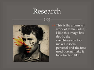
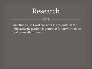
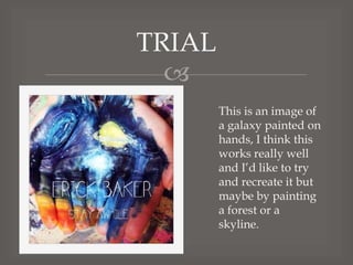
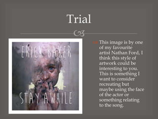
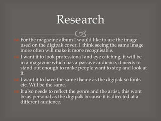
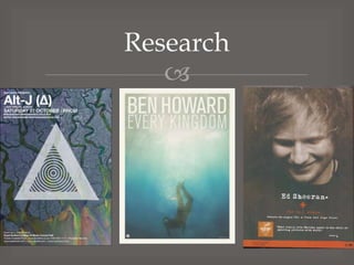
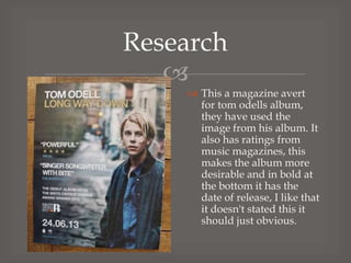
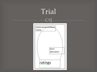
Download to read offline

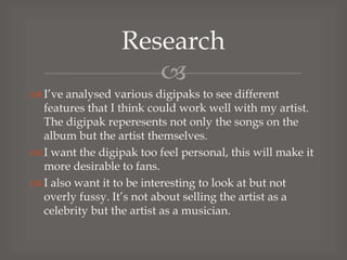
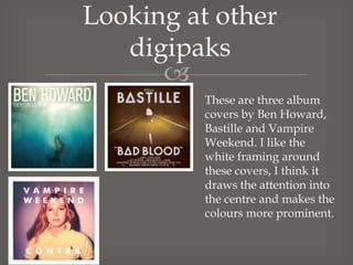


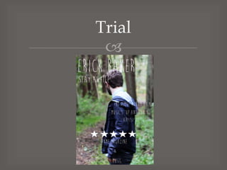
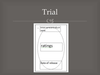


The document discusses research and trials for designing a digipak and magazine advertisement for an artist's album. It analyzes features of other successful digipaks that could work well, including using framing, natural feels, and emotive artist images. Fonts and artwork styles are considered. The goal is for the designs to feel personal yet interesting and not overly simple. The target audiences - fans for the digipak and general public for the magazine - are also discussed.


![Pre production planning [recovered]](https://cdn.slidesharecdn.com/ss_thumbnails/preproductionplanningrecovered-140123072858-phpapp01-thumbnail.jpg?width=640&height=640&fit=bounds)


![5G Explained! A High Level Overview [Introduction]](https://cdn.slidesharecdn.com/ss_thumbnails/5gexplainedahighleveloverview-260119165306-cc137a3e-thumbnail.jpg?width=640&height=640&fit=bounds)


