Download to read offline


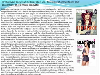
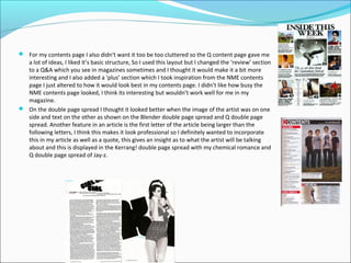
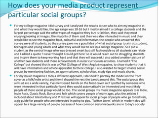

The document discusses how the creator used inspiration from real music magazines to construct their own music magazine media product. They analyzed magazines like NME, Q, Blender, and Kerrang to inform conventions they adopted, such as featuring the cover artist in a double-page spread and matching the cover colors to the artist. Elements like layout, graphic features, and sections were inspired by or adapted from these magazines. Audience feedback was also gathered to help shape the magazine for its target demographic.


![Media%20 evaluation%20questions[1]](https://cdn.slidesharecdn.com/ss_thumbnails/media20evaluation20questions1-120302063519-phpapp01-thumbnail.jpg?width=640&height=640&fit=bounds)


