
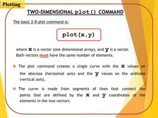
![PLOT OF GIVEN DATA
Given data:
>> x=[1 2 3 5 7 7.5 8 10];
>> y=[2 6.5 7 7 5.5 4 6 8];
>> plot(x,y)
A plot can be created by the commands shown below. This can be done
in the Command Window, or by writing and then running a script file.
Once the plot command is executed, the Figure Window opens with the
following plot.
x
y
1 2 3 5 7 7.5 8
6.5 7 7 5.5 4 6 8
10
2
Plotting](https://image.slidesharecdn.com/programmingwithmatlabsession6-201004063417/85/Programming-with-matlab-session-6-7-320.jpg)
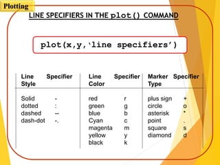
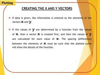
![Year
Sales (M)
1988 1989 1990 1991 1992 1993 1994
127 130 136 145 158 178 211
PLOT OF GIVEN DATA USING LINE
SPECIFIERS IN THE plot() COMMAND
>> year = [1988:1:1994];
>> sales = [127, 130, 136, 145, 158, 178, 211];
>> plot(year,sales,'--r*')
Line Specifiers:
dashed red line and
asterisk markers.
Plotting](https://image.slidesharecdn.com/programmingwithmatlabsession6-201004063417/85/Programming-with-matlab-session-6-12-320.jpg)
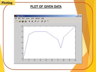
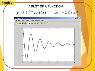
![% A script file that creates a plot of
% the function: 3.5^(-0.5x)*cos(6x)
x = [-2:0.01:4];
y = 3.5.^(-0.5*x).*cos(6*x);
plot(x,y)
CREATING A PLOT OF A FUNCTION
Consider: 42for)6cos(5.3 5.0
xxy x
A script file for plotting the function is:
Creating a vector with spacing of 0.01.
Calculating a value of y
for each x.
Once the plot command is executed, the Figure Window opens with the
following plot.
Plotting](https://image.slidesharecdn.com/programmingwithmatlabsession6-201004063417/85/Programming-with-matlab-session-6-15-320.jpg)
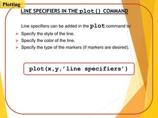
![CREATING A PLOT OF A FUNCTION
If the vector x is created with large spacing, the graph is not accurate.
Below is the previous plot with spacing of 0.3.
x = [-2:0.3:4];
y = 3.5.^(-0.5*x).*cos(6*x);
plot(x,y)
Plotting](https://image.slidesharecdn.com/programmingwithmatlabsession6-201004063417/85/Programming-with-matlab-session-6-17-320.jpg)
![THE fplot COMMAND
fplot(‘function’,limits)
The fplot command can be used to plot a function
with the form: y = f(x)
The function is typed in as a string.
The limits is a vector with the domain of x, and optionally with limits
of the y axis:
[xmin,xmax] or [xmin,xmax,ymin,ymax]
Line specifiers can be added.
Plotting](https://image.slidesharecdn.com/programmingwithmatlabsession6-201004063417/85/Programming-with-matlab-session-6-18-320.jpg)
![PLOT OF A FUNCTION WITH THE fplot() COMMAND
>> fplot('x^2 + 4 * sin(2*x) - 1', [-3 3])
33for1)2sin(42
xxxyA plot of:
Plotting](https://image.slidesharecdn.com/programmingwithmatlabsession6-201004063417/85/Programming-with-matlab-session-6-19-320.jpg)
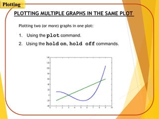
![USING THE plot() COMMAND TO PLOT
MULTIPLE GRAPHS IN THE SAME PLOT
42 x
Plot of the function, and its first and second
derivatives, for , all in the same plot.
10263 3
xxy
42 x
x = [-2:0.01:4];
y = 3*x.^3-26*x+6;
yd = 9*x.^2-26;
ydd = 18*x;
plot(x,y,'-b',x,yd,'--r',x,ydd,':k')
vector x with the domain of the function.
Vector y with the function value at each x.
42 x
Vector yd with values of the first derivative.
Vector ydd with values of the second derivative.
Create three graphs, y vs. x (solid blue line),
yd vs. x (dashed red line), and ydd vs. x
(dotted black line) in the same figure.
Plotting](https://image.slidesharecdn.com/programmingwithmatlabsession6-201004063417/85/Programming-with-matlab-session-6-22-320.jpg)
![Plot of the function, and its first and second
derivatives, for all in the same plot.
10263 3
xxy
42 x
x = [-2:0.01:4];
y = 3*x.^3-26*x+6;
yd = 9*x.^2-26;
ydd = 18*x;
plot(x,y,'-b')
hold on
plot(x,yd,'--r')
plot(x,ydd,':k')
hold off
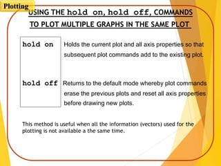
Two more graphs are created.
First graph is created.
USING THE hold on, hold off, COMMANDS
TO PLOT MULTIPLE GRAPHS IN THE SAME PLOT
Plotting](https://image.slidesharecdn.com/programmingwithmatlabsession6-201004063417/85/Programming-with-matlab-session-6-25-320.jpg)
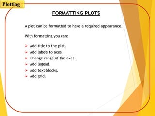
![FORMATTING COMMANDS
title(‘string’)
Adds the string as a title at the top of the plot.
xlabel(‘string’)
Adds the string as a label to the x-axis.
ylabel(‘string’)
Adds the string as a label to the y-axis.
axis([xmin xmax ymin ymax])
Sets the minimum and maximum limits of the x- and y-axes.
Plotting](https://image.slidesharecdn.com/programmingwithmatlabsession6-201004063417/85/Programming-with-matlab-session-6-29-320.jpg)

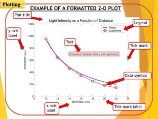
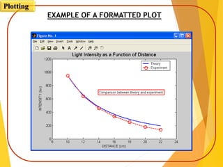
![EXAMPLE OF A FORMATTED PLOT
Below is a script file of the formatted light intensity plot (2nd slide).
(Some of the formatting options were not covered in the lectures, but
are described in the book)
x=[10:0.1:22];
y=95000./x.^2;
xd=[10:2:22];
yd=[950 640 460 340 250 180 140];
plot(x,y,'-','LineWidth',1.0)
hold on
plot(xd,yd,'ro--','linewidth',1.0,'markersize',10)
hold off
Creating a vector with
light intensity from data.
Creating a vector with coordinates of data points.
Creating vector x for plotting the theoretical curve.
Creating vector y for plotting the theoretical curve.
Plotting](https://image.slidesharecdn.com/programmingwithmatlabsession6-201004063417/85/Programming-with-matlab-session-6-31-320.jpg)
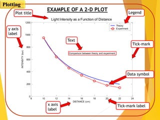
![EXAMPLE OF A FORMATTED PLOT
Formatting of the light intensity plot (cont.)
xlabel('DISTANCE (cm)')
ylabel('INTENSITY (lux)')
title('fontname{Arial}Light Intensity as a Function of
Distance','FontSize',14)
axis([8 24 0 1200])
text(14,700,'Comparison between theory and
experiment.','EdgeColor','r','LineWidth',2)
legend('Theory','Experiment',0)
Creating text.
Creating a legend.
Title for the plot.
Setting limits of the axes.
Labels for the axes.
The plot that is obtained is shown again in the next slide.
Plotting](https://image.slidesharecdn.com/programmingwithmatlabsession6-201004063417/85/Programming-with-matlab-session-6-32-320.jpg)
![DIFFERENT PLOT CODE FOR PRACTISE
Plotting
%%
x=[10:0.1:22];
y=95000./x.^2;
xd=[10:2:22];
yd=[950 640 460 340 250 180 140];
plot(x,y,'-','LineWidth',1.0)
hold on
plot(xd,yd,'ro--','linewidth',1.0,'markersize',10)
hold off
xlabel('DISTANCE (cm)')
ylabel('INTENSITY (lux)')
title('fontname{Arial}Light Intensity as a Function of Distance','FontSize',14)
axis([8 24 0 1200])
text(14,700,'Comparison between theory and experiment.','EdgeColor','r','LineWidth',2)
legend('Theory','Experiment',0)
%%
clear all;
x = randn(1,1000);
hist(x,100);
%%
figure(2);
t=-4:.1:4;
y = exp(-t.^2);
plot(t,y);
%%
t = 0:pi/20:2*pi;
x = sin(t);
y = cos(t);
figure(1);
plot(x);
figure(2);
plot(t,y);
figure(3);
plot(x,y);](https://image.slidesharecdn.com/programmingwithmatlabsession6-201004063417/85/Programming-with-matlab-session-6-36-320.jpg)
![DIFFERENT PLOT CODE FOR PRACTISE
Plotting
%%
sys = tf([2 5 1],[1 2 3]);
rlocus(sys)
sys = tf([0.5 -1],[4 0 3 0 2]);
k = (1:0.5:5);
r = rlocus(sys,k);
size(r)
rlocus(sys,k)
%%
[x,y] = meshgrid(-2:.1:2, -2:.1:2);
z = x.*exp(-x.^2 - y.^2);
mesh(z);
%%
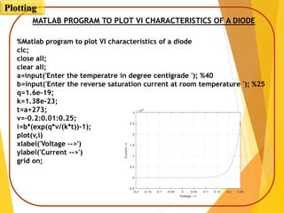
%Matlab program to plot VI characteristics of a diode
clc;
close all;
clear all;
a=input('Enter the temperatre in degree centigrade ');
b=input('Enter the reverse saturation current at room temperature ');
q=1.6e-19;
k=1.38e-23;
t=a+273;
v=-0.2:0.01:0.25;
i=b*(exp(q*v/(k*t))-1);
plot(v,i)
xlabel('Voltage -->')
ylabel('Current -->')
grid on;](https://image.slidesharecdn.com/programmingwithmatlabsession6-201004063417/85/Programming-with-matlab-session-6-37-320.jpg)


The document provides an overview of MATLAB plotting techniques, focusing on 2D and 3D plots, including commands for creating basic plots, customizing styles, and formatting outputs. It explains how to plot data using vectors, utilize line specifiers for visual enhancement, and manage multiple plots using 'hold on' and 'hold off' commands. Additionally, it discusses the importance of formatting plots with titles, labels, and legends to improve clarity and presentation.


![Lec 9 05_sept [compatibility mode]](https://cdn.slidesharecdn.com/ss_thumbnails/lec905septcompatibilitymode-130917013819-phpapp01-thumbnail.jpg?width=640&height=640&fit=bounds)