This document analyzes the codes and conventions used in magazine front covers. It discusses several magazines' use of bold mastheads, catchy headlines, celebrity images, and taglines to attract readers. The goal is to understand techniques for engaging audiences and increasing sales, such as employing contrasting colors, different font sizes, hermeneutic questions, and promotional offers. The document aims to incorporate successful conventions into a music magazine cover the author will create.
The Art of the Pitch: WordPress Relationships and SalesLaura Byrne
Clients don’t know what they don’t know. What web solutions are right for them? How does WordPress come into the picture? How do you make sure you understand scope and timeline? What do you do if sometime changes?
All these questions and more will be explored as we talk about matching clients’ needs with what your agency offers without pulling teeth or pulling your hair out. Practical tips, and strategies for successful relationship building that leads to closing the deal.
Connector Corner: Automate dynamic content and events by pushing a buttonDianaGray10
Here is something new! In our next Connector Corner webinar, we will demonstrate how you can use a single workflow to:
Create a campaign using Mailchimp with merge tags/fields
Send an interactive Slack channel message (using buttons)
Have the message received by managers and peers along with a test email for review
But there’s more:
In a second workflow supporting the same use case, you’ll see:
Your campaign sent to target colleagues for approval
If the “Approve” button is clicked, a Jira/Zendesk ticket is created for the marketing design team
But—if the “Reject” button is pushed, colleagues will be alerted via Slack message
Join us to learn more about this new, human-in-the-loop capability, brought to you by Integration Service connectors.
And...
Speakers:
Akshay Agnihotri, Product Manager
Charlie Greenberg, Host
JMeter webinar - integration with InfluxDB and GrafanaRTTS
Watch this recorded webinar about real-time monitoring of application performance. See how to integrate Apache JMeter, the open-source leader in performance testing, with InfluxDB, the open-source time-series database, and Grafana, the open-source analytics and visualization application.
In this webinar, we will review the benefits of leveraging InfluxDB and Grafana when executing load tests and demonstrate how these tools are used to visualize performance metrics.
Length: 30 minutes
Session Overview
-------------------------------------------
During this webinar, we will cover the following topics while demonstrating the integrations of JMeter, InfluxDB and Grafana:
- What out-of-the-box solutions are available for real-time monitoring JMeter tests?
- What are the benefits of integrating InfluxDB and Grafana into the load testing stack?
- Which features are provided by Grafana?
- Demonstration of InfluxDB and Grafana using a practice web application
To view the webinar recording, go to:
https://www.rttsweb.com/jmeter-integration-webinar
Epistemic Interaction - tuning interfaces to provide information for AI supportAlan Dix
Paper presented at SYNERGY workshop at AVI 2024, Genoa, Italy. 3rd June 2024
https://alandix.com/academic/papers/synergy2024-epistemic/
As machine learning integrates deeper into human-computer interactions, the concept of epistemic interaction emerges, aiming to refine these interactions to enhance system adaptability. This approach encourages minor, intentional adjustments in user behaviour to enrich the data available for system learning. This paper introduces epistemic interaction within the context of human-system communication, illustrating how deliberate interaction design can improve system understanding and adaptation. Through concrete examples, we demonstrate the potential of epistemic interaction to significantly advance human-computer interaction by leveraging intuitive human communication strategies to inform system design and functionality, offering a novel pathway for enriching user-system engagements.
Smart TV Buyer Insights Survey 2024 by 91mobiles.pdf91mobiles
91mobiles recently conducted a Smart TV Buyer Insights Survey in which we asked over 3,000 respondents about the TV they own, aspects they look at on a new TV, and their TV buying preferences.
Encryption in Microsoft 365 - ExpertsLive Netherlands 2024Albert Hoitingh
In this session I delve into the encryption technology used in Microsoft 365 and Microsoft Purview. Including the concepts of Customer Key and Double Key Encryption.
DevOps and Testing slides at DASA ConnectKari Kakkonen
My and Rik Marselis slides at 30.5.2024 DASA Connect conference. We discuss about what is testing, then what is agile testing and finally what is Testing in DevOps. Finally we had lovely workshop with the participants trying to find out different ways to think about quality and testing in different parts of the DevOps infinity loop.
Securing your Kubernetes cluster_ a step-by-step guide to success !KatiaHIMEUR1
Today, after several years of existence, an extremely active community and an ultra-dynamic ecosystem, Kubernetes has established itself as the de facto standard in container orchestration. Thanks to a wide range of managed services, it has never been so easy to set up a ready-to-use Kubernetes cluster.
However, this ease of use means that the subject of security in Kubernetes is often left for later, or even neglected. This exposes companies to significant risks.
In this talk, I'll show you step-by-step how to secure your Kubernetes cluster for greater peace of mind and reliability.
Transcript: Selling digital books in 2024: Insights from industry leaders - T...BookNet Canada
The publishing industry has been selling digital audiobooks and ebooks for over a decade and has found its groove. What’s changed? What has stayed the same? Where do we go from here? Join a group of leading sales peers from across the industry for a conversation about the lessons learned since the popularization of digital books, best practices, digital book supply chain management, and more.
Link to video recording: https://bnctechforum.ca/sessions/selling-digital-books-in-2024-insights-from-industry-leaders/
Presented by BookNet Canada on May 28, 2024, with support from the Department of Canadian Heritage.
Key Trends Shaping the Future of Infrastructure.pdfCheryl Hung
Keynote at DIGIT West Expo, Glasgow on 29 May 2024.
Cheryl Hung, ochery.com
Sr Director, Infrastructure Ecosystem, Arm.
The key trends across hardware, cloud and open-source; exploring how these areas are likely to mature and develop over the short and long-term, and then considering how organisations can position themselves to adapt and thrive.
Builder.ai Founder Sachin Dev Duggal's Strategic Approach to Create an Innova...Ramesh Iyer
In today's fast-changing business world, Companies that adapt and embrace new ideas often need help to keep up with the competition. However, fostering a culture of innovation takes much work. It takes vision, leadership and willingness to take risks in the right proportion. Sachin Dev Duggal, co-founder of Builder.ai, has perfected the art of this balance, creating a company culture where creativity and growth are nurtured at each stage.
Builder.ai Founder Sachin Dev Duggal's Strategic Approach to Create an Innova...
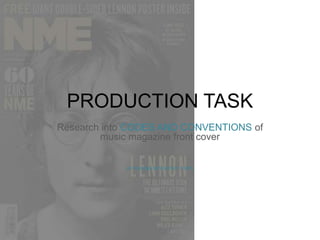
PRODUCTION TASK- Research into codes and conventions of a Front cover
1. PRODUCTION TASK
Research into CODES AND CONVENTIONS of
music magazine front cover
BY PHOEBE MCCARTHY 12RP2
2. Bold masthead- using
contrast of red and
white-engages readers-recognizable
logo- using
also a box out to make
the text stand out more
SPLASH- main story on front page-accompanied
with headline and
image- various quotes and fonts-more
interesting an credible to
audience
Direct mode of address
used- connects artist
Audience- bold bright eye
make up- used to
Enhance the images
intensity (PERSONAL
RELATIONSHIPS)
Main cover lines- bold- stands
out- creates a hermeneutic
question- consumers want to
buy magazine-find out what's
inside- question luring them in-uses
and grat needs model-hypodermic
needle model-audience
are not resistant to
find out the answer- uses grat
and needs model to answer
the unknown
SECONDARY LEAD- sneak
preview of Inside articles-medium
text-bold fonts-allowing
reader clear idea of
Stories inside- engaging with
reader- encouraging words-
“MEET” “NEW”
Cover/sell lines- break the
conventions - sells the
magazine to the consumer-larger
text- emphasizing the
story. TAG/LURE: categorizes
readers interests- BLOW OUT-positive
engagement
Buzz words- main feature
Article- attracts attention- Puff
Words- flash of information- here
White used within house style
Barcode- placed at bottom
Of page normally- includes-
Date- issue number- price- website-
Additional information for the reader
Main House colours- red-white
Contrasting colours- black- blue relating to make-up-
Natural pale gender colour
3. Q CODES AND
CONVENTIONS
• From re search the masthead in all of Q magazines is continuous meaning that the logo
colour and position is always the same, this is a usual convention and a positive concept as it
makes the magazine more reconcilable by the consumers. Even though I am only producing
one version of my magazine I intend on using a continuous layout and colour scheme through
the different pages.
• The house style in Q magazine is also continuous as the images in a large amount of the
magazines are model shots I wish to use this type of photography in my final production of a
magazine as I feel it would be beneficial to me as I could choose the colour scheme of what
the model wears, the position of them etc to suit the design of the magazine. Furthermore
throughout Q magazines the layout has a frame that surrounds the image in the centre,
leading the magazine to look more professional and organized.
• Cover and main sell lines are a main selling point for the magazine and lure people in to buy
it. For example in Q, the use of bold white text contrasting with the celebrities red hair stands
out along with the different sizes of text uses adding uniqueness along with engaging the
reader.
• The use of the hermeneutic question and hypodermic needle method draw the reader into
wanting to read the magazine as the audience wants to find out the ‘unknown’ from the Tag
lines.
4. Masthead-familiar-same
positioning- bold
font- recognizable
Handwriting type font-urban
feel- appeals to
younger generation-
SPLASH- quotes
magazine credible- bold
colours- red-white-appeals
to reader
Sell line- magazine aim- to sell-exclusive stories
Large font- bold colour- red-
Engages reader- ‘NOEL’-
One member of band-question-
going solo?- smaller
text beneath- starts over-
Unknown answer
hermeneutic question- lures
reader in
Barcode- bottom of page-
Website-issue number- date- price-
Additional information for reader
TAG- free promotional gift-
Catches readers attention – wants to
Buy magazine for chance to win
Low key lighting- adds shadow-
Making celebrity first thing you
look at
mid close up- celebrity POV shot
-Eyes looking straight to audience
-Personal relationship between
-Audience and artist
Main sell line- contrast of red and
Black- engaging- fun colours
BUZZ words- ‘PLUS’- conveying
Interesting stories to audience-
Increased consumers
Main house colours- red-black
–white- rock and
roll image- connecting to
wide range of ages- target
audience- large amount
of consumers
5. NME CODES AND
CONVENTIONS
• The mid close-up shot catches the attention of the reader and by having the celebrity posing
so there is a point of view shot present, this makes a personal relationship between the
audience and artist as the eye match connects with the reader. I would like to use this
convention in my final front page to make sure my front cover is eye catching and noticeable.
• The SPLASH in this particular magazine is the main headline however the font used is
handwriting like along with different colours used simultaneously between the lines. I wish to
use this in my final production of my front page due to the urban feel because of the
handwriting font and the contrast of colours, along with the fact that I want my target
audience to be in the range of 16-25 years old.
• The TAG used in this particular magazine is a promotional offer and competition by using
BUZZ words to lure the reader in, and increase the amount of consumers. I would like to use
this in my final font cover production as I feel it would make the magazine look more
professional and organized which is the look I am aiming to succeed.
• The low key lighting adds definition to the image and is the main feature that engages with
the reader to make them look at this particular magazine. For my front cover I wish to use
thing lighting and the white blank screen in order to gain a highly professional image and
increase the intense feeling of my front cover.
6. Masthead- bold large font-
Similar text and background colour-
Blue used for subtitles- stands out
more to audience
LURE- bold – white and black text- stands out
From masthead- lures reader in to buy magazine-
Limited edition- BUZZ words used- ‘FIRST’ ‘EVER’
Main sell lines- bright blue- distinct
From beige background and masthead
-Italic font- depicts hip hop and RnB
-Music- relating to main image
Model image- not continuous of
Magazine- makes reader want to
Have this issue- increases consumers
Fun image- messy hair- props used-
Enthusiastic facial expression- eye
Catching image- lures attention in –
Costume risky- different- hip hope
Style- basing design towards younger
Generation- large market for music
magazines
‘LIKES TO WATCH’ –uses and grat
Method- informing audience
About article- personal relationship-
Audience and artist- credible- facts
About celebrity
Barcode- price- date- issue number
-website- additional information for
reader
Outlining of text- stand out-
Inside articles- music genres- bold
-Most popular music- large target
-Market- famous musicians- people
Have a connection with- wanting to
Read the article even more
TAG/LURE- hermeneutic question-
Readers- want to find out the ‘UNTOLD STORY’
- Italics to hint the opposite view- question
House colours- beige - blue
Contrasting colours- black and white outlining-
Gender colour contrasts with chosen colours- image
Follows with the chosen colour scheme
7. VIBECODES AND CONVENTIONS
• In VIBE magazine the colour scheme is not continuous and varies in each magazine depending on the model/ celebrity and
the clothing. However the positioning of the masthead is continuous and is always places mainly in the centre reaching
across the width of the page. As I am not making a series of magazines I don’t have the chance to experiment with
continuous colour scheme or positioning of the logo however I would like to use the same or similar colour scheme
throughout my front page, contents and double page spread as I feel it will make the set of pages look more professional
and appeal more to an audience.
• In this particular issue of VIBE magazine the outlining of sell lines is present, I feel like this makes the smaller article stories
still engage with the audience increasing the number of consumers towards the magazine. Along with the italic font for TAG
and LURING lines I feel like this is a very effective feature as it firstly catches the attention of the audience along with making
the magazine look more interesting and the perceived thought by the audience of the stories inside more enjoyable to read.
• The main feature in this magazine is the main image. I feel that this image is very effective for the magazine design as it
portrays a fun yet risky image that depicts the hip hop and RnB genres of music through using props; (camera) along with
the choice of costume relating to these music genres. For my Final production I would like to use different clothing and
props to relate to the genre of music I intend to do, as I feel it makes the magazine as a whole look more organized and
illustrates a clear idea of what the particular magazine is about.
• Moreover in this VIBE magazine even the sell lines are outlined and in bold font even though they are of a smaller size, I feel
that this is a positive feature of this magazine as this makes the audience still notice these titles, which can be one of the
most important concepts of the magazine as the sell lines are what ‘sells’ the magazine and without the audience being able
to straight away notice them the amount of consumers could possibly decrease.
8. Masthead- bold-simplistic-lower
case lettering- bold colours-white-
multi colours- engages
with reader
Barcode- price-
Issue number- website-date –
Additional information for reader
Main sell lines-
Highlighted in fluorescent
Colour- attracting younger
Generation-bold black text
- Enables sell line to stand out
Slight low key lighting- resembles –
Definition in face- incenses the
Celebrity- eye match- POV shot-
Portrays personal relationship-
Between audience and artist-
Serious look- audience question the
Singers intentions (uses and grats
Model) readers powerless to
Resist not finding the answer
TAG- promotional- exclusive
Keynote- lures readers in- bright
Green- eye catching- use of
white and black emphasizes the
offer
Simple text- thin style font-
Simple however effective-
Large size- first thing reader
Sees- popular artist- wide
Audience and target market-
Fluorescent green subtitle-
Seen straight after seeing
‘DRAKE’- using PUFF flash of
Information- inc. hermeneutic
Question audience want to find
Success- answer to statement
etc.
SELL LINES-Sneak
preview- what's inside-
Engages with reader-
Bold white font- capitals-
Catches readers attention
Close up- celebrity- connects
To reader- shadow effect- higher key lighting
On face- classy image- appeals to more people
House colour scheme- black and white image-
Pop of colour throughout- contrast of bold colours and
Simplistic= simple and clean but effective layout and design
9. BILLIBOARD CODES AND
CONVENTIONS
• In Billboard magazine the logo Is continuous throughout all of the issues. I like the way of the different bold
colours in some of the letters as I feel it catches the eye of the younger generation due to the ‘pop of colours’ and
by the colour scheme including fluorescent colours this also adds to the luring in of the younger generation. In
addition to this I like the way that there is hints of bright colours and I wish to use this in my final production to
engage with the readers as I am aiming for a target market of 16-25 year olds.
• One of the best features of this magazine in my opinion is the simple but effective design and layout of the front
page, I like this feature because it’s a very modern concept yet retro design. By using simple fonts (mostly long and
thin) and keeping the colour scheme very plain apart from the hints of colour this adds more effect than having a
full page with too much to look at. I wish to use a clear and simple yet effective design in my final production to
lure in the younger generation.
• Furthermore the image is the main feature of the magazine from looking at the image and the slight low key
lighting adding definition to the celebrities face; I wish to use this lighting in my final production on my front cover
as I feel this is the most eye catching and the main feature that engages with the audience.
• Finally the use of the uses and grats model and the hermeneutic questions throughout this piece it makes the
readers question the meaning behind the sell lines and want to find out the answer therefore having to buy the
magazine to read on. Completing the magazines aim to sell the magazine and increase the amount of consumers.
In my final product I will be using this terminology to make my magazine look and read more professionally also
adding to the layout and design.