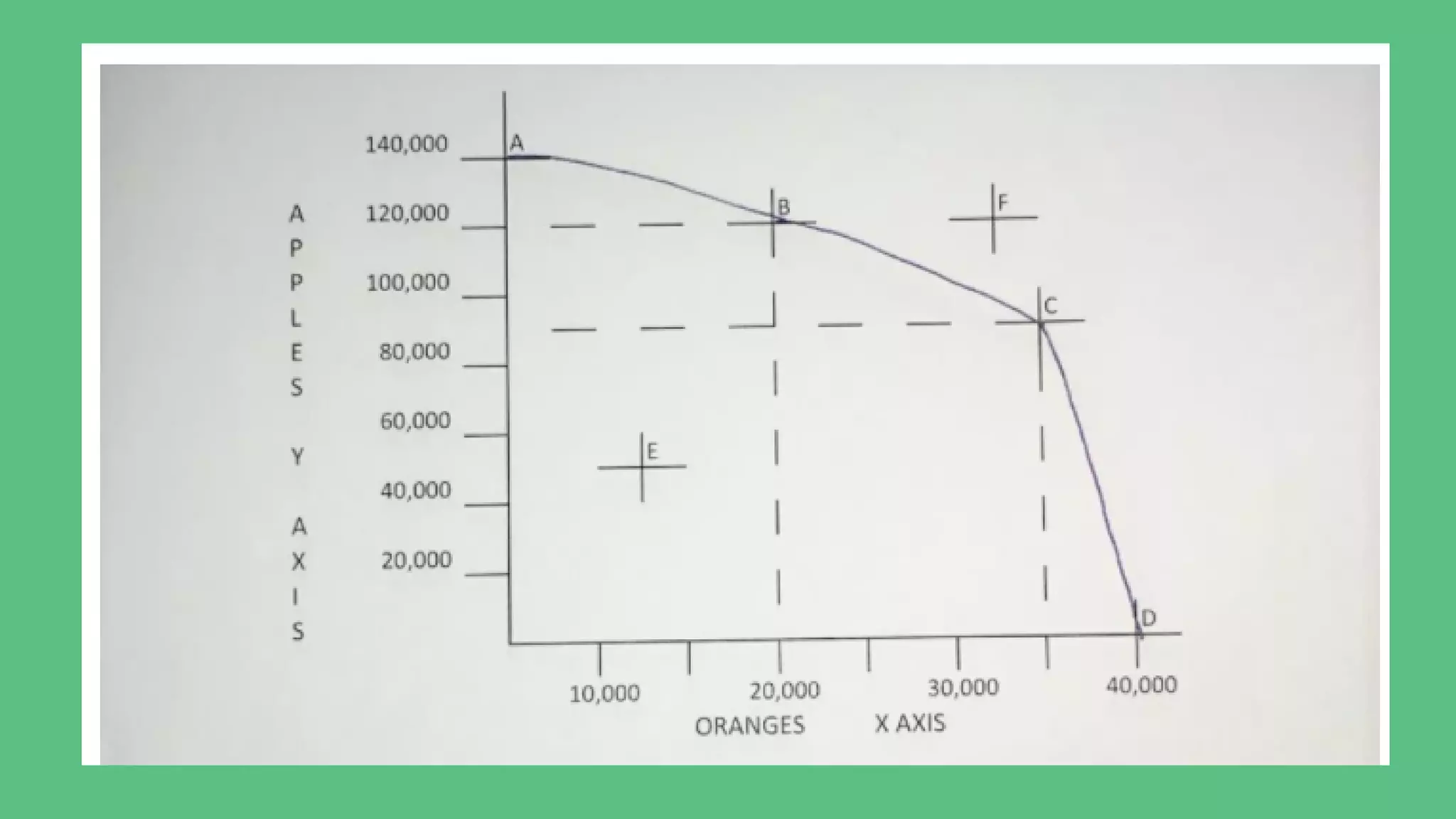
PRODUCTION
POSSIBILITIES
CURVE
Mudassir Raza
ACTIVITY
A 55 year old employee has been offered a new job or the chance to retire
early. He will earn $20,000 per year in the new job and will no longer have to
work on weekends, which means he can spend more time with family.
However, if he chooses to retire early he will benefit from having much more
leisure time but will receive a small monthly pension of just $1000.
Production Possibilities Curve
A  production possibility curve  measures the maximum output of two goods
using a fixed amount of input.
The input is any combination of the four  factors of production:  natural
resources (including land), labor, capital goods, and entrepreneurship.
Each point on the curve shows how much of each good will be produced when
resources shift from making more of one good and less of the other.
For example, say an economy can produce 20,000 oranges and 120,000
apples. On the chart, that's point B. If it wants to produce more oranges, it
must produce fewer apples. On the chart, Point C shows that if it produces
45,000 oranges, it can only produce 85,000 apples.By describing this trade-
off, the curve demonstrates the concept of opportunity cost. Making more of
one good will cost society the opportunity of making more of the other good.
EXAMPLE
PRODUCTION POSSIBILITY FRONTIER
POINT E
The production possibility curve portrays the cost of society's choice between two different goods.
An economy that operates at the frontier has the highest standard of living it can achieve, as it is
producing as much as it can using the same resources.
If the amount produced is inside the curve, then all of the resources are not being used. On the
chart, that is point E.
POINT F
Conversely, any point outside the PPF curve is impossible. More of both goods cannot be produced
with the limited resources. On the chart, that is point F.
WHAT THE SHAPE OF THE CURVE TELLS YOU
The production possibility curve bows outward. The highest point on the curve is when you only
produce one good, on the y-axis, and zero of the other, on the x-axis. On the chart, that is Point A.
The economy produces 140,000 apples and zero oranges.The widest point is when you produce
none of the good on the y-axis, producing as much as possible of the good on the x-axis. On the
chart, that is point D.
The society produces zero apples and 40,000 oranges.All the points in between are a trade-off of
some combination of the two goods. An economy operates more efficiently by producing that mix.
The reason is that every resource is better suited to producing one good than another.
Some land is better suited for apples, while other land is best for oranges. Society does best when it
directs the production of each resource toward its specialty. The more specialized the resources, the
more bowed out the production possibility curve.
A PPC FOR AN ECONOMY
KEY TAKEAWAYS
Given fixed constraints of production factors, the production possibilities
curve shows the possible combinations of production volume for two
goods in question.  
The assumption is that production of one commodity decreases if that of
the other one increases, given the finite resources or inputs available for
use.
The production possibilities curve is also called the PPF or the production
possibilities frontier.
KEY TAKEAWAYS
The PPF simply shows the trade-offs in production volume between two
choices.
All choices along the curve shows production efficiency of both
goods. Production points inside the curve show an economy is not producing
at its comparative advantage. Conversely, production outside the curve is
not possible as more of both goods cannot be produced given the fixed
resources.
The PPF is a tool that displays the right proportional mix of goods to be
produced. These ideal production volumes are at levels that would profit a
company or economy, the most.
THANK YOU

Production possibilities curve

  • 1.
  • 2.
    ACTIVITY A 55 yearold employee has been offered a new job or the chance to retire early. He will earn $20,000 per year in the new job and will no longer have to work on weekends, which means he can spend more time with family. However, if he chooses to retire early he will benefit from having much more leisure time but will receive a small monthly pension of just $1000.
  • 3.
    Production Possibilities Curve A production possibility curve  measures the maximum output of two goods using a fixed amount of input. The input is any combination of the four  factors of production:  natural resources (including land), labor, capital goods, and entrepreneurship. Each point on the curve shows how much of each good will be produced when resources shift from making more of one good and less of the other.
  • 4.
    For example, sayan economy can produce 20,000 oranges and 120,000 apples. On the chart, that's point B. If it wants to produce more oranges, it must produce fewer apples. On the chart, Point C shows that if it produces 45,000 oranges, it can only produce 85,000 apples.By describing this trade- off, the curve demonstrates the concept of opportunity cost. Making more of one good will cost society the opportunity of making more of the other good. EXAMPLE
  • 7.
    PRODUCTION POSSIBILITY FRONTIER POINTE The production possibility curve portrays the cost of society's choice between two different goods. An economy that operates at the frontier has the highest standard of living it can achieve, as it is producing as much as it can using the same resources. If the amount produced is inside the curve, then all of the resources are not being used. On the chart, that is point E. POINT F Conversely, any point outside the PPF curve is impossible. More of both goods cannot be produced with the limited resources. On the chart, that is point F.
  • 8.
    WHAT THE SHAPEOF THE CURVE TELLS YOU The production possibility curve bows outward. The highest point on the curve is when you only produce one good, on the y-axis, and zero of the other, on the x-axis. On the chart, that is Point A. The economy produces 140,000 apples and zero oranges.The widest point is when you produce none of the good on the y-axis, producing as much as possible of the good on the x-axis. On the chart, that is point D. The society produces zero apples and 40,000 oranges.All the points in between are a trade-off of some combination of the two goods. An economy operates more efficiently by producing that mix. The reason is that every resource is better suited to producing one good than another. Some land is better suited for apples, while other land is best for oranges. Society does best when it directs the production of each resource toward its specialty. The more specialized the resources, the more bowed out the production possibility curve.
  • 9.
    A PPC FORAN ECONOMY
  • 10.
    KEY TAKEAWAYS Given fixedconstraints of production factors, the production possibilities curve shows the possible combinations of production volume for two goods in question.   The assumption is that production of one commodity decreases if that of the other one increases, given the finite resources or inputs available for use. The production possibilities curve is also called the PPF or the production possibilities frontier.
  • 11.
    KEY TAKEAWAYS The PPFsimply shows the trade-offs in production volume between two choices. All choices along the curve shows production efficiency of both goods. Production points inside the curve show an economy is not producing at its comparative advantage. Conversely, production outside the curve is not possible as more of both goods cannot be produced given the fixed resources. The PPF is a tool that displays the right proportional mix of goods to be produced. These ideal production volumes are at levels that would profit a company or economy, the most.
  • 12.