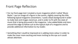
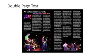
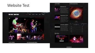
William Thirlaway conducted research on print magazines to inform his final project. He looked at gaming, movie, and music magazines and found common conventions across genres. This led him to propose a TV and movie magazine reviewing shows and films. He created test versions of a music magazine front page, a double page article spread, and a website for the magazine. In his reflections, he analyzed design elements, what worked well, and opportunities for improvement in making the content engaging and readable.
2. Research
• For my research I started out by looking at the gaming magazines,
PlayStation Magazine, and PC Gamer and discovered they have a lot
of similarities. I then compared them to the magazine Empire, which
is a movie magazine which showed me that these similarities carried
though other genres of magazine, and were common conventions
used throughout print in general. Looking at Empire also made me
decide to do a TV magazine for my final product.
3. Proposal
• For my proposal I put forward a TV and Movie magazine which would
review and give gossip about upcoming shows and films, as well as
providing film making and story writing techniques and tips. I
considered the idea of a music magazine, which I decided to do as a
test magazine before my final project, but I eventually settled on the
TV and Movie magazine idea instead after doing research on Empire.
5. Front Page Reflection
• For my front page test I created a music magazine which I called ‘Music
Rocks’. I put an image of a figure in the centre, slightly covering the title,
following typical magazine conventions. I used a black background in order
to make text and images stand out, and in order to fit with the style of
music that is being discussed in the magazine. I also added blobs and stars
around the edge to follow suit to the typical style of a magazine and to
provide additional information to my reader.
• Something that I could've improved on is adding more colour in order to
make the cover more exciting and more inviting to the eye so it could
attract attention.
7. Double Page Reflection
• For my double page spread I used a black background the same as the front cover
in order to keep continuity with the rest of my magazine. This, paired with the
white font, helped the text to be very clear and readable, even in smaller fonts,
because white on black is the most readable colour combination.
• I used two images of the band around the article which helps the reader to be
able to relate the article to what they can see and helps them visualise it in their
heads, but also helps to catch the reader's eye if they're just flicking through and
encourages them to read it.
• Something I could've done better is used more colourful images that stand out
more because this would help to grab the reader's attention more and encourage
them to read the article more than it does currently.
9. Website Reflection
• For my website, again I kept the consistent theme which was present in the magazine of a black
background, however, this time the background has a slightly muddied texture which is to make
the website feel more interactive and so the user can see more movement as they scroll through
the page, which will make the website feel bigger and full of content.
• I included an articles section which would include articles from the magazine, as well as fresh
content which the user may not be able to get from the magazine. This will give the reader to
view the website whilst they're waiting for the magazine and will encourage them to use both.
• I also included interactive features, such as videos, and music to listen to from the bands which
the articles are talking about. This helps the user to feel involved in the website and explore the
content the articles are discussing which may encourage them to buy or listen to the content
discussed and in turn buy more magazines to look for further recommendations.