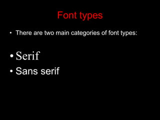
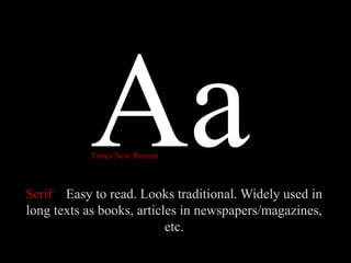
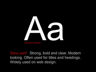
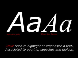
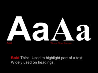
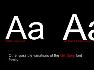
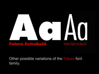
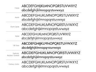
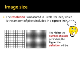
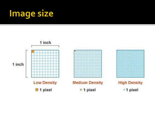
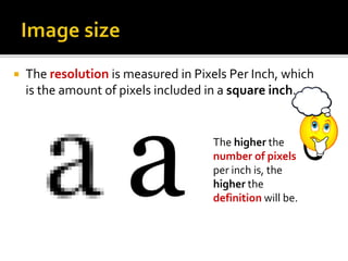
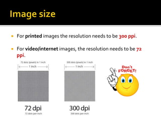
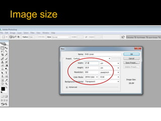
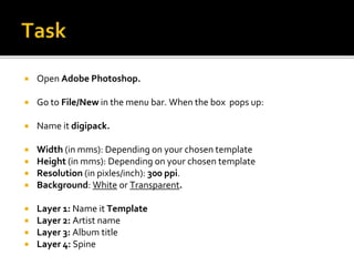
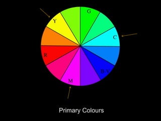
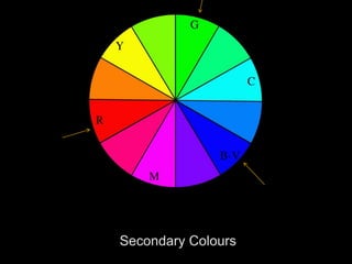
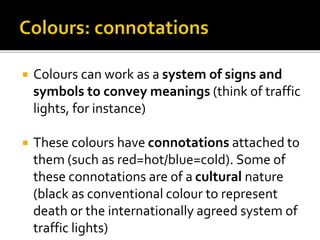
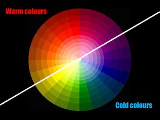
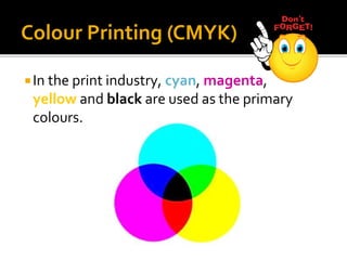
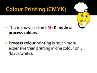
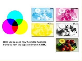
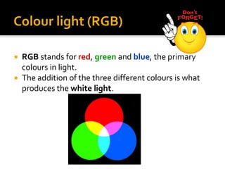
Printed media
By the end of this lesson you:
 Must – be able to explain the differences between serif and
sans serif font types.
 Should – be able to analyse the different elements in a
graphic product.
 Amazing If - you can compare and evaluate both printed and
audiovisual media languages.
There are three main elements in media
language in printed media:
 Text (font types)
 Images (Main and secondary)
 Colour (colour schemes)
 The way we present our text is determinant
to appeal our audience to read it.
 The placement, the size and choice of font
type is what it will make our text successful.
 There are two types of fonts:
 Serif
 Sans serif
What is graphic design
Font types 1
Font types
• There are two main categories of font types:
•Serif
• Sans serif
Serif Easy to read. Looks traditional. Widely used in
long texts as books, articles in newspapers/magazines,
etc.
Times New Roman
Sans serif Strong, bold and clear. Modern
looking. Often used for titles and headings.
Widely used on web design.
Century Gothic
Italic Used to highlight or emphasise a text.
Associated to quoting, speeches and dialogs.
Verdana Italic Times New Roman
Bold Thick. Used to highlight part of a text.
Widely used on headings.
Arial Times New Roman
Gill Sans Ultrabold
Other possible variations of the Gill Sans font
family.
Gill Sans Condensed
Other possible variations of the Futura font
family.
http://www.dafont.com/
http://www.urbanfonts.com/
http://www.free-fonts.com/links/
http://www.1001fonts.com/
1. Choose three font types from www.dafont.com for your artist’s
corporative image/logo and three font types for the title of your
record/single.
2. Download and install those font types in your computer.
3. Open word document. Write your name at the top of the page.
4. Type the name of the font type with the chosen font type.
5. Type the name of the artist and the title of your record/single.
6. Do this with the three font types that you have chosen for your
masthead.
7. Save as PDF file.
What is graphics
Lesson 2:
Image size in Adobe Photoshop
The size of an image depends of two factors:
 The resolution, measured in Pixels Per Inch (ppi)
 The physical measures, measured in centimetres.
 The physical measures are the height and the width of
that image, which can be measured in inches, millimetres
or pixels.
 The resolution is the number of pixels per inch (ppi) in
that image.
 The resolution is measured in Pixels Per Inch, which
is the amount of pixels included in a square inch.
The higher the
number of pixels
per inch is, the
higher the
definition will be.
 The resolution is measured in Pixels Per Inch, which
is the amount of pixels included in a square inch.
The higher the
number of pixels
per inch is, the
higher the
definition will be.
 For printed images the resolution needs to be 300 ppi.
 For video/internet images, the resolution needs to be 72
ppi.
Image size
 Open Adobe Photoshop.
 Go to File/New in the menu bar. When the box pops up:
 Name it digipack.
 Width (in mms): Depending on your chosen template
 Height (in mms): Depending on your chosen template
 Resolution (in pixles/inch): 300 ppi.
 Background: White or Transparent.
 Layer 1: Name it Template
 Layer 2: Artist name
 Layer 3: Album title
 Layer 4: Spine
What is graphics
Lesson 3:
Colour modes in Adobe Photoshop
The Colour Wheel
 Colours can work as a system of signs and
symbols to convey meanings (think of traffic
lights, for instance)
 These colours have connotations attached to
them (such as red=hot/blue=cold). Some of
these connotations are of a cultural nature
(black as conventional colour to represent
death or the internationally agreed system of
traffic lights)
Cold colours
Warm colours
HOT
COLD
FRESH
Theory of colour
Colour Interaction
Colour Context
• How colour behaves in relation to other
colours and shapes is a complex area of
colour theory.
• It is important to know how our brains
perceive combinations of colours if you are
to design a product that has a successful
colour scheme.
Look at the small purple rectangles and compare their colours. The
small purple rectangle on the left appears to have a red-purple tinge
when compared to the small purple rectangle on the right.
They are in fact both the same colour as seen in the illustration above.
This demonstrates how three colours can be perceived as four colours.
• Red appears more brilliant against a black background and somewhat
duller against the white background.
• In contrast with orange, the red appears lifeless; in contrast with blue-
green, it exhibits brilliance.
• Notice that the red square appears larger on black than on other
background colours.
Theory of colour
Colour printing
In the print industry, cyan, magenta,
yellow and black are used as the primary
colours.
Colour Printing (CMYK)
 This is known as the CMYK mode or
process colours.
 Process colour printing is much more
expensive than printing in one colour only
(black/white).
Colour Printing (CMYK)
Here you can see how the image has been
made up from the separate colours CMYK.
Colour light (RGB)
 RGB stands for red, green and blue, the primary
colours in light.
 The addition of the three different colours is what
produces the white light.
When getting ready images to be used on an
audio-visual format (video or web), the colour
mode that we should use would be RGB mode.
Colour light (RGB)
CMYK vs. RGB
What colour scheme corresponds to each mode?
CMYK RGB
CMYK vs. RGB
Theory of colour
Lesson 5: Composition
Piet Mondrian (March 7, 1872 – February 1, 1944)
Composition II in Red, Blue, and Yellow, 1930
Piet Mondrian (1872 –1944) Composition with Yellow, Blue, and Red, 1937-42, Oil
on canvas, 72.5 x 69 cm, Tate Gallery, London
Piet Mondrian (March 7, 1872 – February 1, 1944)
Composition 10, 1939-1942, private collection
Yves St. Lauren Autum 1965
NIke
Vans
Printed media language introduction

Printed media language introduction

  • 1.
  • 2.
    By the endof this lesson you:  Must – be able to explain the differences between serif and sans serif font types.  Should – be able to analyse the different elements in a graphic product.  Amazing If - you can compare and evaluate both printed and audiovisual media languages.
  • 3.
    There are threemain elements in media language in printed media:  Text (font types)  Images (Main and secondary)  Colour (colour schemes)
  • 4.
     The waywe present our text is determinant to appeal our audience to read it.  The placement, the size and choice of font type is what it will make our text successful.  There are two types of fonts:  Serif  Sans serif
  • 5.
  • 6.
  • 7.
    Font types • Thereare two main categories of font types: •Serif • Sans serif
  • 8.
    Serif Easy toread. Looks traditional. Widely used in long texts as books, articles in newspapers/magazines, etc. Times New Roman
  • 9.
    Sans serif Strong,bold and clear. Modern looking. Often used for titles and headings. Widely used on web design. Century Gothic
  • 10.
    Italic Used tohighlight or emphasise a text. Associated to quoting, speeches and dialogs. Verdana Italic Times New Roman
  • 11.
    Bold Thick. Usedto highlight part of a text. Widely used on headings. Arial Times New Roman
  • 12.
    Gill Sans Ultrabold Otherpossible variations of the Gill Sans font family. Gill Sans Condensed
  • 13.
    Other possible variationsof the Futura font family.
  • 15.
  • 16.
    1. Choose threefont types from www.dafont.com for your artist’s corporative image/logo and three font types for the title of your record/single. 2. Download and install those font types in your computer. 3. Open word document. Write your name at the top of the page. 4. Type the name of the font type with the chosen font type. 5. Type the name of the artist and the title of your record/single. 6. Do this with the three font types that you have chosen for your masthead. 7. Save as PDF file.
  • 17.
    What is graphics Lesson2: Image size in Adobe Photoshop
  • 18.
    The size ofan image depends of two factors:  The resolution, measured in Pixels Per Inch (ppi)  The physical measures, measured in centimetres.
  • 19.
     The physicalmeasures are the height and the width of that image, which can be measured in inches, millimetres or pixels.  The resolution is the number of pixels per inch (ppi) in that image.
  • 20.
     The resolutionis measured in Pixels Per Inch, which is the amount of pixels included in a square inch. The higher the number of pixels per inch is, the higher the definition will be.
  • 22.
     The resolutionis measured in Pixels Per Inch, which is the amount of pixels included in a square inch. The higher the number of pixels per inch is, the higher the definition will be.
  • 23.
     For printedimages the resolution needs to be 300 ppi.  For video/internet images, the resolution needs to be 72 ppi.
  • 24.
  • 25.
     Open AdobePhotoshop.  Go to File/New in the menu bar. When the box pops up:  Name it digipack.  Width (in mms): Depending on your chosen template  Height (in mms): Depending on your chosen template  Resolution (in pixles/inch): 300 ppi.  Background: White or Transparent.  Layer 1: Name it Template  Layer 2: Artist name  Layer 3: Album title  Layer 4: Spine
  • 26.
    What is graphics Lesson3: Colour modes in Adobe Photoshop
  • 28.
  • 31.
     Colours canwork as a system of signs and symbols to convey meanings (think of traffic lights, for instance)  These colours have connotations attached to them (such as red=hot/blue=cold). Some of these connotations are of a cultural nature (black as conventional colour to represent death or the internationally agreed system of traffic lights)
  • 32.
  • 33.
  • 34.
  • 35.
  • 40.
  • 41.
    Colour Context • Howcolour behaves in relation to other colours and shapes is a complex area of colour theory. • It is important to know how our brains perceive combinations of colours if you are to design a product that has a successful colour scheme.
  • 42.
    Look at thesmall purple rectangles and compare their colours. The small purple rectangle on the left appears to have a red-purple tinge when compared to the small purple rectangle on the right.
  • 43.
    They are infact both the same colour as seen in the illustration above. This demonstrates how three colours can be perceived as four colours.
  • 44.
    • Red appearsmore brilliant against a black background and somewhat duller against the white background. • In contrast with orange, the red appears lifeless; in contrast with blue- green, it exhibits brilliance. • Notice that the red square appears larger on black than on other background colours.
  • 45.
  • 46.
    In the printindustry, cyan, magenta, yellow and black are used as the primary colours. Colour Printing (CMYK)
  • 47.
     This isknown as the CMYK mode or process colours.  Process colour printing is much more expensive than printing in one colour only (black/white). Colour Printing (CMYK)
  • 48.
    Here you cansee how the image has been made up from the separate colours CMYK.
  • 49.
    Colour light (RGB) RGB stands for red, green and blue, the primary colours in light.  The addition of the three different colours is what produces the white light.
  • 50.
    When getting readyimages to be used on an audio-visual format (video or web), the colour mode that we should use would be RGB mode. Colour light (RGB)
  • 51.
    CMYK vs. RGB Whatcolour scheme corresponds to each mode?
  • 52.
  • 53.
  • 54.
    Piet Mondrian (March7, 1872 – February 1, 1944) Composition II in Red, Blue, and Yellow, 1930
  • 55.
    Piet Mondrian (1872–1944) Composition with Yellow, Blue, and Red, 1937-42, Oil on canvas, 72.5 x 69 cm, Tate Gallery, London
  • 56.
    Piet Mondrian (March7, 1872 – February 1, 1944) Composition 10, 1939-1942, private collection
  • 57.
    Yves St. LaurenAutum 1965
  • 59.
  • 60.