Download as PDF, PPTX

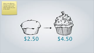
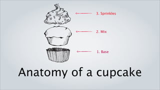
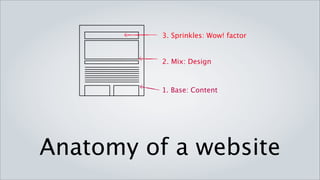
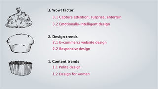
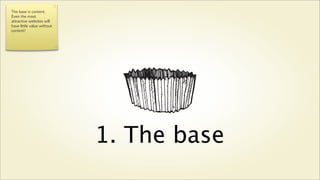


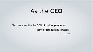


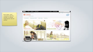
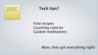

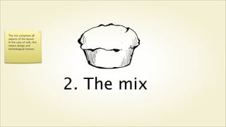


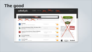
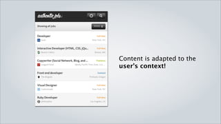


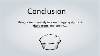
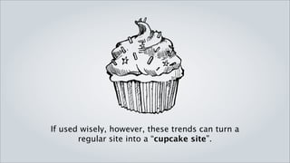


The presentation discusses the importance of strategically using design trends to elevate websites from mediocre to memorable experiences, as illustrated by the cupcake versus muffin analogy. It emphasizes that content is the foundation of any site, and that emotionally intelligent design, especially catering to women consumers, can enhance usability and engagement. Ultimately, the effective application of trends can create a 'cupcake site' that captivates and retains users.


![Directions - Council for Vocational Services Society - Halifax [2010-10-07]](https://cdn.slidesharecdn.com/ss_thumbnails/directions-councilforvocationalservicessociety-halifax2010-10-07-101007084802-phpapp02-thumbnail.jpg?width=640&height=640&fit=bounds)

![Community Sector Provincial Forum - St. John's [2010-10-01]](https://cdn.slidesharecdn.com/ss_thumbnails/communitysectorprovincialforum-st-johns-2010-10-01-101001144925-phpapp02-thumbnail.jpg?width=640&height=640&fit=bounds)


