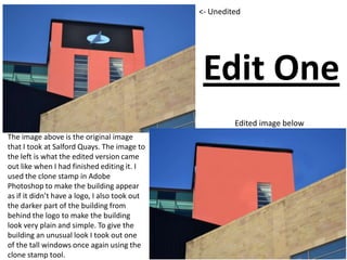
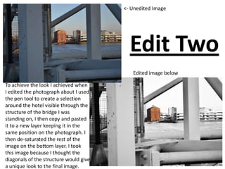
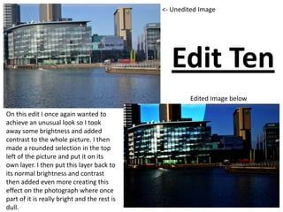
The image above is the original image
that I took at Salford Quays. The image to
the left is what the edited version came
out like when I had finished editing it. I
used the clone stamp in Adobe
Photoshop to make the building appear
as if it didn’t have a logo, I also took out
the darker part of the building from
behind the logo to make the building
look very plain and simple. To give the
building an unusual look I took out one
of the tall windows once again using the
clone stamp tool.
<- Unedited
Edited image below
Edit One
Edit Two
Edited image below
<- Unedited Image
To achieve the look I achieved when
I edited the photograph about I used
the pen tool to create a selection
around the hotel visible through the
structure of the bridge I was
standing on, I then copy and pasted
it to a new layer keeping it in the
same position on the photograph. I
then de-saturated the rest of the
image on the bottom layer. I took
this image because I thought the
diagonals of the structure would give
a unique look to the final image.
Edit Three
Edited image below
<- Unedited Image
I took this shot because I liked how
the structure of the bridge makes
the reflective glass of the building
the focal point of the picture, it
leads our eye towards it. When I
edited this image I just kept it simple
and just used the curves adjustment
to give it that look as if it was nigh
time.
Edit Four
<- Unedited image
Edited image below
When I edited this image I
made a selection around the
arrow like structure of the
bridge and then copy and
pasted it twice, positioning the
pasted versions side by side of
the original to give a realistic
appearance that the bridge has
3 of the arrow like shapes
instead of one. I also de-
saturated the photograph
afterwards.
Edit Five
Edited image belowUnedited Image
On this image I tried to edit it with a theme, the theme I went with was love. I took a piece of
graffiti off a different picture I had taken. I then changed the perspective of the graffiti
numerous times and placed them to look like they were on the steps. I placed them side by
side as if it was footprints going up the steps. I put a enlarged version of the graffiti on the
riser, I made them look as if they were actually on the riser by changed the perspective again. I
placed these two as if they was looking at each other, I then put love hearts around them. I put
a copy of the graffiti in the bottom right of my edit on its own with no red outline. I place it
half in the shadow my aim in doing this was to try telling a story as if that piece of graffiti was
alone.
Edit Six
The aim of this edit was to go for an
unusual effect of actually making the
background stand out and for the right part
of the picture to stand out also. I made a
selection around the two sculptures on the
left and then de-saturated them. This gave
me the look I wanted so I decided to leave
the edit how it was and I just adjusted the
brightness and contrast to add to the
unusual effect. The fact that the two
sculptures of the left are de-saturated
draws the viewers eyes to the picture in the
circle on the sculpture on the left.
<- Unedited Image
Edited Image below
Edit Seven
This photograph has a very lot happening in it, so for that reason I just added brightness and
contrast along side de-saturating the image. I like this image because there is plenty of diagonals
as well as the dots off the glass bridge. I also like the way the river is shown just slightly in the
top left corner it makes your eyes follow it and this leads you to the structure of the bridge I was
on showing all the diagonals.
Unedited Image above Edited Image above
Edit Eight
<- Unedited Image
Edited Image below
The original photograph was quite dull
however I used how dull the photograph
was to emphasise what the sign was
saying which was ‘No Smoking’. I did this
by making a selection around the no
smoking sign and the no smoking
instructions. I then copy and pasted these
both on to a new layer. Once I had these
on their own separate layers it meant I
could really brighten them up as much as I
wanted so they really stood out from the
background catching the viewers eye and
emphasising it was a no smoking area.
Edit Nine
Edited Image below
<- Unedited Image
This edit is my favourite of my
edits. I like it because it gives
the appearance of the sunlight
just going down for night time
however it was broad day light. I
achieve this look by adding
some brightness and contrast
and then used the curves
adjustment to play around with
it until I got the look I wanted.
Edit Ten
<- Unedited Image
Edited Image below
On this edit I once again wanted to
achieve an unusual look so I took
away some brightness and added
contrast to the whole picture. I then
made a rounded selection in the top
left of the picture and put it on its
own layer. I then put this layer back to
its normal brightness and contrast
then added even more creating this
effect on the photograph where once
part of it is really bright and the rest is
dull.

Presentation for edits pp

  • 1.
    The image aboveis the original image that I took at Salford Quays. The image to the left is what the edited version came out like when I had finished editing it. I used the clone stamp in Adobe Photoshop to make the building appear as if it didn’t have a logo, I also took out the darker part of the building from behind the logo to make the building look very plain and simple. To give the building an unusual look I took out one of the tall windows once again using the clone stamp tool. <- Unedited Edited image below Edit One
  • 2.
    Edit Two Edited imagebelow <- Unedited Image To achieve the look I achieved when I edited the photograph about I used the pen tool to create a selection around the hotel visible through the structure of the bridge I was standing on, I then copy and pasted it to a new layer keeping it in the same position on the photograph. I then de-saturated the rest of the image on the bottom layer. I took this image because I thought the diagonals of the structure would give a unique look to the final image.
  • 3.
    Edit Three Edited imagebelow <- Unedited Image I took this shot because I liked how the structure of the bridge makes the reflective glass of the building the focal point of the picture, it leads our eye towards it. When I edited this image I just kept it simple and just used the curves adjustment to give it that look as if it was nigh time.
  • 4.
    Edit Four <- Uneditedimage Edited image below When I edited this image I made a selection around the arrow like structure of the bridge and then copy and pasted it twice, positioning the pasted versions side by side of the original to give a realistic appearance that the bridge has 3 of the arrow like shapes instead of one. I also de- saturated the photograph afterwards.
  • 5.
    Edit Five Edited imagebelowUnedited Image On this image I tried to edit it with a theme, the theme I went with was love. I took a piece of graffiti off a different picture I had taken. I then changed the perspective of the graffiti numerous times and placed them to look like they were on the steps. I placed them side by side as if it was footprints going up the steps. I put a enlarged version of the graffiti on the riser, I made them look as if they were actually on the riser by changed the perspective again. I placed these two as if they was looking at each other, I then put love hearts around them. I put a copy of the graffiti in the bottom right of my edit on its own with no red outline. I place it half in the shadow my aim in doing this was to try telling a story as if that piece of graffiti was alone.
  • 6.
    Edit Six The aimof this edit was to go for an unusual effect of actually making the background stand out and for the right part of the picture to stand out also. I made a selection around the two sculptures on the left and then de-saturated them. This gave me the look I wanted so I decided to leave the edit how it was and I just adjusted the brightness and contrast to add to the unusual effect. The fact that the two sculptures of the left are de-saturated draws the viewers eyes to the picture in the circle on the sculpture on the left. <- Unedited Image Edited Image below
  • 7.
    Edit Seven This photographhas a very lot happening in it, so for that reason I just added brightness and contrast along side de-saturating the image. I like this image because there is plenty of diagonals as well as the dots off the glass bridge. I also like the way the river is shown just slightly in the top left corner it makes your eyes follow it and this leads you to the structure of the bridge I was on showing all the diagonals. Unedited Image above Edited Image above
  • 8.
    Edit Eight <- UneditedImage Edited Image below The original photograph was quite dull however I used how dull the photograph was to emphasise what the sign was saying which was ‘No Smoking’. I did this by making a selection around the no smoking sign and the no smoking instructions. I then copy and pasted these both on to a new layer. Once I had these on their own separate layers it meant I could really brighten them up as much as I wanted so they really stood out from the background catching the viewers eye and emphasising it was a no smoking area.
  • 9.
    Edit Nine Edited Imagebelow <- Unedited Image This edit is my favourite of my edits. I like it because it gives the appearance of the sunlight just going down for night time however it was broad day light. I achieve this look by adding some brightness and contrast and then used the curves adjustment to play around with it until I got the look I wanted.
  • 10.
    Edit Ten <- UneditedImage Edited Image below On this edit I once again wanted to achieve an unusual look so I took away some brightness and added contrast to the whole picture. I then made a rounded selection in the top left of the picture and put it on its own layer. I then put this layer back to its normal brightness and contrast then added even more creating this effect on the photograph where once part of it is really bright and the rest is dull.